Moore’s Law and me

Graph of Transistor count and Moore's Law, 1970-2016
Transistor count and Moore's Law, 1970-2016

In 1985 I bought an Apple Macintosh computer.  It cost $3,500 ($7,000 in today’s dollars).  Soon after, Apple and other companies started selling external hard-disk drives for the Mac.  They, too, were expensive.  But in 1986 or ’87 the price for a hard disk came down to an “affordable” $2,000, and I and many Mac owners were tempted.  In the mid-1980s, a 20-megabyte (MB) hard drive cost $2,000 ($4,000 in today’s dollars).  That’s $200 per MB (in today’s dollars).

Fast forward to 2018.  On my way home last week I stopped by an office-supply store and paid $139 for a 4 terabyte (TB) hard drive.  That’s $34 per TB.

What would that 4 TB hard drive have cost me if prices had remained the same as in the 1980s?  Well, one terabyte is equal to a million megabytes.  So, that 4 TB drive contains 4 million MBs.  At $200 per MB (the 1980s price) the hard drive I picked up from Staples would have cost me $800 million dollars—not much under a billion once I paid sales taxes.  But it didn’t cost that: it was just $139.  Hard disk storage capacity has become millions of times cheaper in just over a generation.  Or, to put it another way, for the same money I can buy millions of times more storage.

I can reprise these same cost reductions, focusing on computer memory rather than hard disk capacity.  My 1979 Apple II had 16 kilobytes of memory.  My recently purchased Lenovo laptop has 16 gigabytes—a million times more.  Yet my new laptop cost a fraction of the inflation-adjusted prices of that Apple II.  Computer memory is millions of times cheaper.  The same is true of processing power—the amount of raw computation you can buy for a dollar.

The preceding trends have been understood for half a century—the basis for Moore’s Law.  Gordon Moore was a founder of Intel Corporation, one of the world’s leading computer processor and “chip” makers.  In 1965, Moore published a paper in which he observed that the number of transistors in computer chips was doubling every two years, and he predicted that this doubling would go on for some years to come.  (See this post for data on the astronomical rate of annual transistor production.)  Related to Moore’s Law is the price-performance ratio of computers.  Loosely stated, a given amount of money will buy twice as much computing power two or three years from now.

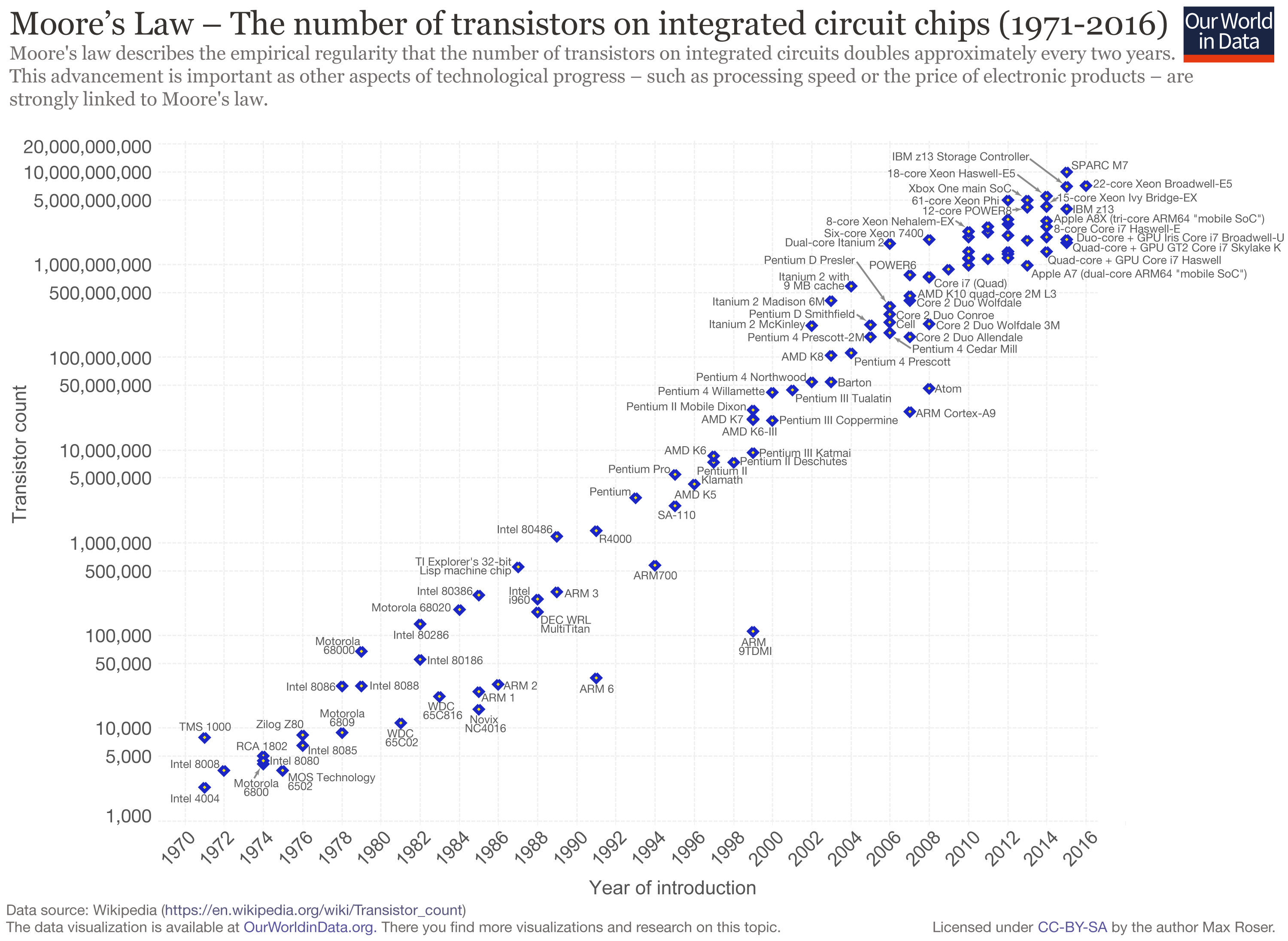
The graph above illustrates Moore’s Law and shows the transistor count for many important computer central processing units (CPUs) over the past five decades. (Here’s a link to a high-resolution version of the graph.)  Note that the graph’s vertical axis is logarithmic; what appears as a doubling is actually a far larger increase.  In the lower-left, the graph includes the CPU from my 1979 Apple II computer, the Motorola/MOS 6502.  That CPU chip contained about 3,500 transistors.  In the upper right, the graph includes the Intel i7 processor in my new laptop. That CPU contains about 2,000,000,000 transistors—roughly 500,000 times more than my Apple II.

Assuming a doubling every 2 years, in the 39 years between 1979 (my Apple II) and 2018 (My Lenovo) we should have seen 19.5 doublings in the number of transistors—about a 700,000-fold increase.  This number is close to the 500,000-fold increase calculated above by comparing the number of transistors in a 6502 chip to the number in an Intel i7 chip.  Moreover, computing power has increased even faster than the huge increases in transistor count would indicate.  Computer chips cycle faster today, and they also sport sophisticated math co-processors and graphics chips.

In terms of civilization and the future, the key questions include: can these computing-power increases continue?  Can the computers of the 2050s be hundreds-of-thousands of times more powerful than those of today?  Can we continue making transistors smaller and packing twice as many onto a chip every two years?  Can Moore’s Law continue unabated?  Probably not.  Transistors can only be made so small.  The rate of increase in computing power will slow.  We won’t see a million-fold increase in the coming 40 years like we saw in the past 40.  But does that matter?  What if the rate of increase in computing power fell by half—to a doubling every four years instead of every two?  That would mean that in 2050 our computers would still be 256 times more powerful than they are now.  And in 2054 they would be 512 times more powerful.  And in 2058, 1024 times more powerful.  What would it mean to our civilization if each of us had access to a thousand times more computing power?

One could easily add a last, pessimistic paragraph—noting the intersection between exponential increases in computing power, on the one hand, and climate change and resource limits, on the other.  But for now, let’s leave unresolved the questions raised in the preceding paragraph.  What is most important to understand is that technologies such as solar panels and massively powerful computers give us the option to move in a different direction.  But we have to choose to make changes.  And we have to act.  Our technologies are immensely powerful, but our efforts to use those technologies to avert calamity are feeble.  Our means are magnificent, but our chosen ends are ruinous.  Too often we become distracted by the novelty and power of our tools and fail to hone our skills to use those tools to build livable futures.


Through the mill: 150 years of wheat price data

Graph of wheat price, western Canada (Sask. or Man.), farmgate, dollars per bushel, 1867–2017
Wheat price, western Canada (Sask. or Man.), farmgate, dollars per bushel, 1867–2017

The price of wheat is declining, and it has been for many years.  The same is true for the prices of other grains and oilseeds.  The graph above shows wheat prices in Canada since Confederation—over the past 150 years.  The units are dollars per bushel.  A bushel is 60 pounds (27 kilograms).  The brown line suggests a trendline.

These prices are adjusted for inflation.  The downward trend reflects the fact that wheat prices fell relative to prices for nearly all other goods and services; as time went on it took more and more bushels of wheat or other grains to buy a pair of shoes, lunch, or a movie ticket.  For example, my father bought a new, top-of-the-line pickup truck in 1976 for $6,000, equivalent to about 1,200 bushels of wheat at the time.  Today, a comparable pickup (base model) might cost the equivalent of about 4,000 bushels of wheat.  As a second example, a house in 1980 might have cost the equivalent of 20,000 bushels of wheat; today, that very same house would cost the equivalent of 60,000 bushels.

The graph below adds shaded boxes to highlight three distinct periods in Canadian wheat prices.  The period from Confederation to the end of the First World War saw prices roughly in the range of $20 to $30 per bushel (adjusted to today’s dollars).  From 1920 to the mid-’80s, prices entered a new phase, and oscillated between about $8 and $18 per bushel.  And in 1985, wheat prices entered a third phase, oscillating between $5 and $10 per bushel, more often closer to $5 than $10.  In each phase, the top of the range in a given period is roughly equal to the bottom of the range in the previous period.

Graph of wheat price, western Canada (Sask. or Man.), farmgate, dollars per bushel, 1867–2017
Wheat price, western Canada, farmgate, dollars per bushel

1985 is often cited as the beginning of the farm crisis period.  The graph above shows why the crisis began in that year.  Grain prices since the mid-’80s have been especially damaging to Canadian agriculture.  The post-1985 collapse in grain prices has had several effects:

– The expulsion of one-third of Canadian farm families in just one generation;
– The expulsion of two-thirds of young farmers (under 35 years of age) over the same period;
– A tripling of farm debt, to a record $102 billion;
– A chronic need to transfer taxpayer dollars to farmers through farm-support programs (with transfers totaling $110 billion since 1985); and
– A push toward farm giantism, with the majority of land in western Canada now operated by farms larger than 3,000 acres, and with many farms covering tens-of-thousands of acres.

As per-bushel and per-acre margins fall, the solution is to cover more acres.  The inescapable result is fewer farms and farmers.

It is impossible to delve into all the causes of the grain price decline in one blog post.  Briefly, farmers are getting less and less because others are taking more and more.  A previous blog post highlighted the widening gap between what Canadians pay for bread in the grocery store and what farmers receive for wheat at the elevator.  This widening gap is created because grain companies, railways, milling companies, other processors, and retailers are taking more and more, chocking off the flow of dollars to farmers.  This is manifest in declining prices.  Agribusiness giants are profiting by charging consumers more per loaf and paying farmers less per bushel.

Of course, grain prices are a function of domestic and international markets.  The current free trade and globalization era began in the mid-1980s.  (The Canada-US Free Trade Agreement was concluded in 1987, the North American Free Trade Agreement in 1994, and the World Trade Organization Agreement on Agriculture in 1995.)  The effect of free trade and globalization has been to plunge all the world’s farmers into a single, borderless, hyper-competitive market.  At the same time, agribusiness corporations entered a period of accelerating mergers in order to reduce the competition they faced.  As competition levels increase for farmers and decrease for agribusiness corporations it is easy to predict shifts in relative profitability.  Increased competition for farmers meant lower prices while decreased competition for agribusiness transnationals translated into higher prices and profits.

Graph sources:
– 1867–1974: Historical Statistics of Canada, eds. Leacy, Urquhart, and Buckley, 2nd ed. (Ottawa: Statistics Canada, 1983);
– 1890–1909: Wholesale Prices in Canada, 189O–19O9, ed. R. H. Coats (Ottawa: Government Printing Bureau, 1910);
– 1908–1984: Statistics Canada, Table: 32-10-0359-01 Estimated areas, yield, production, average farm price and total farm value of principal field crops (formerly CANSIM 001-0017);
– 1969–2009: Saskatchewan Agriculture and Food: Statfact, Canadian Wheat Board Final Price for Wheat, basis in store Saskatoon;
– 2012–2018: Statistics Canada, Table: 32-10-0077-01 Farm product prices, crops and livestock (formerly CANSIM 002-0043).

The cattle crisis: 100 years of Canadian cattle prices

Graph of Canadian cattle prices, historic, 1918-2018
Canadian cattle prices at slaughter, Alberta and Ontario, 1918-2018

Earlier this month, Brazilian beef packer Marfrig Global Foods announced it is acquiring 51 percent ownership of US-based National Beef Packing for just under $1 billion (USD).  The merged entity will slaughter about 5.5 million cattle per year, making Marfrig/National the world’s fourth-largest beef packer.  (The top-three are JBS, 17.4 million per year; Tyson, 7.7 million; and Cargill, 7.6.)  To put these numbers into perspective, with the Marfrig/National merger, the largest four packing companies will together slaughter about 15 times more cattle worldwide than Canada produces in a given year.  In light of continuing consolidation in the beef sector it is worth taking a look at how cattle farmers and ranchers are fairing.

This week’s graph shows Canadian cattle prices from 1918 to 2018.  The heavy blue line shows Ontario slaughter steer prices, and is representative of Eastern Canadian cattle prices.  The narrower tan-coloured line shows Alberta slaughter steer prices, and is representative for Western Canada.  The prices are in dollars per pound and they are adjusted for inflation.

The two red lines at the centre of the graph delineate the price range from 1942 to 1989.  The red lines on the right-hand side of the graph delineate prices since 1989.  The difference between the two periods is stark.  In the 47 years before 1989, Canadian slaughter steer prices never fell below $1.50 per pound (adjusted for inflation).  In the 28 years since 1989, prices have rarely risen that high.  Price levels that used to mark the bottom of the market now mark the top.

What changed in 1989?  Several things:

1.       The arrival of US-based Cargill in Canada in that year marked the beginning of integration and consolidation of the North American continental market.  This was later followed by global integration as packers such as Brazil-based JBS set up plants in Canada and elsewhere.

2.       Packing companies became much larger but packing plants became much less numerous.  Gone were the days when two or three packing plants in a given city would compete to purchase cattle.

3.       Packer consolidation and giantism was faciliated by trade agreements and global economic integration.  It was in 1989 that Canada signed the Canada-US Free Trade Agreement (CUSTA).  A few years later Canada would sign the NAFTA, the World Trade Organization (WTO) Agreement on Agriculture, and other bilateral and multilateral “free trade” deals.

4.       Packing companies created captive supplies—feedlots full of packer-owned cattle that the company could draw from if open-market prices rose, curtailing demand for farmers’ cattle and disciplining prices.

Prices and profits are only partly determined by supply and demand.  A larger factor is market power.  It is this power that determines the allocation of profits within a supply chain.  In the late ’80s and continuing today, the power balance between packers and farmers shifted as packers merged to become giant, global corporations.  The balance shifted as packing plants became less numerous, reducing competition for farmers’ cattle.  The balance shifted still further as packers began to utilize captive supplies.  And it shifted further still as trade agreements thrust farmers in every nation into a single, hyper-competitive global market.  Because market power determines profit allocation, these shifts increased the profit share for packers and decreased the share for farmers.   The effects on cattle farmers have been devastating.  Since the latter-1980s, Canada has lost half of its cattle farmers and ranchers.

For more background and analysis, please see the 2008 report by the National Farmers Union: The Farm Crisis and the Cattle Sector: Toward a New Analysis and New Solutions.

Graph sources: numerous, including Statistics Canada CANSIM Tables 002-0043, 003-0068, 003-0084; and  Statistics Canada “Livestock and Animal Products”, Cat. No. 23-203


Cattle Rustling? The growing gap between cattle and beef prices

Graph of Canadian cattle prices and retail beef prices, 1995 to 2017
Retail prices of ground beef and steak compared to farmers’ prices for cattle, 1995–2017

This week’s graph highlights the growing gap between what Canadians pay for beef and what farmers receive for their cattle.  The rising blue lines show grocery-store prices for steak and ground beef.  The comparatively flat green lines represent the prices farmers and feedlot operators receive for the cattle they sell to beef packers.  Steers (castrated male cattle) are more likely to be the source of steaks, while cows are primarily turned into ground beef.

The blue lines show what consumers pay; the green lines show what farmers get.  The widening gap between the blue lines and the green lines reveals the amount that packers and retailers take for themselves.

Let’s look first at the dotted lines.  The green dotted line shows the per-pound price farmers in Alberta receive for their cows.  (prices across Canada are similar.)  In the decade-and-a-half before 2010, that price averaged about 50¢.  In recent years it has averaged about $1.00.  One could say that farmers are receiving an extra 50¢ per pound for their cows.  These figures do not take into account rising costs (they are not adjusted for inflation) but we’ll leave that issue aside for now.  Note what happens to the blue dotted line: the grocery-store price of ground beef.  It more than triples, from about $1.70 per pound to about $5.50.  Farmers’ prices increased by 100%, but packers and retailers increased their take by 320%.  Farmers’ prices increased by 50¢, but packers and retailers increased their prices by nearly $4.00.

The solid green line shows the price that farmers (or feedlot operators) receive for slaughter-ready steers.  The solid blue line is a representative price for grocery-store steaks.  If we compare recent years to those before 2013, we see that steer prices have risen by perhaps 50¢ or 60¢ per pound.  Over the same period, steak prices have risen by $5.00 or $6.00.

There is little discernible connection between the prices consumers pay and the prices farmers receive.  This is true of cattle and beef, but also true of nearly every other farm-retail product pair.  For a graph comparing the prices of wheat and bread, click here.  Similar “wedge” graphs can be created for corn and cornflakes, hogs and pork chops, and many other farm-retail product pairs.

Food processors, packers, and retailers are choking off the flow of dollars to Canadian farms, with devastating effects.  The number of Canadian farms raising cattle has been cut nearly in half in a generation—from 142,000 in 1995 to less than 75,000 today.  Moreover, many of these farms reporting cattle are dairy farms (which do sell cattle for slaughter, but support themselves primarily from milk sales).  The number of farms classified as “beef cattle ranching and farming, including feedlots” stood at just 36,000 in 2016.  Farm debt is a record $100 billion.  And the number of young farmers (<35 years of age) today is just one-third the number a generation ago.

Canadians are paying many times over.  We’re paying a high price at the store.  We’re paying again through our taxes to fund farm support programs—money paid to farmers to backfill for the dollars extracted by powerful transnational packers, processors, and retailers.  And we’re paying yet again as our rural economies are hollowed out, our communities decimated, our family farms destroyed, and our nation’s capacity to sustainably produce food is eroded.

Graph sources: Statistics Canada CANSIM Tables 326-0012 and 002-0043.  

Efficiency, the Jevons Paradox, and the limits to economic growth

Graph of the cost of lighting in the UK, 1300-2000

I’ve been thinking about efficiency.  Efficiency talk is everywhere.  Car buyers can purchase ever more fuel-efficient cars.  LED lightbulbs achieve unprecedented efficiencies in turning electricity into visible light.  Solar panels are more efficient each year.  Farmers are urged toward fertilizer-use efficiency.  And our Energy Star appliances are the most efficient ever, as are the furnaces and air conditioners in many homes.

The implication of all this talk and technology is that efficiency can play a large role in solving our environmental problems.  Citizens are encouraged to adopt a positive, uncritical, and unsophisticated view of efficiency: we’ll just make things more efficient and that will enable us to reduce resource use, waste, and emissions, to solve our problems, and to pave the way for “green growth” and “sustainable development.”

But there’s something wrong with this efficiency solution: it’s not working.  The current environmental multi-crisis (depletion, extinction, climate destabilization, ocean acidification, plastics pollution, etc.) is not occurring as a result of some failure to achieve large efficiency gains.  The opposite.  It is occurring after a century of stupendous and transformative gains.  Indeed, the efficiencies of most civilizational processes (e.g., hydroelectric power generation, electrical heating and lighting, nitrogen fertilizer synthesis, etc.) have increased by so much that they are now nearing their absolute limits—their thermodynamic maxima.  For example, engineers have made the large electric motors that power factories and mines exquisitely efficient; those motors turn 90 to 97 percent of the energy in electricity into usable shaft power.  We have maximized efficiencies in many areas, and yet our environmental problems are also at a maximum.  What gives?

There are many reasons why efficiency is not delivering the benefits and solutions we’ve been led to expect.  One is the “Jevons Paradox.”  That Paradox predicts that, as the efficiencies of energy converters increase—as cars, planes, or lightbulbs become more efficient—the cost of using these vehicles, products, and technologies falls, and those falling costs spur increases in use that often overwhelm any resource-conservation gains we might reap from increasing efficiencies.  Jevons tells us that energy efficiency often leads to more energy use, not less.  If our cars are very fuel efficient and our operating costs therefore low, we may drive more, more people may drive, and our cities may sprawl outward so that we must drive further to work and shop.  We get more miles per gallon, or per dollar, so we drive more miles and use more gallons.  The Jevons Paradox is a very important concept to know if you’re trying to understand our world and analyze our situation.

The graph above helps illustrate the Jevons Paradox.  It shows the cost of a unit of artificial light (one hour of illumination equivalent to a modern 100 Watt incandescent lightbulb) in England over the past 700 years.  The currency units are British Pounds, adjusted for inflation.  The dramatic decline in costs reflects equally dramatic increases in efficiency.

Adjusted for inflation, lighting in the UK was more than 100 times more affordable in 2000 than in 1900 and 3,000 time more affordable than in 1800.  Stated another way, because electrical power plants have become more efficient (and thus electricity has become cheaper), and because new lighting technologies have become more efficient and produce more usable light per unit of energy, an hour’s pay for the average worker today buys about 100 times more artificial light than it did a century ago and 3,000 time more than two centuries ago.

But does all this efficiency mean that we’re using less energy for lighting?  No.  Falling costs have spurred huge increases in demand and use.  For example, the average UK resident in the year 2000 consumed 75 times more artificial light than did his or her ancestor in 1900 and more than 6,000 times more than in 1800 (Fouquet and Pearson).  Much of this increase was in the form of outdoor lighting of streets and buildings.  Jevons was right: large increases in efficiency have meant large decreases in costs and large increases in lighting demand and energy consumption.

Another example of the Jevons Paradox is provided by passenger planes.  Between 1960 and 2016, the per-seat fuel efficiency of jet airliners tripled or quadrupled (IPCC).  This, in turn, helped lower the cost of flying by more than 60%.  A combination of lower airfares, increasing incomes, and a growing population has driven a 50-fold increase in global annual air travel since 1960—from 0.14 trillion passenger-kilometres per year to nearly 7 trillion (see here for more on the exponential growth in air travel).  Airliners have become three or four times more fuel efficient, yet we’re now burning seventeen times more fuel.  William Stanley Jevons was right.

One final point about efficiency.  “Efficiency” talk serves an important role in our society and economy: it licenses growth.  The idea of efficiency allows most people to believe that we can double and quadruple the size of the global economy and still reduce energy use and waste production and resource depletion.  Efficiency is one of our civilization’s most important licensing myths.  The concept of efficiency-without-limit has been deployed to green-light the project of growth-without-end.

Graph sources: Roger Fouquet, Heat Power and Light: Revolutions in Energy Services

Taking nearly the whole loaf: US and Canadian wheat and bread prices, 1975 to present

Graph of Canadian retail store bread price and country elevator wheat price, 1975-2016
Canadian retail store bread price and farm-gate wheat price, 1975-2016

Graph of United States retail store bread price and farm-gate wheat price, 1975-2016

United States retail store bread price and farm-gate wheat price, 1975-2016

It’s been said before but it bears repeating: farmers are making too little because others are taking too much.  For instance, food retailers, processors, grain companies, and railways are taking far too large a share of the retail price of bread.  And the share taken by these companies is increasing—choking off the flow of dollars to our family farms.  At the same time, these same corporations are profiteering by driving up the prices of the staple foods we all need to feed ourselves and our families.

This week’s two graph show data for the US and Canada.  Both graphs show the price of a bushel of wheat (the relatively flat line across the bottom of each graph) and the retail value of the approximately 60 loaves of bread that can be produced from a bushel of wheat (the upward-trending line in each graph).  The wheat prices are farm-gate or country elevator values.  The units are Canadian or US dollars, as appropriate, not adjusted for inflation.

The units are not important, however.  What is important is the widening gap between what consumers pay for bread and the amount of money that makes it back to the farm.  This growing gap represents the ever-larger share taken by food retailers, flour millers and other processors, railways, and elevator companies and grain traders.

Very little of the money spent in grocery stores makes it back to American or Canadian farms.  Compounding this problem is the fact that most of the money that does make it back to these farms is quickly captured by powerful farm-input companies. (See details here.)  Corporations upstream and downstream from farmers use their market power to capture huge profits for themselves while reducing net farm income to zero in many years.  To keep farms solvent, governments and citizens must step in with taxpayer-funded farm support payments.  In Canada, these payments have totaled $100 billion dollars over the past three decades, and more than $400 billion in the US.  From some perspectives, the primary beneficiaries of these payments are the executives and shareholders of the dominant agribusiness/food corporations.

Finally, there is the issue of efficiency.  Farmers are relentlessly urged to become more efficient.  Indeed, they are forced to increase efficiency simply to remain solvent in the face of declining farm-gate prices and rising input costs.  Farmers are so efficient today that they can produce grains and other products for 1970s’ prices.  But what of efficiency elsewhere in the system?  What does it indicate about the efficiency of huge corporate flour millers and food retailers if they must constantly take more and more money for themselves?  Are they becoming less efficient as they get larger?  Or are they simply using their increasing size and power to capture more profit for themselves?  And if citizens are going to be made to pay more for food anyway, then why badger farmers to become ever more efficient?

Farmers are the primary victims of the abuses of power within the food system.  But everyone is hurt as we are made to pay increased taxes to fund farm-support programs and to pay increased retail prices to support the outsized profit needs of the dominant food-system transnationals and their shareholders.

Graph sources:
Canadian bread: Statistics Canada, Consumer Prices and Price Indexes (Catalog number 62-010); CANSIM Table 326-0012.
US bread: Bureau of Labour Statistics, “Bread prices 1980-2015“.
Canadian wheat: Government of Saskatchewan, Saskatchewan Agriculture and Agri-food, “StatFacts-Canadian Wheat Board Payments for No. 1 CWRS”; CANSIM Table  002-0043.
US Wheat: United States Department of Agriculture, “Wheat Yearbook”   

Cheap oil? Long-term US and Canadian crude oil prices

Graph of US and Canadian crude oil prices, historic, 1860 to 2016
US and Canadian crude oil prices, historical, 1860-2016

Many corporate spokespeople, government officials, economists, and journalists are repeating a very odd line: “oil prices are low.” Others talk of “cheap oil,” “plunging prices,” and a “crash.” Here’s one example, a 2016 headline from Maclean’s: “Life at $20 a barrel: What the oil crash means for Canada.”

I will argue that talk of “low oil prices” ignores history, misconstrues energy’s role in making civilizations, and confuses our efforts to build resilient, sustainable, climate-stabilizing economies. The graph above and the table below put recent oil prices into their long-term context. The graph covers the 156-year period from the first large-scale production of petroleum oil to the present: 1860 to 2016. It shows US average crude oil prices and Canadian prices for light sweet crude and heavy tarsands crude. For comparability, all figures are in US dollars and adjusted for inflation.

This table helps us interpret the data in the graph by showing average prices for each decade.

Canada and US crude oil prices, decade-averages, US dollars, adjusted for inflation
Canada and US crude oil prices, decade-averages, inflation-adjusted US dollars

Here’s what the graph and table can tell us about current “low oil prices.”

1. The graph shows that the very high 2003-2014 prices are an anomaly.

2. The $80 average price in the 2010s is the highest since the 1870s.

3. Even with recent declines, oil prices remain above the levels that held during the century from 1875 to 1975.

4. While prices have averaged $80 in the 2010s, the average price in the 1950s, ’60s, and ’70s was below $30. The greatest period of economic growth in global history, the postwar US boom, was accomplished with very cheap oil. As the cost of oil goes up, the cost of civilization goes up. If energy prices rise too high, we may no longer be able to afford to continue to build or even maintain our sprawling mega-civilization.

5. Many say that Canadian prices are particularly low relative to US or world prices. That isn’t the case. It’s not that Canadian oil is priced lower than US oil; rather, Canadian heavy (tar sands) oil is priced lower than US and Canadian light oil. The values in the table show this. The graph also shows this in the close correlation of US average oil prices with Canadian light oil prices. The right-wing think-tank The Fraser Institute explains that heavy oil from the tarsands and similar sources is priced lower because such oil “is more costly to transport by pipeline …. Further, the heavier the crude oil …, the lower its value to a refiner as it will either require more processing or yield a higher percentage of lower-valued by-products such as heavy fuel oil. Complex crudes containing more sulphur also generally cost more to refine than low-sulphur crudes. For these reasons, oil refiners are willing to pay more for light, low-sulphur crude oil.”

6. Western Canadians are particularly sensitive to “low oil prices” because our economy is dependent upon some of the highest-cost oil production systems in the world: the tar sands. We are the high-cost producers.

As the International Energy Agency (IEA) said recently, “Attempting to understand how the oil market will look during the next five years is today a task of enormous complexity.” I certainly cannot predict oil prices. And I’m not advocating lower prices. Just the opposite. As someone deeply concerned by climate change, I hope that oil prices rise and stay high, and that governments impose taxes on carbon emissions to push the cost of burning fossil fuels higher still. Nonetheless, we need to dispassionately interpret the data if we are to have any hope of directing our future and our economy. We need to be able to discern when energy prices are low and when they are not.

To leave a comment, click on the graph or the title and then scroll down.

Graph Sources: Canadian Association of Petroleum Producers (CAPP), Statistical Handbookfor Canada’s Upstream Petroleum Industry (October, 2016); and US Energy Information Administration (EIA), U.S. Crude Oil First Purchase Price