Civilization as asteroid: humans, livestock, and extinctions

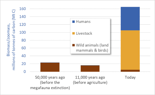
Graph of biomass of humans, livestock, and wild animals
Mass of humans, livestock, and wild animals (terrestrial mammals and birds)

Humans and our livestock now make up 97 percent of all animals on land.  Wild animals (mammals and birds) have been reduced to a mere remnant: just 3 percent.  This is based on mass.  Humans and our domesticated animals outweigh all terrestrial wild mammals and birds 32-to-1.

To clarify, if we add up the weights of all the people, cows, sheep, pigs, horses, dogs, chickens, turkeys, etc., that total is 32 times greater than the weight of all the wild terrestrial mammals and birds: all the elephants, mice, kangaroos, lions, raccoons, bats, bears, deer, wolves, moose, chickadees, herons, eagles, etc.  A specific example is illuminating: the biomass of chickens is more than double the total mass of all other birds combined.

Before the advent of agriculture and human civilizations, however, the opposite was the case: wild animals and birds dominated, and their numbers and mass were several times greater than their numbers and mass today. Before the advent of agriculture, about 11,000 years ago, humans made up just a tiny fraction of animal biomass, and domesticated livestock did not exist.  The current situation—the domination of the Earth by humans and our food animals—is a relatively recent development.

The preceding observations are based on a May 2018 report by Yinon Bar-On, Rob Phillips, and Ron Milo published in the academic journal Proceedings of the National Academy of Sciences.  Bar-On and his coauthors use a variety of sources to construct a “census of the biomass of Earth”; they estimate the mass of all the plants, animals, insects, bacteria, and other living things on our planet.

The graph above is based on data from that report (supplemented with estimates based on work by Vaclav Smil).  The graph shows the mass of humans, our domesticated livestock, and “wild animals”: terrestrial mammals and birds.  The units are millions of tonnes of carbon.*  Three time periods are listed.  The first, 50,000 years ago, is the time before the Quaternary Megafauna Extinction.  The Megafauna Extinction was a period when Homo sapiens radiated outward into Eurasia, Australia, and the Americas and contributed to the extinction of about half the planet’s large animal species (>44 kgs).  (Climate change also played a role in that extinction.)  In the middle of the graph we see the period around 11,000 years ago—before humans began practicing agriculture.  At the right-hand side we see the situation today.  Note how the first two periods are dominated by wild animals.  The mass of humans in those periods is so small that the blue bar representing human biomass is not even visible in the graph.**

This graph highlights three points:
1. wild animal numbers and biomass have been catastrophically reduced, especially over the past 11,000 years;
2. human numbers and livestock numbers have skyrocketed, to unnatural, abnormal levels; and
3. The downward trendline for wild animals visible in this graph is gravely concerning; this graph suggests accelerating extinctions.

Indeed, we are today well into the fastest extinction event in the past 65 million years.  According to the 2005 Millennium Ecosystem Assessment “the rate of known extinctions of species in the past century is roughly 50–500 times greater than the extinction rate calculated from the fossil record….”

The extinction rate that humans are now causing has not been seen since the Cretaceous–Paleogene extinction event 65 million years ago—the asteroid-impact-triggered extinction that wiped out the dinosaurs.  Unless we reduce the scale and impacts of human societies and economies, and unless we more equitably share the Earth with wild species, we will enter fully a major global extinction event—only the sixth in 500 million years.  To the other species of the Earth, and to the fossil record, human impacts increasingly resemble an asteroid impact.

In addition to the rapid decline in the mass and number of wild animals it is also worth contemplating the converse: the huge increase in human and livestock biomass.  Above, I called this increase “unnatural,” and I did so advisedly.  The mass of humans and our food animals is now 7 times larger than the mass of animals on Earth 11,000 or 50,000 years ago—7 times larger than what is normal or natural.  For millions of years the Earth sustained a certain range of animal biomass; in recent millennia humans have multiplied that mass roughly sevenfold.

How?  Fossil fuels.  Via fertilizers, petro-chemical pesticides, and other inputs we are pushing hundreds of millions of tonnes of fossil fuels into our food system, and thereby pushing out billions of tonnes of additional food and livestock feed.  We are turning fossil fuel Calories from the ground into food Calories on our plates and in livestock feed-troughs.   For example, huge amounts of fossil-fuel energy go into growing the corn and soybeans that are the feedstocks for the tens-of-billions of livestock animals that populate the planet.

Dr. Anthony Barnosky has studied human-induced extinctions and the growing dominance of humans and their livestock.  In a 2008 journal article he writes that “as soon as we began to augment the global energy budget, megafauna biomass skyrocketed, such that we are orders of magnitude above the normal baseline today.”  According to Barnosky “the normal biomass baseline was exceeded only after the Industrial Revolution” and this indicates that “the current abnormally high level of megafauna biomass is sustained solely by fossil fuels.”

Only a limited number of animals can be fed from leaves and grass energized by current sunshine.  But by tapping a vast reservoir of fossil sunshine we’ve multiplied the number of animals that can be fed.  We and our livestock are petroleum products.

There is no simple list of solutions to mega-problems like accelerating extinctions, fossil-fuel over-dependence, and human and livestock overpopulation.  But certain common sense solutions seem to present themselves.  I’ll suggest just one: we need to eat less meat and fewer dairy products and we need to reduce the mass and number of livestock on Earth.  Who can look at the graph above and come to any other conclusion?  We need not eliminate meat or dairy products (grazing animals are integral parts of many ecosystems) but we certainly need to cut the number of livestock animals by half or more.  Most importantly, we must not try to proliferate the Big Mac model of meat consumption to 8 or 9 or 10 billion people.  The graph above suggests a stark choice: cut the number of livestock animals, or preside over the demise of most of the Earth’s wild species.


* Using carbon content allows us to compare the mass of plants, animals, bacteria, viruses, etc.  Very roughly, humans and other animals are about half to two-thirds water.  The remaining “dry mass” is about 50 percent carbon.  Thus, to convert from tonnes of carbon to dry mass, a good approximation is to multiply by 2.

** There is significant uncertainty regarding animal biomass in the present, and much more so in the past.  Thus, the biomass values for wild animals in the graph must be considered as representing a range of possible values.  That said, the overall picture revealed in the graph is not subject to any uncertainty.  The overall conclusions are robust: the mass of humans and our livestock today is several times larger than wild animal biomass today or in the past; and wild animal biomass today is a fraction of its pre-agricultural value.

Graph sources:
– Yinon M. Bar-On, Rob Phillips, and Ron Milo, “The Biomass Distribution on Earth,” Proceedings of the National Academy of Sciences, May 17, 2018.
– Anthony Barnosky, “Megafauna Biomass Tradeoff as a Driver of Quaternary and Future Extinctions,” Proceedings of the National Academy of Sciences 105 (August 2008).
– Vaclav Smil, Harvesting the Biosphere: What We Have Taken from Nature (Cambridge, MA: MIT Press, 2013).
Everything must double: Economic growth to mid-century

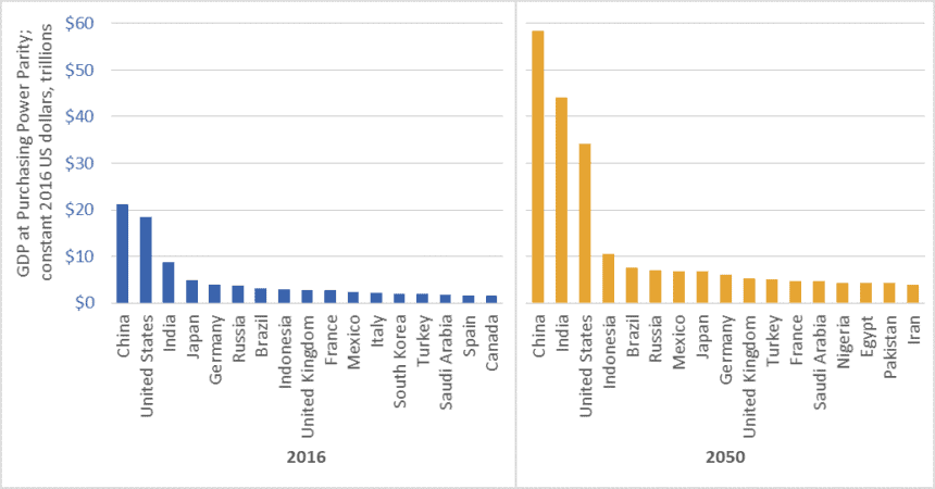
Graph of GDP of the world's largest economies, 2016 vs 2050
Size of the world’s 17 largest economies, 2016, and projections for 2050

In February 2017, global accounting firm PricewaterhouseCoopers (PwC) released a report on economic growth entitled The Long View: How will the Global Economic Order Change by 2050?  The graph above is based on data from that report.  (link here)  It shows the gross domestic product (GDP) of the largest economies in the world in 2016, and projections for 2050.  The values in the graph are stated in constant (i.e., inflation adjusted) 2016 dollars.

PwC projects that China’s economy in 2050 will be larger than the combined size of the five largest economies today—a list that includes China itself, but also the US, India, Japan, and Germany.

Moreover, the expanded 2050 economies of China and India together ($102.5 trillion in GDP) will be almost as large as today’s global economy ($107 trillion).

We must not, however, simply focus on economic growth “over there.”  The US economy will nearly double in size by 2050, and Americans will continue to enjoy per-capita GDP and consumption levels that are among the highest in the world.  The size of the Canadian economy is similarly projected to nearly double.   The same is true for several EU countries, Australia, and many other “rich” nations.

Everything must double

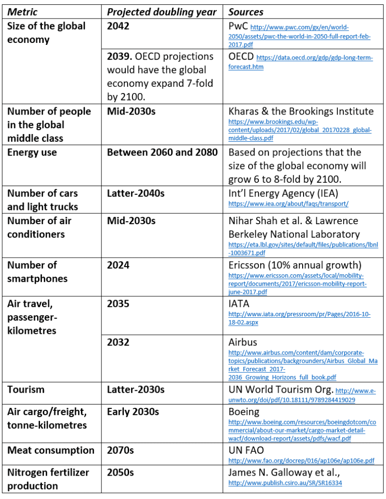
PwC’s report tells us that between now and 2050, the size of the global economy will more than double.  Other reports concur (See the OECD data here).  And this doubling of the size of the global economy is just one metric—just one aspect of the exponential growth around us.  Indeed, between now and the middle decades of this century, nearly everything is projected to double.  This table lists just a few examples.

Table of projected year of doubling for various energy, consumption, transport, and other metrics
Projected year of doubling for selected energy, consumption, and transport metrics

At least one thing, however, is supposed to fall to half

While we seem committed to doubling everything, the nations of the world have also made a commitment to cut greenhouse gas (GHG) emissions by half by the middle decades of this century.  In the lead-up to the 2015 Paris climate talks, Canada, the US, and many other nations committed to cut GHG emissions by 30 percent by 2030.  Nearly every climate scientist who has looked at carbon budgets agrees that we must cut emissions even faster.  To hold temperature increases below 2 degrees Celsius relative to pre-industrial levels, emissions must fall by half by about the 2040s, and to near-zero shortly after.

Is it rational to believe that we can double the number of cars, airline flights, air conditioners, and steak dinners and cut global GHG emissions by half?

To save the planet from climate chaos and to spare our civilization from ruin, we must—at least in the already-rich neighborhoods—end the doubling and redoubling of economic activity and consumption.  Economic growth of the magnitude projected by PwC, the OECD, and nearly every national government will make it impossible to cut emissions, curb temperature increases, and preserve advanced economies and stable societies.  As citizens of democracies, it is our responsibility to make informed, responsible choices.  We must choose policies that curb growth.

Graph source: PriceWaterhouseCoopers

Turning fossil fuels into fertilizer into food into us: Historic nitrogen fertilizer consumption

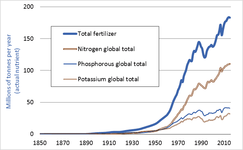
Graph of historic global fertilizer use, including nitrogen fertilizer, 1850-2015
Global consumption of nitrogen fertilizer and other fertilizers, historic, 1850 to 2015

Last week’s blog post (Feeding the World) showed that farmers worldwide had, since 1950, quadrupled grain production. How is this possible? The answer is fertilizer; more specifically, nitrogen fertilizer. This graph shows global fertilizer use. In 1950, farmers applied less than 5 million tonnes of nitrogen (measured in terms of actual nutrient, not fertilizer product). In 2015, farmers applied more than 110 million tonnes. We managed to increase grain output fourfold largely by increasing nitrogen inputs 23-fold.

Nitrogen fertilizer is a fossil fuel product, made primarily from natural gas. One can think of a modern nitrogen fertilizer factory as having a large natural gas pipeline feeding into one end and a large pipe coming out the other carrying ammonia, a nitrogen-rich gas. To produce, transport, and apply one tonne of nitrogen fertilizer requires an amount of energy equal to almost two tonnes of gasoline. One reason we have been able to increase grain production fourfold since 1950, and human population threefold, is that we found a way to turn fossil fuels into plant nutrients into enlarged food supplies into us. With fertilizers, we can convert hydrocarbons into carbohydrates.

Dr. Vaclav Smil is an expert on the material flows, nutrient cycles, and energy transformations that underpin natural and human systems. He believes that without the capacity to turn fossil fuels into nitrogen fertilizers into enlarged harvests, nearly half the 7.4 billion people now on Earth could not be fed and could not exist. Smil calls factory-made nitrogen “the solution to one of the key limiting factors on the growth of modern civilization.” This blog highlights the many ways humans have managed to remove the limiting factors to the growth of modern civilization.

Finally, 1950 was long ago. Surely rapid increases in fertilizer consumption must have tapered off in recent years. That isn’t the case. Canadian consumption is rising especially rapidly. A look at Statistics Canada data (CANSIM 001-0069) reveals that Canadian nitrogen fertilizer consumption has increased 65 percent over the past decade (2006 to 2016). Like many countries, Canada is boosting food output by increasing the use of energy-intensive agricultural inputs.

Graph sources: Vaclav Smil, Enriching the Earth; UN FAO, FAOSTAT; International Fertilizer Industry Association, IFADATA; and Clark Gellings and Kelly Parmenter, “Energy Efficiency in Fertilizer Production and Use.”

Feeding the world: our struggle to multiply global grain production

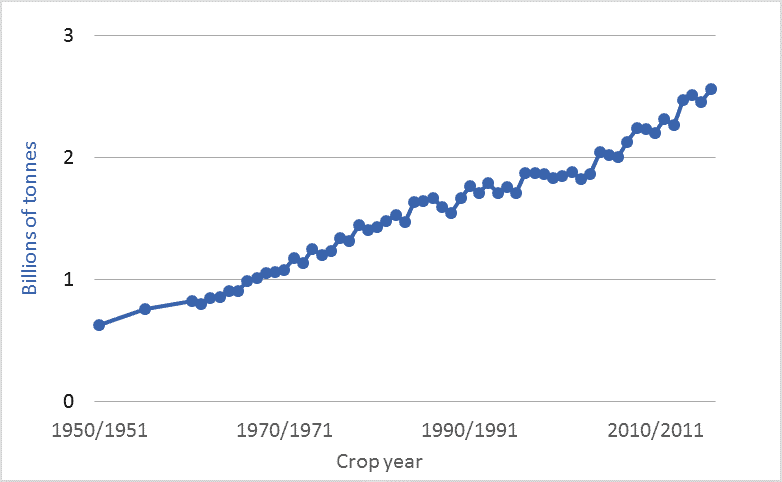
Graph of global grain production historic 1950 to 2016
Global grain production, annual, 1950–2016

This blog post and the next (Turning fossil fuels into … food) look at the rapid expansion of our global food supply and how we’ve accomplished that feat. The graph above shows world grain production for the past 66 years: 1950 to 2016. The units are billions of tonnes of annual production of all grains: primarily wheat, corn, rice, barley, oats, and millet. The figures exclude oilseeds, tonnage of which is about one-fifth as large as that of grains.

By utilizing ever-increasing inputs of water, machinery, fuels, chemicals, technologically-enhanced seeds, and, especially, fertilizers, the world’s farmers have managed to quadruple global grain production since 1950, and to double production since 1975. This expansion has been accomplished on a largely unchanged land area. Farmers have doubled output since the mid-’70s on a cropland area that, according to the UN’s Food and Agriculture Organization (FAO), has increased by just 5 percent.

The UN projects that global human population will increase by 50 percent by the end of this century, to 11.2 billion. That enlarged population will likely be richer, on average, than today’s population. Thus, per-capita meat demand will probably rise. When we feed grains to livestock, we turn 5 to 10 grain Calories into 1 meat Calorie. Thus, diets rich in meat require higher levels of grain production. Coming on top of these drivers of increased grain consumption is the likely increase in demand for biofuels, biomass, and feedstocks for “the bioeconomy.” The Global Harvest Initiative is an industry group whose members include John Deere, Monsanto, Mosaic, and Dupont. The group asserts that there is a “Global Agricultural Imperative” to “nearly double global agricultural output by 2050 to respond to a rapidly growing population and to meet the consumer demands of an expanding middle class.” If this doubling is accomplished, it will mark an 8-fold increase over 1950 production levels. Few citizens or policymakers are aware that the bounty in our supermarkets and on our tables depends upon very rapid and difficult-to-sustain rates of growth in food production.

Graph sources: 1960-2016: United States Department of Agriculture (USDA) World Agricultural Supply and Demand Estimates (WASDE),  ; 1950 and 1955: Lester Brown and Worldwatch Institute, various publications. Brown and Worldwatch cite USDA, “World Grain Database,” unpublished printout, 1991.