Canucks in hock: 50 years of Canadian debt levels

Graph of Canadian government debt and consumer debt historical
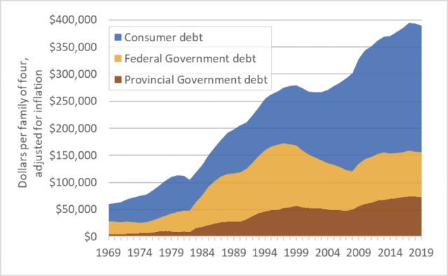
Canadian personal and government debt, per family of four, adjusted for inflation, 1969-2019

Canada has a debt problem.  Total consumer and government debt is now $3.7 trillion, with 60 percent being consumer debt: mortgages, home-equity loans, credit lines, car loans, credit card balances, etc.  Provincial government debt is about $0.7 trillion and federal government debt is $0.8 trillion.  Corporate and financial-system debts would add trillions more, but we’ll leave those amounts aside.

Those are big numbers—too big to make sense of.  It is easier to understand debt if we look at it on a per-household basis.  The graph above shows debt levels for a hypothetical family of four over the past 50 years: 1969 to 2019.  All figures are adjusted for inflation.  For an average Canadian household, debt levels today are about six times higher than in 1970.  Granted, we’re richer than we were in the 1970s, but six times richer?  More important, are we richer as a nation?  In 1970 the eastern oceans were full of cod and western regions were brimming with oil.

There are many ways to evaluate debt—to put it into perspective.  Often it’s expressed as a percentage of GDP or of household income.  The idea being that if the economy is bigger or incomes are larger, it’s okay to owe more.  I want to argue that this is the wrong approach.  I want to suggest a different and more concerning interpretation of ever-rising Canadian debt levels.

Debt rises when our financial outflows exceed inflows.  If we need to pay out more than we are bringing in, we can borrow, and debt goes up.  But implicit in this idea is another one: the day will come when inflows exceed outflows and we’ll have surplus money we can use to pay off the debt.

So let’s look at the graph in that light.  Here’s what the graph shows: collectively, we Canadians couldn’t quite pay all our personal and government bills in the 1970s, so we borrowed money and debt increased.  The same in the 1980s: we didn’t have enough so we borrowed and debt increased.  This continued through the 1990s, 2000s, and 2010s.  In each decade of the past half-century we couldn’t quite afford our lifestyles and infrastructure projects and social programs and day-to-day bills so we borrowed more money than we repaid, so debt rose—continuously, consistently.

So here’s the question that puts this debt into perspective: if we didn’t have enough money in any of the recent decades why are we confident that the situation will change in the future?  Why, after five decades of increasing debt, are we confident that in the 2020s or 2030s or 2040s we can reverse the pattern of two generations and amass money so fast that we’ll not only be able to pay all our personal and government bills but we’ll also have large surpluses we can use to retire the debt we accumulated over 50 years?  …a debt that now stands at about $400,000 per family of four.

Let’s explore that argument again, over a shorter time frame.  Over just the past 15 years—2004 to 2019—the average Canadian household has increased its debt by about 45 percent—by about $110,000.  But the recent decade-and-a-half were good years in much of Canada—unemployment was relatively low, the economy was usually strong, rising stock markets helped stoke investments and retirement accounts.  In many parts of Canada most of the 2004-2019 period was a “boom” time.  The economy was booming, yet we borrowed.  Are we confident that our future will be even more … boomy?  Because it’s in that future that we’re not only going to have to find ways to pay all the day-to-day bills in our households and legislatures, but also find large surpluses to retire debt.  Are we confident that in the 2020s or 2030s our nation and our collective households will be so much richer than we were in the 2004-2019 period that that we’ll be able to retire all that debt?

My aim is certainly not to scold.  Rising debt should not be seen as a personal problem, but rather as a collective error.  Rather, my aim is to warn—to disabuse governments and my fellow citizens of a dangerous and possibly prosperity-curdling idea: that current debt levels are somehow safe and sustainable and that we should be calm as we or our governments pile on trillions more (as the trendlines in the graph suggest we will).  Most of us have debts.  But debt is a public policy issue, not a personal failing.  Moreover, even those who do not have debt should not be smug.  If, as a nation, our collective borrowing rises too far there will be a reckoning, and all will suffer as a result.

Every household must make its own decisions regarding mortgages and education spending and financing cars.  But there is also a larger, collective, public-policy decision needed.  Government leadership is needed to begin moving debt levels lower.

Greta vs. growth

Graph of the size of the global economy (Gross World Product) historic
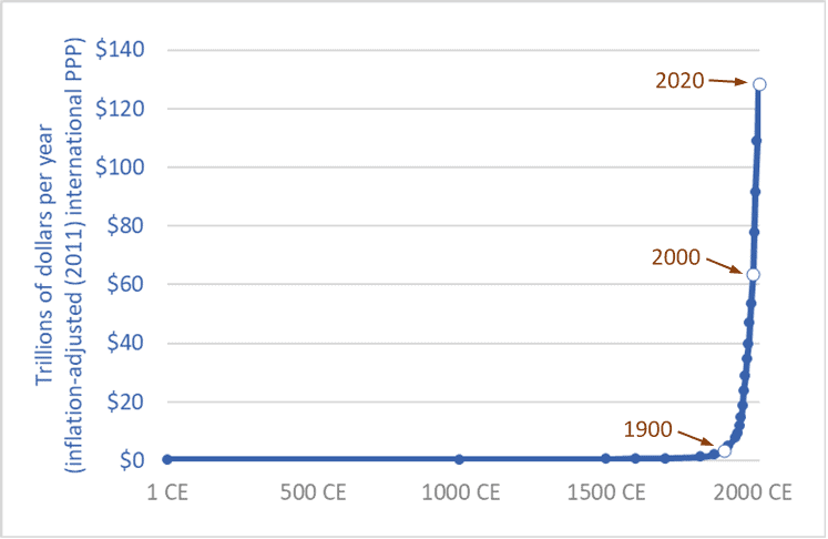
The size of the global economy (Gross World Product) over the long term, 1 CE – 2020 CE

“People are suffering.  People are dying.  Entire ecosystems are collapsing.  We are in the beginning of a mass extinction, and all you can talk about is money and fairy tales of eternal economic growth.  How dare you!”  So spake Greta Thunberg at the United Nations on September 23rd, 2019.

Thunberg, a sixteen-year-old without a university education, has had the insight, clarity, and courage to say what ten-billion-dollars worth of Ph.D. economists haven’t: that continued economic growth is, at best, unsustainable and probably much worse: a malignant illusion driving us to destroy our biosphere, civilization, and future.  The project of making the current global economy four or eight times larger is a suicide pact.

The graph above places our 21st century economy in its long-term context.  It shows the size of the global economy (Gross World Product) from 1 CE to 2020.  The units are trillions of US/international dollars adjusted for inflation (constant 2011 dollars).  The main source is the World Bank, with historical data from Angus Maddison.  (Pre-20th century values are, by necessity, estimates by Maddison.)

The years 1900, 2000, and 2020 are highlighted.  Sometime in 2020 the size of the global economy will surpass 127 trillion dollars.  When it does, it will be twice as large as it was in 2000.  The economy will have doubled in size in just 20 years.  This shouldn’t be a surprise.  Sustained growth rates of 3.5 percent leads to a doubling every 20 years.  (Recall the Rule of 70.)

Going forward, if we maintain current rates of growth—three to four percent annually—the economy will be twice as large again by 2040 or soon after—making it four times larger than in 2000.  Earth’s atmosphere, oceans, land, and biosphere will be hosting four 2000-sized economies.

And by 2060 or 2070, another doubling will bring the global economy to eight times its 2000 level.  And there’ll still be more than enough time left in this century to double it again—at least a 16-fold increase in size in a single century, if we stay the course.  If we accomplish this, we will be reprising the 18-fold increase seen during the 20th century.

Of course, we won’t do this—we won’t make the global economy 8 or 16 times larger.  Within a generation or two nearly everyone on the planet will be living in a post-growth economy: either because we’ve had the wisdom to end runaway exponential growth and put the biosphere first, or because we have not.

The end of growth, inescapable in the medium term, will bring numerous problems, such as how will we deal with the equity claims of the poor if we can no longer rely on the convenient fictions of “a rising tide raises all boats” and “anyone (everyone?) can grow up to be rich.”  While the end of growth must come for nearly all within a few decades, it must come first for those of us who are richest, so that growth can continue in places where people are poorer.  Those of us who enjoy jet vacations need to step off the growth escalator first so that growth can continue for others and deliver to them running water and refrigerators.  The end of growth casts into sharp relief a series of moral problems.

But the end of growth will also solve many problems.  We will be forced to take less of our economy’s productivity and bounty in the form of consumer products and more in the form of free time and low-emission leisure—more time with family, more time with friends drinking coffee or wine, more time with culture and nature; more discussion, poetry, romance, literature, and contemplation.  Most of the people in the fast-expanding (-metasticizing?) global middle class are living high-stress, low-quality, time-impoverished lives.  Stepping off the growth escalator can be part of a larger civilizational, cultural, and spiritual shift in which we rediscover meaning and purpose beyond getting and spending.

Thunberg is neither sage nor prophet.  And one need be neither to see what is absolutely, inescapably obvious: growth must and will soon end.  But we have a choice: We can deny the fact of growth’s imminent end and continue in the fairy tale and massively deplete and damage the planet in a last frenzied attempt to squeeze out one or two more doublings, or we can be as mature as a sixteen-year-old, admit the obvious, get on with the needed changes, and reap the benefits of slower, saner, more sustainable, more enjoyable lives.

Sources for graph:
– 
World Bank, Databank website: “GDP, PPP (constant 2011 international $)”
– 
Angus Maddison, The World Economy, Volume 1: A Millennial Perspective (Paris: OECD, 2001); Angus Maddison, Contours of the World Economy, 1–2030 AD: Essays in Macro-Economic History (Oxford: Oxford University Press, 2007)


Through the mill: 150 years of wheat price data

Graph of wheat price, western Canada (Sask. or Man.), farmgate, dollars per bushel, 1867–2017
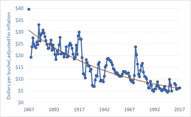
Wheat price, western Canada (Sask. or Man.), farmgate, dollars per bushel, 1867–2017

The price of wheat is declining, and it has been for many years.  The same is true for the prices of other grains and oilseeds.  The graph above shows wheat prices in Canada since Confederation—over the past 150 years.  The units are dollars per bushel.  A bushel is 60 pounds (27 kilograms).  The brown line suggests a trendline.

These prices are adjusted for inflation.  The downward trend reflects the fact that wheat prices fell relative to prices for nearly all other goods and services; as time went on it took more and more bushels of wheat or other grains to buy a pair of shoes, lunch, or a movie ticket.  For example, my father bought a new, top-of-the-line pickup truck in 1976 for $6,000, equivalent to about 1,200 bushels of wheat at the time.  Today, a comparable pickup (base model) might cost the equivalent of about 4,000 bushels of wheat.  As a second example, a house in 1980 might have cost the equivalent of 20,000 bushels of wheat; today, that very same house would cost the equivalent of 60,000 bushels.

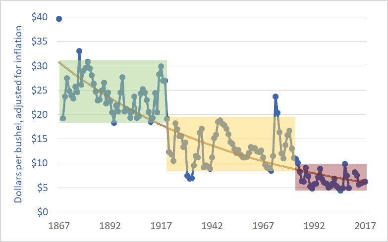
The graph below adds shaded boxes to highlight three distinct periods in Canadian wheat prices.  The period from Confederation to the end of the First World War saw prices roughly in the range of $20 to $30 per bushel (adjusted to today’s dollars).  From 1920 to the mid-’80s, prices entered a new phase, and oscillated between about $8 and $18 per bushel.  And in 1985, wheat prices entered a third phase, oscillating between $5 and $10 per bushel, more often closer to $5 than $10.  In each phase, the top of the range in a given period is roughly equal to the bottom of the range in the previous period.

Graph of wheat price, western Canada (Sask. or Man.), farmgate, dollars per bushel, 1867–2017
Wheat price, western Canada, farmgate, dollars per bushel

1985 is often cited as the beginning of the farm crisis period.  The graph above shows why the crisis began in that year.  Grain prices since the mid-’80s have been especially damaging to Canadian agriculture.  The post-1985 collapse in grain prices has had several effects:

– The expulsion of one-third of Canadian farm families in just one generation;
– The expulsion of two-thirds of young farmers (under 35 years of age) over the same period;
– A tripling of farm debt, to a record $102 billion;
– A chronic need to transfer taxpayer dollars to farmers through farm-support programs (with transfers totaling $110 billion since 1985); and
– A push toward farm giantism, with the majority of land in western Canada now operated by farms larger than 3,000 acres, and with many farms covering tens-of-thousands of acres.

As per-bushel and per-acre margins fall, the solution is to cover more acres.  The inescapable result is fewer farms and farmers.

It is impossible to delve into all the causes of the grain price decline in one blog post.  Briefly, farmers are getting less and less because others are taking more and more.  A previous blog post highlighted the widening gap between what Canadians pay for bread in the grocery store and what farmers receive for wheat at the elevator.  This widening gap is created because grain companies, railways, milling companies, other processors, and retailers are taking more and more, chocking off the flow of dollars to farmers.  This is manifest in declining prices.  Agribusiness giants are profiting by charging consumers more per loaf and paying farmers less per bushel.

Of course, grain prices are a function of domestic and international markets.  The current free trade and globalization era began in the mid-1980s.  (The Canada-US Free Trade Agreement was concluded in 1987, the North American Free Trade Agreement in 1994, and the World Trade Organization Agreement on Agriculture in 1995.)  The effect of free trade and globalization has been to plunge all the world’s farmers into a single, borderless, hyper-competitive market.  At the same time, agribusiness corporations entered a period of accelerating mergers in order to reduce the competition they faced.  As competition levels increase for farmers and decrease for agribusiness corporations it is easy to predict shifts in relative profitability.  Increased competition for farmers meant lower prices while decreased competition for agribusiness transnationals translated into higher prices and profits.

Graph sources:
– 1867–1974: Historical Statistics of Canada, eds. Leacy, Urquhart, and Buckley, 2nd ed. (Ottawa: Statistics Canada, 1983);
– 1890–1909: Wholesale Prices in Canada, 189O–19O9, ed. R. H. Coats (Ottawa: Government Printing Bureau, 1910);
– 1908–1984: Statistics Canada, Table: 32-10-0359-01 Estimated areas, yield, production, average farm price and total farm value of principal field crops (formerly CANSIM 001-0017);
– 1969–2009: Saskatchewan Agriculture and Food: Statfact, Canadian Wheat Board Final Price for Wheat, basis in store Saskatoon;
– 2012–2018: Statistics Canada, Table: 32-10-0077-01 Farm product prices, crops and livestock (formerly CANSIM 002-0043).

Everything must double: Economic growth to mid-century

Graph of GDP of the world's largest economies, 2016 vs 2050
Size of the world’s 17 largest economies, 2016, and projections for 2050

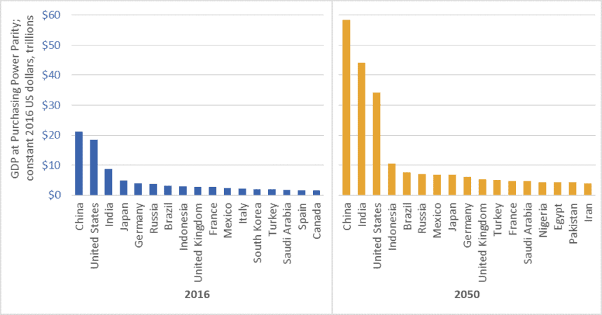
In February 2017, global accounting firm PricewaterhouseCoopers (PwC) released a report on economic growth entitled The Long View: How will the Global Economic Order Change by 2050?  The graph above is based on data from that report.  (link here)  It shows the gross domestic product (GDP) of the largest economies in the world in 2016, and projections for 2050.  The values in the graph are stated in constant (i.e., inflation adjusted) 2016 dollars.

PwC projects that China’s economy in 2050 will be larger than the combined size of the five largest economies today—a list that includes China itself, but also the US, India, Japan, and Germany.

Moreover, the expanded 2050 economies of China and India together ($102.5 trillion in GDP) will be almost as large as today’s global economy ($107 trillion).

We must not, however, simply focus on economic growth “over there.”  The US economy will nearly double in size by 2050, and Americans will continue to enjoy per-capita GDP and consumption levels that are among the highest in the world.  The size of the Canadian economy is similarly projected to nearly double.   The same is true for several EU countries, Australia, and many other “rich” nations.

Everything must double

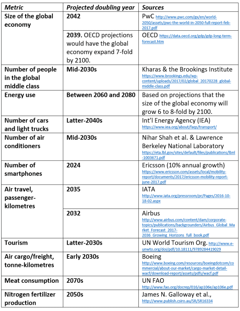
PwC’s report tells us that between now and 2050, the size of the global economy will more than double.  Other reports concur (See the OECD data here).  And this doubling of the size of the global economy is just one metric—just one aspect of the exponential growth around us.  Indeed, between now and the middle decades of this century, nearly everything is projected to double.  This table lists just a few examples.

Table of projected year of doubling for various energy, consumption, transport, and other metrics
Projected year of doubling for selected energy, consumption, and transport metrics

At least one thing, however, is supposed to fall to half

While we seem committed to doubling everything, the nations of the world have also made a commitment to cut greenhouse gas (GHG) emissions by half by the middle decades of this century.  In the lead-up to the 2015 Paris climate talks, Canada, the US, and many other nations committed to cut GHG emissions by 30 percent by 2030.  Nearly every climate scientist who has looked at carbon budgets agrees that we must cut emissions even faster.  To hold temperature increases below 2 degrees Celsius relative to pre-industrial levels, emissions must fall by half by about the 2040s, and to near-zero shortly after.

Is it rational to believe that we can double the number of cars, airline flights, air conditioners, and steak dinners and cut global GHG emissions by half?

To save the planet from climate chaos and to spare our civilization from ruin, we must—at least in the already-rich neighborhoods—end the doubling and redoubling of economic activity and consumption.  Economic growth of the magnitude projected by PwC, the OECD, and nearly every national government will make it impossible to cut emissions, curb temperature increases, and preserve advanced economies and stable societies.  As citizens of democracies, it is our responsibility to make informed, responsible choices.  We must choose policies that curb growth.

Graph source: PriceWaterhouseCoopers

$20 TRILLION: US national debt, and stealing from the future

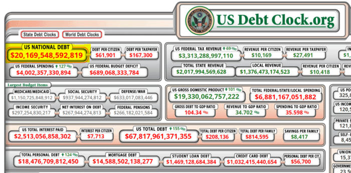
Debt clock showing that the US national debt has topped $20 trillion

Bang!  Last week, US national debt broke through the $20 trillion mark.  As I noted in a previous post (link here), debt of this magnitude works out to about $250,000 per hypothetical family of four.

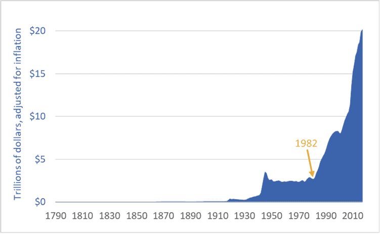
Moreover, US national debt is rising faster than at any time in history.  Adjusted for inflation, the debt is seven times higher than in 1982 ($20 trillion vs. $2.9 trillion).  Indeed, it was in 1982—not 2001 or 2008—that US government debt began its unprecedented (and probably disastrous) rise.

The graph below shows US debt over the past 227 years.  The figures are adjusted for inflation (i.e., they are stated in 2017 US dollars).

Graph of US national debt, historic, 1790 to 2017
United States national debt, adjusted for inflation, 1790-2017

It’s important to understand what is happening here: the US is transferring wealth from the future into the present.  The United States government is not merely engaging in some Keynesian fiscal stimulus, it is not simply borrowing for a rainy day (or 35 years of rainy days), it is not just taking advantage of low interest rates to do a bit of infrastructural fix-up or job creation, and it is not just responding to the financial crisis of 2008.  No.  The US government, the nation’s elites, its corporations, and its citizens are engaging in a form of temporal imperialism—colonizing the future and plundering its wealth.  They are today spending wealth that, if this debt is ever to be repaid, will have to be created by workers toiling in decades to come.

You cannot understand our modern world unless you understand this: Fossil-fueled consumer-industrial economies such as those in the US, Canada, and the EU draw heavily from the future and the past.

We reach back in time hundreds-of-millions of years to source the fossil fuels to power our cars and cities.  We are increasingly reliant on hundred-million-year-old sunlight to feed ourselves—accessing that ancient sunshine in the form of natural gas we turn into nitrogen fertilizer and enlarged harvests.  At the same time, we irrigate many fields from fossil aquifers, created at the end of the last ice age and now pumped hundreds of times faster than they refill.  We extract metal ores concentrated in the distant past.  And the cement in the concrete that forms our cities is the calcium-rich remnants of tiny sea creatures that lived millions of years ago.  We have thrust the resource-intake pipes for our food, industrial, and transport systems hundreds-of-millions of years into the past.

We also reach forward in time, consuming the wealth of future generations as we borrow and spend trillions of dollars they must repay; live well in the present at the expense of their future climate stability; deplete resources, clear-cut ecosystems, extinguish species, and degrade soils and water supplies.  We consume today and push the bills into the future.  This is the real meaning of the news that US national debt has now topped $20 trillion.

Graph sources: U.S. Department of the Treasury, “TreasuryDirect: Historical Debt Outstanding–Annual”  (link here

Improvident province: Saskatchewan government debt

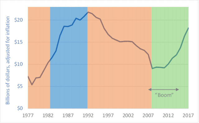
Total Saskatchewan provincial government debt, 1977 to 2017

   ‘Improvident’: Lacking foresight; spendthrift; failing to provide for the future.  

This week’s graph shows total Saskatchewan government debt, adjusted for inflation, for the period 1977 to 2017.  The coloured shading indicates the political party in power at the time: orange for New Democratic Party, blue for the Conservative Party, and green for the Saskatchewan Party.

From 2007 to 2015, Saskatchewan experienced an economic boom.  In 2007 and ’08, commodity values spiked and pushed up the prices of potash, uranium, oil, natural gas, lumber, and grains and oilseeds.  Provincial gross domestic product (GDP) rose sharply.  Even after the financial problems of 2008, a revival in energy prices and energy-sector expansion in this province and neighboring Alberta kept demand for employees strong and wages high (for many workers, though not all).  Since the boom began, housing prices in Saskatchewan have nearly doubled.  Saskatchewan went from being a have-not province to a prosperous and swaggering economic leader.

As resource royalties rose and taxable incomes and sales increased, provincial tax inflows initially swelled.  One could imagine that the provincial government would take advantage of these windfalls to pay down Saskatchewan’s debt.  The government did not.  Instead, it cut taxes and embarked on several ill-conceived spending projects.  Corporate income taxes in Saskatchewan are now, according to the government, the lowest in the country (source here).  As the graph shows, after 16 years of paying down the debt (1992-2008), that pay-down ended in 2009, just as the Saskatchewan economy was heating up.

Initially, provincial debt levels stayed relatively constant as the boom proceeded, but debt began increasing in 2012.  Since then, Saskatchewan’s provincial government debt has doubled, with much of the increase racked up before the economic good times ended. Even as the economy was prospering the government was borrowing money.

Having squandered its chance to pay down debt, save for a rainy day, or build up a financial cushion, the Saskatchewan government came to the end of the economic upturn only to find itself in an increasingly dire financial situation.  In its most recent budget, the province took several draconian steps to try to control its self-inflicted deficits and restrain its ballooning debt.  The government:
– shut down the province’s bus company;
– cut transfers to cities;
– reduced funding to libraries;
– eliminated funding for home repairs for people on social assistance;
– reduced wages for civil servants;
– cut subsidized podiatry services (creating a risk of increased foot amputations for diabetics and others);
– cut subsidies for hearing aids for children; and
– eliminated funding to pay for funerals for its poorest citizens.

Projections by the provincial government show that by 2020 the province’s debt will return to levels not seen since 1992.  In that year, provincial government cabinet ministers were forced to fly to New York City to meet with bond-rating agencies to prevent those agencies from downgrading provincial debt to “junk” status.  The specter of a return to those levels of debt shows that the government of Saskatchewan truly bungled the boom.

Graph sources: data obtained by request from the Economic & Fiscal Policy Branch of Saskatchewan’s Ministry of Finance

Our civilizational predicament: Doubling economic activity and energy use while cutting emissions by half

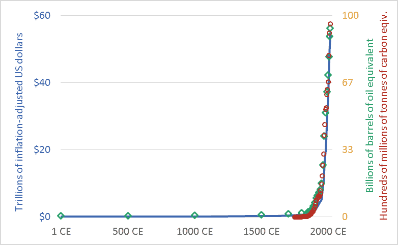
Graph of Global economic activity, energy use, and greenhouse gas emissions, 1CE to 2015CE.
Global economic activity, energy use, and carbon dioxide emissions, 1CE to 2015CE.

My friends sometimes suggest that I’m too pessimistic.  I’m not.  Rather, I’d suggest that everyone else is too optimistic.  Or, more precisely, I live in a society where people are discouraged from thinking rigorously about our predicament.  The graph above sets out our civilizational predicament, and it hints at the massive scale of the transformation that climate change requires us to accomplish in the coming decade or two.

The main point of the graph above is this: Long-term data shows that the size and speed of our global mega-civilization is precisely correlated with energy use, and energy use is precisely correlated with greenhouse gas emissions.  We have multiplied the size of our global economy and our living standards by using more energy, and this increased energy use has led us to emit more carbon dioxide and other greenhouse gases.

The graph plots three key civilizational metrics: economic activity, energy use, and carbon dioxide (CO2) emissions.  The graph covers the past 2015 years, the period from 1 CE (aka 1 AD) to 2015 CE.  The blue line depicts the size of the global economy.  The units are trillions of US dollars, adjusted for inflation.  The green diamond-shaped markers show global energy use, with all energy converted to a common measure: barrels of oil equivalent.  And the red circles show global CO2 emissions, in terms of tonnes of carbon.

Though it is seldom stated explicitly, most government and business leaders and most citizens are proceeding under the assumption that the economic growth line in the graph can continue to spike upward.  This will require the energy line to also climb skyward.  But our leaders are suggesting that the emissions line can be wrenched downward.  When people are “optimistic” about climate change, they are optimistic about doing something that has never been done before: maintaining the upward arc of the economic and energy trendlines, but somehow unhooking the emissions trendline and bending it downward, toward zero.  I worry that this will be very hard.  Most important, it will be impossibly hard unless we are realistic about what we are trying to do, and about the challenges and disruptions ahead.

We must not despair, but neither should we permit ourselves unfounded optimism.  There is a line from a great movie—the Cohen Brother’s “Miller’s Crossing”—in which the lead character, a gangster played by Gabriel Byrne, says “I’d worry a lot less if I thought you were worrying enough.”

Graph sources: GDP: Angus Maddison, The World Economy, Volume 1: A Millennial Perspective (Paris: Organization for Economic Co-operation and Development, 2001)

GHGs: Boden, T.A., Marland, G., and Andres R.J., “Global, Regional, and National Fossil-Fuel CO2 Emissions,” Carbon Dioxide Information Analysis Center (CDIAC), Oak Ridge National Laboratory, U.S. Department of Energy, Oak Ridge, Tenn., U.S.A.

Energy consumption: Vaclav Smil, Energy in Nature and Society: General Energetics of Complex Systems (Cambridge, MA: The MIT Press, 2008); British Petroleum, BP Statistical Review of World Energy: June 2016 (London: British Petroleum, 2016); pre-1500 energy levels estimated by the author based on data in Smil.

Deindustrialization: Or, what are half-a-billion Canadians and Americans going to do for a living?

Graph of United States Gross Domestic Product, by sector, 1947 to 2016, highlighting deindustrialization
United States Gross Domestic Product, by sector, 1947 to 2016

Canada and the US continue to undergo rapid deindustrialization.  Our economies are increasingly service-based, and that should worry us.

The graph above looks complicated, but the key idea is contained in two trends.  And both are negative.  First, note the declining contribution manufacturing is making to United States (US) Gross Domestic Product (GDP).  The red, dotted line shows manufacturing’s percentage contribution.

Manufacturing now makes up just 12 percent of US GDP, and less than 10 percent in Canada.  The decline of manufacturing is even more evident when we look at employment rather than GDP.  According to the US Bureau of Labor Statistics, goods-producing industries (manufacturing, mining, construction, agriculture, etc.) now employ roughly 15 percent of America’s working population.  Nearly 85 percent are employed in the service sector.  The situation is similar in Canada.  According to Statistics Canada data , approximately 77 percent of Canadian workers are employed in the service sector, and this percentage continues to rise.  Both nations continue to deindustrialize.

Second, note the rise in the importance of three service sectors: 1. Finance, insurance, real estate, and rentals (the broad blue line); 2. Professional and business services (green line); and 3. Education and healthcare (red line). A US economy built upon General Motors, General Electric, and U.S. Steel has given way to one built upon JPMorgan Chase, Walmart, and UnitedHealth Group.

Note, especially, the blue line: finance and real estate.  With the 2008 financial crisis still fresh in our minds, and its effects still resonating through global economies, it should worry North Americans that banking and real estate have replaced manufacturing as the one of the largest economic sectors.

Manufacturing is declining, our energy sectors may have to contract as we deal with climate change, most North American fisheries have been depleted and agriculture seems to need fewer farmers and workers each year, low-wage nations continue to claim Canadian and American jobs, and we’re told that the robots are coming.  By mid-century there will be more than 450 million people living in Canada and the US.  Every politician in every party and every engaged citizen should be asking the same question: what are nearly half-a-billion North Americans going to do for a living?

We are not doomed to decline, but decline will be our lot unless we actively engage in a collective democratic effort to build a new, sustainable economy for North America.

Graph source: US Dept. of Commerce, Bureau of Economic Analysis


A doubling problem: 21st century exponential growth of the global economy

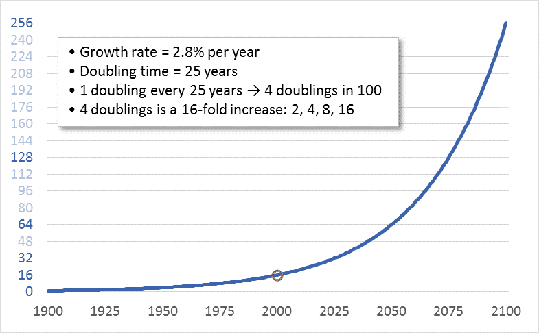
Graph of stylized exponential growth in the global economy
A notional graph modelling exponential growth in the global economy

When I was in grade-school, an uncle taught me something about limits, and about doubling.  He asked me: How many times can you fold a piece of paper in half?  Before I could reply, he told me that the answer was eight.  I thought this seemed too low.  So, as a child eager to demonstrate adults’ errors, I located a sheet of writing paper and began folding.  I managed seven folds—not even achieving the predicted eight.  I thought that the problem was the small size of the paper.  So, I located a newspaper, removed one sheet, and began folding.  I folded it eight times but could not make it to nine.

Why this limit?  Most people assume that the problem is the size of the sheet of paper: as we fold it, the paper gets smaller and, thus, the next fold becomes harder.  This is true, but the real problem is that the number of sheets to be folded increases exponentially.  Fold the paper once and it is two sheets thick.  A second fold brings the thickness to four sheets.  A third fold: eight.  A fourth, fifth, and sixth fold: sixteen sheets, thirty-two, then sixty-four.  The seventh fold doubles the thickness again to 128 sheets, and an eighth to 256.  When I was a child folding that sheet of newspaper, in attempting that ninth fold I was straining to bend 256 sheets.

Now, if I started with a very large piece  of paper perhaps I could prove my late uncle wrong and achieve that ninth fold.  It’s hard to predict precisely where limits lie.  Imagine a football-field-sized piece of paper and ten linebackers assigned the task of folding.  Those players could certainly make nine folds.  Perhaps they might even achieve ten, bending 512 sheets to increase the thickness to 1,024.  Maybe they could strain to make eleven folds, bending those 1,024 sheets to achieve a thickness of 2,048.  But eventually the doubling and redoubling would reach a point where it was impossible to double again.  Exponential growth creates a doubling problem.

Our petro-industrial-consumer mega-civilization has a doubling problem.  During the 20th century we doubled the size of the global economy four times.  Four doublings is a sixteenfold increase: 2, 4, 8, 16.  Despite this multiplication, today, every banker, CEO, investor, Minister of Finance, shareholder, bondholder, and would-be retiree (i.e., nearly all of us) wants to keep economic growth going.  And we want growth to continue at “normal” rates—rates that lead to a doubling in the size of the economy about every 25 years.  Thus, in effect, what we want in the 21st century is another four doublings—another sixteenfold increase.  The graph above shows the sixteenfold increase that occurred during the 20th century and shows what a sixteenfold increase during the 21st century would look like.

The first doubling of the 21st century is already underway.  We’re rapidly moving toward a global economy in 2025 that is twice the size of the one that existed in 2000.  But the economy in 2000 was already placing a heavy boot upon the biosphere.  By that year, North America’s East Coast cod fishery had already collapsed, greenhouse gas emissions were already driving up temperatures, and the Amazon was shrinking.  Despite this, we seem to believe that a 2025 economy twice as large as that year-2000 economy is “sustainable.”  Even worse, in 2025, we won’t be “sustaining” that two-times-2000 economy, we’ll be working to double it again.

Clearly, at some point, this has to stop.  Even those who think that the Earth can support and withstand a human economy twice the size that existed in 2000 must begin to have doubts about an economy four or eight times as large.  There can be no dispute that economic growth must end.  Though we may disagree as to when.

Perceptive readers will have noted a shortcoming in my paper-folding analogy: That system runs into hard limits; at some point, attempts to double the number of sheets simply fail, and that failure is immediately apparent.  Our civilizational-biospheric system is different.  Limits to Earth’s capacities to provision the human economy and absorb its wastes certainly exist, but they are not hard limits.  Given the immense power of our economy and technologies, we can breach Earth’s limits, at least for a time.  On many fronts we already have.  It will only be in hindsight—as ecosystems collapse and species disappear and the biosphere and climate become destabilized, damaged, and hostile—that we will know for sure that we’ve crossed a terrible line.  Only then will we know for sure that at some point in our past our doubling proceeded too far.  So, unlike paper folding, determining the limits of economic growth requires human wisdom and self-restraint.

China (re)rising: 1,000+ years of data on who dominates the global economy

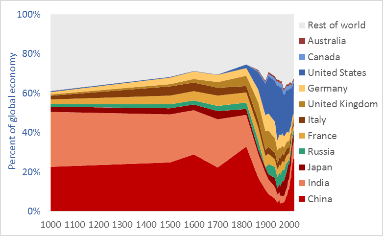
Graph of China's share of the global economy, and selected other nations, 1000 AD to present
China’s share of the global economy, along with other nations, 1000AD to present

China’s share of the global economy has increased rapidly—from about 5 percent in the early 1980s to more than 26 percent today.  India’s economy has similarly expanded, from 3 percent of the global economy in the early ’80s to more than 8 percent today.  Meanwhile, the percentage shares of the US, UK, Germany, Japan, and other nations are falling fast.  The graph above shows the relative share of global GDP represented by selected nations.  The time-frame is 1000 AD to 2016.

Manufacturing data* similarly shows India and China’s long-term dominance. In 1800, fully half the manufacturing output of the world came from India and China.  In that year, the UK contributed 4.3 percent of manufacturing output and the US just 0.8 percent.  The UK and US came to dominate global manufacturing by the late-1800s, but their rise is recent and, as the graph above suggests, their dominance may be shortlived.

Many people have been surprised by the “rise of China” and that of India.  No one should be.  The global economy is merely returning to its long-term normal—resetting after an anomalous period when European and New World nations were economically ascendant.  Indeed, England and Europe have been economic backwaters for 97 percent of the time since civilizations first arose 5,000 years ago. Our educational system fails to teach us that China and India are the default global superpowers.

To give just two final examples of the long-term dominance of Asia, China  smelted hundreds of thousands of tons of iron in the 11th century using coal rather than wood, a feat not matched in Europe until 600 years later.** A list of the ten largest cities in the world in the year 1500 includes four in China (Beijing, Nanjing, Hangzhou, and Guangzhou) and two in India (Gaur and Vijayanagara), but just one in Europe, (Paris). The three cities rounding off the top-ten list were Tabriz, Cairo, and Istanbul.*** Clearly, the economic and civilizational centre of gravity was in the East. It appears to be shifting back there.

* Paul Bairoch, “International Industrial Levels from 1750 to 1980”
** Hartwell, various pubs
*** Hohenberg, Oxford Encyclopaedia of Economic History

Graph sources: 1000AD-2008, Angus Maddison, 2009-2016 Conference Board