We’re in year 30 of the current climate crisis

An excerpt from the Conference Statement of the 1988 World Conference on the Changing Atmosphere held in Toronto

In late-June, 1988, Canada hosted the world’s first large-scale climate conference that brought together scientists, experts, policymakers, elected officials, and the media.  The “World Conference on the Changing Atmosphere: Implications for Global Security” was held in Toronto, hosted by Canada’s Conservative government, and attended by hundreds of scientists and officials.

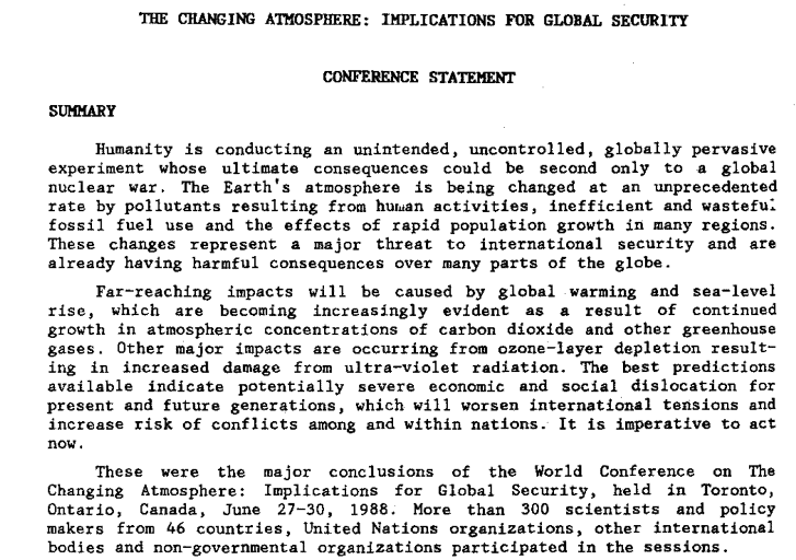
In their final conference statement, attendees wrote that “Humanity is conducting an unintended, uncontrolled, globally pervasive experiment whose ultimate consequences could be second only to a global nuclear war.”  (See excerpt pictured above.)  The 30-year-old conference statement contains a detailed catalogue of causes and effects of climate change.

Elizabeth May—who in 1988 was employed by Canada’s Department of Environment—attended the conference.   In a 2006 article she reflected on Canada’s leadership in the 1980s on climate and atmospheric issues:

“The conference … was a landmark event.  It was opened by Prime Minister Mulroney, who spoke then of the need for an international law of the atmosphere, citing our work on acid rain and ozone as the first planks in this growing area of international environmental governance…. 

Canada was acknowledged as the leader in hosting the first-ever international scientific conference on climate change, designed to give the issue a public face.  No nation would be surprised to see Canada in the lead.  After all, we had just successfully wrestled to the ground a huge regional problem, acid rain, and we had been champions of the Montreal Protocol to protect the ozone layer.”

The Toronto conference’s final statement also called on governments and industry to work together to “reduce CO2 emissions by approximately 20% … by the year 2005…. ”  This became known as the Toronto Target.  Ignoring that target and many others, Canada has increased its CO2 emissions by 29 percent since 1988.

Other events mark 1988 as the beginning of the modern climate-change era.  In 1988, governments and scientists came together to form the United Nations Intergovernmental Panel on Climate Change (IPCC). Since its formation, IPCC teams of thousands of scientists have worked to create five Assessment Reports which together total thousands of pages.

Also in 1988, NASA scientist Dr. James Hansen told a US congressional committee that climate change and global warming were already underway and that he was 99 percent certain that the cause was a buildup of carbon dioxide and other gases released by human activities.  Thirty years ago, Hansen told the committee that “It is time to stop waffling so much and say that the evidence is pretty strong that the greenhouse effect is here.” The New York Times and other papers gave prominent coverage to Hansen’s 1988 testimony.

Fast-forward to recent weeks.  Ironically, in Toronto, the site of the 1988 conference, and 30 years later, almost to the day, newly elected Ontario Premier Doug Ford announced he was scrapping Ontario’s carbon cap-and-trade emission-reduction plan, he vowed to push back against any federal-government moves to price or tax carbon, and he said he would join a legal challenge against the federal legislation.  In effect, Ford and premiers such as Saskatchewan’s Scott Moe have pledged to fight and stop Canada’s flagship climate change and emission-reduction initiative.  To do so, 30 years into the modern climate change era, is foolhardy, destructive, and unpardonable.

Citizens need to understand that when they vote for leaders such as Doug Ford (Ontario), Scott Moe (Saskatchewan), Jason Kenney (Alberta), or Andrew Scheer (federal Conservative leader) they are voting against climate action.  They are voting for higher emissions; runaway climate change; melting glaciers and permafrost; submerged seaports and cities worldwide; hundreds of millions of additional deaths from heat, floods, storms, and famines; and crop failures in this country and around the world.  A vote for a leader who promises inaction, slow action, or retrograde action is a vote to damage Canada and the Earth; it is a vote for economic devastation in the medium and long term, for dried-up rivers and scorched fields.  A vote for Moe, Ford, Kenney, Scheer, Trump, and a range of similar leaders is a vote to unleash biosphere-damaging and civilization-cracking forces upon our grandchildren, upon the natural environment, and upon the air, water, soil, and climate systems that support, provision, nourish, and enfold us.

In the 1990s, in decade one of the current climate crisis, inaction was excusable.  We didn’t know.  We weren’t sure.  We didn’t have the data.

As we enter decade four, inaction is tantamount to reckless endangerment—criminal negligence.  And retrograde action, such as that from Ford, Moe, Trump, and others, is tantamount to vandalism, arson, ecocide, and homicide.  How we vote and who we elect will affect how many forests burn, how many reefs disappear, and how many animals and people die.

In the aftermath of every crime against humanity (or against the planet or against the future) there are individuals who try to claim “I didn’t know.”  In year 30 of the current climate-change era, none can make that claim.  We’ve known for 30 years that the ultimate consequences of ongoing emissions and climate change “could be second only to a global nuclear war.”
A critically important solution to our climate crisis (and other crises)

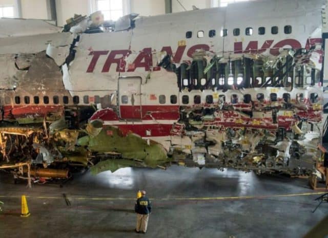
Reconstructed wreckage of TWA Flight 800
US National Transportation Safety Board (NTSB) reconstruction of wreckage from TWA Flight 800

Ronald Wright’s A Short History of Progress is available as a book and as a five-part audio series—the 2004 CBC Massey Lectures.  (Listen here.)  In both its written and oral forms, A Short History of Progress is an accessible, eye-opening tour of humanity’s long historic journey—a look at the big picture and the long term.  It is aphoristic and packed with insights.  But one idea stands out.  Wright gets at this important idea by using the analogy of plane crashes.

Air travel today is very safe.  Mile for mile, your chances of being killed or injured while traveling on a commercial jetliner are about one one-hundredth your chances of suffering the same fate in your own car.  In 2016, zero people died in crashes of a US-based airlines operating anywhere in the world—the seventh year in a row that this was true (source here).

There’s a reason that airliners have become so safe: after every crash, well-resourced teams of highly-trained aviation experts are tasked with determining why a crash occurred, and once the cause is known the entire global aviation system implements changes to ensure that no plane in the future crashes for the same reasons.

Government agencies and airlines often expend enormous efforts to determine the cause of a crash.  The photograph above is of the reconstructed wreckage of TWA Flight 800, a Boeing 747 that crashed in 1996 after its fuel tank exploded, splitting the plane apart just ahead of the wings.  The plane crashed into the ocean off the coast of New York.  All 230 people aboard died.

The debris field covered several square miles.  In a massive effort, approximately 95 percent of the plane’s wreckage was salvaged from the sea.  The plane was painstakingly reconstructed.  And using the reconstructed plane as well as the flight data and cockpit voice recorders, the cause of the failure was traced back to a short circuit in wiring connected to the “fuel quantity indication system” in the centre fuel tank.  As a result of this investigation, changes were made to planes around the world to ensure that no similar crashes would occur.  As a result of crash investigations around the world, airlines and aircraft makers have made thousands of changes to airplane construction, crew training, air traffic control, airport security, airline maintenance, and operating procedures.  The results, as noted above, have been so successful that some years now pass without, for instance, a single fatality on a US airline.

Ronald Wright argues that the ruins and records of fallen civilizations can be investigated like airplane crash sites, and we can use the lessons we learn to make changes that can safeguard our current global civilization against similar crashes.  He writes that these ruined cities and civilizations are like “fallen airliners whose black boxes can tell us what went wrong” so that we can “avoid repeating past mistakes of flight plan, crew selection, and design.”  When Wright talks metaphorically about “flight plan,” consider our own plan to increase the size of the global economy tenfold, or more, this century.  And when he talks about crew selection, think about who’s in the cockpit in the United States.

Wright continues: “While the facts of each case [of civilizational collapse] differ, the patterns are alarmingly … similar.  We should be alarmed by the predictability of our mistakes but encouraged that this very fact makes them useful for understanding what we face today.”

Wright urges us to deploy our archaeologists, historians, anthropologists, ecologists, and other experts as crash-scene investigators—to read “the flight recorders in the wreckage of crashed civilizations,” and to take what we learn there and make changes to our own.  It is good advice.  It is, perhaps, the best advice our global mega-civilization will ever receive. 

While the crash of a jetliner may kill hundreds, the crash of our mega-civilization could kill billions.  And as more passengers pile in, as our global craft accelerates, and as the reading on the fuel-gauge drops and our temperature gauge rises, we should become more and more concerned about how we will keep our civilizational jetliner aloft through the storms to come.

Photo source: Newsday 

Efficiency, the Jevons Paradox, and the limits to economic growth

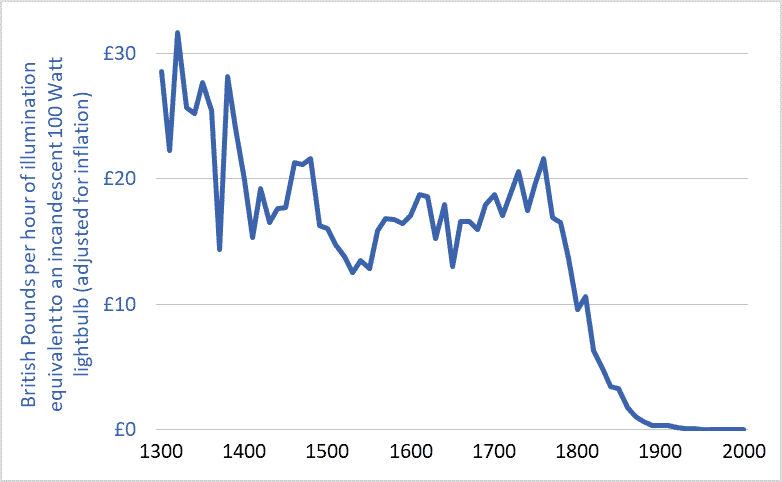
Graph of the cost of lighting in the UK, 1300-2000

I’ve been thinking about efficiency.  Efficiency talk is everywhere.  Car buyers can purchase ever more fuel-efficient cars.  LED lightbulbs achieve unprecedented efficiencies in turning electricity into visible light.  Solar panels are more efficient each year.  Farmers are urged toward fertilizer-use efficiency.  And our Energy Star appliances are the most efficient ever, as are the furnaces and air conditioners in many homes.

The implication of all this talk and technology is that efficiency can play a large role in solving our environmental problems.  Citizens are encouraged to adopt a positive, uncritical, and unsophisticated view of efficiency: we’ll just make things more efficient and that will enable us to reduce resource use, waste, and emissions, to solve our problems, and to pave the way for “green growth” and “sustainable development.”

But there’s something wrong with this efficiency solution: it’s not working.  The current environmental multi-crisis (depletion, extinction, climate destabilization, ocean acidification, plastics pollution, etc.) is not occurring as a result of some failure to achieve large efficiency gains.  The opposite.  It is occurring after a century of stupendous and transformative gains.  Indeed, the efficiencies of most civilizational processes (e.g., hydroelectric power generation, electrical heating and lighting, nitrogen fertilizer synthesis, etc.) have increased by so much that they are now nearing their absolute limits—their thermodynamic maxima.  For example, engineers have made the large electric motors that power factories and mines exquisitely efficient; those motors turn 90 to 97 percent of the energy in electricity into usable shaft power.  We have maximized efficiencies in many areas, and yet our environmental problems are also at a maximum.  What gives?

There are many reasons why efficiency is not delivering the benefits and solutions we’ve been led to expect.  One is the “Jevons Paradox.”  That Paradox predicts that, as the efficiencies of energy converters increase—as cars, planes, or lightbulbs become more efficient—the cost of using these vehicles, products, and technologies falls, and those falling costs spur increases in use that often overwhelm any resource-conservation gains we might reap from increasing efficiencies.  Jevons tells us that energy efficiency often leads to more energy use, not less.  If our cars are very fuel efficient and our operating costs therefore low, we may drive more, more people may drive, and our cities may sprawl outward so that we must drive further to work and shop.  We get more miles per gallon, or per dollar, so we drive more miles and use more gallons.  The Jevons Paradox is a very important concept to know if you’re trying to understand our world and analyze our situation.

The graph above helps illustrate the Jevons Paradox.  It shows the cost of a unit of artificial light (one hour of illumination equivalent to a modern 100 Watt incandescent lightbulb) in England over the past 700 years.  The currency units are British Pounds, adjusted for inflation.  The dramatic decline in costs reflects equally dramatic increases in efficiency.

Adjusted for inflation, lighting in the UK was more than 100 times more affordable in 2000 than in 1900 and 3,000 time more affordable than in 1800.  Stated another way, because electrical power plants have become more efficient (and thus electricity has become cheaper), and because new lighting technologies have become more efficient and produce more usable light per unit of energy, an hour’s pay for the average worker today buys about 100 times more artificial light than it did a century ago and 3,000 time more than two centuries ago.

But does all this efficiency mean that we’re using less energy for lighting?  No.  Falling costs have spurred huge increases in demand and use.  For example, the average UK resident in the year 2000 consumed 75 times more artificial light than did his or her ancestor in 1900 and more than 6,000 times more than in 1800 (Fouquet and Pearson).  Much of this increase was in the form of outdoor lighting of streets and buildings.  Jevons was right: large increases in efficiency have meant large decreases in costs and large increases in lighting demand and energy consumption.

Another example of the Jevons Paradox is provided by passenger planes.  Between 1960 and 2016, the per-seat fuel efficiency of jet airliners tripled or quadrupled (IPCC).  This, in turn, helped lower the cost of flying by more than 60%.  A combination of lower airfares, increasing incomes, and a growing population has driven a 50-fold increase in global annual air travel since 1960—from 0.14 trillion passenger-kilometres per year to nearly 7 trillion (see here for more on the exponential growth in air travel).  Airliners have become three or four times more fuel efficient, yet we’re now burning seventeen times more fuel.  William Stanley Jevons was right.

One final point about efficiency.  “Efficiency” talk serves an important role in our society and economy: it licenses growth.  The idea of efficiency allows most people to believe that we can double and quadruple the size of the global economy and still reduce energy use and waste production and resource depletion.  Efficiency is one of our civilization’s most important licensing myths.  The concept of efficiency-without-limit has been deployed to green-light the project of growth-without-end.

Graph sources: Roger Fouquet, Heat Power and Light: Revolutions in Energy Services

Full-world economics and the destructive power of capital: Codfish catch data 1850 to 2000

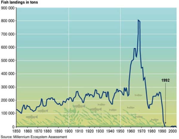
Graph of North Atlantic cod fishery, fish landing in tonnes, 1850 to 2000
Codfish catch, North Atlantic, tonnes per year

Increasingly, the ideas of economists guide the actions of our elected leaders and shape the societies and communities in which we live.  This means that incorrect or outdated economic theories can result in damaging policy errors.  So we should be concerned to learn that economics has failed to take into account a key transition: from a world relatively empty of humans and their capital equipment to one now relatively full.

A small minority of economists do understand that we have made an important shift.  In the 1990s, Herman Daly and others developed the idea that we have shifted to “full-world economies.”  (See pages 29-40 here.)  The North Atlantic cod fishery illustrates this transition.  This week’s graph shows tonnes of codfish landed per year, from 1850 to 2000.

Fifty years ago, when empty-world economics still held, the fishery was constrained by a lack of human capital: boats, motors, and nets.  At that time, adding more human capital could have caused the catch to increase.  Indeed, that is exactly what happened in the 1960s when new and bigger boats with advanced radar and sonar systems were deployed to the Grand Banks and elsewhere.  The catch tripled.  The spike in fish landings is clearly visible in the graph above.

But in the 1970s and ’80s, a shift occurred: human capital stocks—those fleets of powerful, sonar-equipped trawlers—expanded so much that the limiting factor became natural capital: the supply of fish.  The fishery began to collapse and no amount of added human capital could reverse the decline.  The system had transitioned from one constrained by human capital to one constrained by natural capital—from empty-world to full-world economics.  A similar transition is now evident almost everywhere.

An important change has occurred.  Unfortunately, economics has not internalized or adapted to this change.  Economists, governments, and business-people still act as if the shortage is in human-made capital.  Thus, we continue our drive to amass capital—we expand our factories, technologies, fuel flows, pools of finance capital, and the size of our corporations, in order to further expand the quantity and potency of human-made capital stocks.  Indeed, this is a defining feature of our economies: the endless drive to expand and accumulate supplies of capital.  That is why our system is called “capitalism.”  And a focus on human-made capital was rational when it was in short supply.  But now, in most parts of the world, human capital is too plentiful and powerful and and, thus, destructive.  It is nature and natural capital that is now scarce and limiting.  This requires an economic and civilizational shift: away from a focus on amassing human capital and toward a focus on protecting and maximizing natural capital: forests, soils, water, fish, biodiversity, wild animal populations, a stable climate, and intact ecosystems.  Failure to make that shift will push more and more of the systems upon which humans depend toward a collapse that mirrors that of the cod stock.

Graph source:  United Nations GRID-Arendal, “Collapse of Atlantic cod stocks off the East Coast of Newfoundland in 1992


Complexity, energy, and the fate of our civilization

Tainter Collapse of Complex Societies book cover

Some concepts stay with you your whole life and shape the way you see the world.  For me, one such concept is complexity.  Thinking about the increasing complexity of our human-made systems gives a window into future energy needs, the rise and fall of economies, the structures of cities, and possibly even the fate of our global mega-civilization.

In 1988, Joseph Tainter wrote a groundbreaking book on complexity and civilizations: The Collapse of Complex Societies.  The book is a detailed historical and anthropological examination of the Roman, Mayan, Chacoan, and other civilizations.  As a whole, the book can be challenging.  But most of the important big-picture concepts are contained in chapters 4 and 6.

Regarding complexity, energy, and collapse, Tainter argues that:

1.  Human societies are problem-solving entities;
2.  Problem solving creates complexity: new hierarchies and control structures; increased reporting and information processing; more managers, accountants, and consultants;
3.  All human systems require energy, and increased complexity must be supported by increased energy use;
4.  Investment in problem-solving complexity reaches a point of declining marginal returns: (energy) costs rise faster than (social or economic) benefits; and
5.  Complexity rises to a point where available energy supplies become inadequate to support it and, in that state, an otherwise withstandable shock can cause a society to collapse.  For example, the western Roman Empire, unable to access enough bullion, grain, and other resources to support the complexity of its cities, armies, and far-flung holdings, succumbed to a series of otherwise unremarkable attacks by barbarians.

Societies certainly are problem-solving entities.  Our communities and nations encounter problems: external enemies, environmental threats, resource availability, disease, crime.  For these problems we create solutions: standing armies and advanced weaponry, environmental protection agencies, transnational energy and mining corporations, healthcare companies, police forces.

Problem-solving, however, entails costs in the form of complexity.  To solve problems we create ever-larger bureaucracies, new financial products, larger data processing networks, and a vast range of regulations, institutions, interconnections, structures, programs, products, and technologies.  We often solve problems by creating new managerial or bureaucratic roles (e.g., ombudsmen, human resources managers, or cyber-security specialist); creating new institutions (the UN or EU); or developing new technologies (smartphones, smart bombs, geoengineering, in vitro fertilization).  We accept or even demand this added complexity because we believe that there are benefits to solving problems.  And there certainly are, at least if we evaluate benefits on a case-by-case basis.  Taken as whole, however, the unrelenting accretion of complexity weighs on the system, bogs it down, increases energy requirements, and, as Tainter argues, eventually outstrips available energy supplies and sets the stage for collapse.  We should keep this in mind as we push to further increase the complexity of our civilization even as energy availability may be contracting.  Tainter is telling us that complexity has costs—costs that civilizations sometimes cannot bear.  This warning should ring in our ears as we consider the internet of things, smart-grids, globe-circling production chains, and satellite-controlled autonomous cars.  The costs of complexity must be paid in the currency of energy.

Complexity remains a powerful concept for understanding our civilization and its future even if we don’t share Tainter’s conclusion that increasing complexity sets the stage for collapse.  Because embedded in Tainter’s theory is an indisputable idea: greater complexity must be supported by larger energy inflows.  Because of their complexity, there simply cannot be low-energy versions of London, Japan, the EU, or the global trading system.  As economies grow and consumer choices proliferate and as we increase the complexity of societies here and around the world we necessarily increase energy requirements.

It is no longer possible to understand the world by watching money flows.  There are simply too many trillions of notional dollars, euros, and yen flitting through the global economy.  These torrents of e-money obscure what is really happening.  If we want to understand our civilization and its future, we must think about energy and material flows—about the physical structure and organization of our societies.  Complexity is a powerful analytical concept that enables us to do this.

Our civilizational predicament: Doubling economic activity and energy use while cutting emissions by half

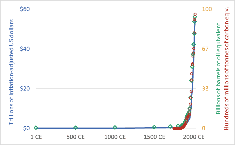
Graph of Global economic activity, energy use, and greenhouse gas emissions, 1CE to 2015CE.
Global economic activity, energy use, and carbon dioxide emissions, 1CE to 2015CE.

My friends sometimes suggest that I’m too pessimistic.  I’m not.  Rather, I’d suggest that everyone else is too optimistic.  Or, more precisely, I live in a society where people are discouraged from thinking rigorously about our predicament.  The graph above sets out our civilizational predicament, and it hints at the massive scale of the transformation that climate change requires us to accomplish in the coming decade or two.

The main point of the graph above is this: Long-term data shows that the size and speed of our global mega-civilization is precisely correlated with energy use, and energy use is precisely correlated with greenhouse gas emissions.  We have multiplied the size of our global economy and our living standards by using more energy, and this increased energy use has led us to emit more carbon dioxide and other greenhouse gases.

The graph plots three key civilizational metrics: economic activity, energy use, and carbon dioxide (CO2) emissions.  The graph covers the past 2015 years, the period from 1 CE (aka 1 AD) to 2015 CE.  The blue line depicts the size of the global economy.  The units are trillions of US dollars, adjusted for inflation.  The green diamond-shaped markers show global energy use, with all energy converted to a common measure: barrels of oil equivalent.  And the red circles show global CO2 emissions, in terms of tonnes of carbon.

Though it is seldom stated explicitly, most government and business leaders and most citizens are proceeding under the assumption that the economic growth line in the graph can continue to spike upward.  This will require the energy line to also climb skyward.  But our leaders are suggesting that the emissions line can be wrenched downward.  When people are “optimistic” about climate change, they are optimistic about doing something that has never been done before: maintaining the upward arc of the economic and energy trendlines, but somehow unhooking the emissions trendline and bending it downward, toward zero.  I worry that this will be very hard.  Most important, it will be impossibly hard unless we are realistic about what we are trying to do, and about the challenges and disruptions ahead.

We must not despair, but neither should we permit ourselves unfounded optimism.  There is a line from a great movie—the Cohen Brother’s “Miller’s Crossing”—in which the lead character, a gangster played by Gabriel Byrne, says “I’d worry a lot less if I thought you were worrying enough.”

Graph sources: GDP: Angus Maddison, The World Economy, Volume 1: A Millennial Perspective (Paris: Organization for Economic Co-operation and Development, 2001)

GHGs: Boden, T.A., Marland, G., and Andres R.J., “Global, Regional, and National Fossil-Fuel CO2 Emissions,” Carbon Dioxide Information Analysis Center (CDIAC), Oak Ridge National Laboratory, U.S. Department of Energy, Oak Ridge, Tenn., U.S.A.

Energy consumption: Vaclav Smil, Energy in Nature and Society: General Energetics of Complex Systems (Cambridge, MA: The MIT Press, 2008); British Petroleum, BP Statistical Review of World Energy: June 2016 (London: British Petroleum, 2016); pre-1500 energy levels estimated by the author based on data in Smil.

A doubling problem: 21st century exponential growth of the global economy

Graph of stylized exponential growth in the global economy
A notional graph modelling exponential growth in the global economy

When I was in grade-school, an uncle taught me something about limits, and about doubling.  He asked me: How many times can you fold a piece of paper in half?  Before I could reply, he told me that the answer was eight.  I thought this seemed too low.  So, as a child eager to demonstrate adults’ errors, I located a sheet of writing paper and began folding.  I managed seven folds—not even achieving the predicted eight.  I thought that the problem was the small size of the paper.  So, I located a newspaper, removed one sheet, and began folding.  I folded it eight times but could not make it to nine.

Why this limit?  Most people assume that the problem is the size of the sheet of paper: as we fold it, the paper gets smaller and, thus, the next fold becomes harder.  This is true, but the real problem is that the number of sheets to be folded increases exponentially.  Fold the paper once and it is two sheets thick.  A second fold brings the thickness to four sheets.  A third fold: eight.  A fourth, fifth, and sixth fold: sixteen sheets, thirty-two, then sixty-four.  The seventh fold doubles the thickness again to 128 sheets, and an eighth to 256.  When I was a child folding that sheet of newspaper, in attempting that ninth fold I was straining to bend 256 sheets.

Now, if I started with a very large piece  of paper perhaps I could prove my late uncle wrong and achieve that ninth fold.  It’s hard to predict precisely where limits lie.  Imagine a football-field-sized piece of paper and ten linebackers assigned the task of folding.  Those players could certainly make nine folds.  Perhaps they might even achieve ten, bending 512 sheets to increase the thickness to 1,024.  Maybe they could strain to make eleven folds, bending those 1,024 sheets to achieve a thickness of 2,048.  But eventually the doubling and redoubling would reach a point where it was impossible to double again.  Exponential growth creates a doubling problem.

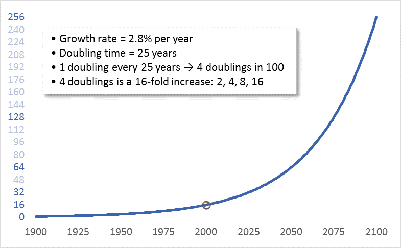
Our petro-industrial-consumer mega-civilization has a doubling problem.  During the 20th century we doubled the size of the global economy four times.  Four doublings is a sixteenfold increase: 2, 4, 8, 16.  Despite this multiplication, today, every banker, CEO, investor, Minister of Finance, shareholder, bondholder, and would-be retiree (i.e., nearly all of us) wants to keep economic growth going.  And we want growth to continue at “normal” rates—rates that lead to a doubling in the size of the economy about every 25 years.  Thus, in effect, what we want in the 21st century is another four doublings—another sixteenfold increase.  The graph above shows the sixteenfold increase that occurred during the 20th century and shows what a sixteenfold increase during the 21st century would look like.

The first doubling of the 21st century is already underway.  We’re rapidly moving toward a global economy in 2025 that is twice the size of the one that existed in 2000.  But the economy in 2000 was already placing a heavy boot upon the biosphere.  By that year, North America’s East Coast cod fishery had already collapsed, greenhouse gas emissions were already driving up temperatures, and the Amazon was shrinking.  Despite this, we seem to believe that a 2025 economy twice as large as that year-2000 economy is “sustainable.”  Even worse, in 2025, we won’t be “sustaining” that two-times-2000 economy, we’ll be working to double it again.

Clearly, at some point, this has to stop.  Even those who think that the Earth can support and withstand a human economy twice the size that existed in 2000 must begin to have doubts about an economy four or eight times as large.  There can be no dispute that economic growth must end.  Though we may disagree as to when.

Perceptive readers will have noted a shortcoming in my paper-folding analogy: That system runs into hard limits; at some point, attempts to double the number of sheets simply fail, and that failure is immediately apparent.  Our civilizational-biospheric system is different.  Limits to Earth’s capacities to provision the human economy and absorb its wastes certainly exist, but they are not hard limits.  Given the immense power of our economy and technologies, we can breach Earth’s limits, at least for a time.  On many fronts we already have.  It will only be in hindsight—as ecosystems collapse and species disappear and the biosphere and climate become destabilized, damaged, and hostile—that we will know for sure that we’ve crossed a terrible line.  Only then will we know for sure that at some point in our past our doubling proceeded too far.  So, unlike paper folding, determining the limits of economic growth requires human wisdom and self-restraint.

China (re)rising: 1,000+ years of data on who dominates the global economy

Graph of China's share of the global economy, and selected other nations, 1000 AD to present
China’s share of the global economy, along with other nations, 1000AD to present

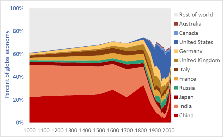
China’s share of the global economy has increased rapidly—from about 5 percent in the early 1980s to more than 26 percent today.  India’s economy has similarly expanded, from 3 percent of the global economy in the early ’80s to more than 8 percent today.  Meanwhile, the percentage shares of the US, UK, Germany, Japan, and other nations are falling fast.  The graph above shows the relative share of global GDP represented by selected nations.  The time-frame is 1000 AD to 2016.

Manufacturing data* similarly shows India and China’s long-term dominance. In 1800, fully half the manufacturing output of the world came from India and China.  In that year, the UK contributed 4.3 percent of manufacturing output and the US just 0.8 percent.  The UK and US came to dominate global manufacturing by the late-1800s, but their rise is recent and, as the graph above suggests, their dominance may be shortlived.

Many people have been surprised by the “rise of China” and that of India.  No one should be.  The global economy is merely returning to its long-term normal—resetting after an anomalous period when European and New World nations were economically ascendant.  Indeed, England and Europe have been economic backwaters for 97 percent of the time since civilizations first arose 5,000 years ago. Our educational system fails to teach us that China and India are the default global superpowers.

To give just two final examples of the long-term dominance of Asia, China  smelted hundreds of thousands of tons of iron in the 11th century using coal rather than wood, a feat not matched in Europe until 600 years later.** A list of the ten largest cities in the world in the year 1500 includes four in China (Beijing, Nanjing, Hangzhou, and Guangzhou) and two in India (Gaur and Vijayanagara), but just one in Europe, (Paris). The three cities rounding off the top-ten list were Tabriz, Cairo, and Istanbul.*** Clearly, the economic and civilizational centre of gravity was in the East. It appears to be shifting back there.

* Paul Bairoch, “International Industrial Levels from 1750 to 1980”
** Hartwell, various pubs
*** Hohenberg, Oxford Encyclopaedia of Economic History

Graph sources: 1000AD-2008, Angus Maddison, 2009-2016 Conference Board

Cheap oil? Long-term US and Canadian crude oil prices

Graph of US and Canadian crude oil prices, historic, 1860 to 2016
US and Canadian crude oil prices, historical, 1860-2016

Many corporate spokespeople, government officials, economists, and journalists are repeating a very odd line: “oil prices are low.” Others talk of “cheap oil,” “plunging prices,” and a “crash.” Here’s one example, a 2016 headline from Maclean’s: “Life at $20 a barrel: What the oil crash means for Canada.”

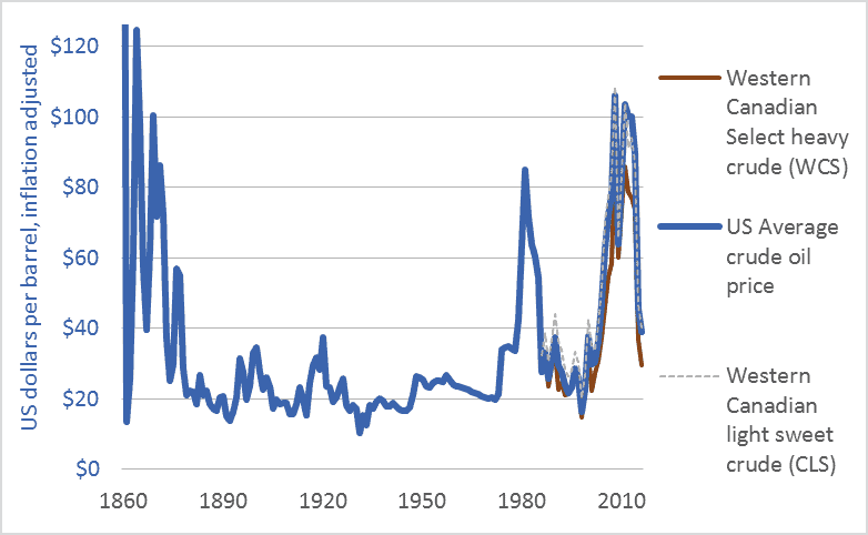
I will argue that talk of “low oil prices” ignores history, misconstrues energy’s role in making civilizations, and confuses our efforts to build resilient, sustainable, climate-stabilizing economies. The graph above and the table below put recent oil prices into their long-term context. The graph covers the 156-year period from the first large-scale production of petroleum oil to the present: 1860 to 2016. It shows US average crude oil prices and Canadian prices for light sweet crude and heavy tarsands crude. For comparability, all figures are in US dollars and adjusted for inflation.

This table helps us interpret the data in the graph by showing average prices for each decade.

Canada and US crude oil prices, decade-averages, US dollars, adjusted for inflation
Canada and US crude oil prices, decade-averages, inflation-adjusted US dollars

Here’s what the graph and table can tell us about current “low oil prices.”

1. The graph shows that the very high 2003-2014 prices are an anomaly.

2. The $80 average price in the 2010s is the highest since the 1870s.

3. Even with recent declines, oil prices remain above the levels that held during the century from 1875 to 1975.

4. While prices have averaged $80 in the 2010s, the average price in the 1950s, ’60s, and ’70s was below $30. The greatest period of economic growth in global history, the postwar US boom, was accomplished with very cheap oil. As the cost of oil goes up, the cost of civilization goes up. If energy prices rise too high, we may no longer be able to afford to continue to build or even maintain our sprawling mega-civilization.

5. Many say that Canadian prices are particularly low relative to US or world prices. That isn’t the case. It’s not that Canadian oil is priced lower than US oil; rather, Canadian heavy (tar sands) oil is priced lower than US and Canadian light oil. The values in the table show this. The graph also shows this in the close correlation of US average oil prices with Canadian light oil prices. The right-wing think-tank The Fraser Institute explains that heavy oil from the tarsands and similar sources is priced lower because such oil “is more costly to transport by pipeline …. Further, the heavier the crude oil …, the lower its value to a refiner as it will either require more processing or yield a higher percentage of lower-valued by-products such as heavy fuel oil. Complex crudes containing more sulphur also generally cost more to refine than low-sulphur crudes. For these reasons, oil refiners are willing to pay more for light, low-sulphur crude oil.”

6. Western Canadians are particularly sensitive to “low oil prices” because our economy is dependent upon some of the highest-cost oil production systems in the world: the tar sands. We are the high-cost producers.

As the International Energy Agency (IEA) said recently, “Attempting to understand how the oil market will look during the next five years is today a task of enormous complexity.” I certainly cannot predict oil prices. And I’m not advocating lower prices. Just the opposite. As someone deeply concerned by climate change, I hope that oil prices rise and stay high, and that governments impose taxes on carbon emissions to push the cost of burning fossil fuels higher still. Nonetheless, we need to dispassionately interpret the data if we are to have any hope of directing our future and our economy. We need to be able to discern when energy prices are low and when they are not.

To leave a comment, click on the graph or the title and then scroll down.

Graph Sources: Canadian Association of Petroleum Producers (CAPP), Statistical Handbookfor Canada’s Upstream Petroleum Industry (October, 2016); and US Energy Information Administration (EIA), U.S. Crude Oil First Purchase Price


Agribusiness takes all: 90 years of Canadian net farm income

Graph of Canadian net farm income and gross revenues, 1926 to 2016
Canadian net farm income and gross revenue, inflation adjusted, net of government payments, 1926–2016.

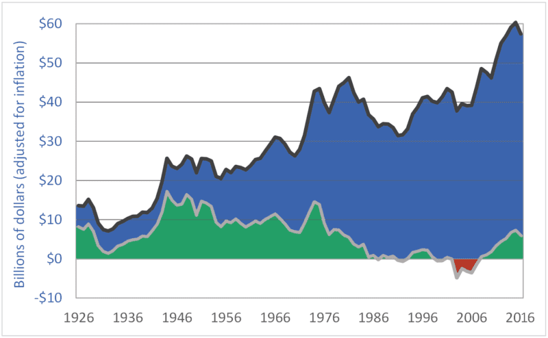
Canadian net farm income remains low, despite a modest recovery during the past decade.  In the graph above, the black, upper line is gross farm revenue.  The lower, gray line is realized net farm income.  Both measures are adjusted for inflation.  And, in both cases, taxpayer-funded farm support payments are subtracted out, to remove the masking effects these payments can otherwise create.  The graph shows farmers’ revenues and net incomes from the markets.

The green-shaded area highlights periods of positive net farm income; the red-shaded area marks negative net income periods.  Most important, however, is the area shaded blue—the area between the gross revenue and net income lines.  That area represents farmers’ expenses: the amounts they pay to input manufacturers (Monsanto, Agrium, Deere, Shell, etc.) and service providers (banks, accountants, etc.).  Note how the blue area has expanded over time to consume almost all of farmers’ revenues, forcing Canadian net farm income lower and lower.

In the 23 years from 1985 to 2007, inclusive, the dominant agribusiness input suppliers and service providers captured 100 percent of Canadian farm revenues—100 percent!  During that period, all of farm families’ household incomes had to come from off-farm employment, taxpayer-funded farm-support programs, asset sales and depreciation, and borrowed money.  During that time, farmers produced and sold $870 billion worth of farm products, but expenses (i.e., amounts captured by input manufacturers and service providers) consumed the entire amount.

Bringing these calculations up to date, in the 32-year period from 1985 to 2016, inclusive, agribusiness corporations captured 98 percent of farmers’ revenues—$1.32 trillion out of $1.35 trillion in revenues.  These globally dominant transnational corporations have made themselves the primary beneficiaries of the vast food wealth produced on Canadian farms.  These companies have extracted almost all the value in the “value chain.”  They have left Canadian taxpayers to backfill farm incomes (approximately $100 billion have been transferred to farmers since 1985).  And they have left farmers to borrow the rest (farm debt is at a record high–just under $100 billion).  The massive extraction of wealth by some of the world’s most powerful corporations is the cause of an ongoing farm income crisis.

To leave a comment, click on the graph or this post’s title and then scroll down.

Graph sources: Statistics Canada, CANSIM matrices, and Statistics Canada, Agricultural Economic Statistics, Catalogue No.  21-603-XPE