The cattle crisis: 100 years of Canadian cattle prices

Graph of Canadian cattle prices, historic, 1918-2018
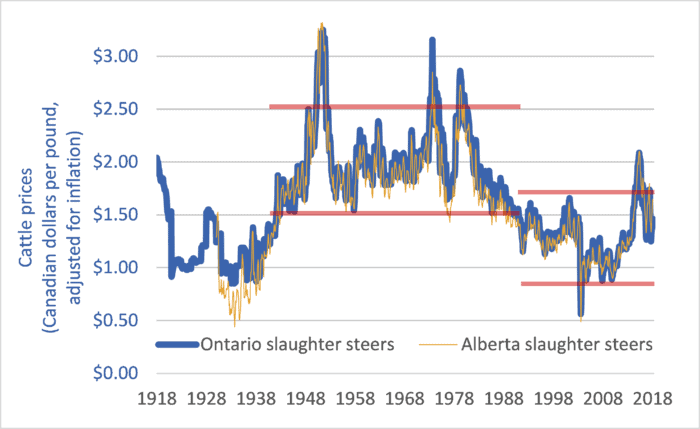
Canadian cattle prices at slaughter, Alberta and Ontario, 1918-2018

Earlier this month, Brazilian beef packer Marfrig Global Foods announced it is acquiring 51 percent ownership of US-based National Beef Packing for just under $1 billion (USD).  The merged entity will slaughter about 5.5 million cattle per year, making Marfrig/National the world’s fourth-largest beef packer.  (The top-three are JBS, 17.4 million per year; Tyson, 7.7 million; and Cargill, 7.6.)  To put these numbers into perspective, with the Marfrig/National merger, the largest four packing companies will together slaughter about 15 times more cattle worldwide than Canada produces in a given year.  In light of continuing consolidation in the beef sector it is worth taking a look at how cattle farmers and ranchers are fairing.

This week’s graph shows Canadian cattle prices from 1918 to 2018.  The heavy blue line shows Ontario slaughter steer prices, and is representative of Eastern Canadian cattle prices.  The narrower tan-coloured line shows Alberta slaughter steer prices, and is representative for Western Canada.  The prices are in dollars per pound and they are adjusted for inflation.

The two red lines at the centre of the graph delineate the price range from 1942 to 1989.  The red lines on the right-hand side of the graph delineate prices since 1989.  The difference between the two periods is stark.  In the 47 years before 1989, Canadian slaughter steer prices never fell below $1.50 per pound (adjusted for inflation).  In the 28 years since 1989, prices have rarely risen that high.  Price levels that used to mark the bottom of the market now mark the top.

What changed in 1989?  Several things:

1.       The arrival of US-based Cargill in Canada in that year marked the beginning of integration and consolidation of the North American continental market.  This was later followed by global integration as packers such as Brazil-based JBS set up plants in Canada and elsewhere.

2.       Packing companies became much larger but packing plants became much less numerous.  Gone were the days when two or three packing plants in a given city would compete to purchase cattle.

3.       Packer consolidation and giantism was faciliated by trade agreements and global economic integration.  It was in 1989 that Canada signed the Canada-US Free Trade Agreement (CUSTA).  A few years later Canada would sign the NAFTA, the World Trade Organization (WTO) Agreement on Agriculture, and other bilateral and multilateral “free trade” deals.

4.       Packing companies created captive supplies—feedlots full of packer-owned cattle that the company could draw from if open-market prices rose, curtailing demand for farmers’ cattle and disciplining prices.

Prices and profits are only partly determined by supply and demand.  A larger factor is market power.  It is this power that determines the allocation of profits within a supply chain.  In the late ’80s and continuing today, the power balance between packers and farmers shifted as packers merged to become giant, global corporations.  The balance shifted as packing plants became less numerous, reducing competition for farmers’ cattle.  The balance shifted still further as packers began to utilize captive supplies.  And it shifted further still as trade agreements thrust farmers in every nation into a single, hyper-competitive global market.  Because market power determines profit allocation, these shifts increased the profit share for packers and decreased the share for farmers.   The effects on cattle farmers have been devastating.  Since the latter-1980s, Canada has lost half of its cattle farmers and ranchers.

For more background and analysis, please see the 2008 report by the National Farmers Union: The Farm Crisis and the Cattle Sector: Toward a New Analysis and New Solutions.

Graph sources: numerous, including Statistics Canada CANSIM Tables 002-0043, 003-0068, 003-0084; and  Statistics Canada “Livestock and Animal Products”, Cat. No. 23-203


Deindustrialization: Or, what are half-a-billion Canadians and Americans going to do for a living?

Graph of United States Gross Domestic Product, by sector, 1947 to 2016, highlighting deindustrialization
United States Gross Domestic Product, by sector, 1947 to 2016

Canada and the US continue to undergo rapid deindustrialization.  Our economies are increasingly service-based, and that should worry us.

The graph above looks complicated, but the key idea is contained in two trends.  And both are negative.  First, note the declining contribution manufacturing is making to United States (US) Gross Domestic Product (GDP).  The red, dotted line shows manufacturing’s percentage contribution.

Manufacturing now makes up just 12 percent of US GDP, and less than 10 percent in Canada.  The decline of manufacturing is even more evident when we look at employment rather than GDP.  According to the US Bureau of Labor Statistics, goods-producing industries (manufacturing, mining, construction, agriculture, etc.) now employ roughly 15 percent of America’s working population.  Nearly 85 percent are employed in the service sector.  The situation is similar in Canada.  According to Statistics Canada data , approximately 77 percent of Canadian workers are employed in the service sector, and this percentage continues to rise.  Both nations continue to deindustrialize.

Second, note the rise in the importance of three service sectors: 1. Finance, insurance, real estate, and rentals (the broad blue line); 2. Professional and business services (green line); and 3. Education and healthcare (red line). A US economy built upon General Motors, General Electric, and U.S. Steel has given way to one built upon JPMorgan Chase, Walmart, and UnitedHealth Group.

Note, especially, the blue line: finance and real estate.  With the 2008 financial crisis still fresh in our minds, and its effects still resonating through global economies, it should worry North Americans that banking and real estate have replaced manufacturing as the one of the largest economic sectors.

Manufacturing is declining, our energy sectors may have to contract as we deal with climate change, most North American fisheries have been depleted and agriculture seems to need fewer farmers and workers each year, low-wage nations continue to claim Canadian and American jobs, and we’re told that the robots are coming.  By mid-century there will be more than 450 million people living in Canada and the US.  Every politician in every party and every engaged citizen should be asking the same question: what are nearly half-a-billion North Americans going to do for a living?

We are not doomed to decline, but decline will be our lot unless we actively engage in a collective democratic effort to build a new, sustainable economy for North America.

Graph source: US Dept. of Commerce, Bureau of Economic Analysis


Far-flung food: local food falls victim to a fixation on food exports

A graph of Canadian agri-food exports and imports, 1970 to 2015
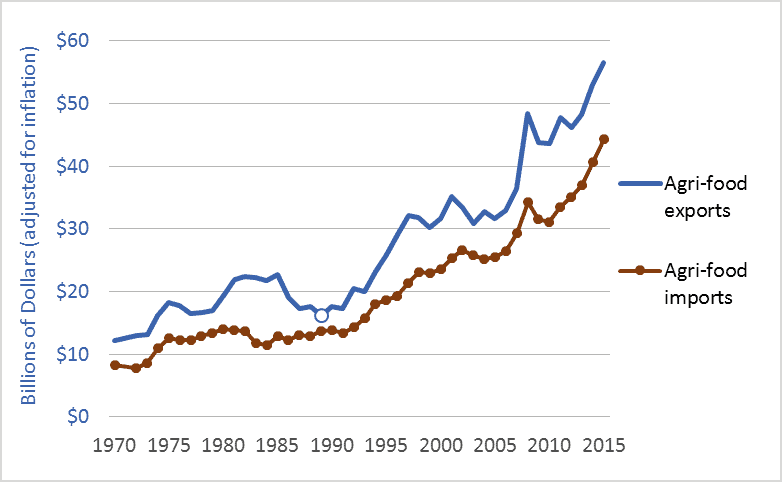
Canadian agri-food exports and imports, 1970 to 2015

The local food movement is important—a grassroots force for positive change.  People are increasingly aware of the benefits of eating local food and more are demanding it.  That said, it would be wrong to think that we are localizing our food system.  Just the opposite.  The most powerful players are putting their money and influence behind the project of globalizing and de-localizing our food supply.  Our food has never been less local.

In early-April, Canada’s federal government announced an ambitious new target for higher agri-food exports: $75 billion by 2025.  Unfortunately, as exports increase, so will imports.   We’re maximizing food miles.

The graph above shows Canadian agri-food exports and imports.  The units are billions of dollars, adjusted for inflation.  The graph covers 1970 to 2015.  A round circle highlights 1989, which marks the beginning of the modern “free trade” period.  In 1989, we implemented the historic Canada-US Free Trade Agreement (CUSTA).  Not long after, we implemented the North American Free Trade Agreement (NAFTA), and the World Trade Organization (WTO) Agreement on Agriculture.  Other agreements have followed.

Since ’89, Canada has been very successful in finding export markets for Canadian grains, meat, processed foods, and other agri-food products.  Exports have more than tripled.  This is no chance occurrence.  Governments and industry have worked together to drive up exports—repeatedly setting and meeting ever-higher targets.  In 1993, for example, federal and provincial governments pledged to double agri-food exports to $20 billion by 2000. Next, they pledged to double exports again: to $40 billion by 2005.  (This latter goal was actually suggested by the Canadian Agri-Food Marketing Council, an industry group that included representatives of Cargill, Maple Leaf, and McCains.)  Just last year, the Canadian Agri-Food Trade Alliance—whose members include some of the world’s largest agricultural traders and processors—voiced strong support for new trade agreements: the Comprehensive Economic and Trade Agreement (CETA) and the Trans-Pacific Partnership (TPP).  To support of this industry-led effort, the federal government has now pledged to help increase exports to $75 billion.  While many citizens want local food, governments and agribusiness appear to want the opposite.

The trade agreements that pave the way for Canadian exports do the same for imports.  Since 1989, Canadian food imports have more than tripled, to nearly $45 billion per year.  With each uptick in exports comes a comparable increase in imports.  If we reach our 2025 goal of $75 billion in exports, the trendlines in the graph above suggest that imports will rise to about $65 billion per year—on average, about $8,000 for a hypothetical family of four.  That’s a lot of imported food. Especially in a food-rich nation such as Canada.

The preceding is not an argument against exports and trade, or even against food imports.  But it is an argument against a simplistic fixation on exports.  While exports have doubled and redoubled, farmers’ net incomes have stagnated or fallen, the number of Canadian farms has been reduced by a third, farm debt has quadrupled, many Canadian processing companies have disappeared, and our agricultural and food systems have become increasingly controlled by foreign corporations.  Good agricultural policy must go far beyond a push to produce and export.  And a sound national food policy must go far, far beyond such simplistic schemes.

Graph sources: Agriculture and Agri-Food Canada (AAFC): “Agri-food Export Potential for the year 2000;” and data from AAFC by request.

China (re)rising: 1,000+ years of data on who dominates the global economy

Graph of China's share of the global economy, and selected other nations, 1000 AD to present
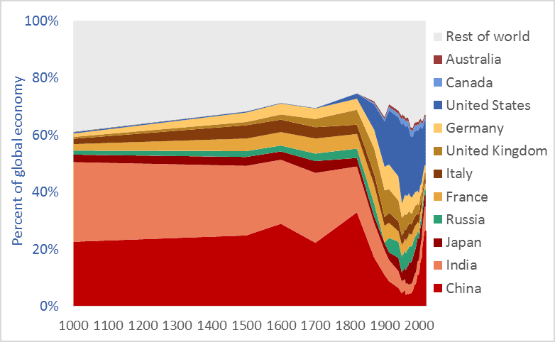
China’s share of the global economy, along with other nations, 1000AD to present

China’s share of the global economy has increased rapidly—from about 5 percent in the early 1980s to more than 26 percent today.  India’s economy has similarly expanded, from 3 percent of the global economy in the early ’80s to more than 8 percent today.  Meanwhile, the percentage shares of the US, UK, Germany, Japan, and other nations are falling fast.  The graph above shows the relative share of global GDP represented by selected nations.  The time-frame is 1000 AD to 2016.

Manufacturing data* similarly shows India and China’s long-term dominance. In 1800, fully half the manufacturing output of the world came from India and China.  In that year, the UK contributed 4.3 percent of manufacturing output and the US just 0.8 percent.  The UK and US came to dominate global manufacturing by the late-1800s, but their rise is recent and, as the graph above suggests, their dominance may be shortlived.

Many people have been surprised by the “rise of China” and that of India.  No one should be.  The global economy is merely returning to its long-term normal—resetting after an anomalous period when European and New World nations were economically ascendant.  Indeed, England and Europe have been economic backwaters for 97 percent of the time since civilizations first arose 5,000 years ago. Our educational system fails to teach us that China and India are the default global superpowers.

To give just two final examples of the long-term dominance of Asia, China  smelted hundreds of thousands of tons of iron in the 11th century using coal rather than wood, a feat not matched in Europe until 600 years later.** A list of the ten largest cities in the world in the year 1500 includes four in China (Beijing, Nanjing, Hangzhou, and Guangzhou) and two in India (Gaur and Vijayanagara), but just one in Europe, (Paris). The three cities rounding off the top-ten list were Tabriz, Cairo, and Istanbul.*** Clearly, the economic and civilizational centre of gravity was in the East. It appears to be shifting back there.

* Paul Bairoch, “International Industrial Levels from 1750 to 1980”
** Hartwell, various pubs
*** Hohenberg, Oxford Encyclopaedia of Economic History

Graph sources: 1000AD-2008, Angus Maddison, 2009-2016 Conference Board

Fraught freight: trade agreements, globalization, and rising global freight transport

Graph of global freight transport, trillions of tonne-kilometres
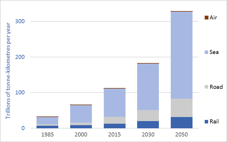
Global freight transport, all modes, trillions of tonne-kilometres, selected years, 1985 to 2050

Global freight transport now exceeds 122 trillion tonne-kilometres* per year. That enormous tonnage/distance has more than tripled since the beginning of the “free trade” era, in the 1980s.  And the Organization for Economic Cooperation and Development (OECD) projects that global freight transport tonnage will triple again in the coming generation—rising to 330 trillion tonne-kilometres per year by 2050 (see OECD).  To put these trillions into perspective, freight movement will soon surpass 100,000 tonne-kilometres per capita per year for those of us living high-consumption lifestyles, here and around the world.

*Note: a tonne-kilometre is equivalent to moving one tonne one kilometre.  If you move 10 tonnes 10 kilometres, that is 100 tonne-kilometres.

A major part of this increase in transport tonnage is related to trade agreements and globalization.  As we’ve restructured the global economy we have off-shored our factories.  Our washing machines, toasters, rubber boots, TVs, and many of our cars now come from half-way around the world.  Our foods and fertilizers are increasingly shipped across continents or oceans.  And we ship food, resources, and other goods around the world.  Economic growth means we’re consuming more and more; globalization means we’re consuming resources and products from further away.  These two trends, together, help explain the tenfold increase in global freight transport depicted in the graph.

Moving this colossal tonnage requires ships, trains, trucks, and airplanes—all of which burn fossil fuels and emit greenhouse gas (GHG) emissions.  Emissions from the freight transport sector make up about 10 percent of all man-made CO2 emissions (see OECD). The OECD predicts that if current trends and policies hold, emissions will nearly double by 2050, to 5.7 billion tonnes of CO2 per year (see OECD).  This near-doubling of freight transport emissions between now and 2050 will occur at the same time that we are attempting to cut overall GHG emissions by half.  It is time to ask the obvious questions: Is our ongoing drive toward globalization (i.e., de-localization and transport maximization) compatible with our emission-reduction commitments and a livable climate?  Indeed, as our leaders aggressively sign and implement still more “free trade” agreements (TPP, CETA, etc.) we should consider that  perhaps doubling down on globalization vetoes emissions reduction, vetoes a stable climate, vetoes local food, and vetoes local jobs.

To leave a comment, click on the graph or this post’s title and then scroll down.

Graph sources: 2015, 2030, and 2050 data from the OECD/ITF page 56. Data for 2000 and 1985 are from various sources: air freight data is from the World Bank. Rail freight data is from the World Bank. Maritime freight data is from the United Nations, Review of Maritime Transport. Road freight data for 2000 is from the OECD. Road freight data for 1985 is an informed estimate.