Self-incineration? 100 years of Australian coal production

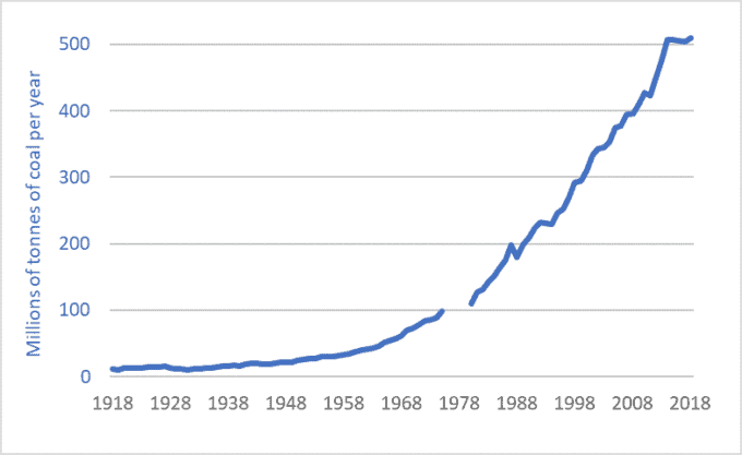
Graph of Australian coal production, historic, 1918-2018

I’m saddened and horrified by the pictures of the fires in Australia.  But the graph above gives the context for those fires and other instances of climate chaos and destruction.  To some extent, what we’re witnessing in Australia is time-delayed arson, in that humans have applied “accelerants.”

But let’s not be smug or think of this as a problem “over there.”  Graphs of Canadian and US oil production would appear nearly identical to this graph of Australian coal.  Moreover, it’s not just emissions from Australian coal that are contributing to the firestorms in that country, but Canadian and US and EU and Chinese emissions as well.  Each of us, in our flying and driving and consuming, have contributed to this carnage.  Greenhouse gas (GHG) emissions from one place will contribute to melting a glacier in another place, damaging a reef in another, and intensifying a fire in yet another.

Sadly, a major part of the Anthropocene will be the Pyrocene.  Our petro-industrial emissions are pushing the planet, biosphere, and our communities into a new age of megafires.

Let’s conclude with some insights from the coal corporations and their industry associations:

“The Australian coal industry is a key pillar of the Australian economy….  Coal benefits all Australians through its contribution to exports, wages, investment and tax revenue.  It is Australia’s comparative advantage in coal … that has helped to sustain the longest period of continuous economic growth in the nation’s history.  …  Australia [is] the fourth largest producer of black coal in the world. …  This production is possible because Australia has vast resources of coal. …  At current production rates these resources will sustain production of black coal for 125 years and lignite for over 1,200 years” [italics added].—Minerals Council of Australia, “Coal’s Economic Contribution

Sources for Graph:
– B.R. Mitchell, International Historical Statistics: The Americas and Australasia (London: The Macmillan Press, 1983), Table E2, p. 404;
– U.S. Energy Information Administration, International Energy Statistics 
See also:
– Reserve Bank of Australia, “The Changing Global Market for Australian Coal” (Bulletin – September 2019  Global Economy) 
Australian Commodity Statistics 2006, p. 244 & 245 

New report on agriculture, GHG emissions, climate change, and the farm income crisis

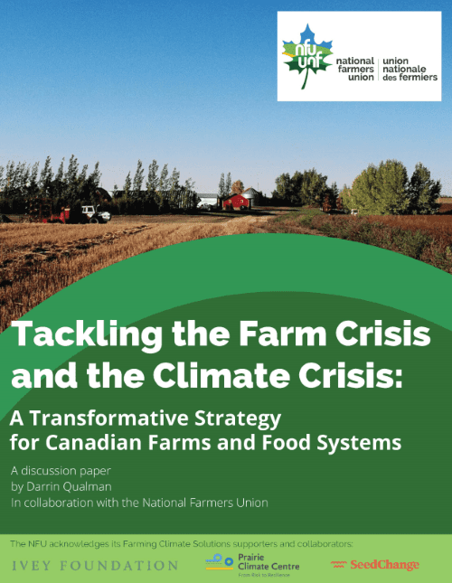
Cover of Tackling the Farm Crisis and the Climate Crisis by Darrin Qualman

How can we reduce agricultural greenhouse gas (GHG) emissions by half by mid-century?  And how can steps to do so help strengthen and safeguard family farms?  These two questions are the focus of a new report written by Darrin Qualman in collaboration with the National Farmers Union (NFU).  The report is entitled Tackling the Farm Crisis and the Climate Crisis: A Transformative Strategy for Canadian Farms and Food Systems and it’s available from the NFU website.

The report looks at the climate crisis and the farm income crisis.  It concludes that our farms’ high emissions and low net incomes have the same cause: overdependence on purchased inputs: fertilizers, chemicals, fuels, etc.

The report shows clearly that the GHG emissions coming out of our farm and food systems are simply the downstream byproducts of the petro-industrial inputs we push in.  “Push in millions of gallons of fossil fuels and they will come out as millions of tonnes of carbon dioxide.  Push in megatonnes of fertilizers and they will come out as megatonnes of nitrous oxide.  As we have doubled and redoubled input use, we have doubled and redoubled the GHG emissions from agriculture,” states the report.  From this novel observation comes an inescapable conclusion: “Any low-emission food system will be a low-input food system.”

The report takes a long-term view and states that “10,000 years of human history makes one thing crystal clear: farming does not create GHG emissions; petro-industrial farm inputs create GHG emissions.”  It goes on to state that “Two things happen when farmers become overdependent on  purchased inputs: emissions go up, and net incomes go down.”

The report is optimistic, however, arguing that solutions to climate problems can also be solutions to farm income problems.  On average, farmers are now retaining just five cents out of every dollar they earn.  The other 95 cents go to pay for inputs—to pay fertilizer, chemical, seed, fuel, and machinery companies and other input and service providers.  But as input use is reduced as a way to reduce emissions, margins and net incomes can go up.  Steps to deal with the climate crisis can also be steps to solve the farm income crisis.

The report explores dozens of practical on-farm measures and government policies that can, taken together, reduce agricultural emissions by half by mid-century.  The report, however, does not underestimate the scale of the task ahead.  It acknowledges that “farmers, other citizens, all sectors, and all levels of government must mobilize, with near-wartime-levels of commitment and effectiveness, to slash emissions.  ”

The report is a hopeful blueprint for the transformation of our farms and food systems.  “We are looking at a future wherein agriculture must increasingly re-merge with nature and culture to create a much more integrated, life-sustaining, and community-sustaining agroecological model of human food provision, nutrition, and health.”

Darrin Qualman worked as Director of Research for the National Farmers Union from 1996 to 2010.  He is the author of the book, published in 2019, Civilization Critical: Energy, Food, Nature, and the Future.

Click HERE to read the report.

Canucks in hock: 50 years of Canadian debt levels

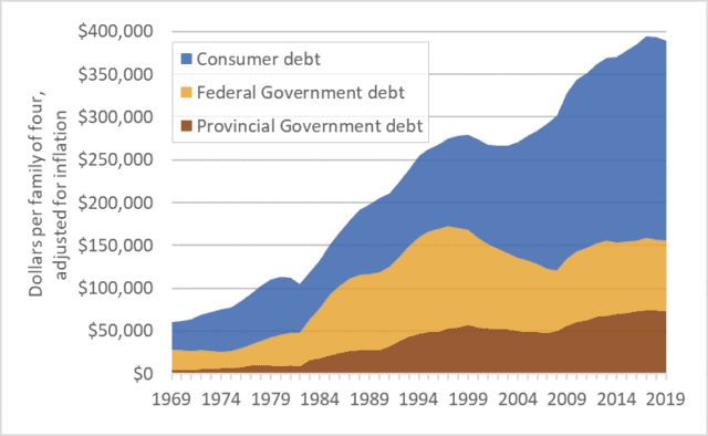
Graph of Canadian government debt and consumer debt historical
Canadian personal and government debt, per family of four, adjusted for inflation, 1969-2019

Canada has a debt problem.  Total consumer and government debt is now $3.7 trillion, with 60 percent being consumer debt: mortgages, home-equity loans, credit lines, car loans, credit card balances, etc.  Provincial government debt is about $0.7 trillion and federal government debt is $0.8 trillion.  Corporate and financial-system debts would add trillions more, but we’ll leave those amounts aside.

Those are big numbers—too big to make sense of.  It is easier to understand debt if we look at it on a per-household basis.  The graph above shows debt levels for a hypothetical family of four over the past 50 years: 1969 to 2019.  All figures are adjusted for inflation.  For an average Canadian household, debt levels today are about six times higher than in 1970.  Granted, we’re richer than we were in the 1970s, but six times richer?  More important, are we richer as a nation?  In 1970 the eastern oceans were full of cod and western regions were brimming with oil.

There are many ways to evaluate debt—to put it into perspective.  Often it’s expressed as a percentage of GDP or of household income.  The idea being that if the economy is bigger or incomes are larger, it’s okay to owe more.  I want to argue that this is the wrong approach.  I want to suggest a different and more concerning interpretation of ever-rising Canadian debt levels.

Debt rises when our financial outflows exceed inflows.  If we need to pay out more than we are bringing in, we can borrow, and debt goes up.  But implicit in this idea is another one: the day will come when inflows exceed outflows and we’ll have surplus money we can use to pay off the debt.

So let’s look at the graph in that light.  Here’s what the graph shows: collectively, we Canadians couldn’t quite pay all our personal and government bills in the 1970s, so we borrowed money and debt increased.  The same in the 1980s: we didn’t have enough so we borrowed and debt increased.  This continued through the 1990s, 2000s, and 2010s.  In each decade of the past half-century we couldn’t quite afford our lifestyles and infrastructure projects and social programs and day-to-day bills so we borrowed more money than we repaid, so debt rose—continuously, consistently.

So here’s the question that puts this debt into perspective: if we didn’t have enough money in any of the recent decades why are we confident that the situation will change in the future?  Why, after five decades of increasing debt, are we confident that in the 2020s or 2030s or 2040s we can reverse the pattern of two generations and amass money so fast that we’ll not only be able to pay all our personal and government bills but we’ll also have large surpluses we can use to retire the debt we accumulated over 50 years?  …a debt that now stands at about $400,000 per family of four.

Let’s explore that argument again, over a shorter time frame.  Over just the past 15 years—2004 to 2019—the average Canadian household has increased its debt by about 45 percent—by about $110,000.  But the recent decade-and-a-half were good years in much of Canada—unemployment was relatively low, the economy was usually strong, rising stock markets helped stoke investments and retirement accounts.  In many parts of Canada most of the 2004-2019 period was a “boom” time.  The economy was booming, yet we borrowed.  Are we confident that our future will be even more … boomy?  Because it’s in that future that we’re not only going to have to find ways to pay all the day-to-day bills in our households and legislatures, but also find large surpluses to retire debt.  Are we confident that in the 2020s or 2030s our nation and our collective households will be so much richer than we were in the 2004-2019 period that that we’ll be able to retire all that debt?

My aim is certainly not to scold.  Rising debt should not be seen as a personal problem, but rather as a collective error.  Rather, my aim is to warn—to disabuse governments and my fellow citizens of a dangerous and possibly prosperity-curdling idea: that current debt levels are somehow safe and sustainable and that we should be calm as we or our governments pile on trillions more (as the trendlines in the graph suggest we will).  Most of us have debts.  But debt is a public policy issue, not a personal failing.  Moreover, even those who do not have debt should not be smug.  If, as a nation, our collective borrowing rises too far there will be a reckoning, and all will suffer as a result.

Every household must make its own decisions regarding mortgages and education spending and financing cars.  But there is also a larger, collective, public-policy decision needed.  Government leadership is needed to begin moving debt levels lower.

Greta vs. growth

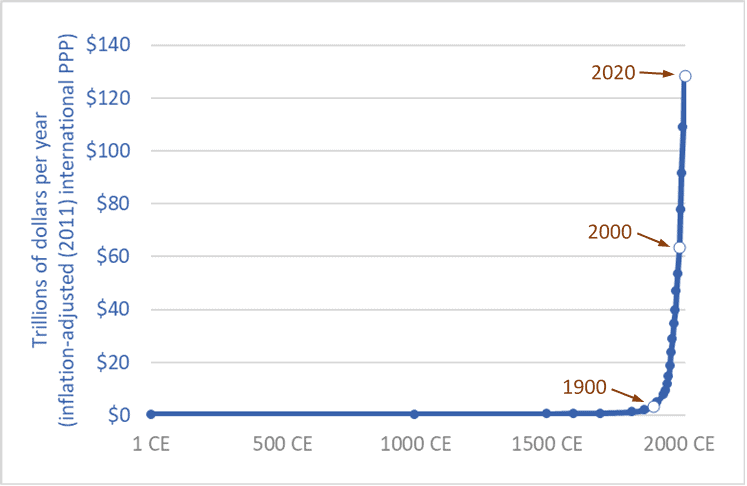
Graph of the size of the global economy (Gross World Product) historic
The size of the global economy (Gross World Product) over the long term, 1 CE – 2020 CE

“People are suffering.  People are dying.  Entire ecosystems are collapsing.  We are in the beginning of a mass extinction, and all you can talk about is money and fairy tales of eternal economic growth.  How dare you!”  So spake Greta Thunberg at the United Nations on September 23rd, 2019.

Thunberg, a sixteen-year-old without a university education, has had the insight, clarity, and courage to say what ten-billion-dollars worth of Ph.D. economists haven’t: that continued economic growth is, at best, unsustainable and probably much worse: a malignant illusion driving us to destroy our biosphere, civilization, and future.  The project of making the current global economy four or eight times larger is a suicide pact.

The graph above places our 21st century economy in its long-term context.  It shows the size of the global economy (Gross World Product) from 1 CE to 2020.  The units are trillions of US/international dollars adjusted for inflation (constant 2011 dollars).  The main source is the World Bank, with historical data from Angus Maddison.  (Pre-20th century values are, by necessity, estimates by Maddison.)

The years 1900, 2000, and 2020 are highlighted.  Sometime in 2020 the size of the global economy will surpass 127 trillion dollars.  When it does, it will be twice as large as it was in 2000.  The economy will have doubled in size in just 20 years.  This shouldn’t be a surprise.  Sustained growth rates of 3.5 percent leads to a doubling every 20 years.  (Recall the Rule of 70.)

Going forward, if we maintain current rates of growth—three to four percent annually—the economy will be twice as large again by 2040 or soon after—making it four times larger than in 2000.  Earth’s atmosphere, oceans, land, and biosphere will be hosting four 2000-sized economies.

And by 2060 or 2070, another doubling will bring the global economy to eight times its 2000 level.  And there’ll still be more than enough time left in this century to double it again—at least a 16-fold increase in size in a single century, if we stay the course.  If we accomplish this, we will be reprising the 18-fold increase seen during the 20th century.

Of course, we won’t do this—we won’t make the global economy 8 or 16 times larger.  Within a generation or two nearly everyone on the planet will be living in a post-growth economy: either because we’ve had the wisdom to end runaway exponential growth and put the biosphere first, or because we have not.

The end of growth, inescapable in the medium term, will bring numerous problems, such as how will we deal with the equity claims of the poor if we can no longer rely on the convenient fictions of “a rising tide raises all boats” and “anyone (everyone?) can grow up to be rich.”  While the end of growth must come for nearly all within a few decades, it must come first for those of us who are richest, so that growth can continue in places where people are poorer.  Those of us who enjoy jet vacations need to step off the growth escalator first so that growth can continue for others and deliver to them running water and refrigerators.  The end of growth casts into sharp relief a series of moral problems.

But the end of growth will also solve many problems.  We will be forced to take less of our economy’s productivity and bounty in the form of consumer products and more in the form of free time and low-emission leisure—more time with family, more time with friends drinking coffee or wine, more time with culture and nature; more discussion, poetry, romance, literature, and contemplation.  Most of the people in the fast-expanding (-metasticizing?) global middle class are living high-stress, low-quality, time-impoverished lives.  Stepping off the growth escalator can be part of a larger civilizational, cultural, and spiritual shift in which we rediscover meaning and purpose beyond getting and spending.

Thunberg is neither sage nor prophet.  And one need be neither to see what is absolutely, inescapably obvious: growth must and will soon end.  But we have a choice: We can deny the fact of growth’s imminent end and continue in the fairy tale and massively deplete and damage the planet in a last frenzied attempt to squeeze out one or two more doublings, or we can be as mature as a sixteen-year-old, admit the obvious, get on with the needed changes, and reap the benefits of slower, saner, more sustainable, more enjoyable lives.

Sources for graph:
– 
World Bank, Databank website: “GDP, PPP (constant 2011 international $)”
– 
Angus Maddison, The World Economy, Volume 1: A Millennial Perspective (Paris: OECD, 2001); Angus Maddison, Contours of the World Economy, 1–2030 AD: Essays in Macro-Economic History (Oxford: Oxford University Press, 2007)


The nitrogen crisis: the other mega-threat to the biosphere

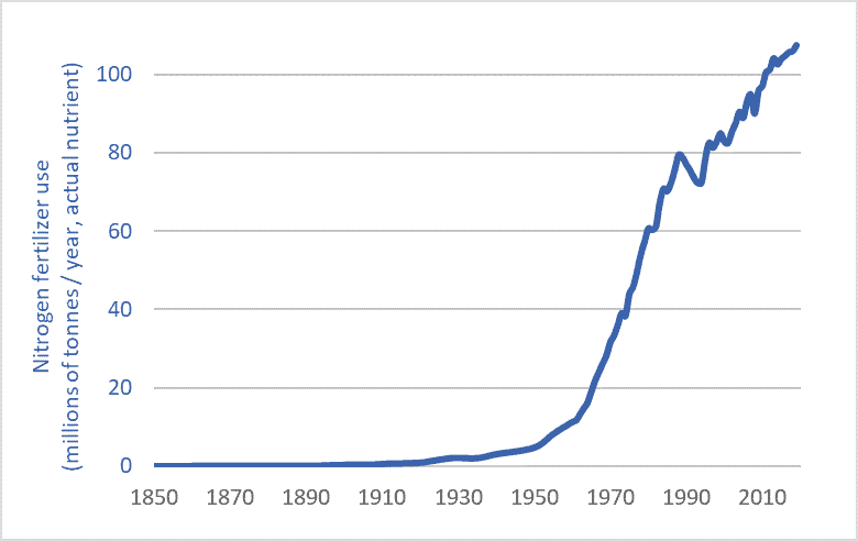
Nitrogen fertilizer use graph historic long-term 1850-2019
Global nitrogen fertilizer use, 1850-2019

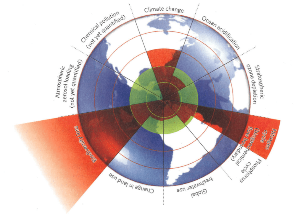
If there was no climate crisis we’d all be talking about the nitrogen crisis.  Humans have super-saturated Earth’s biosphere with reactive nitrogen, setting off a cascade of impacts from species shifts, ecosystem changes, and extinctions to ocean dead zones and algae-clogged lakes.  When scientists surveyed the many threats to the biosphere to determine a “safe operating space” for planet Earth, the areas in which they concluded that we’d pushed furthest past “planetary boundaries” were climate change, species extinction, and nitrogen flows.  The graphic below, from the journal Nature, shows the extent to which we’ve transgressed safe planetary boundaries.  Note nitrogen—the red wedge, lower right.

Planetary Boundaries Rockstrom Steffen et al

Source: Reproduced from: Johan Rockström, Will Steffen, et al., “A Safe Operating Space for Humanity,” Nature 461, no. 24 (2009).

A nitrogen primer

Nitrogen is indispensable for life—a building block of proteins and DNA.  Nitrogen (N) is one of the most important plant nutrients and the most heavily applied agricultural fertilizer.  Nitrogen  is common in the atmosphere—making up 78 percent of the air we breath.  But this atmospheric N is inert; non-reactive—it can’t be used by plants.  In contrast, reactive, plant-usable N is just one-one-thousandth as abundant in the biosphere as nitrogen gas is in the atmosphere.  For hundreds-of-millions of years, plants have struggled to find sufficient quantities of usable N.

But humans have intervened massively in the planet’s nitrogen cycles—effectively tripling the quantity of N flowing through terrestrial ecosystems—through farmland, forests, wetlands, and grasslands.  In intensively cropped areas, nitrogen flows are now ten times higher than natural levels.

Here’s the most important part: nitrogen is a fossil-fuel product.  Natural gas is the main input for making N fertilizer.  That gas provides the tremendous energy, heat, and pressure needed to split atmospheric nitrogen molecules and combine N atoms with hydrogen to make reactive compounds.  The amount of energy needed to create, transport, and apply one tonne of N fertilizer is nearly equal to two tonnes of gasoline.  Nitrogen is one way that we push fossil-fuel energy into the food system in order to push more food out.  We turn fossil fuels into fertilizer into food into us.

Humans managed to increase global food production about eight-fold during the 20th and early 21st centuries.*  There’s more tonnage coming out of our food system.  But that system is linear, so if there’s more food coming out one end, there must be more inputs being pushed into the other end—more energy, chemicals, and fertilizers.  The graph above shows how humans have increased N fertilizer inputs three-hundred-fold since 1900 and thereby helped increase human food outputs eight-fold, and human populations four-and-a-half-fold.  By pushing in a hundred million tonnes of fossil-fuel-derived fertilizer we can push out enough food to feed an additional six billion people.  (for more information on nitrogen, see chapters 3 and 28 of my recent book, Civilization Critical.)

Greenhouse gas emission from nitrogen fertilizer

The nitrogen crisis is compounded by the fact that N production and use drive climate change.  The production and use of nitrogen fertilizer is unique among human activities in that it produces large quantities of all three of the main greenhouse gases: carbon dioxide (from fertilizer-production facilities fueled by natural gas); nitrous oxide (from soils over-enriched by factory-made N); and methane (from the production and distribution of natural gas feedstocks and from the fertilizer-production process, i.e., from fracking, leaking gas pipelines, and from emissions from fertilizer plants).  A 2019 science journal article reported that actual methane emissions from fertilizer plants may be 100 times higher than previously assumed.  Emissions from N fertilizer production and use make up about half the total emissions from agriculture in many regions.  It’s fertilizer, not diesel fuel, that’s the largest emissions source on many farms.

Alternatives

We cannot continue to push massive quantities of petro-industrial N fertilizer into our farm fields and ecosystems.   Luckily there are alternatives and partial solutions.  these include:
– Getting nitrogen from natural sources: legumes and better crop rotations;
– Scaling back our demand for agricultural products: reducing food waste; rethinking biofuels; minimizing nutritionally disfigured food (sugar pops and tater tots); ceasing the attempt to globally proliferate North American levels of meat consumption;
– Funding agronomic research into low-input, organic, and agro-ecological production systems;  and
– Rationalizing and democratizing our food system—moving away from systems based on yield-, output-, trade-, and profit-maximization; corporate control; farmer elimination; and energy- and emission-maximization to new paradigms based on food sovereignty, health and nutrition-maximization, input-optimization, emissions-reduction, and long-term sustainability.

Any maximum-input, maximum-output agricultural system will  be a high-emission system.  Input reduction, however, can boost sustainability and net farm incomes while reducing energy use and emissions.  Cutting N use is key.

* The FAO records a four-fold increase in grain production between 1950 and 2018 and it is likely that production roughly doubled between 1900 and 1950, so an eight- to ten-fold increase in production is likely between 1900 and 2018.

Graph sources:
International Fertilizer Association (IFA);
– Vaclav Smil, Enriching the Earth (Cambridge, MA: The MIT Press, 2001);
– UN Food and Agriculture Organization (FAO), FAOSTAT; and
– Clark Gellings & Kelly Parmenter, “Energy Efficiency in Fertilizer Production and Use.”


Another trillion tonnes: 250 years of global material use data

Graph of Global materials use 1850-2100
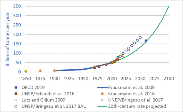
Global materials use, 1850-2100

Want to understand your society and economy and the fate of petro-industrial civilization?  If so, don’t “follow the money.”  The stock market casino, quantitative easing, derivatives and other “financial innovations,” and the trillions of e-dollars that flit through the global monetary system each day obscure the real economy—the production and destruction of actual wealth: mining, farming, processing, transport, manufacturing, consumption, disposal.  To understand where we are and where we may be going, we must follow more tangible flows—things that are real.  We must follow the oil, coal, steel, concrete, grain, copper, fertilizers, salt, gravel, and other materials.

Our cars, homes, phones, foods, fuels, clothes, and all the other products we consume or aspire to are made out of stuff—out of materials, out of wood, iron, cotton, etc.   And our economies consume enormous quantities of those materials—tens-of-billions of tonnes per year.

The graph above shows 250 years of actual and projected material flows through our global economy.  The graph may initially appear complicated, because it brings together seven different sources and datasets and includes a projection to the year 2100.  But the details of the graph aren’t important.  What is important is the overall shape: the ever-steepening upward trendline—the exponential growth.

In 1900, global material flows totalled approximately 7 billion tonnes.  The technical term for these material flows is “utilized materials”—the stuff we dig out of mines, pump up from oil or natural gas wells, cut down in forests, grow on farms, catch from the sea, dig out of quarries, and otherwise appropriate for human uses.  These tonnages do not include water, nor do they include unused overburden, but they do include mine tailings, though this last category adds just a few percent to the total.

Between 1900 and 2000, global material tonnage increased sevenfold—to approximately 49 billion tonnes (Krausman et al. 2009).  Tonnage rose to approx. 70 billion tonnes by 2010 (UNEP/Schandl 2016), and to approx. 90 billion tonnes by 2018 (UNEP/Bringezu 2018).  At the heart of our petro-industrial consumerist civilization is a network of globe-spanning conveyors that, each second, extract and propel nearly 3,000 tonnes of materials from Earth’s surface and subsurface to factories, cities, shops, and homes, and eventually on to landfills, rivers and oceans, and the atmosphere.  At a rate of a quarter-billion tonnes per day we’re turning the Earth and biosphere into cities, homes, products, indulgences, and fleeting satisfactions; and emissions, by-products, toxins, and garbage.

And these extraction, consumption, and disposal rates are projected to continue rising—to double every 30 to 40 years (Lutz and Giljum 2009).  Just as we increased material use sevenfold during the 20th century we’re on track to multiply it sevenfold during the 21st.  If we maintain the “normal” economic growth rates of the 20th century through the 21st we will almost certainly increase the volume and mass of our extraction, production, and disposal sevenfold by 2100.

But 2100 is a long way away.  Anything could happen by then.  Granted.  So let’s leave aside the long-term and look only at the coming decade.  Material throughput now totals about 90 billion tonnes per year, and is projected to rise to about 120 billion tonnes per year over the coming decade.  For ease of math, let’s say that the average over the coming decade will be 100 billion tonnes per year.  That means that between 2019 and 2029 we will extract from within the Earth and from the biosphere one trillion tonnes of materials: coal, oil, wood, fish, nickel, aluminum, chromium, uranium, etc.  …one trillion tonnes.  And we’ll send most of that trillion tonnes on into disposal in the ground, air, or water—into landfills, skyfills, and seafills.  In the coming decade, when you hear ever-more-frequent reports of the oceans filling with plastic and the atmosphere filling with carbon, think of that trillion tonnes.

Postscript: “dematerialization”

At conferences and in the media there’s a lot of talk of “dematerialization,” and its cousin “decarbonization.”  The idea is this: creating a dollar of economic activity used to require X units of energy or materials, but now, in countries such as Canada and the United States, creating a dollar of economic activity requires only two-thirds-X units.  Pundits and officials would have us believe that, because efficiency is increasing and less material and energy are needed per dollar, the economy is being “dematerialized.”  They attempt to show that the economy can grow and grow but we need not use more materials or energy.  Instead of consuming heavy steel cars, we will consume apps, massages, and manicures.  But this argument is wrong.  Global material and energy use increased manyfold during the 20th century.  The increases continue.  A business-as-usual scenario will see energy and materials use double every 30 to 40 years.  And just because the sizes of our economies, measured in abstract currencies, are growing faster, this does not change the fact that our use of energy and materials is growing.  “Dematerialization” has no useful meaning in a global economy in which we are using 90 billion tonnes of materials per year and projecting the use of 180 billion tonnes by 2050.  Our rate of extraction and consumption of materials is rising; the fact that the volume of dollar flows is rising faster is merely a distraction.

Sources for material flow tonnage:

Fridolin Krausmann et al., “Growth in Global Materials Use, GDP, and Population During the 20th Century,” Ecological Economics 68, no. 10 (2009).

Christian Lutz and Stefan Giljum, “Global Resource Use in a Business-as-Usual World: Updated Results from the GINFORS Model,” in Sustainable Growth and Resource Productivity: Economic and Global Policy Issues, ed. Bleischwitz et al. (Sheffield, UK: Greenleaf Publishing, 2009).

Stefan Giljum et al., Sustainable Europe Research Institute (SERI), “Resource Efficiency for Sustainable Growth: Global Trends and European Policy Scenarios,” background paper, delivered Sept. 10, 2009, in Manila, Philippines.

Julia Steinberger et al., “Global Patterns of Materials Use: A Socioeconomic and Geophysical Analysis,” Ecological Economics 69, no. 5 (2010).

UN Environmental Programme (UNEP) and H. Schandl et al., Global Material Flows and Resource Productivity: An Assessment Study of the UNEP International Resource Panel (Paris: UNEP, 2016).

Krausmann et al., “Long-term Trends in Global Material and Energy Use,” in Social Ecology: Society-Nature Relations across Time and Space, ed. Haberl et al. (Switzerland: Springer, 2016).

United Nations Environment Programme (UNEP), International Resource Panel, and Stefan Bringezu et al., Assessing Global Resource Use: A Systems Approach to Resource Efficiency and Pollution Reduction (Nairobi: UNEP, 2017).

Organization for Economic Cooperation and Development (OECD), Global Material Resources Outlook to 2060: Economic Drivers and Environmental Consequences (Paris: OECD Publishing, 2019)
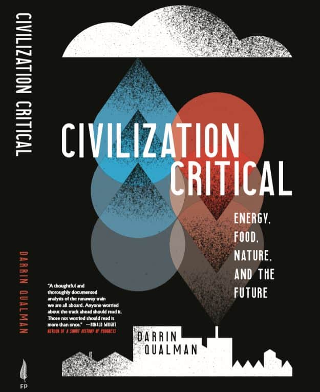
Darrin Qualman’s book, Civilization Critical, is now available

Civilization Critical, Darrin Qualman, front cover

My book is done!  Published and printed!  I’m very excited.  I’ve included information on ordering and availability below.

The title is Civilization Critical: Energy, Food, Nature, and the Future.  The book charts the past, present, and possible futures of our global petro-industrial consumerist civilization.  It looks at how we produce our food and how we fuel and provision the incredibly powerful systems of industry.  The book includes chapters on energy, the Industrial Revolution, transport, farming, efficiency, and progress.

Most important, Civilization Critical provides a wholly new analysis of our problems and their potential solutions—new ideas about material and energy flows and the structure of global civilization.  The book argues that a nineteenth- and twentieth-century transition to linear systems and away from the circular patterns of nature (and of all previous civilizations) is the foundational error—the underlying problem, the root cause of climate change, resource depletion, oceans full of plastics, and a host of mega-problems now intensifying and merging, with potentially civilization-cracking results.

So?  Are we doomed?  No.  Doom is a choice.  One we’re currently making, but there are other options.  The book concludes that we face a momentous decision.  On the one hand, we possess a profusion of technologies and options that can deliver us from our predicament: solar panels, wind turbines, electric transport, low-emission agriculture, aggressive recycling, increased economic equality and security, and improved systems of governance.  On the other hand, we remain committed to increasing consumption and economic growth such that current plans—two to three percent economic growth per year—will cause the global economy to grow eight times larger in the coming century.  We possess powerful means of destruction, but also of deliverance.  Civilization Critical lays bare our choice, and the very negative or very positive outcomes within our grasp.

How to get a copy of Civilization Critical

The book is available directly from the publisher, Fernwood Press.  The cost is $25 plus $5 shipping.  https://fernwoodpublishing.ca/book/civilization-critical

The book is in stock in Saskatoon at Turning the Tide books, 615 Main Street (just off Broadway).  https://turning.ca/  Turning the Tide will also ship books throughout Canada and the United States.

You can order Civilization Critical at your favourite bookstore.  Please support local, independent bookstores.

And, of course, it’s available from Amazon.

Surrounded by Solutions: electric buses, solar panels, high-speed trains, and more

Graph of lifecycle GHG emissions for buses using various energy sources
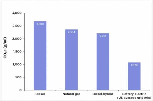
Lifecycle greenhouse gas emissions for buses using various energy sources

Most North Americans have never seen an electric bus.  Admittedly, momentum is building—some jurisdictions, notably California, have committed to buying only electric transit buses after 2029.  But such buses remain rare in Canada and the United States.  A 2018 report found that just 0.2% of US buses (two in a thousand) were electric, and that tiny percentage is rising very slowly.  New York City provides an example of the modest pace of e-bus adoption—a three-year pilot project, adding just 10 electric buses to its fleet of 5,700.

How’s this for a contrast?  Shenzhen China has 16,000 electric buses—100% of its fleet.  And that city is not unusual in China.  Overall, that country has more than 400,000 electric buses, and is adding 100,000 more each year, with numbers projected to reach one million by 2023.

The graph above shows that electric buses can cut greenhouse gas (GHG) emissions by 60 percent (1,078 grams COequivalent per mile for electric vs. 2,680 grams for diesel).  These low emission values for e-buses take into account that much of North American electricity is generated by burning coal or natural gas.  If we assume a future in which most of our electricity can come from cleaner solar and wind sources then e-buses can reduce emissions by 85 percent compared to diesel.

In addition to having most of the planet’s low-emission buses, China is also leading the world in electric car production and sales.  In 2017, China produced more than half the world’s output of electric cars.  Chinese motorists purchased 580,000 EVs in 2017 while Americans purchased about 200,000 and Canadians 15,000.  Admittedly, many of those Chinese autos are small (think Smart Cars, not Teslas), but that is rapidly changing as Chinese cars become larger and more luxurious.  Indeed, their more modest size can be seen as part of the solution, as the production of small EVs creates lower emissions than the production of large ones.

China is also leading the world in high-speed rail—passenger trains that travel 250 to 350 km/h.  China has added 30,000 kms of new high-speed rail track since 2003 and plans to add another 10,000 kms by 2025, for a total of 40,000 kms—enough to circle the planet.  (For more information on the tremendous potential of high-speed rail, see this blog post, and this one.)

Finally, and this is well known, China dominates the world in solar-panel production and solar-power generation, with production and installation rates several times those in the Americas or EU.  Moreover, China is not the only country shaming us in terms of clean energy adoption: India installed more solar power capacity than the US in 2017 and again in 2018, and far more than Canada.

The four examples above illustrate something important about the current climate crisis: solutions are thick on the ground, but we in North America are simply choosing not to adopt them.  China has made itself the world’s largest solar panel manufacturer; the US has doubled-down on coal, and Canada continues to pin its economic fortunes on the carbon-fuel sector.  China is the world’s largest EV producer; in Canada and the US the best-selling vehicle is the Ford F-150.  China has built tens-of-thousands of kms of passenger-rail track; North Americans have doubled air travel.  We’re walking past mature and promising technologies—choosing to ignore them.

Granted, China has a larger population, but we in North America are far richer.  The combined size of the Canadian and US economies is double that of China’s economy.  Canadian per-capita GDP is five times higher than that of China, and US per-capita GDP is seven times higher.  For every dollar the average Chinese person has to spend on an electric car or solar panels, Canadians and Americans have five to seven dollars.

Moreover, we’re not dependent on foreign technologies or companies.  Canadian Solar, headquartered in Guelph, is one of the six largest solar panel companies in the world.  Bombardier, headquartered in Montreal, is one of the three largest producers of high-speed rail equipment in the world—supplying China with locomotives and rolling stock.  And New Flyer Bus Company, headquartered in Winnipeg, has delivered electric buses to several US and Canadian cities.

We’re not short of high-tech corporations—many world-leading technology companies are headquartered in Canada and the US.  We’re not without technological options.  And we’re not short of funds.  We have extremely promising options and opportunities.  We’re not doomed.  But we are reckless, indulgent, short-sighted, and despicably immoral.  And by continuing to act in the ways we are we will probably manage to doom ourselves.  But that need not be the case.  Solutions abound.

Let’s not dwell on the negative.  Instead, let’s acknowledge the tremendous upside potential and technological possibilities.  Solar panels and electric trains, buses, and cars are solutions close at hand.  Within a decade, North America could host tens-of-thousands of kms of new passenger rail track, hundreds-of-thousands of electric buses, tens-of-millions of electric vehicles, and billions of new solar panels.  This wouldn’t be a complete solution to the climate crisis, but it would be a very good start.

Graph source: Jimmy O’Dea and the Union of Concerned Scientists

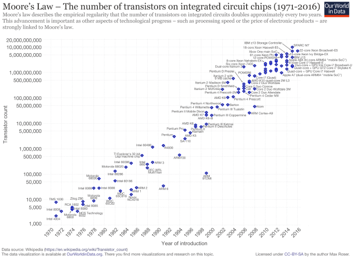
Moore’s Law and me

Graph of Transistor count and Moore's Law, 1970-2016
Transistor count and Moore's Law, 1970-2016

In 1985 I bought an Apple Macintosh computer.  It cost $3,500 ($7,000 in today’s dollars).  Soon after, Apple and other companies started selling external hard-disk drives for the Mac.  They, too, were expensive.  But in 1986 or ’87 the price for a hard disk came down to an “affordable” $2,000, and I and many Mac owners were tempted.  In the mid-1980s, a 20-megabyte (MB) hard drive cost $2,000 ($4,000 in today’s dollars).  That’s $200 per MB (in today’s dollars).

Fast forward to 2018.  On my way home last week I stopped by an office-supply store and paid $139 for a 4 terabyte (TB) hard drive.  That’s $34 per TB.

What would that 4 TB hard drive have cost me if prices had remained the same as in the 1980s?  Well, one terabyte is equal to a million megabytes.  So, that 4 TB drive contains 4 million MBs.  At $200 per MB (the 1980s price) the hard drive I picked up from Staples would have cost me $800 million dollars—not much under a billion once I paid sales taxes.  But it didn’t cost that: it was just $139.  Hard disk storage capacity has become millions of times cheaper in just over a generation.  Or, to put it another way, for the same money I can buy millions of times more storage.

I can reprise these same cost reductions, focusing on computer memory rather than hard disk capacity.  My 1979 Apple II had 16 kilobytes of memory.  My recently purchased Lenovo laptop has 16 gigabytes—a million times more.  Yet my new laptop cost a fraction of the inflation-adjusted prices of that Apple II.  Computer memory is millions of times cheaper.  The same is true of processing power—the amount of raw computation you can buy for a dollar.

The preceding trends have been understood for half a century—the basis for Moore’s Law.  Gordon Moore was a founder of Intel Corporation, one of the world’s leading computer processor and “chip” makers.  In 1965, Moore published a paper in which he observed that the number of transistors in computer chips was doubling every two years, and he predicted that this doubling would go on for some years to come.  (See this post for data on the astronomical rate of annual transistor production.)  Related to Moore’s Law is the price-performance ratio of computers.  Loosely stated, a given amount of money will buy twice as much computing power two or three years from now.

The graph above illustrates Moore’s Law and shows the transistor count for many important computer central processing units (CPUs) over the past five decades. (Here’s a link to a high-resolution version of the graph.)  Note that the graph’s vertical axis is logarithmic; what appears as a doubling is actually a far larger increase.  In the lower-left, the graph includes the CPU from my 1979 Apple II computer, the Motorola/MOS 6502.  That CPU chip contained about 3,500 transistors.  In the upper right, the graph includes the Intel i7 processor in my new laptop. That CPU contains about 2,000,000,000 transistors—roughly 500,000 times more than my Apple II.

Assuming a doubling every 2 years, in the 39 years between 1979 (my Apple II) and 2018 (My Lenovo) we should have seen 19.5 doublings in the number of transistors—about a 700,000-fold increase.  This number is close to the 500,000-fold increase calculated above by comparing the number of transistors in a 6502 chip to the number in an Intel i7 chip.  Moreover, computing power has increased even faster than the huge increases in transistor count would indicate.  Computer chips cycle faster today, and they also sport sophisticated math co-processors and graphics chips.

In terms of civilization and the future, the key questions include: can these computing-power increases continue?  Can the computers of the 2050s be hundreds-of-thousands of times more powerful than those of today?  Can we continue making transistors smaller and packing twice as many onto a chip every two years?  Can Moore’s Law continue unabated?  Probably not.  Transistors can only be made so small.  The rate of increase in computing power will slow.  We won’t see a million-fold increase in the coming 40 years like we saw in the past 40.  But does that matter?  What if the rate of increase in computing power fell by half—to a doubling every four years instead of every two?  That would mean that in 2050 our computers would still be 256 times more powerful than they are now.  And in 2054 they would be 512 times more powerful.  And in 2058, 1024 times more powerful.  What would it mean to our civilization if each of us had access to a thousand times more computing power?

One could easily add a last, pessimistic paragraph—noting the intersection between exponential increases in computing power, on the one hand, and climate change and resource limits, on the other.  But for now, let’s leave unresolved the questions raised in the preceding paragraph.  What is most important to understand is that technologies such as solar panels and massively powerful computers give us the option to move in a different direction.  But we have to choose to make changes.  And we have to act.  Our technologies are immensely powerful, but our efforts to use those technologies to avert calamity are feeble.  Our means are magnificent, but our chosen ends are ruinous.  Too often we become distracted by the novelty and power of our tools and fail to hone our skills to use those tools to build livable futures.


Through the mill: 150 years of wheat price data

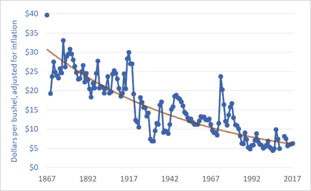
Graph of wheat price, western Canada (Sask. or Man.), farmgate, dollars per bushel, 1867–2017
Wheat price, western Canada (Sask. or Man.), farmgate, dollars per bushel, 1867–2017

The price of wheat is declining, and it has been for many years.  The same is true for the prices of other grains and oilseeds.  The graph above shows wheat prices in Canada since Confederation—over the past 150 years.  The units are dollars per bushel.  A bushel is 60 pounds (27 kilograms).  The brown line suggests a trendline.

These prices are adjusted for inflation.  The downward trend reflects the fact that wheat prices fell relative to prices for nearly all other goods and services; as time went on it took more and more bushels of wheat or other grains to buy a pair of shoes, lunch, or a movie ticket.  For example, my father bought a new, top-of-the-line pickup truck in 1976 for $6,000, equivalent to about 1,200 bushels of wheat at the time.  Today, a comparable pickup (base model) might cost the equivalent of about 4,000 bushels of wheat.  As a second example, a house in 1980 might have cost the equivalent of 20,000 bushels of wheat; today, that very same house would cost the equivalent of 60,000 bushels.

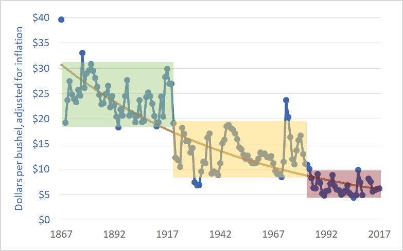
The graph below adds shaded boxes to highlight three distinct periods in Canadian wheat prices.  The period from Confederation to the end of the First World War saw prices roughly in the range of $20 to $30 per bushel (adjusted to today’s dollars).  From 1920 to the mid-’80s, prices entered a new phase, and oscillated between about $8 and $18 per bushel.  And in 1985, wheat prices entered a third phase, oscillating between $5 and $10 per bushel, more often closer to $5 than $10.  In each phase, the top of the range in a given period is roughly equal to the bottom of the range in the previous period.

Graph of wheat price, western Canada (Sask. or Man.), farmgate, dollars per bushel, 1867–2017
Wheat price, western Canada, farmgate, dollars per bushel

1985 is often cited as the beginning of the farm crisis period.  The graph above shows why the crisis began in that year.  Grain prices since the mid-’80s have been especially damaging to Canadian agriculture.  The post-1985 collapse in grain prices has had several effects:

– The expulsion of one-third of Canadian farm families in just one generation;
– The expulsion of two-thirds of young farmers (under 35 years of age) over the same period;
– A tripling of farm debt, to a record $102 billion;
– A chronic need to transfer taxpayer dollars to farmers through farm-support programs (with transfers totaling $110 billion since 1985); and
– A push toward farm giantism, with the majority of land in western Canada now operated by farms larger than 3,000 acres, and with many farms covering tens-of-thousands of acres.

As per-bushel and per-acre margins fall, the solution is to cover more acres.  The inescapable result is fewer farms and farmers.

It is impossible to delve into all the causes of the grain price decline in one blog post.  Briefly, farmers are getting less and less because others are taking more and more.  A previous blog post highlighted the widening gap between what Canadians pay for bread in the grocery store and what farmers receive for wheat at the elevator.  This widening gap is created because grain companies, railways, milling companies, other processors, and retailers are taking more and more, chocking off the flow of dollars to farmers.  This is manifest in declining prices.  Agribusiness giants are profiting by charging consumers more per loaf and paying farmers less per bushel.

Of course, grain prices are a function of domestic and international markets.  The current free trade and globalization era began in the mid-1980s.  (The Canada-US Free Trade Agreement was concluded in 1987, the North American Free Trade Agreement in 1994, and the World Trade Organization Agreement on Agriculture in 1995.)  The effect of free trade and globalization has been to plunge all the world’s farmers into a single, borderless, hyper-competitive market.  At the same time, agribusiness corporations entered a period of accelerating mergers in order to reduce the competition they faced.  As competition levels increase for farmers and decrease for agribusiness corporations it is easy to predict shifts in relative profitability.  Increased competition for farmers meant lower prices while decreased competition for agribusiness transnationals translated into higher prices and profits.

Graph sources:
– 1867–1974: Historical Statistics of Canada, eds. Leacy, Urquhart, and Buckley, 2nd ed. (Ottawa: Statistics Canada, 1983);
– 1890–1909: Wholesale Prices in Canada, 189O–19O9, ed. R. H. Coats (Ottawa: Government Printing Bureau, 1910);
– 1908–1984: Statistics Canada, Table: 32-10-0359-01 Estimated areas, yield, production, average farm price and total farm value of principal field crops (formerly CANSIM 001-0017);
– 1969–2009: Saskatchewan Agriculture and Food: Statfact, Canadian Wheat Board Final Price for Wheat, basis in store Saskatoon;
– 2012–2018: Statistics Canada, Table: 32-10-0077-01 Farm product prices, crops and livestock (formerly CANSIM 002-0043).