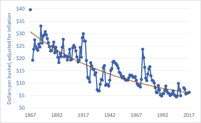
The price of wheat is declining, and it has been for many years. The same is true for the prices of other grains and oilseeds. The graph above shows wheat prices in Canada since Confederation—over the past 150 years. The units are dollars per bushel. A bushel is 60 pounds (27 kilograms). The brown line suggests a trendline.
These prices are adjusted for inflation. The downward trend reflects the fact that wheat prices fell relative to prices for nearly all other goods and services; as time went on it took more and more bushels of wheat or other grains to buy a pair of shoes, lunch, or a movie ticket. For example, my father bought a new, top-of-the-line pickup truck in 1976 for $6,000, equivalent to about 1,200 bushels of wheat at the time. Today, a comparable pickup (base model) might cost the equivalent of about 4,000 bushels of wheat. As a second example, a house in 1980 might have cost the equivalent of 20,000 bushels of wheat; today, that very same house would cost the equivalent of 60,000 bushels.
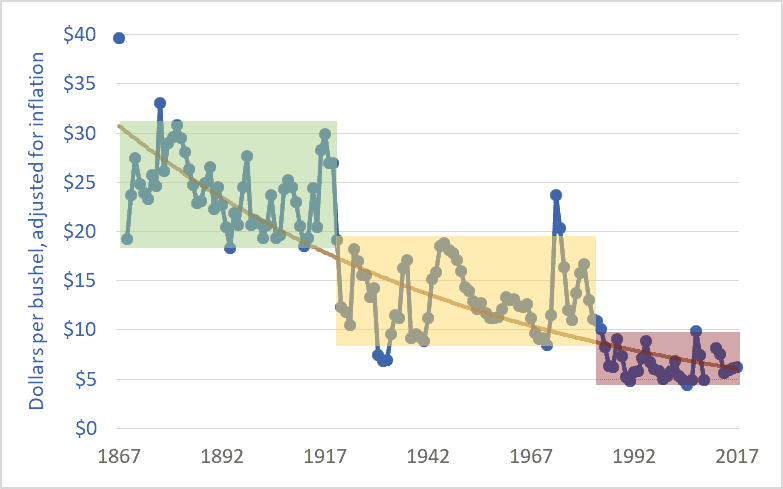
The graph below adds shaded boxes to highlight three distinct periods in Canadian wheat prices. The period from Confederation to the end of the First World War saw prices roughly in the range of $20 to $30 per bushel (adjusted to today’s dollars). From 1920 to the mid-’80s, prices entered a new phase, and oscillated between about $8 and $18 per bushel. And in 1985, wheat prices entered a third phase, oscillating between $5 and $10 per bushel, more often closer to $5 than $10. In each phase, the top of the range in a given period is roughly equal to the bottom of the range in the previous period.

1985 is often cited as the beginning of the farm crisis period. The graph above shows why the crisis began in that year. Grain prices since the mid-’80s have been especially damaging to Canadian agriculture. The post-1985 collapse in grain prices has had several effects:
– The expulsion of one-third of Canadian farm families in just one generation;
– The expulsion of two-thirds of young farmers (under 35 years of age) over the same period;
– A tripling of farm debt, to a record $102 billion;
– A chronic need to transfer taxpayer dollars to farmers through farm-support programs (with transfers totaling $110 billion since 1985); and
– A push toward farm giantism, with the majority of land in western Canada now operated by farms larger than 3,000 acres, and with many farms covering tens-of-thousands of acres.
As per-bushel and per-acre margins fall, the solution is to cover more acres. The inescapable result is fewer farms and farmers.
It is impossible to delve into all the causes of the grain price decline in one blog post. Briefly, farmers are getting less and less because others are taking more and more. A previous blog post highlighted the widening gap between what Canadians pay for bread in the grocery store and what farmers receive for wheat at the elevator. This widening gap is created because grain companies, railways, milling companies, other processors, and retailers are taking more and more, chocking off the flow of dollars to farmers. This is manifest in declining prices. Agribusiness giants are profiting by charging consumers more per loaf and paying farmers less per bushel.
Of course, grain prices are a function of domestic and international markets. The current free trade and globalization era began in the mid-1980s. (The Canada-US Free Trade Agreement was concluded in 1987, the North American Free Trade Agreement in 1994, and the World Trade Organization Agreement on Agriculture in 1995.) The effect of free trade and globalization has been to plunge all the world’s farmers into a single, borderless, hyper-competitive market. At the same time, agribusiness corporations entered a period of accelerating mergers in order to reduce the competition they faced. As competition levels increase for farmers and decrease for agribusiness corporations it is easy to predict shifts in relative profitability. Increased competition for farmers meant lower prices while decreased competition for agribusiness transnationals translated into higher prices and profits.
Graph sources:
– 1867–1974: Historical Statistics of Canada, eds. Leacy, Urquhart, and Buckley, 2nd ed. (Ottawa: Statistics Canada, 1983);
– 1890–1909: Wholesale Prices in Canada, 189O–19O9, ed. R. H. Coats (Ottawa: Government Printing Bureau, 1910);
– 1908–1984: Statistics Canada, Table: 32-10-0359-01 Estimated areas, yield, production, average farm price and total farm value of principal field crops (formerly CANSIM 001-0017);
– 1969–2009: Saskatchewan Agriculture and Food: Statfact, Canadian Wheat Board Final Price for Wheat, basis in store Saskatoon;
– 2012–2018: Statistics Canada, Table: 32-10-0077-01 Farm product prices, crops and livestock (formerly CANSIM 002-0043).


Darrin- just found your blog. Good stuff, thanks for your efforts.
I am one of those farm kids that saw the writing on the wall back in the early eighties, and left the farm for a white collar job, so I lived what you are describing.
The family farm is now part of a neighbor’s ( a nice guy) larger farm.
This post led me to try to check commodity prices here in the U.S. for similar time spans, and found that trends were either up and down, or mostly trending upwards. Is this because they are not taking inflation in to account? For the most part, the graphs I found were lousy about defining the variables, so could not tell if this was the case. So, just wondered what the Canadian wheat chart would look like without the inflation adjustments?
Did you have to download data and do the adjustments yourself?
I have not followed farm economics for decades, so don’t have a gut feel for what the current drivers are, but back in my youth, it wasn’t just the middle man grabbing a bigger share, it was also the leap in input costs that bankrupted so many.
Here in Wisconsin, low milk prices are now ending hundreds of family farms each year. This will not end well. (I’ve been saying that a lot lately).
Thanks for your efforts, and now I’ll dig through your archives.
Steve, Thanks for the kind words and questions. US and Canadian grain prices will be very similar. A graph of US wheat prices over the past 150 years would look almost identical to the one I created. 99% of the data you find online includes prices that are “nominal” (not adjusted for inflation) rather than “real” (adjusted). I found the data I needed in a half-dozen sources and then adjusted it for inflation using the consumer price index.
It would be interesting to do a long-term graph of inflation-adjusted Wisconsin milk prices. I’ll maybe put that on my list.