New report on agriculture, GHG emissions, climate change, and the farm income crisis

Cover of Tackling the Farm Crisis and the Climate Crisis by Darrin Qualman

How can we reduce agricultural greenhouse gas (GHG) emissions by half by mid-century?  And how can steps to do so help strengthen and safeguard family farms?  These two questions are the focus of a new report written by Darrin Qualman in collaboration with the National Farmers Union (NFU).  The report is entitled Tackling the Farm Crisis and the Climate Crisis: A Transformative Strategy for Canadian Farms and Food Systems and it’s available from the NFU website.

The report looks at the climate crisis and the farm income crisis.  It concludes that our farms’ high emissions and low net incomes have the same cause: overdependence on purchased inputs: fertilizers, chemicals, fuels, etc.

The report shows clearly that the GHG emissions coming out of our farm and food systems are simply the downstream byproducts of the petro-industrial inputs we push in.  “Push in millions of gallons of fossil fuels and they will come out as millions of tonnes of carbon dioxide.  Push in megatonnes of fertilizers and they will come out as megatonnes of nitrous oxide.  As we have doubled and redoubled input use, we have doubled and redoubled the GHG emissions from agriculture,” states the report.  From this novel observation comes an inescapable conclusion: “Any low-emission food system will be a low-input food system.”

The report takes a long-term view and states that “10,000 years of human history makes one thing crystal clear: farming does not create GHG emissions; petro-industrial farm inputs create GHG emissions.”  It goes on to state that “Two things happen when farmers become overdependent on  purchased inputs: emissions go up, and net incomes go down.”

The report is optimistic, however, arguing that solutions to climate problems can also be solutions to farm income problems.  On average, farmers are now retaining just five cents out of every dollar they earn.  The other 95 cents go to pay for inputs—to pay fertilizer, chemical, seed, fuel, and machinery companies and other input and service providers.  But as input use is reduced as a way to reduce emissions, margins and net incomes can go up.  Steps to deal with the climate crisis can also be steps to solve the farm income crisis.

The report explores dozens of practical on-farm measures and government policies that can, taken together, reduce agricultural emissions by half by mid-century.  The report, however, does not underestimate the scale of the task ahead.  It acknowledges that “farmers, other citizens, all sectors, and all levels of government must mobilize, with near-wartime-levels of commitment and effectiveness, to slash emissions.  ”

The report is a hopeful blueprint for the transformation of our farms and food systems.  “We are looking at a future wherein agriculture must increasingly re-merge with nature and culture to create a much more integrated, life-sustaining, and community-sustaining agroecological model of human food provision, nutrition, and health.”

Darrin Qualman worked as Director of Research for the National Farmers Union from 1996 to 2010.  He is the author of the book, published in 2019, Civilization Critical: Energy, Food, Nature, and the Future.

Click HERE to read the report.
The nitrogen crisis: the other mega-threat to the biosphere

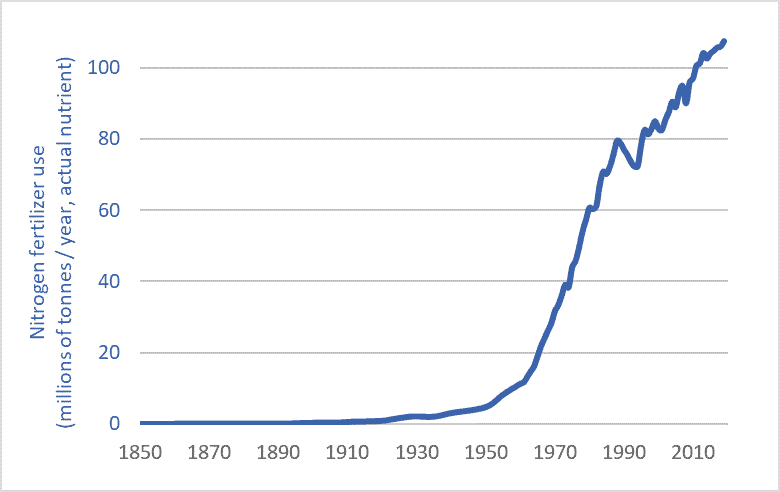
Nitrogen fertilizer use graph historic long-term 1850-2019
Global nitrogen fertilizer use, 1850-2019

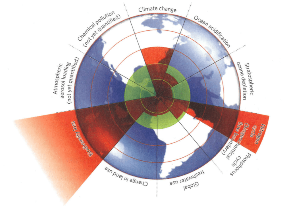
If there was no climate crisis we’d all be talking about the nitrogen crisis.  Humans have super-saturated Earth’s biosphere with reactive nitrogen, setting off a cascade of impacts from species shifts, ecosystem changes, and extinctions to ocean dead zones and algae-clogged lakes.  When scientists surveyed the many threats to the biosphere to determine a “safe operating space” for planet Earth, the areas in which they concluded that we’d pushed furthest past “planetary boundaries” were climate change, species extinction, and nitrogen flows.  The graphic below, from the journal Nature, shows the extent to which we’ve transgressed safe planetary boundaries.  Note nitrogen—the red wedge, lower right.

Planetary Boundaries Rockstrom Steffen et al

Source: Reproduced from: Johan Rockström, Will Steffen, et al., “A Safe Operating Space for Humanity,” Nature 461, no. 24 (2009).

A nitrogen primer

Nitrogen is indispensable for life—a building block of proteins and DNA.  Nitrogen (N) is one of the most important plant nutrients and the most heavily applied agricultural fertilizer.  Nitrogen  is common in the atmosphere—making up 78 percent of the air we breath.  But this atmospheric N is inert; non-reactive—it can’t be used by plants.  In contrast, reactive, plant-usable N is just one-one-thousandth as abundant in the biosphere as nitrogen gas is in the atmosphere.  For hundreds-of-millions of years, plants have struggled to find sufficient quantities of usable N.

But humans have intervened massively in the planet’s nitrogen cycles—effectively tripling the quantity of N flowing through terrestrial ecosystems—through farmland, forests, wetlands, and grasslands.  In intensively cropped areas, nitrogen flows are now ten times higher than natural levels.

Here’s the most important part: nitrogen is a fossil-fuel product.  Natural gas is the main input for making N fertilizer.  That gas provides the tremendous energy, heat, and pressure needed to split atmospheric nitrogen molecules and combine N atoms with hydrogen to make reactive compounds.  The amount of energy needed to create, transport, and apply one tonne of N fertilizer is nearly equal to two tonnes of gasoline.  Nitrogen is one way that we push fossil-fuel energy into the food system in order to push more food out.  We turn fossil fuels into fertilizer into food into us.

Humans managed to increase global food production about eight-fold during the 20th and early 21st centuries.*  There’s more tonnage coming out of our food system.  But that system is linear, so if there’s more food coming out one end, there must be more inputs being pushed into the other end—more energy, chemicals, and fertilizers.  The graph above shows how humans have increased N fertilizer inputs three-hundred-fold since 1900 and thereby helped increase human food outputs eight-fold, and human populations four-and-a-half-fold.  By pushing in a hundred million tonnes of fossil-fuel-derived fertilizer we can push out enough food to feed an additional six billion people.  (for more information on nitrogen, see chapters 3 and 28 of my recent book, Civilization Critical.)

Greenhouse gas emission from nitrogen fertilizer

The nitrogen crisis is compounded by the fact that N production and use drive climate change.  The production and use of nitrogen fertilizer is unique among human activities in that it produces large quantities of all three of the main greenhouse gases: carbon dioxide (from fertilizer-production facilities fueled by natural gas); nitrous oxide (from soils over-enriched by factory-made N); and methane (from the production and distribution of natural gas feedstocks and from the fertilizer-production process, i.e., from fracking, leaking gas pipelines, and from emissions from fertilizer plants).  A 2019 science journal article reported that actual methane emissions from fertilizer plants may be 100 times higher than previously assumed.  Emissions from N fertilizer production and use make up about half the total emissions from agriculture in many regions.  It’s fertilizer, not diesel fuel, that’s the largest emissions source on many farms.

Alternatives

We cannot continue to push massive quantities of petro-industrial N fertilizer into our farm fields and ecosystems.   Luckily there are alternatives and partial solutions.  these include:
– Getting nitrogen from natural sources: legumes and better crop rotations;
– Scaling back our demand for agricultural products: reducing food waste; rethinking biofuels; minimizing nutritionally disfigured food (sugar pops and tater tots); ceasing the attempt to globally proliferate North American levels of meat consumption;
– Funding agronomic research into low-input, organic, and agro-ecological production systems;  and
– Rationalizing and democratizing our food system—moving away from systems based on yield-, output-, trade-, and profit-maximization; corporate control; farmer elimination; and energy- and emission-maximization to new paradigms based on food sovereignty, health and nutrition-maximization, input-optimization, emissions-reduction, and long-term sustainability.

Any maximum-input, maximum-output agricultural system will  be a high-emission system.  Input reduction, however, can boost sustainability and net farm incomes while reducing energy use and emissions.  Cutting N use is key.

* The FAO records a four-fold increase in grain production between 1950 and 2018 and it is likely that production roughly doubled between 1900 and 1950, so an eight- to ten-fold increase in production is likely between 1900 and 2018.

Graph sources:
International Fertilizer Association (IFA);
– Vaclav Smil, Enriching the Earth (Cambridge, MA: The MIT Press, 2001);
– UN Food and Agriculture Organization (FAO), FAOSTAT; and
– Clark Gellings & Kelly Parmenter, “Energy Efficiency in Fertilizer Production and Use.”


Through the mill: 150 years of wheat price data

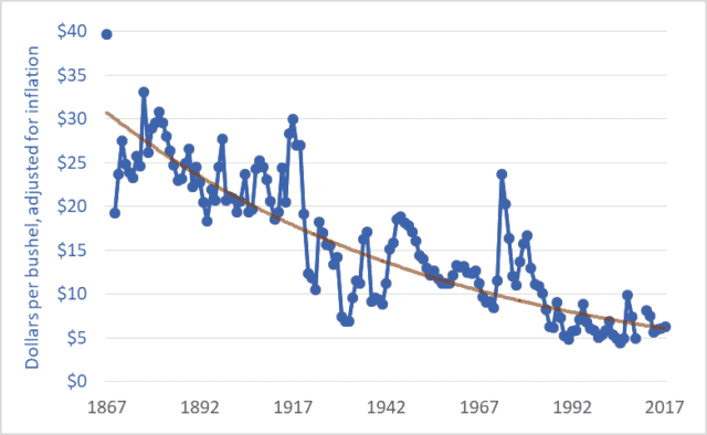
Graph of wheat price, western Canada (Sask. or Man.), farmgate, dollars per bushel, 1867–2017
Wheat price, western Canada (Sask. or Man.), farmgate, dollars per bushel, 1867–2017

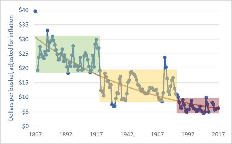
The price of wheat is declining, and it has been for many years.  The same is true for the prices of other grains and oilseeds.  The graph above shows wheat prices in Canada since Confederation—over the past 150 years.  The units are dollars per bushel.  A bushel is 60 pounds (27 kilograms).  The brown line suggests a trendline.

These prices are adjusted for inflation.  The downward trend reflects the fact that wheat prices fell relative to prices for nearly all other goods and services; as time went on it took more and more bushels of wheat or other grains to buy a pair of shoes, lunch, or a movie ticket.  For example, my father bought a new, top-of-the-line pickup truck in 1976 for $6,000, equivalent to about 1,200 bushels of wheat at the time.  Today, a comparable pickup (base model) might cost the equivalent of about 4,000 bushels of wheat.  As a second example, a house in 1980 might have cost the equivalent of 20,000 bushels of wheat; today, that very same house would cost the equivalent of 60,000 bushels.

The graph below adds shaded boxes to highlight three distinct periods in Canadian wheat prices.  The period from Confederation to the end of the First World War saw prices roughly in the range of $20 to $30 per bushel (adjusted to today’s dollars).  From 1920 to the mid-’80s, prices entered a new phase, and oscillated between about $8 and $18 per bushel.  And in 1985, wheat prices entered a third phase, oscillating between $5 and $10 per bushel, more often closer to $5 than $10.  In each phase, the top of the range in a given period is roughly equal to the bottom of the range in the previous period.

Graph of wheat price, western Canada (Sask. or Man.), farmgate, dollars per bushel, 1867–2017
Wheat price, western Canada, farmgate, dollars per bushel

1985 is often cited as the beginning of the farm crisis period.  The graph above shows why the crisis began in that year.  Grain prices since the mid-’80s have been especially damaging to Canadian agriculture.  The post-1985 collapse in grain prices has had several effects:

– The expulsion of one-third of Canadian farm families in just one generation;
– The expulsion of two-thirds of young farmers (under 35 years of age) over the same period;
– A tripling of farm debt, to a record $102 billion;
– A chronic need to transfer taxpayer dollars to farmers through farm-support programs (with transfers totaling $110 billion since 1985); and
– A push toward farm giantism, with the majority of land in western Canada now operated by farms larger than 3,000 acres, and with many farms covering tens-of-thousands of acres.

As per-bushel and per-acre margins fall, the solution is to cover more acres.  The inescapable result is fewer farms and farmers.

It is impossible to delve into all the causes of the grain price decline in one blog post.  Briefly, farmers are getting less and less because others are taking more and more.  A previous blog post highlighted the widening gap between what Canadians pay for bread in the grocery store and what farmers receive for wheat at the elevator.  This widening gap is created because grain companies, railways, milling companies, other processors, and retailers are taking more and more, chocking off the flow of dollars to farmers.  This is manifest in declining prices.  Agribusiness giants are profiting by charging consumers more per loaf and paying farmers less per bushel.

Of course, grain prices are a function of domestic and international markets.  The current free trade and globalization era began in the mid-1980s.  (The Canada-US Free Trade Agreement was concluded in 1987, the North American Free Trade Agreement in 1994, and the World Trade Organization Agreement on Agriculture in 1995.)  The effect of free trade and globalization has been to plunge all the world’s farmers into a single, borderless, hyper-competitive market.  At the same time, agribusiness corporations entered a period of accelerating mergers in order to reduce the competition they faced.  As competition levels increase for farmers and decrease for agribusiness corporations it is easy to predict shifts in relative profitability.  Increased competition for farmers meant lower prices while decreased competition for agribusiness transnationals translated into higher prices and profits.

Graph sources:
– 1867–1974: Historical Statistics of Canada, eds. Leacy, Urquhart, and Buckley, 2nd ed. (Ottawa: Statistics Canada, 1983);
– 1890–1909: Wholesale Prices in Canada, 189O–19O9, ed. R. H. Coats (Ottawa: Government Printing Bureau, 1910);
– 1908–1984: Statistics Canada, Table: 32-10-0359-01 Estimated areas, yield, production, average farm price and total farm value of principal field crops (formerly CANSIM 001-0017);
– 1969–2009: Saskatchewan Agriculture and Food: Statfact, Canadian Wheat Board Final Price for Wheat, basis in store Saskatoon;
– 2012–2018: Statistics Canada, Table: 32-10-0077-01 Farm product prices, crops and livestock (formerly CANSIM 002-0043).

The cattle crisis: 100 years of Canadian cattle prices

Graph of Canadian cattle prices, historic, 1918-2018
Canadian cattle prices at slaughter, Alberta and Ontario, 1918-2018

Earlier this month, Brazilian beef packer Marfrig Global Foods announced it is acquiring 51 percent ownership of US-based National Beef Packing for just under $1 billion (USD).  The merged entity will slaughter about 5.5 million cattle per year, making Marfrig/National the world’s fourth-largest beef packer.  (The top-three are JBS, 17.4 million per year; Tyson, 7.7 million; and Cargill, 7.6.)  To put these numbers into perspective, with the Marfrig/National merger, the largest four packing companies will together slaughter about 15 times more cattle worldwide than Canada produces in a given year.  In light of continuing consolidation in the beef sector it is worth taking a look at how cattle farmers and ranchers are fairing.

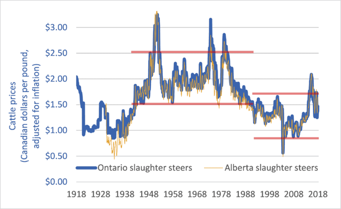
This week’s graph shows Canadian cattle prices from 1918 to 2018.  The heavy blue line shows Ontario slaughter steer prices, and is representative of Eastern Canadian cattle prices.  The narrower tan-coloured line shows Alberta slaughter steer prices, and is representative for Western Canada.  The prices are in dollars per pound and they are adjusted for inflation.

The two red lines at the centre of the graph delineate the price range from 1942 to 1989.  The red lines on the right-hand side of the graph delineate prices since 1989.  The difference between the two periods is stark.  In the 47 years before 1989, Canadian slaughter steer prices never fell below $1.50 per pound (adjusted for inflation).  In the 28 years since 1989, prices have rarely risen that high.  Price levels that used to mark the bottom of the market now mark the top.

What changed in 1989?  Several things:

1.       The arrival of US-based Cargill in Canada in that year marked the beginning of integration and consolidation of the North American continental market.  This was later followed by global integration as packers such as Brazil-based JBS set up plants in Canada and elsewhere.

2.       Packing companies became much larger but packing plants became much less numerous.  Gone were the days when two or three packing plants in a given city would compete to purchase cattle.

3.       Packer consolidation and giantism was faciliated by trade agreements and global economic integration.  It was in 1989 that Canada signed the Canada-US Free Trade Agreement (CUSTA).  A few years later Canada would sign the NAFTA, the World Trade Organization (WTO) Agreement on Agriculture, and other bilateral and multilateral “free trade” deals.

4.       Packing companies created captive supplies—feedlots full of packer-owned cattle that the company could draw from if open-market prices rose, curtailing demand for farmers’ cattle and disciplining prices.

Prices and profits are only partly determined by supply and demand.  A larger factor is market power.  It is this power that determines the allocation of profits within a supply chain.  In the late ’80s and continuing today, the power balance between packers and farmers shifted as packers merged to become giant, global corporations.  The balance shifted as packing plants became less numerous, reducing competition for farmers’ cattle.  The balance shifted still further as packers began to utilize captive supplies.  And it shifted further still as trade agreements thrust farmers in every nation into a single, hyper-competitive global market.  Because market power determines profit allocation, these shifts increased the profit share for packers and decreased the share for farmers.   The effects on cattle farmers have been devastating.  Since the latter-1980s, Canada has lost half of its cattle farmers and ranchers.

For more background and analysis, please see the 2008 report by the National Farmers Union: The Farm Crisis and the Cattle Sector: Toward a New Analysis and New Solutions.

Graph sources: numerous, including Statistics Canada CANSIM Tables 002-0043, 003-0068, 003-0084; and  Statistics Canada “Livestock and Animal Products”, Cat. No. 23-203


Earth’s dominant bird: a look at 100 years of chicken production

Graph of Chicken production, 1950-2050
Chicken meat production, global, actual and projected, 1950 to 2050

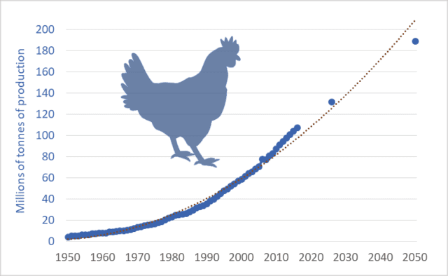
There are approximately 23 billion chickens on the planet right now.   But because the life of a meat chicken is short—less than 50 days—annual production far exceeds the number of chickens alive at any one time.  In 2016, worldwide, chicken production topped 66 billion birds.  Humans are slaughtering, processing, and consuming about 2,100 chickens per second.

We’re producing a lot of chicken meat: about 110 million tonnes per year.  And we’re producing more and more.  In 1966, global production was 10 million tonnes.  In just twelve years, by 1978, we’d managed to double production.  Fourteen years after that, 1992, we managed to double it again, to 40 million tonnes.  We doubled it again to 80 million tonnes by 2008.  And we’re on track for another doubling—a projected 160 million tonnes per year before 2040.  By mid-century, production should exceed 200 million tonnes—20 times the levels in the mid-’60s.  This week’s graph shows the steady increase in production.  Data sources are listed below.

The capacity of our petro-industrial civilization to double and redouble output is astonishing.  And there appears to be no acknowledged limit.  Most would predict that as population and income levels rise in the second half of the century—as another one or two billion people join the “global middle class”—that consumption of chicken and other meats will double again between 2050 and 2100.  Before this century ends, consumption of meat (chicken, pork, beef, lamb, farmed fish, and other meats) may approach a trillion kilograms per year.

Currently in Canada the average chicken farm produces about 325,000 birds annually.  Because these are averages, we can assume that the output of the largest operations is several times this figure.  In the US, chicken production is dominated by contracting.  Large transnationals such as Tyson Foods contract with individual growers to feed birds.  It is not unusual for a contract grower to have 6 to 12 barns on his or her farm and raise more than a million broiler chickens per year.

We’re probably making too many McNuggets.  We’re probably catching too many fish.  We’re probably feeding too many pigs.  And it is probably not a good idea to double the number of domesticated livestock on the planet—double it to 60 billion animals.  It’s probably time to rethink our food system.  

Graph sources:
FAOSTAT database
OECD-FAO, Agricultural Outlook 2017-2026
Brian Revell: One Man’s Meat … 2050?
Lester Brown: Full Planet, Empty Plates
FAO: World Agriculture Towards 2030/2050, the 2012 revision

The 100th Anniversary of high-input agriculture

Graph of tractor and horse numbers, Canada, historic, 1910 to 1980
Tractors and horses on farms in Canada, 1910 to 1980

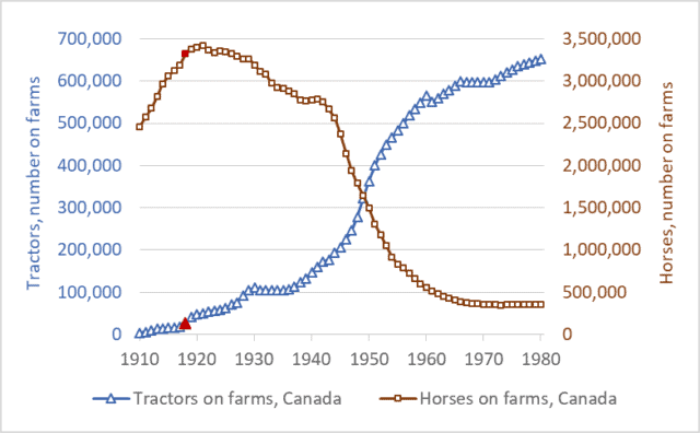
2018 marks the 100th anniversary of the beginning of input-dependent farming—the birth of what would become modern high-input agriculture.  It was in 1918 that farmers in Canada and the US began to purchase large numbers of farm tractors.  These tractors required petroleum fuels.  Those fuels became the first major farm inputs.  In the early decades of the 20th century, farmers became increasingly dependent on fossil fuels, in the middle decades most also became dependent on fertilizers, and in the latter decades they also became dependent on agricultural chemicals and high-tech, patented seeds.

This week’s graph shows tractor and horse numbers in Canada from 1910 to 1980.  On both lines, the year 1918 is highlighted in red.  Before 1918, there were few tractors in Canada.  The tractors that did exist—mostly large steam engines—were too big and expensive for most farms.  But in 1918 three developments spurred tractor proliferation: the introduction of smaller, gasoline-engine tractors (The Fordson, for example); a wartime farm-labour shortage; and a large increase in industrial production capacity.  In the final year of WWI and in the years after, tractor sales took off.  Shortly after, the number of horses on farms plateaued and began to fall.  Economists Olmstead and Rhode have produced a similar graph for the US.

It’s important to understand the long-term significance of what has unfolded since 1918.  Humans have practiced agriculture for about 10,000 years—about 100 centuries.  For 99 centuries, there were almost no farm inputs—no industrial products that farmers had to buy each spring in order to grow their crops.  Sure, before 1918, farmers bought farm implements—hoes, rakes, and sickles in the distant past, and plows and binders more recently.  And there were some fertilizer products available, such as those derived from seabird guano (manure) in the eighteenth and nineteenth centuries.  And farmers occasionally bought and sold seeds.  But for most farmers in most years before about 1918, the production of a crop did not require purchasing an array of farm inputs.  Farm chemicals did not exist, very little fertilizer was available anywhere in the world until after WWII, and farmers had little use for gasoline or diesel fuel.  Before 1918, farms were largely self-sufficient, deriving seeds from the previous years’ crop, fertility from manure and nitrogen-fixing crops, and pulling-power from horses energized by the hay and grain that grew on the farm itself.  For 99 of the 100 centuries that agriculture has existed, farms produced the animal- and crop-production inputs they needed.  Nearly everything that went into farming came out of farming.

For 99 percent of the time that agriculture has existed there were few farm inputs, no farm-input industries, and little talk of “high input costs.”  Agricultural production was low-input, low-cost, solar-powered, and low-emission.  In the most recent 100 years, however, we’ve created a new kind of agricultural system: one that is high-input, high-cost, fossil-fuelled, and high-emission.

Modern agriculture is also, admittedly, high-output.  But this last fact must be understood in context: the incredible food-output tonnage of modern agriculture is largely a reflection of the megatonnes of fertilizers, fuels, and chemicals we push into the system.  Nitrogen fertilizer illustrates this process.  To produce, transport, and apply one tonne of synthetic nitrogen fertilizer requires an amount of energy equal to almost two tonnes of gasoline.  Modern agriculture is increasingly a system for turning fossil fuel Calories into food Calories.  Food is increasingly a petroleum product.

The high-input era has not been kind to farmers.  Two-thirds of Canadian farmers have been ushered out of agriculture over the past two generations.  More troubling and more recent: the number of young farmers—those under 35—has been reduced by two-thirds since 1991.  Farm debt is at a record high: nearly $100 billion.  And about the same amount, $100 billion, has had to be transferred from taxpayers to farmers since the mid-1980s to keep the Canadian farm sector afloat.  Farmers are struggling with high costs and low margins.

This is not a simplistic indictment of “industrial agriculture.”  We’re not going back to horses.  But on the 100th anniversary of the creation of fossil-fuelled, high-input agriculture we need to think clearly and deeply about our food production future.  As our fossil-fuel supplies dwindle, as greenhouse gas levels rise, as we struggle to feed and employ billions more people, and as we struggle with many other environmental and economic problems, we will need to rethink and radically transform our food production systems.  Our current food system isn’t “normal”: it’s an anomaly—a break with the way that agriculture has operated for 99 percent of its history.  It’s time to ask hard questions and make big changes.  It’s time to question the input-maximizing production systems agribusiness corporations have created, and to explore new methods of low-input, low-energy-use, low-emission production.

Rather than maximizing input use, we need to maximize net farm incomes, maximize the number of farm families on the land, and maximize the resilience and sustainability of our food systems.

Cattle Rustling? The growing gap between cattle and beef prices

Graph of Canadian cattle prices and retail beef prices, 1995 to 2017
Retail prices of ground beef and steak compared to farmers’ prices for cattle, 1995–2017

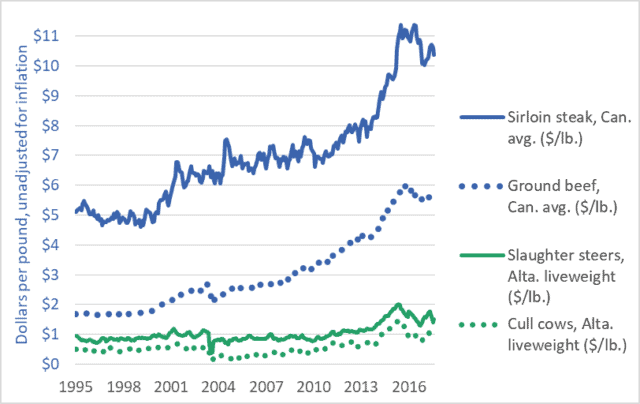
This week’s graph highlights the growing gap between what Canadians pay for beef and what farmers receive for their cattle.  The rising blue lines show grocery-store prices for steak and ground beef.  The comparatively flat green lines represent the prices farmers and feedlot operators receive for the cattle they sell to beef packers.  Steers (castrated male cattle) are more likely to be the source of steaks, while cows are primarily turned into ground beef.

The blue lines show what consumers pay; the green lines show what farmers get.  The widening gap between the blue lines and the green lines reveals the amount that packers and retailers take for themselves.

Let’s look first at the dotted lines.  The green dotted line shows the per-pound price farmers in Alberta receive for their cows.  (prices across Canada are similar.)  In the decade-and-a-half before 2010, that price averaged about 50¢.  In recent years it has averaged about $1.00.  One could say that farmers are receiving an extra 50¢ per pound for their cows.  These figures do not take into account rising costs (they are not adjusted for inflation) but we’ll leave that issue aside for now.  Note what happens to the blue dotted line: the grocery-store price of ground beef.  It more than triples, from about $1.70 per pound to about $5.50.  Farmers’ prices increased by 100%, but packers and retailers increased their take by 320%.  Farmers’ prices increased by 50¢, but packers and retailers increased their prices by nearly $4.00.

The solid green line shows the price that farmers (or feedlot operators) receive for slaughter-ready steers.  The solid blue line is a representative price for grocery-store steaks.  If we compare recent years to those before 2013, we see that steer prices have risen by perhaps 50¢ or 60¢ per pound.  Over the same period, steak prices have risen by $5.00 or $6.00.

There is little discernible connection between the prices consumers pay and the prices farmers receive.  This is true of cattle and beef, but also true of nearly every other farm-retail product pair.  For a graph comparing the prices of wheat and bread, click here.  Similar “wedge” graphs can be created for corn and cornflakes, hogs and pork chops, and many other farm-retail product pairs.

Food processors, packers, and retailers are choking off the flow of dollars to Canadian farms, with devastating effects.  The number of Canadian farms raising cattle has been cut nearly in half in a generation—from 142,000 in 1995 to less than 75,000 today.  Moreover, many of these farms reporting cattle are dairy farms (which do sell cattle for slaughter, but support themselves primarily from milk sales).  The number of farms classified as “beef cattle ranching and farming, including feedlots” stood at just 36,000 in 2016.  Farm debt is a record $100 billion.  And the number of young farmers (<35 years of age) today is just one-third the number a generation ago.

Canadians are paying many times over.  We’re paying a high price at the store.  We’re paying again through our taxes to fund farm support programs—money paid to farmers to backfill for the dollars extracted by powerful transnational packers, processors, and retailers.  And we’re paying yet again as our rural economies are hollowed out, our communities decimated, our family farms destroyed, and our nation’s capacity to sustainably produce food is eroded.

Graph sources: Statistics Canada CANSIM Tables 326-0012 and 002-0043.  

Everything must double: Economic growth to mid-century

Graph of GDP of the world's largest economies, 2016 vs 2050
Size of the world’s 17 largest economies, 2016, and projections for 2050

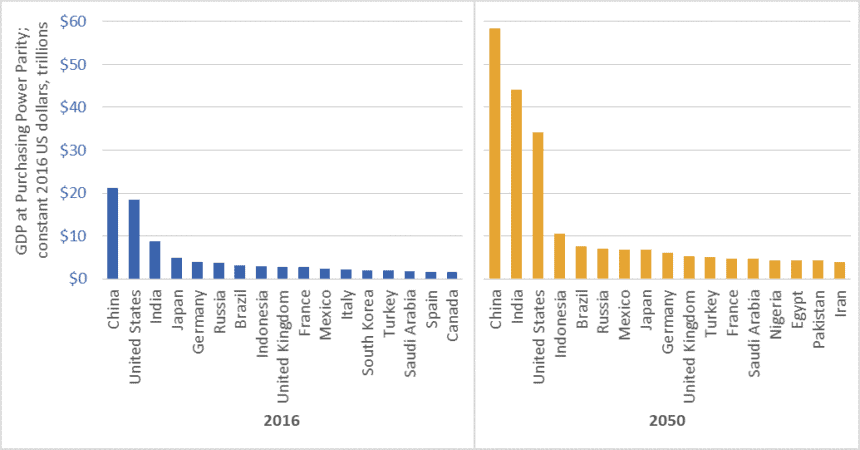
In February 2017, global accounting firm PricewaterhouseCoopers (PwC) released a report on economic growth entitled The Long View: How will the Global Economic Order Change by 2050?  The graph above is based on data from that report.  (link here)  It shows the gross domestic product (GDP) of the largest economies in the world in 2016, and projections for 2050.  The values in the graph are stated in constant (i.e., inflation adjusted) 2016 dollars.

PwC projects that China’s economy in 2050 will be larger than the combined size of the five largest economies today—a list that includes China itself, but also the US, India, Japan, and Germany.

Moreover, the expanded 2050 economies of China and India together ($102.5 trillion in GDP) will be almost as large as today’s global economy ($107 trillion).

We must not, however, simply focus on economic growth “over there.”  The US economy will nearly double in size by 2050, and Americans will continue to enjoy per-capita GDP and consumption levels that are among the highest in the world.  The size of the Canadian economy is similarly projected to nearly double.   The same is true for several EU countries, Australia, and many other “rich” nations.

Everything must double

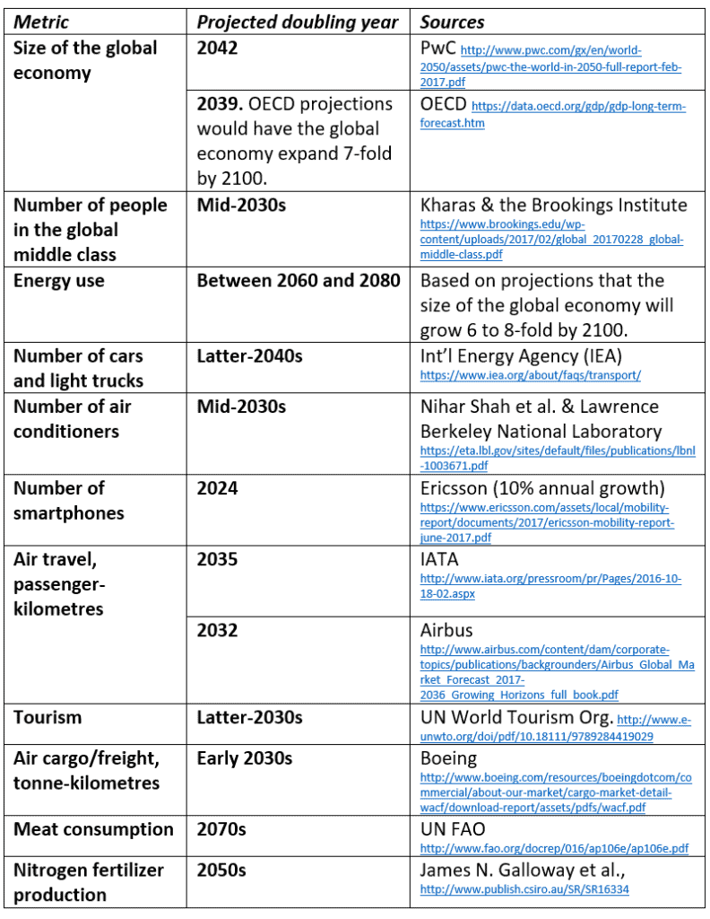
PwC’s report tells us that between now and 2050, the size of the global economy will more than double.  Other reports concur (See the OECD data here).  And this doubling of the size of the global economy is just one metric—just one aspect of the exponential growth around us.  Indeed, between now and the middle decades of this century, nearly everything is projected to double.  This table lists just a few examples.

Table of projected year of doubling for various energy, consumption, transport, and other metrics
Projected year of doubling for selected energy, consumption, and transport metrics

At least one thing, however, is supposed to fall to half

While we seem committed to doubling everything, the nations of the world have also made a commitment to cut greenhouse gas (GHG) emissions by half by the middle decades of this century.  In the lead-up to the 2015 Paris climate talks, Canada, the US, and many other nations committed to cut GHG emissions by 30 percent by 2030.  Nearly every climate scientist who has looked at carbon budgets agrees that we must cut emissions even faster.  To hold temperature increases below 2 degrees Celsius relative to pre-industrial levels, emissions must fall by half by about the 2040s, and to near-zero shortly after.

Is it rational to believe that we can double the number of cars, airline flights, air conditioners, and steak dinners and cut global GHG emissions by half?

To save the planet from climate chaos and to spare our civilization from ruin, we must—at least in the already-rich neighborhoods—end the doubling and redoubling of economic activity and consumption.  Economic growth of the magnitude projected by PwC, the OECD, and nearly every national government will make it impossible to cut emissions, curb temperature increases, and preserve advanced economies and stable societies.  As citizens of democracies, it is our responsibility to make informed, responsible choices.  We must choose policies that curb growth.

Graph source: PriceWaterhouseCoopers

Falling per-capita farmland raises critical questions

Graph of per capita farmland arable land, global, 1950 to 2050
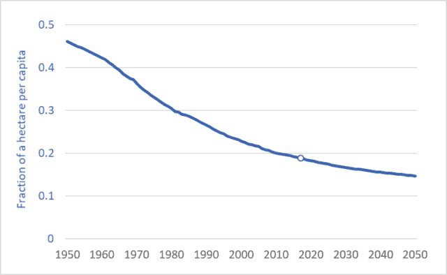
Per-capita arable land (cropland), world average, 1950 to 2050.

As populations continue rising, per-capita farmland area is falling.  In 1950, for each person in the world (about 2.5 billion back then) there was, on average, 0.46 hectares of cropland (“arable” land).  That is an area roughly equal to the in-bounds playing area of a US football field.  Today, per-capita cropland area is just 0.19 hectares.  By 2050, it will be lower still: 0.15 hectares—one-third the area in 1950.  We’ll soon be down to just a third of a football field each.

The graph above shows the average per-capita cropland area from 1950 to 2050.  The units are fractions of a hectare.

Humanity’s in a bind.  We’re becoming more numerous.  The UN predicts a global population of 9.8 billion by mid-century.  Moreover, we’re becoming richer.  Projected rates of economic growth—3 percent compounded annually, according to the World Bank—will cause the size of the global economy to nearly triple by 2050.  That enlarged, enriched population will want to consume more food.  It will want to consume more of its food in the form of meat rather than vegetables or grains.  It will be more prone to overeating and more demanding of processed foods and junk food.  And it will waste more of its food, because comfortable, well-fed people do that.  In addition, more food will be diverted to energy and fuel uses, including biofuels for air travel and ocean shipping.  Based on these factors, the UN projects that food production in 2050 will have to be 70 percent higher than in 2005 (see here or here).

Here’s the bind.  In order to deal with climate change, the world’s governments have committed to reducing GHG emissions by 30 percent by 2030—just over 12 years from now.  And reductions of 50 to 80 percent are needed by 2050.  How do we expand food supplies and reduce emissions?  Bringing new land into production (Amazon rainforest, for example) emits huge plumes of GHGs as soil carbon is released by tillage.  If we want to reduce emissions we cannot afford to continue releasing carbon stored in forests or grasslands.  So the alternative is to intensify production—produce more on the land we already have.  This usually requires more fertilizer.  But the most used and most critical fertilizer, nitrogen, is made from natural gas and is a major source of GHG emissions.  Globally, nitrogen (N) fertilizer use has doubled since the 1970s (see blog post here); Canadian farmers have doubled their N use since the 1990s.  Our commitments to downward-trending GHG emissions is already in conflict with upward trending nitrogen fertilizer usage.

In the face of monumental problems such as these it is best to just spend some time mulling our predicament.  We must resist the “rush to solutions.”  For now, let’s just consider some questions:
– Can we continue to waste 20 to 40 percent of our food?
– Can we burn food in cars and airliners and cruise ships?
– Should we increase livestock production by two-thirds in the next three decades (as the UN predicts), knowing that many livestock production systems inefficiently turn 5 to 10 Calories worth of grain into one Calorie of meat?
– Should we continue to make bad food out of good—producing millions of tonnes of nutritionally disfigured foods such as soft drinks, cocoa puffs, and potato chips?  (One quarter of US Calories now come from junk food.  See here.)
– Should we continue to foster a food industry that promotes over-eating and resulting health problems?

As our per-capita land base contracts, and as our atmospheric emission-space fills, can we afford these extravagances?  …these follies?  An adequate response to these problem will require re-imagining and restructuring of our food system–fundamental changes to food production and consumption.

Graph sources: FAOSTAT and the UN Population Division 


Earning negative returns: Energy use in modern food systems

Graph of energy use in the U.S. food system
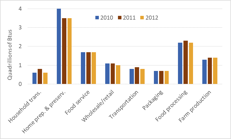
Energy use in the U.S. food system, 2010, 2011, and 2012

Humans eat food and food gives us energy.  Some humans use some of that energy to move their bodies and limbs to produce more food.  Our great-grandparents ate hearty breakfasts and used some of that food energy to power their work in fields or gardens.  Here’s the important part: until the fossil fuel age, our food production work had to produce more energy than it required.  We had to achieve positive returns on our energy investments.  If we expended 1 Calorie of energy working in the field, the resulting food had to yield 3, 4, 5, or more Calories, or else we and those who depended upon us would starve.

Pioneering research by David and Marcia Pimentel and others show that traditional food systems yielded positive returns.  The Pimentels’ book, Food, Energy, and Society, documents that for every unit of energy that a traditional farmer (i.e., no fossil fuels) put into cultivating and harvesting corn or other crops, that farmer received back 5 to 10 units.  For almost the entire 10,000-year history of agriculture, food systems were net energy producers.  Food powered  societies and civilizations.

In the 20th century we did something unprecedented: we turned human food systems from energy sources into energy sinks.  Today, for every Calorie consumed in North America, 13.3 Calories (mostly in the form of fossil fuels) have been expended.  This calculation includes all energy use in the food system: farm production, transport, processing, packaging, retailing, in-home food preservation and cooking, energy use in restaurants, etc.  It also takes into account the fact that 30 to 40 percent of all food produced is thrown away.

Traditional food systems generated an energy return on investment (EROI) of between 5:1 and 10:1.  Because our modern food system returns one unit of energy for every 13.3 invested, the EROI works out to just 0.08:1.*

The graph above shows energy use in the US food system in the years 2010, 2011, and 2012.  The data is from a recent report published by the USDA.  It shows very high levels of energy use throughout the entire food system.  Perhaps surprising, aggregate food-related energy use in US homes—running refrigerators, powering ovens, washing dishes—far exceeds aggregate energy use on US farms.  Similarly, energy use in food services (food served in restaurants, hospitals, prisons, care homes, etc.) also exceeds energy use on farms.  This data shows that the entire food system is very energy costly.  As we’re forced to curtail fossil fuel use we will be forced to dramatically transform all parts of our food systems.

* This comparison does not take into account the firewood used to cook meals in traditional systems.  But even taking that into account we still find that traditional systems have EROI values that were (and are) large multiples of the EROI values for fossil-fueled systems.

Graph source: Canning, Rehkamp, Waters, and Etemadnia, The Role of Fossil Fuels in the U.S. Food System and the American Diet (USDA, 2017)