Greta vs. growth

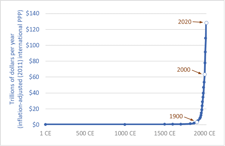
Graph of the size of the global economy (Gross World Product) historic
The size of the global economy (Gross World Product) over the long term, 1 CE – 2020 CE

“People are suffering.  People are dying.  Entire ecosystems are collapsing.  We are in the beginning of a mass extinction, and all you can talk about is money and fairy tales of eternal economic growth.  How dare you!”  So spake Greta Thunberg at the United Nations on September 23rd, 2019.

Thunberg, a sixteen-year-old without a university education, has had the insight, clarity, and courage to say what ten-billion-dollars worth of Ph.D. economists haven’t: that continued economic growth is, at best, unsustainable and probably much worse: a malignant illusion driving us to destroy our biosphere, civilization, and future.  The project of making the current global economy four or eight times larger is a suicide pact.

The graph above places our 21st century economy in its long-term context.  It shows the size of the global economy (Gross World Product) from 1 CE to 2020.  The units are trillions of US/international dollars adjusted for inflation (constant 2011 dollars).  The main source is the World Bank, with historical data from Angus Maddison.  (Pre-20th century values are, by necessity, estimates by Maddison.)

The years 1900, 2000, and 2020 are highlighted.  Sometime in 2020 the size of the global economy will surpass 127 trillion dollars.  When it does, it will be twice as large as it was in 2000.  The economy will have doubled in size in just 20 years.  This shouldn’t be a surprise.  Sustained growth rates of 3.5 percent leads to a doubling every 20 years.  (Recall the Rule of 70.)

Going forward, if we maintain current rates of growth—three to four percent annually—the economy will be twice as large again by 2040 or soon after—making it four times larger than in 2000.  Earth’s atmosphere, oceans, land, and biosphere will be hosting four 2000-sized economies.

And by 2060 or 2070, another doubling will bring the global economy to eight times its 2000 level.  And there’ll still be more than enough time left in this century to double it again—at least a 16-fold increase in size in a single century, if we stay the course.  If we accomplish this, we will be reprising the 18-fold increase seen during the 20th century.

Of course, we won’t do this—we won’t make the global economy 8 or 16 times larger.  Within a generation or two nearly everyone on the planet will be living in a post-growth economy: either because we’ve had the wisdom to end runaway exponential growth and put the biosphere first, or because we have not.

The end of growth, inescapable in the medium term, will bring numerous problems, such as how will we deal with the equity claims of the poor if we can no longer rely on the convenient fictions of “a rising tide raises all boats” and “anyone (everyone?) can grow up to be rich.”  While the end of growth must come for nearly all within a few decades, it must come first for those of us who are richest, so that growth can continue in places where people are poorer.  Those of us who enjoy jet vacations need to step off the growth escalator first so that growth can continue for others and deliver to them running water and refrigerators.  The end of growth casts into sharp relief a series of moral problems.

But the end of growth will also solve many problems.  We will be forced to take less of our economy’s productivity and bounty in the form of consumer products and more in the form of free time and low-emission leisure—more time with family, more time with friends drinking coffee or wine, more time with culture and nature; more discussion, poetry, romance, literature, and contemplation.  Most of the people in the fast-expanding (-metasticizing?) global middle class are living high-stress, low-quality, time-impoverished lives.  Stepping off the growth escalator can be part of a larger civilizational, cultural, and spiritual shift in which we rediscover meaning and purpose beyond getting and spending.

Thunberg is neither sage nor prophet.  And one need be neither to see what is absolutely, inescapably obvious: growth must and will soon end.  But we have a choice: We can deny the fact of growth’s imminent end and continue in the fairy tale and massively deplete and damage the planet in a last frenzied attempt to squeeze out one or two more doublings, or we can be as mature as a sixteen-year-old, admit the obvious, get on with the needed changes, and reap the benefits of slower, saner, more sustainable, more enjoyable lives.

Sources for graph:
– 
World Bank, Databank website: “GDP, PPP (constant 2011 international $)”
– 
Angus Maddison, The World Economy, Volume 1: A Millennial Perspective (Paris: OECD, 2001); Angus Maddison, Contours of the World Economy, 1–2030 AD: Essays in Macro-Economic History (Oxford: Oxford University Press, 2007)


Another trillion tonnes: 250 years of global material use data

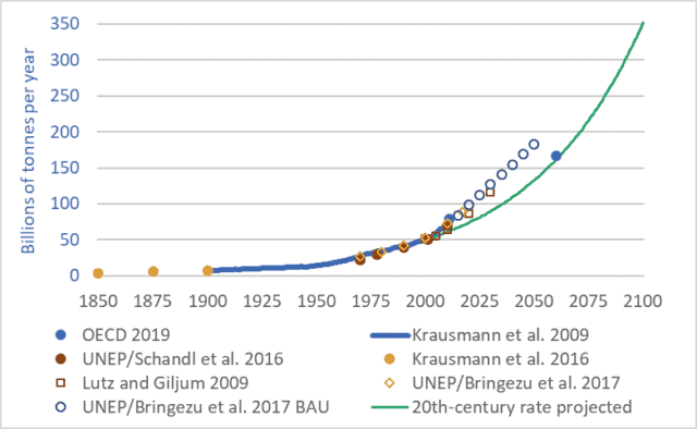
Graph of Global materials use 1850-2100
Global materials use, 1850-2100

Want to understand your society and economy and the fate of petro-industrial civilization?  If so, don’t “follow the money.”  The stock market casino, quantitative easing, derivatives and other “financial innovations,” and the trillions of e-dollars that flit through the global monetary system each day obscure the real economy—the production and destruction of actual wealth: mining, farming, processing, transport, manufacturing, consumption, disposal.  To understand where we are and where we may be going, we must follow more tangible flows—things that are real.  We must follow the oil, coal, steel, concrete, grain, copper, fertilizers, salt, gravel, and other materials.

Our cars, homes, phones, foods, fuels, clothes, and all the other products we consume or aspire to are made out of stuff—out of materials, out of wood, iron, cotton, etc.   And our economies consume enormous quantities of those materials—tens-of-billions of tonnes per year.

The graph above shows 250 years of actual and projected material flows through our global economy.  The graph may initially appear complicated, because it brings together seven different sources and datasets and includes a projection to the year 2100.  But the details of the graph aren’t important.  What is important is the overall shape: the ever-steepening upward trendline—the exponential growth.

In 1900, global material flows totalled approximately 7 billion tonnes.  The technical term for these material flows is “utilized materials”—the stuff we dig out of mines, pump up from oil or natural gas wells, cut down in forests, grow on farms, catch from the sea, dig out of quarries, and otherwise appropriate for human uses.  These tonnages do not include water, nor do they include unused overburden, but they do include mine tailings, though this last category adds just a few percent to the total.

Between 1900 and 2000, global material tonnage increased sevenfold—to approximately 49 billion tonnes (Krausman et al. 2009).  Tonnage rose to approx. 70 billion tonnes by 2010 (UNEP/Schandl 2016), and to approx. 90 billion tonnes by 2018 (UNEP/Bringezu 2018).  At the heart of our petro-industrial consumerist civilization is a network of globe-spanning conveyors that, each second, extract and propel nearly 3,000 tonnes of materials from Earth’s surface and subsurface to factories, cities, shops, and homes, and eventually on to landfills, rivers and oceans, and the atmosphere.  At a rate of a quarter-billion tonnes per day we’re turning the Earth and biosphere into cities, homes, products, indulgences, and fleeting satisfactions; and emissions, by-products, toxins, and garbage.

And these extraction, consumption, and disposal rates are projected to continue rising—to double every 30 to 40 years (Lutz and Giljum 2009).  Just as we increased material use sevenfold during the 20th century we’re on track to multiply it sevenfold during the 21st.  If we maintain the “normal” economic growth rates of the 20th century through the 21st we will almost certainly increase the volume and mass of our extraction, production, and disposal sevenfold by 2100.

But 2100 is a long way away.  Anything could happen by then.  Granted.  So let’s leave aside the long-term and look only at the coming decade.  Material throughput now totals about 90 billion tonnes per year, and is projected to rise to about 120 billion tonnes per year over the coming decade.  For ease of math, let’s say that the average over the coming decade will be 100 billion tonnes per year.  That means that between 2019 and 2029 we will extract from within the Earth and from the biosphere one trillion tonnes of materials: coal, oil, wood, fish, nickel, aluminum, chromium, uranium, etc.  …one trillion tonnes.  And we’ll send most of that trillion tonnes on into disposal in the ground, air, or water—into landfills, skyfills, and seafills.  In the coming decade, when you hear ever-more-frequent reports of the oceans filling with plastic and the atmosphere filling with carbon, think of that trillion tonnes.

Postscript: “dematerialization”

At conferences and in the media there’s a lot of talk of “dematerialization,” and its cousin “decarbonization.”  The idea is this: creating a dollar of economic activity used to require X units of energy or materials, but now, in countries such as Canada and the United States, creating a dollar of economic activity requires only two-thirds-X units.  Pundits and officials would have us believe that, because efficiency is increasing and less material and energy are needed per dollar, the economy is being “dematerialized.”  They attempt to show that the economy can grow and grow but we need not use more materials or energy.  Instead of consuming heavy steel cars, we will consume apps, massages, and manicures.  But this argument is wrong.  Global material and energy use increased manyfold during the 20th century.  The increases continue.  A business-as-usual scenario will see energy and materials use double every 30 to 40 years.  And just because the sizes of our economies, measured in abstract currencies, are growing faster, this does not change the fact that our use of energy and materials is growing.  “Dematerialization” has no useful meaning in a global economy in which we are using 90 billion tonnes of materials per year and projecting the use of 180 billion tonnes by 2050.  Our rate of extraction and consumption of materials is rising; the fact that the volume of dollar flows is rising faster is merely a distraction.

Sources for material flow tonnage:

Fridolin Krausmann et al., “Growth in Global Materials Use, GDP, and Population During the 20th Century,” Ecological Economics 68, no. 10 (2009).

Christian Lutz and Stefan Giljum, “Global Resource Use in a Business-as-Usual World: Updated Results from the GINFORS Model,” in Sustainable Growth and Resource Productivity: Economic and Global Policy Issues, ed. Bleischwitz et al. (Sheffield, UK: Greenleaf Publishing, 2009).

Stefan Giljum et al., Sustainable Europe Research Institute (SERI), “Resource Efficiency for Sustainable Growth: Global Trends and European Policy Scenarios,” background paper, delivered Sept. 10, 2009, in Manila, Philippines.

Julia Steinberger et al., “Global Patterns of Materials Use: A Socioeconomic and Geophysical Analysis,” Ecological Economics 69, no. 5 (2010).

UN Environmental Programme (UNEP) and H. Schandl et al., Global Material Flows and Resource Productivity: An Assessment Study of the UNEP International Resource Panel (Paris: UNEP, 2016).

Krausmann et al., “Long-term Trends in Global Material and Energy Use,” in Social Ecology: Society-Nature Relations across Time and Space, ed. Haberl et al. (Switzerland: Springer, 2016).

United Nations Environment Programme (UNEP), International Resource Panel, and Stefan Bringezu et al., Assessing Global Resource Use: A Systems Approach to Resource Efficiency and Pollution Reduction (Nairobi: UNEP, 2017).

Organization for Economic Cooperation and Development (OECD), Global Material Resources Outlook to 2060: Economic Drivers and Environmental Consequences (Paris: OECD Publishing, 2019)

Civilization as asteroid: humans, livestock, and extinctions

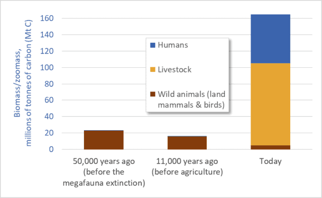
Graph of biomass of humans, livestock, and wild animals
Mass of humans, livestock, and wild animals (terrestrial mammals and birds)

Humans and our livestock now make up 97 percent of all animals on land.  Wild animals (mammals and birds) have been reduced to a mere remnant: just 3 percent.  This is based on mass.  Humans and our domesticated animals outweigh all terrestrial wild mammals and birds 32-to-1.

To clarify, if we add up the weights of all the people, cows, sheep, pigs, horses, dogs, chickens, turkeys, etc., that total is 32 times greater than the weight of all the wild terrestrial mammals and birds: all the elephants, mice, kangaroos, lions, raccoons, bats, bears, deer, wolves, moose, chickadees, herons, eagles, etc.  A specific example is illuminating: the biomass of chickens is more than double the total mass of all other birds combined.

Before the advent of agriculture and human civilizations, however, the opposite was the case: wild animals and birds dominated, and their numbers and mass were several times greater than their numbers and mass today. Before the advent of agriculture, about 11,000 years ago, humans made up just a tiny fraction of animal biomass, and domesticated livestock did not exist.  The current situation—the domination of the Earth by humans and our food animals—is a relatively recent development.

The preceding observations are based on a May 2018 report by Yinon Bar-On, Rob Phillips, and Ron Milo published in the academic journal Proceedings of the National Academy of Sciences.  Bar-On and his coauthors use a variety of sources to construct a “census of the biomass of Earth”; they estimate the mass of all the plants, animals, insects, bacteria, and other living things on our planet.

The graph above is based on data from that report (supplemented with estimates based on work by Vaclav Smil).  The graph shows the mass of humans, our domesticated livestock, and “wild animals”: terrestrial mammals and birds.  The units are millions of tonnes of carbon.*  Three time periods are listed.  The first, 50,000 years ago, is the time before the Quaternary Megafauna Extinction.  The Megafauna Extinction was a period when Homo sapiens radiated outward into Eurasia, Australia, and the Americas and contributed to the extinction of about half the planet’s large animal species (>44 kgs).  (Climate change also played a role in that extinction.)  In the middle of the graph we see the period around 11,000 years ago—before humans began practicing agriculture.  At the right-hand side we see the situation today.  Note how the first two periods are dominated by wild animals.  The mass of humans in those periods is so small that the blue bar representing human biomass is not even visible in the graph.**

This graph highlights three points:
1. wild animal numbers and biomass have been catastrophically reduced, especially over the past 11,000 years;
2. human numbers and livestock numbers have skyrocketed, to unnatural, abnormal levels; and
3. The downward trendline for wild animals visible in this graph is gravely concerning; this graph suggests accelerating extinctions.

Indeed, we are today well into the fastest extinction event in the past 65 million years.  According to the 2005 Millennium Ecosystem Assessment “the rate of known extinctions of species in the past century is roughly 50–500 times greater than the extinction rate calculated from the fossil record….”

The extinction rate that humans are now causing has not been seen since the Cretaceous–Paleogene extinction event 65 million years ago—the asteroid-impact-triggered extinction that wiped out the dinosaurs.  Unless we reduce the scale and impacts of human societies and economies, and unless we more equitably share the Earth with wild species, we will enter fully a major global extinction event—only the sixth in 500 million years.  To the other species of the Earth, and to the fossil record, human impacts increasingly resemble an asteroid impact.

In addition to the rapid decline in the mass and number of wild animals it is also worth contemplating the converse: the huge increase in human and livestock biomass.  Above, I called this increase “unnatural,” and I did so advisedly.  The mass of humans and our food animals is now 7 times larger than the mass of animals on Earth 11,000 or 50,000 years ago—7 times larger than what is normal or natural.  For millions of years the Earth sustained a certain range of animal biomass; in recent millennia humans have multiplied that mass roughly sevenfold.

How?  Fossil fuels.  Via fertilizers, petro-chemical pesticides, and other inputs we are pushing hundreds of millions of tonnes of fossil fuels into our food system, and thereby pushing out billions of tonnes of additional food and livestock feed.  We are turning fossil fuel Calories from the ground into food Calories on our plates and in livestock feed-troughs.   For example, huge amounts of fossil-fuel energy go into growing the corn and soybeans that are the feedstocks for the tens-of-billions of livestock animals that populate the planet.

Dr. Anthony Barnosky has studied human-induced extinctions and the growing dominance of humans and their livestock.  In a 2008 journal article he writes that “as soon as we began to augment the global energy budget, megafauna biomass skyrocketed, such that we are orders of magnitude above the normal baseline today.”  According to Barnosky “the normal biomass baseline was exceeded only after the Industrial Revolution” and this indicates that “the current abnormally high level of megafauna biomass is sustained solely by fossil fuels.”

Only a limited number of animals can be fed from leaves and grass energized by current sunshine.  But by tapping a vast reservoir of fossil sunshine we’ve multiplied the number of animals that can be fed.  We and our livestock are petroleum products.

There is no simple list of solutions to mega-problems like accelerating extinctions, fossil-fuel over-dependence, and human and livestock overpopulation.  But certain common sense solutions seem to present themselves.  I’ll suggest just one: we need to eat less meat and fewer dairy products and we need to reduce the mass and number of livestock on Earth.  Who can look at the graph above and come to any other conclusion?  We need not eliminate meat or dairy products (grazing animals are integral parts of many ecosystems) but we certainly need to cut the number of livestock animals by half or more.  Most importantly, we must not try to proliferate the Big Mac model of meat consumption to 8 or 9 or 10 billion people.  The graph above suggests a stark choice: cut the number of livestock animals, or preside over the demise of most of the Earth’s wild species.


* Using carbon content allows us to compare the mass of plants, animals, bacteria, viruses, etc.  Very roughly, humans and other animals are about half to two-thirds water.  The remaining “dry mass” is about 50 percent carbon.  Thus, to convert from tonnes of carbon to dry mass, a good approximation is to multiply by 2.

** There is significant uncertainty regarding animal biomass in the present, and much more so in the past.  Thus, the biomass values for wild animals in the graph must be considered as representing a range of possible values.  That said, the overall picture revealed in the graph is not subject to any uncertainty.  The overall conclusions are robust: the mass of humans and our livestock today is several times larger than wild animal biomass today or in the past; and wild animal biomass today is a fraction of its pre-agricultural value.

Graph sources:
– Yinon M. Bar-On, Rob Phillips, and Ron Milo, “The Biomass Distribution on Earth,” Proceedings of the National Academy of Sciences, May 17, 2018.
– Anthony Barnosky, “Megafauna Biomass Tradeoff as a Driver of Quaternary and Future Extinctions,” Proceedings of the National Academy of Sciences 105 (August 2008).
– Vaclav Smil, Harvesting the Biosphere: What We Have Taken from Nature (Cambridge, MA: MIT Press, 2013).

The 100th Anniversary of high-input agriculture

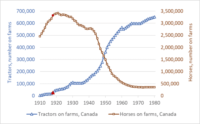
Graph of tractor and horse numbers, Canada, historic, 1910 to 1980
Tractors and horses on farms in Canada, 1910 to 1980

2018 marks the 100th anniversary of the beginning of input-dependent farming—the birth of what would become modern high-input agriculture.  It was in 1918 that farmers in Canada and the US began to purchase large numbers of farm tractors.  These tractors required petroleum fuels.  Those fuels became the first major farm inputs.  In the early decades of the 20th century, farmers became increasingly dependent on fossil fuels, in the middle decades most also became dependent on fertilizers, and in the latter decades they also became dependent on agricultural chemicals and high-tech, patented seeds.

This week’s graph shows tractor and horse numbers in Canada from 1910 to 1980.  On both lines, the year 1918 is highlighted in red.  Before 1918, there were few tractors in Canada.  The tractors that did exist—mostly large steam engines—were too big and expensive for most farms.  But in 1918 three developments spurred tractor proliferation: the introduction of smaller, gasoline-engine tractors (The Fordson, for example); a wartime farm-labour shortage; and a large increase in industrial production capacity.  In the final year of WWI and in the years after, tractor sales took off.  Shortly after, the number of horses on farms plateaued and began to fall.  Economists Olmstead and Rhode have produced a similar graph for the US.

It’s important to understand the long-term significance of what has unfolded since 1918.  Humans have practiced agriculture for about 10,000 years—about 100 centuries.  For 99 centuries, there were almost no farm inputs—no industrial products that farmers had to buy each spring in order to grow their crops.  Sure, before 1918, farmers bought farm implements—hoes, rakes, and sickles in the distant past, and plows and binders more recently.  And there were some fertilizer products available, such as those derived from seabird guano (manure) in the eighteenth and nineteenth centuries.  And farmers occasionally bought and sold seeds.  But for most farmers in most years before about 1918, the production of a crop did not require purchasing an array of farm inputs.  Farm chemicals did not exist, very little fertilizer was available anywhere in the world until after WWII, and farmers had little use for gasoline or diesel fuel.  Before 1918, farms were largely self-sufficient, deriving seeds from the previous years’ crop, fertility from manure and nitrogen-fixing crops, and pulling-power from horses energized by the hay and grain that grew on the farm itself.  For 99 of the 100 centuries that agriculture has existed, farms produced the animal- and crop-production inputs they needed.  Nearly everything that went into farming came out of farming.

For 99 percent of the time that agriculture has existed there were few farm inputs, no farm-input industries, and little talk of “high input costs.”  Agricultural production was low-input, low-cost, solar-powered, and low-emission.  In the most recent 100 years, however, we’ve created a new kind of agricultural system: one that is high-input, high-cost, fossil-fuelled, and high-emission.

Modern agriculture is also, admittedly, high-output.  But this last fact must be understood in context: the incredible food-output tonnage of modern agriculture is largely a reflection of the megatonnes of fertilizers, fuels, and chemicals we push into the system.  Nitrogen fertilizer illustrates this process.  To produce, transport, and apply one tonne of synthetic nitrogen fertilizer requires an amount of energy equal to almost two tonnes of gasoline.  Modern agriculture is increasingly a system for turning fossil fuel Calories into food Calories.  Food is increasingly a petroleum product.

The high-input era has not been kind to farmers.  Two-thirds of Canadian farmers have been ushered out of agriculture over the past two generations.  More troubling and more recent: the number of young farmers—those under 35—has been reduced by two-thirds since 1991.  Farm debt is at a record high: nearly $100 billion.  And about the same amount, $100 billion, has had to be transferred from taxpayers to farmers since the mid-1980s to keep the Canadian farm sector afloat.  Farmers are struggling with high costs and low margins.

This is not a simplistic indictment of “industrial agriculture.”  We’re not going back to horses.  But on the 100th anniversary of the creation of fossil-fuelled, high-input agriculture we need to think clearly and deeply about our food production future.  As our fossil-fuel supplies dwindle, as greenhouse gas levels rise, as we struggle to feed and employ billions more people, and as we struggle with many other environmental and economic problems, we will need to rethink and radically transform our food production systems.  Our current food system isn’t “normal”: it’s an anomaly—a break with the way that agriculture has operated for 99 percent of its history.  It’s time to ask hard questions and make big changes.  It’s time to question the input-maximizing production systems agribusiness corporations have created, and to explore new methods of low-input, low-energy-use, low-emission production.

Rather than maximizing input use, we need to maximize net farm incomes, maximize the number of farm families on the land, and maximize the resilience and sustainability of our food systems.

A critically important solution to our climate crisis (and other crises)

Reconstructed wreckage of TWA Flight 800
US National Transportation Safety Board (NTSB) reconstruction of wreckage from TWA Flight 800

Ronald Wright’s A Short History of Progress is available as a book and as a five-part audio series—the 2004 CBC Massey Lectures.  (Listen here.)  In both its written and oral forms, A Short History of Progress is an accessible, eye-opening tour of humanity’s long historic journey—a look at the big picture and the long term.  It is aphoristic and packed with insights.  But one idea stands out.  Wright gets at this important idea by using the analogy of plane crashes.

Air travel today is very safe.  Mile for mile, your chances of being killed or injured while traveling on a commercial jetliner are about one one-hundredth your chances of suffering the same fate in your own car.  In 2016, zero people died in crashes of a US-based airlines operating anywhere in the world—the seventh year in a row that this was true (source here).

There’s a reason that airliners have become so safe: after every crash, well-resourced teams of highly-trained aviation experts are tasked with determining why a crash occurred, and once the cause is known the entire global aviation system implements changes to ensure that no plane in the future crashes for the same reasons.

Government agencies and airlines often expend enormous efforts to determine the cause of a crash.  The photograph above is of the reconstructed wreckage of TWA Flight 800, a Boeing 747 that crashed in 1996 after its fuel tank exploded, splitting the plane apart just ahead of the wings.  The plane crashed into the ocean off the coast of New York.  All 230 people aboard died.

The debris field covered several square miles.  In a massive effort, approximately 95 percent of the plane’s wreckage was salvaged from the sea.  The plane was painstakingly reconstructed.  And using the reconstructed plane as well as the flight data and cockpit voice recorders, the cause of the failure was traced back to a short circuit in wiring connected to the “fuel quantity indication system” in the centre fuel tank.  As a result of this investigation, changes were made to planes around the world to ensure that no similar crashes would occur.  As a result of crash investigations around the world, airlines and aircraft makers have made thousands of changes to airplane construction, crew training, air traffic control, airport security, airline maintenance, and operating procedures.  The results, as noted above, have been so successful that some years now pass without, for instance, a single fatality on a US airline.

Ronald Wright argues that the ruins and records of fallen civilizations can be investigated like airplane crash sites, and we can use the lessons we learn to make changes that can safeguard our current global civilization against similar crashes.  He writes that these ruined cities and civilizations are like “fallen airliners whose black boxes can tell us what went wrong” so that we can “avoid repeating past mistakes of flight plan, crew selection, and design.”  When Wright talks metaphorically about “flight plan,” consider our own plan to increase the size of the global economy tenfold, or more, this century.  And when he talks about crew selection, think about who’s in the cockpit in the United States.

Wright continues: “While the facts of each case [of civilizational collapse] differ, the patterns are alarmingly … similar.  We should be alarmed by the predictability of our mistakes but encouraged that this very fact makes them useful for understanding what we face today.”

Wright urges us to deploy our archaeologists, historians, anthropologists, ecologists, and other experts as crash-scene investigators—to read “the flight recorders in the wreckage of crashed civilizations,” and to take what we learn there and make changes to our own.  It is good advice.  It is, perhaps, the best advice our global mega-civilization will ever receive. 

While the crash of a jetliner may kill hundreds, the crash of our mega-civilization could kill billions.  And as more passengers pile in, as our global craft accelerates, and as the reading on the fuel-gauge drops and our temperature gauge rises, we should become more and more concerned about how we will keep our civilizational jetliner aloft through the storms to come.

Photo source: Newsday 

Everything must double: Economic growth to mid-century

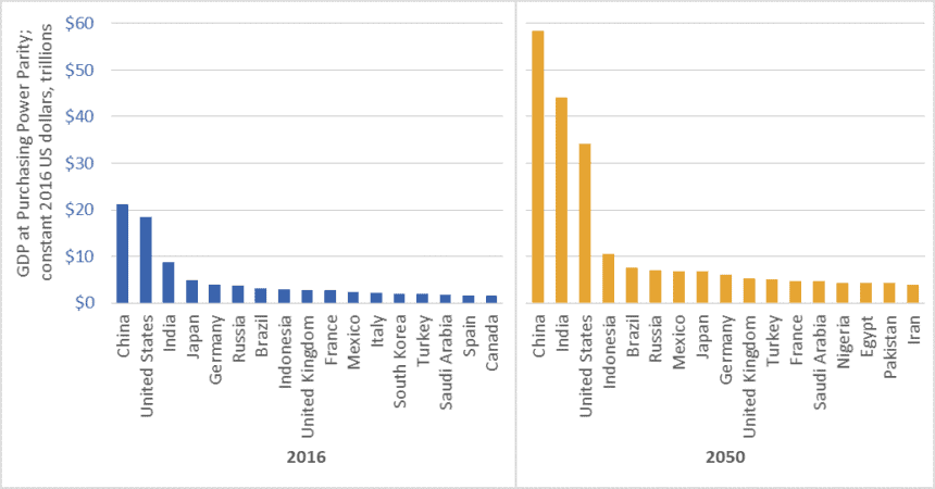
Graph of GDP of the world's largest economies, 2016 vs 2050
Size of the world’s 17 largest economies, 2016, and projections for 2050

In February 2017, global accounting firm PricewaterhouseCoopers (PwC) released a report on economic growth entitled The Long View: How will the Global Economic Order Change by 2050?  The graph above is based on data from that report.  (link here)  It shows the gross domestic product (GDP) of the largest economies in the world in 2016, and projections for 2050.  The values in the graph are stated in constant (i.e., inflation adjusted) 2016 dollars.

PwC projects that China’s economy in 2050 will be larger than the combined size of the five largest economies today—a list that includes China itself, but also the US, India, Japan, and Germany.

Moreover, the expanded 2050 economies of China and India together ($102.5 trillion in GDP) will be almost as large as today’s global economy ($107 trillion).

We must not, however, simply focus on economic growth “over there.”  The US economy will nearly double in size by 2050, and Americans will continue to enjoy per-capita GDP and consumption levels that are among the highest in the world.  The size of the Canadian economy is similarly projected to nearly double.   The same is true for several EU countries, Australia, and many other “rich” nations.

Everything must double

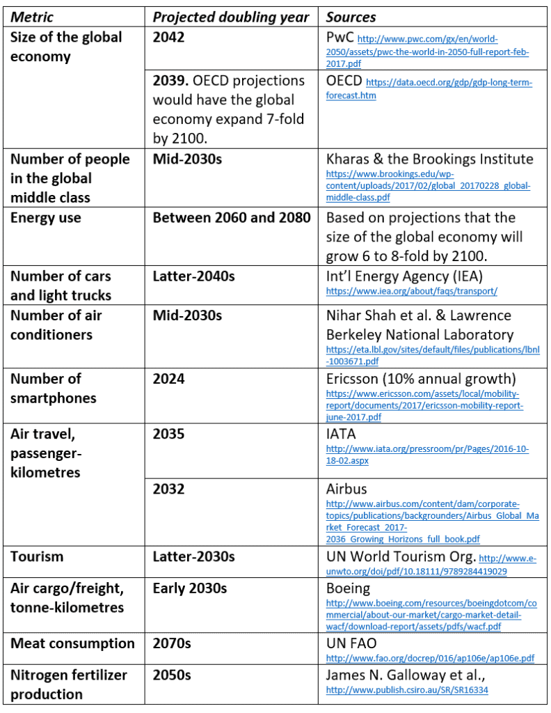
PwC’s report tells us that between now and 2050, the size of the global economy will more than double.  Other reports concur (See the OECD data here).  And this doubling of the size of the global economy is just one metric—just one aspect of the exponential growth around us.  Indeed, between now and the middle decades of this century, nearly everything is projected to double.  This table lists just a few examples.

Table of projected year of doubling for various energy, consumption, transport, and other metrics
Projected year of doubling for selected energy, consumption, and transport metrics

At least one thing, however, is supposed to fall to half

While we seem committed to doubling everything, the nations of the world have also made a commitment to cut greenhouse gas (GHG) emissions by half by the middle decades of this century.  In the lead-up to the 2015 Paris climate talks, Canada, the US, and many other nations committed to cut GHG emissions by 30 percent by 2030.  Nearly every climate scientist who has looked at carbon budgets agrees that we must cut emissions even faster.  To hold temperature increases below 2 degrees Celsius relative to pre-industrial levels, emissions must fall by half by about the 2040s, and to near-zero shortly after.

Is it rational to believe that we can double the number of cars, airline flights, air conditioners, and steak dinners and cut global GHG emissions by half?

To save the planet from climate chaos and to spare our civilization from ruin, we must—at least in the already-rich neighborhoods—end the doubling and redoubling of economic activity and consumption.  Economic growth of the magnitude projected by PwC, the OECD, and nearly every national government will make it impossible to cut emissions, curb temperature increases, and preserve advanced economies and stable societies.  As citizens of democracies, it is our responsibility to make informed, responsible choices.  We must choose policies that curb growth.

Graph source: PriceWaterhouseCoopers

$20 TRILLION: US national debt, and stealing from the future

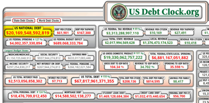
Debt clock showing that the US national debt has topped $20 trillion

Bang!  Last week, US national debt broke through the $20 trillion mark.  As I noted in a previous post (link here), debt of this magnitude works out to about $250,000 per hypothetical family of four.

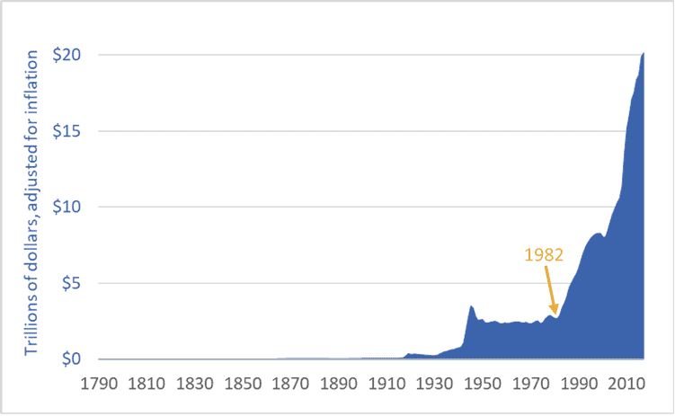
Moreover, US national debt is rising faster than at any time in history.  Adjusted for inflation, the debt is seven times higher than in 1982 ($20 trillion vs. $2.9 trillion).  Indeed, it was in 1982—not 2001 or 2008—that US government debt began its unprecedented (and probably disastrous) rise.

The graph below shows US debt over the past 227 years.  The figures are adjusted for inflation (i.e., they are stated in 2017 US dollars).

Graph of US national debt, historic, 1790 to 2017
United States national debt, adjusted for inflation, 1790-2017

It’s important to understand what is happening here: the US is transferring wealth from the future into the present.  The United States government is not merely engaging in some Keynesian fiscal stimulus, it is not simply borrowing for a rainy day (or 35 years of rainy days), it is not just taking advantage of low interest rates to do a bit of infrastructural fix-up or job creation, and it is not just responding to the financial crisis of 2008.  No.  The US government, the nation’s elites, its corporations, and its citizens are engaging in a form of temporal imperialism—colonizing the future and plundering its wealth.  They are today spending wealth that, if this debt is ever to be repaid, will have to be created by workers toiling in decades to come.

You cannot understand our modern world unless you understand this: Fossil-fueled consumer-industrial economies such as those in the US, Canada, and the EU draw heavily from the future and the past.

We reach back in time hundreds-of-millions of years to source the fossil fuels to power our cars and cities.  We are increasingly reliant on hundred-million-year-old sunlight to feed ourselves—accessing that ancient sunshine in the form of natural gas we turn into nitrogen fertilizer and enlarged harvests.  At the same time, we irrigate many fields from fossil aquifers, created at the end of the last ice age and now pumped hundreds of times faster than they refill.  We extract metal ores concentrated in the distant past.  And the cement in the concrete that forms our cities is the calcium-rich remnants of tiny sea creatures that lived millions of years ago.  We have thrust the resource-intake pipes for our food, industrial, and transport systems hundreds-of-millions of years into the past.

We also reach forward in time, consuming the wealth of future generations as we borrow and spend trillions of dollars they must repay; live well in the present at the expense of their future climate stability; deplete resources, clear-cut ecosystems, extinguish species, and degrade soils and water supplies.  We consume today and push the bills into the future.  This is the real meaning of the news that US national debt has now topped $20 trillion.

Graph sources: U.S. Department of the Treasury, “TreasuryDirect: Historical Debt Outstanding–Annual”  (link here

Efficiency, the Jevons Paradox, and the limits to economic growth

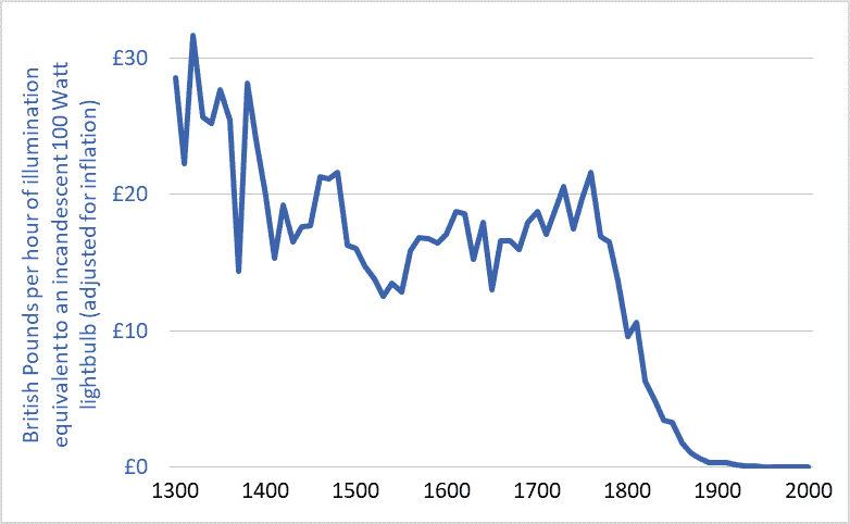
Graph of the cost of lighting in the UK, 1300-2000

I’ve been thinking about efficiency.  Efficiency talk is everywhere.  Car buyers can purchase ever more fuel-efficient cars.  LED lightbulbs achieve unprecedented efficiencies in turning electricity into visible light.  Solar panels are more efficient each year.  Farmers are urged toward fertilizer-use efficiency.  And our Energy Star appliances are the most efficient ever, as are the furnaces and air conditioners in many homes.

The implication of all this talk and technology is that efficiency can play a large role in solving our environmental problems.  Citizens are encouraged to adopt a positive, uncritical, and unsophisticated view of efficiency: we’ll just make things more efficient and that will enable us to reduce resource use, waste, and emissions, to solve our problems, and to pave the way for “green growth” and “sustainable development.”

But there’s something wrong with this efficiency solution: it’s not working.  The current environmental multi-crisis (depletion, extinction, climate destabilization, ocean acidification, plastics pollution, etc.) is not occurring as a result of some failure to achieve large efficiency gains.  The opposite.  It is occurring after a century of stupendous and transformative gains.  Indeed, the efficiencies of most civilizational processes (e.g., hydroelectric power generation, electrical heating and lighting, nitrogen fertilizer synthesis, etc.) have increased by so much that they are now nearing their absolute limits—their thermodynamic maxima.  For example, engineers have made the large electric motors that power factories and mines exquisitely efficient; those motors turn 90 to 97 percent of the energy in electricity into usable shaft power.  We have maximized efficiencies in many areas, and yet our environmental problems are also at a maximum.  What gives?

There are many reasons why efficiency is not delivering the benefits and solutions we’ve been led to expect.  One is the “Jevons Paradox.”  That Paradox predicts that, as the efficiencies of energy converters increase—as cars, planes, or lightbulbs become more efficient—the cost of using these vehicles, products, and technologies falls, and those falling costs spur increases in use that often overwhelm any resource-conservation gains we might reap from increasing efficiencies.  Jevons tells us that energy efficiency often leads to more energy use, not less.  If our cars are very fuel efficient and our operating costs therefore low, we may drive more, more people may drive, and our cities may sprawl outward so that we must drive further to work and shop.  We get more miles per gallon, or per dollar, so we drive more miles and use more gallons.  The Jevons Paradox is a very important concept to know if you’re trying to understand our world and analyze our situation.

The graph above helps illustrate the Jevons Paradox.  It shows the cost of a unit of artificial light (one hour of illumination equivalent to a modern 100 Watt incandescent lightbulb) in England over the past 700 years.  The currency units are British Pounds, adjusted for inflation.  The dramatic decline in costs reflects equally dramatic increases in efficiency.

Adjusted for inflation, lighting in the UK was more than 100 times more affordable in 2000 than in 1900 and 3,000 time more affordable than in 1800.  Stated another way, because electrical power plants have become more efficient (and thus electricity has become cheaper), and because new lighting technologies have become more efficient and produce more usable light per unit of energy, an hour’s pay for the average worker today buys about 100 times more artificial light than it did a century ago and 3,000 time more than two centuries ago.

But does all this efficiency mean that we’re using less energy for lighting?  No.  Falling costs have spurred huge increases in demand and use.  For example, the average UK resident in the year 2000 consumed 75 times more artificial light than did his or her ancestor in 1900 and more than 6,000 times more than in 1800 (Fouquet and Pearson).  Much of this increase was in the form of outdoor lighting of streets and buildings.  Jevons was right: large increases in efficiency have meant large decreases in costs and large increases in lighting demand and energy consumption.

Another example of the Jevons Paradox is provided by passenger planes.  Between 1960 and 2016, the per-seat fuel efficiency of jet airliners tripled or quadrupled (IPCC).  This, in turn, helped lower the cost of flying by more than 60%.  A combination of lower airfares, increasing incomes, and a growing population has driven a 50-fold increase in global annual air travel since 1960—from 0.14 trillion passenger-kilometres per year to nearly 7 trillion (see here for more on the exponential growth in air travel).  Airliners have become three or four times more fuel efficient, yet we’re now burning seventeen times more fuel.  William Stanley Jevons was right.

One final point about efficiency.  “Efficiency” talk serves an important role in our society and economy: it licenses growth.  The idea of efficiency allows most people to believe that we can double and quadruple the size of the global economy and still reduce energy use and waste production and resource depletion.  Efficiency is one of our civilization’s most important licensing myths.  The concept of efficiency-without-limit has been deployed to green-light the project of growth-without-end.

Graph sources: Roger Fouquet, Heat Power and Light: Revolutions in Energy Services

Complexity, energy, and the fate of our civilization

Tainter Collapse of Complex Societies book cover

Some concepts stay with you your whole life and shape the way you see the world.  For me, one such concept is complexity.  Thinking about the increasing complexity of our human-made systems gives a window into future energy needs, the rise and fall of economies, the structures of cities, and possibly even the fate of our global mega-civilization.

In 1988, Joseph Tainter wrote a groundbreaking book on complexity and civilizations: The Collapse of Complex Societies.  The book is a detailed historical and anthropological examination of the Roman, Mayan, Chacoan, and other civilizations.  As a whole, the book can be challenging.  But most of the important big-picture concepts are contained in chapters 4 and 6.

Regarding complexity, energy, and collapse, Tainter argues that:

1.  Human societies are problem-solving entities;
2.  Problem solving creates complexity: new hierarchies and control structures; increased reporting and information processing; more managers, accountants, and consultants;
3.  All human systems require energy, and increased complexity must be supported by increased energy use;
4.  Investment in problem-solving complexity reaches a point of declining marginal returns: (energy) costs rise faster than (social or economic) benefits; and
5.  Complexity rises to a point where available energy supplies become inadequate to support it and, in that state, an otherwise withstandable shock can cause a society to collapse.  For example, the western Roman Empire, unable to access enough bullion, grain, and other resources to support the complexity of its cities, armies, and far-flung holdings, succumbed to a series of otherwise unremarkable attacks by barbarians.

Societies certainly are problem-solving entities.  Our communities and nations encounter problems: external enemies, environmental threats, resource availability, disease, crime.  For these problems we create solutions: standing armies and advanced weaponry, environmental protection agencies, transnational energy and mining corporations, healthcare companies, police forces.

Problem-solving, however, entails costs in the form of complexity.  To solve problems we create ever-larger bureaucracies, new financial products, larger data processing networks, and a vast range of regulations, institutions, interconnections, structures, programs, products, and technologies.  We often solve problems by creating new managerial or bureaucratic roles (e.g., ombudsmen, human resources managers, or cyber-security specialist); creating new institutions (the UN or EU); or developing new technologies (smartphones, smart bombs, geoengineering, in vitro fertilization).  We accept or even demand this added complexity because we believe that there are benefits to solving problems.  And there certainly are, at least if we evaluate benefits on a case-by-case basis.  Taken as whole, however, the unrelenting accretion of complexity weighs on the system, bogs it down, increases energy requirements, and, as Tainter argues, eventually outstrips available energy supplies and sets the stage for collapse.  We should keep this in mind as we push to further increase the complexity of our civilization even as energy availability may be contracting.  Tainter is telling us that complexity has costs—costs that civilizations sometimes cannot bear.  This warning should ring in our ears as we consider the internet of things, smart-grids, globe-circling production chains, and satellite-controlled autonomous cars.  The costs of complexity must be paid in the currency of energy.

Complexity remains a powerful concept for understanding our civilization and its future even if we don’t share Tainter’s conclusion that increasing complexity sets the stage for collapse.  Because embedded in Tainter’s theory is an indisputable idea: greater complexity must be supported by larger energy inflows.  Because of their complexity, there simply cannot be low-energy versions of London, Japan, the EU, or the global trading system.  As economies grow and consumer choices proliferate and as we increase the complexity of societies here and around the world we necessarily increase energy requirements.

It is no longer possible to understand the world by watching money flows.  There are simply too many trillions of notional dollars, euros, and yen flitting through the global economy.  These torrents of e-money obscure what is really happening.  If we want to understand our civilization and its future, we must think about energy and material flows—about the physical structure and organization of our societies.  Complexity is a powerful analytical concept that enables us to do this.

Our civilizational predicament: Doubling economic activity and energy use while cutting emissions by half

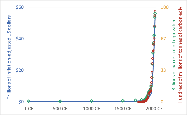
Graph of Global economic activity, energy use, and greenhouse gas emissions, 1CE to 2015CE.
Global economic activity, energy use, and carbon dioxide emissions, 1CE to 2015CE.

My friends sometimes suggest that I’m too pessimistic.  I’m not.  Rather, I’d suggest that everyone else is too optimistic.  Or, more precisely, I live in a society where people are discouraged from thinking rigorously about our predicament.  The graph above sets out our civilizational predicament, and it hints at the massive scale of the transformation that climate change requires us to accomplish in the coming decade or two.

The main point of the graph above is this: Long-term data shows that the size and speed of our global mega-civilization is precisely correlated with energy use, and energy use is precisely correlated with greenhouse gas emissions.  We have multiplied the size of our global economy and our living standards by using more energy, and this increased energy use has led us to emit more carbon dioxide and other greenhouse gases.

The graph plots three key civilizational metrics: economic activity, energy use, and carbon dioxide (CO2) emissions.  The graph covers the past 2015 years, the period from 1 CE (aka 1 AD) to 2015 CE.  The blue line depicts the size of the global economy.  The units are trillions of US dollars, adjusted for inflation.  The green diamond-shaped markers show global energy use, with all energy converted to a common measure: barrels of oil equivalent.  And the red circles show global CO2 emissions, in terms of tonnes of carbon.

Though it is seldom stated explicitly, most government and business leaders and most citizens are proceeding under the assumption that the economic growth line in the graph can continue to spike upward.  This will require the energy line to also climb skyward.  But our leaders are suggesting that the emissions line can be wrenched downward.  When people are “optimistic” about climate change, they are optimistic about doing something that has never been done before: maintaining the upward arc of the economic and energy trendlines, but somehow unhooking the emissions trendline and bending it downward, toward zero.  I worry that this will be very hard.  Most important, it will be impossibly hard unless we are realistic about what we are trying to do, and about the challenges and disruptions ahead.

We must not despair, but neither should we permit ourselves unfounded optimism.  There is a line from a great movie—the Cohen Brother’s “Miller’s Crossing”—in which the lead character, a gangster played by Gabriel Byrne, says “I’d worry a lot less if I thought you were worrying enough.”

Graph sources: GDP: Angus Maddison, The World Economy, Volume 1: A Millennial Perspective (Paris: Organization for Economic Co-operation and Development, 2001)

GHGs: Boden, T.A., Marland, G., and Andres R.J., “Global, Regional, and National Fossil-Fuel CO2 Emissions,” Carbon Dioxide Information Analysis Center (CDIAC), Oak Ridge National Laboratory, U.S. Department of Energy, Oak Ridge, Tenn., U.S.A.

Energy consumption: Vaclav Smil, Energy in Nature and Society: General Energetics of Complex Systems (Cambridge, MA: The MIT Press, 2008); British Petroleum, BP Statistical Review of World Energy: June 2016 (London: British Petroleum, 2016); pre-1500 energy levels estimated by the author based on data in Smil.