Surrounded by Solutions: electric buses, solar panels, high-speed trains, and more

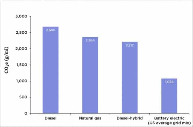
Graph of lifecycle GHG emissions for buses using various energy sources
Lifecycle greenhouse gas emissions for buses using various energy sources

Most North Americans have never seen an electric bus.  Admittedly, momentum is building—some jurisdictions, notably California, have committed to buying only electric transit buses after 2029.  But such buses remain rare in Canada and the United States.  A 2018 report found that just 0.2% of US buses (two in a thousand) were electric, and that tiny percentage is rising very slowly.  New York City provides an example of the modest pace of e-bus adoption—a three-year pilot project, adding just 10 electric buses to its fleet of 5,700.

How’s this for a contrast?  Shenzhen China has 16,000 electric buses—100% of its fleet.  And that city is not unusual in China.  Overall, that country has more than 400,000 electric buses, and is adding 100,000 more each year, with numbers projected to reach one million by 2023.

The graph above shows that electric buses can cut greenhouse gas (GHG) emissions by 60 percent (1,078 grams COequivalent per mile for electric vs. 2,680 grams for diesel).  These low emission values for e-buses take into account that much of North American electricity is generated by burning coal or natural gas.  If we assume a future in which most of our electricity can come from cleaner solar and wind sources then e-buses can reduce emissions by 85 percent compared to diesel.

In addition to having most of the planet’s low-emission buses, China is also leading the world in electric car production and sales.  In 2017, China produced more than half the world’s output of electric cars.  Chinese motorists purchased 580,000 EVs in 2017 while Americans purchased about 200,000 and Canadians 15,000.  Admittedly, many of those Chinese autos are small (think Smart Cars, not Teslas), but that is rapidly changing as Chinese cars become larger and more luxurious.  Indeed, their more modest size can be seen as part of the solution, as the production of small EVs creates lower emissions than the production of large ones.

China is also leading the world in high-speed rail—passenger trains that travel 250 to 350 km/h.  China has added 30,000 kms of new high-speed rail track since 2003 and plans to add another 10,000 kms by 2025, for a total of 40,000 kms—enough to circle the planet.  (For more information on the tremendous potential of high-speed rail, see this blog post, and this one.)

Finally, and this is well known, China dominates the world in solar-panel production and solar-power generation, with production and installation rates several times those in the Americas or EU.  Moreover, China is not the only country shaming us in terms of clean energy adoption: India installed more solar power capacity than the US in 2017 and again in 2018, and far more than Canada.

The four examples above illustrate something important about the current climate crisis: solutions are thick on the ground, but we in North America are simply choosing not to adopt them.  China has made itself the world’s largest solar panel manufacturer; the US has doubled-down on coal, and Canada continues to pin its economic fortunes on the carbon-fuel sector.  China is the world’s largest EV producer; in Canada and the US the best-selling vehicle is the Ford F-150.  China has built tens-of-thousands of kms of passenger-rail track; North Americans have doubled air travel.  We’re walking past mature and promising technologies—choosing to ignore them.

Granted, China has a larger population, but we in North America are far richer.  The combined size of the Canadian and US economies is double that of China’s economy.  Canadian per-capita GDP is five times higher than that of China, and US per-capita GDP is seven times higher.  For every dollar the average Chinese person has to spend on an electric car or solar panels, Canadians and Americans have five to seven dollars.

Moreover, we’re not dependent on foreign technologies or companies.  Canadian Solar, headquartered in Guelph, is one of the six largest solar panel companies in the world.  Bombardier, headquartered in Montreal, is one of the three largest producers of high-speed rail equipment in the world—supplying China with locomotives and rolling stock.  And New Flyer Bus Company, headquartered in Winnipeg, has delivered electric buses to several US and Canadian cities.

We’re not short of high-tech corporations—many world-leading technology companies are headquartered in Canada and the US.  We’re not without technological options.  And we’re not short of funds.  We have extremely promising options and opportunities.  We’re not doomed.  But we are reckless, indulgent, short-sighted, and despicably immoral.  And by continuing to act in the ways we are we will probably manage to doom ourselves.  But that need not be the case.  Solutions abound.

Let’s not dwell on the negative.  Instead, let’s acknowledge the tremendous upside potential and technological possibilities.  Solar panels and electric trains, buses, and cars are solutions close at hand.  Within a decade, North America could host tens-of-thousands of kms of new passenger rail track, hundreds-of-thousands of electric buses, tens-of-millions of electric vehicles, and billions of new solar panels.  This wouldn’t be a complete solution to the climate crisis, but it would be a very good start.

Graph source: Jimmy O’Dea and the Union of Concerned Scientists
Rail lines, not pipelines: the past, present, and future of Canadian passenger rail

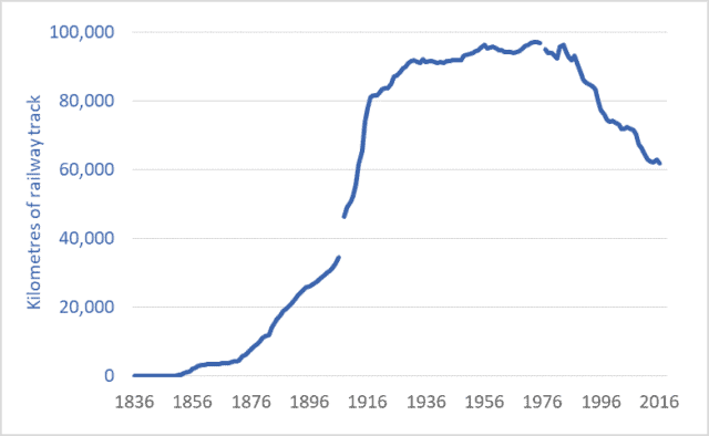
Graph of Canadian railway network, kilometres, historic, 1836 to 2016
Canadian railway network, kilometres of track, 1836 to 2016

One kilometre of oil pipeline contains the same amount of steel as two kilometres of railway track.*  The proposed Trans Mountain pipeline expansion will, if it goes ahead, consume enough steel to build nearly 2,000 kms of new passenger rail track.  The Keystone XL project would consume enough steel to build nearly 4,000 kms of track.  And the now-cancelled Energy East pipeline would have required as much steel as 10,000 kms of track.  (For an overview of proposed pipelines, see this CAPP publication.)

With these facts in mind, Canadians (and Americans) should consider our options and priorities.  There’s tremendous pressure to build new pipelines.  Building them, proponents claim, will result in jobs and economic development.  But if we’re going to spend billions of dollars, lay down millions of tonnes of steel, and consume millions of person-hours of labour, should we be building soon-to-be-obsolete infrastructure to transport climate-destabilizing fossil fuels?  Or should we take the opportunity to create even more jobs building a zero-emission twenty-first century transportation network for Canada and North America?  Admittedly, the economics of passenger rail are different than those of pipelines; building a passenger rail system is not simply a matter of laying down steel rails.  But for reasons detailed below, limiting global warming probably makes significant investments in passenger rail inevitable.

The graph above shows the total length of the Canadian railway network.  The time-frame is the past 180 years: 1836 to 2016.  Between 1880 and 1918, Canada built nearly 70,000 kms of railway track—nearly 2,000 kms per year, using tools and machinery that were crude by modern standards, and at a time when the nation and its citizens were poor, compared to today.  In the middle and latter decades of the twentieth century, tens of thousands of kms of track were upgraded to accommodate heavier loads.

The length of track in the Canadian railway system peaked in the 1980s.  Recent decades have seen the network contract.  About a third of Canadian rail lines have been torn up and melted down over the past three-and-a-half decades.  Passenger rail utilization in recent years has fallen to levels not seen since the 1800s—down almost 90 percent from its 1940s peak, despite a doubling of the Canadian population.  Indeed, ridership on Via Rail is half of what it was as recently as 1989.

Contrast China.  In just one decade, that nation has built 25,000 miles of high-speed passenger rail lines.  Trains routinely operate at speeds in excess of 300 km/h.  Many of those trains were designed and built by Canada’s Bombardier.  China plans to build an additional 13,000 kms of high-speed passenger lines in the next seven years.

Japan’s “bullet trains” began running more than 50 years ago.  The Japanese high-speed rail network now exceeds 2,700 kms, with trains reaching speeds of 320 km/h.

Saudi Arabia, Poland, Turkey, and Morocco all have high-speed lines, as do more than a dozen nations in Europe.  Uzbekistan—with a GDP one-twentieth that of Canada’s—has built 600 kms of high-speed rail line and has trains operating at 250 km/h.

The construction of Canadian and North American passenger rail networks is probably inevitable.  As part of an international effort to hold global temperature increases below 2 degrees C, Canada has committed to reduce greenhouse gas (GHG) emissions emission by 30 percent by 2030—now less than 12 years away.  Emissions reductions must continue after 2030, reaching 50 to 60 percent in little more than a generation.  Emission reductions of this magnitude require an end to routine air travel.  Aircraft may still be needed for trans-oceanic travel, but within continents long-distance travel will have to take place using zero-emission vehicles: electric cars or buses for shorter journeys, and electrified passenger trains for longer ones.

This isn’t bad news.  Trains can transport passengers from city-centre to city-centre, eliminating long drives to and from airports.  Trains do not require time-consuming airport security screenings.  These factors, combined with high speeds, mean that for many trips, the total travel time is less for trains than for planes.  And because trains have more leg-room and often include observation cars, restaurants, and lounges, they are much more comfortable, enjoyable, and social.  For some long journeys where it is not cost-effective to build high-speed rail lines, European-style sleeper trains can provide comfortable, convenient overnight transport.  In other cases, medium-speed trains (traveling 150 to 200 km/h) may be the most cost-effective option.

Canada must embrace the inevitable: air travel must be cut by 90 percent; and fast, comfortable, zero-emission trains must take the place of the planes.  Maybe we can build thousands of kms of passenger rail lines and thousands of kms of pipelines.  But given the gravity and menace of the climate crisis and given the rapidly approaching deadlines to meet our emission-reduction commitments, it isn’t hard to see which should be our priority.


*For example, Kinder Morgan’s Trans Mountain pipeline would be made up primarily of 36” pipe (914mm) with a 0.465 wall thickness (11.8 mm).  This pipe weighs 262 kgs/m.  Rails for high-speed trains and other demanding applications often weigh 60 kgs/m.  As two rails are needed, this means 120 kgs/m—half the weight of a comparable length of pipeline.

Graph sources:
Urquhart and Buckley, 1965, Historical Statistics of Canada.
Leacy, Urquhart, and Buckley, 1983, Historical Statistics of Canada, 2nd Ed.
Stats. Can., Various years, Railway Transport in Canada: General Statistics.
Stats. Can., CANSIM Table 404-0010


Everything must double: Economic growth to mid-century

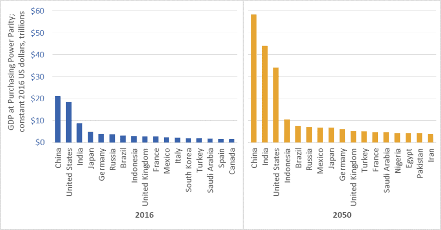
Graph of GDP of the world's largest economies, 2016 vs 2050
Size of the world’s 17 largest economies, 2016, and projections for 2050

In February 2017, global accounting firm PricewaterhouseCoopers (PwC) released a report on economic growth entitled The Long View: How will the Global Economic Order Change by 2050?  The graph above is based on data from that report.  (link here)  It shows the gross domestic product (GDP) of the largest economies in the world in 2016, and projections for 2050.  The values in the graph are stated in constant (i.e., inflation adjusted) 2016 dollars.

PwC projects that China’s economy in 2050 will be larger than the combined size of the five largest economies today—a list that includes China itself, but also the US, India, Japan, and Germany.

Moreover, the expanded 2050 economies of China and India together ($102.5 trillion in GDP) will be almost as large as today’s global economy ($107 trillion).

We must not, however, simply focus on economic growth “over there.”  The US economy will nearly double in size by 2050, and Americans will continue to enjoy per-capita GDP and consumption levels that are among the highest in the world.  The size of the Canadian economy is similarly projected to nearly double.   The same is true for several EU countries, Australia, and many other “rich” nations.

Everything must double

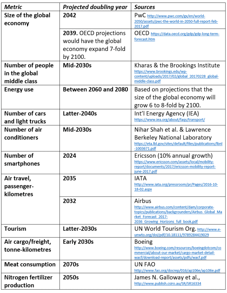
PwC’s report tells us that between now and 2050, the size of the global economy will more than double.  Other reports concur (See the OECD data here).  And this doubling of the size of the global economy is just one metric—just one aspect of the exponential growth around us.  Indeed, between now and the middle decades of this century, nearly everything is projected to double.  This table lists just a few examples.

Table of projected year of doubling for various energy, consumption, transport, and other metrics
Projected year of doubling for selected energy, consumption, and transport metrics

At least one thing, however, is supposed to fall to half

While we seem committed to doubling everything, the nations of the world have also made a commitment to cut greenhouse gas (GHG) emissions by half by the middle decades of this century.  In the lead-up to the 2015 Paris climate talks, Canada, the US, and many other nations committed to cut GHG emissions by 30 percent by 2030.  Nearly every climate scientist who has looked at carbon budgets agrees that we must cut emissions even faster.  To hold temperature increases below 2 degrees Celsius relative to pre-industrial levels, emissions must fall by half by about the 2040s, and to near-zero shortly after.

Is it rational to believe that we can double the number of cars, airline flights, air conditioners, and steak dinners and cut global GHG emissions by half?

To save the planet from climate chaos and to spare our civilization from ruin, we must—at least in the already-rich neighborhoods—end the doubling and redoubling of economic activity and consumption.  Economic growth of the magnitude projected by PwC, the OECD, and nearly every national government will make it impossible to cut emissions, curb temperature increases, and preserve advanced economies and stable societies.  As citizens of democracies, it is our responsibility to make informed, responsible choices.  We must choose policies that curb growth.

Graph source: PriceWaterhouseCoopers

China will save us?  50+ years of data on Chinese energy consumption

Graph of Chinese energy consumption by source or fuel, 1965 to 2016
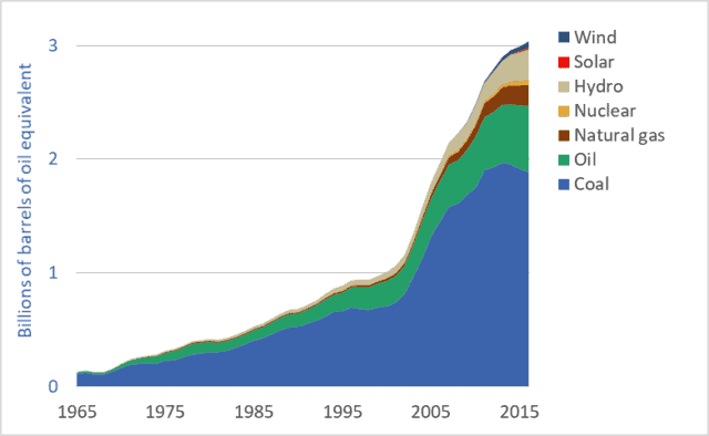
Chinese energy consumption, by source or fuel, 1965 to 2016

There’s a lot being written about China’s rapid push to install solar panels and wind turbines (e.g., see here).  And as the US withdraws from the Paris Agreement, pundits have suggested that this opens the door for Chinese leadership on renewable energy and climate change mitigation (see here).  And China certainly has taken over global production of solar photovoltaic (PV) panels.  But is this talk of China’s low-carbon, renewable-energy future premature and overoptimistic?  Are we just pretending, because so little positive is happening where we live, that something good is happening somewhere?  Chinese energy consumption data provides a corrective to the flood of uncritical news stories that imply that China will save us.

This week’s graph shows how various energy sources are being combined to power China’s rapidly growing and industrializing economy.  The units are “billions of barrels of oil equivalent”: all energy sources have been recorded based on their energy content relative to the energy contained in a barrel of oil.  Similar data for Canada can be found here.  US data is coming soon.

Is the Chinese energy system being rapidly decarbonized?  Is China powered by wind turbines?  Or by coal?  The data can support some optimism for the future, but at present, most of the news is bad.  China remains the world’s largest consumer of fossil fuels and largest emitter of greenhouse gases (GHGs).  Let’s look at the good-news-bad-news story that is China’s energy system.

First, the good news: As is visible in the graph, China’s fossil fuel consumption has been flat-lined since 2013, and coal consumption is falling.  Further, CO2 emissions have been declining since 2014.  China has ceased, or at least paused, its rapid increase in its consumption of fossil fuels.

China is also leading the world in the installation of renewable energy systems, especially wind and solar generation systems (see here).  Chinese wind power production and consumption is growing exponentially—doubling approximately every two years.  Solar power production and consumption is growing even more rapidly and has increased 25-fold in just the past 5 years.  China has also invested massively in hydro dams, which can produce electricity with far fewer GHG emissions than coal-fired power plants.

But it would be naive or premature to simple project Chinese solar and wind power growth rates into the future and conclude that the nation will soon slash its emissions.  China’s coal-fired powerplants are relatively new and unlikely to be decommissioned prematurely.  No matter how cheap solar panels become, installing new solar arrays will never be cheaper than simply continuing to produce electricity with already-built coal plants.

Moreover, the graph makes clear that the current contribution of solar and wind to China’s energy system is small—about 2 percent of total consumption.  And while this portion will undoubtedly grow, there will be huge challenges for China as renewables make up a larger and larger percentage of its electricity generation capacity.  With a less-than-state-of-the-art power grid, China will face difficulties dealing with the fluctuations and uncertainty created by intermittent power sources such as wind and solar power.

Is China the leader we’re looking for?  If so, it is a very odd choice.  China has doubled its fossil fuel use and emissions since 2003.  It is the world’s largest fossil fuel consumer and GHG emitter, and these two facts will almost certainly remain true for decades to come.  The idea that China will pick up the slack as American and European commitments to decarbonization falter is dangerous wishful thinking.  Moreover, it should not be the case that we should expect China to lead.  It was us—the UK, US, EU, Canada and similar early-adopters of fossil fuels, cars, and consumerism—that overfilled the atmosphere with GHGs over the past century.  China has come late to the fossil fuel party.  Asking it to lead the way out the door—asking it to take the lead in decarbonization—is as inappropriate as it is naive.

Here’s one last reason why it’s wrong to look for China to lead the way to a zero-carbon future: Per person, China’s emissions are about half of those in Canada and the US (source here).  Is it right for those of us neck deep in high-emission consumerist car-culture to look to relatively poor people with relatively low emissions and urge them to “go first” down the road of carbon reduction?


2016: record high fossil fuel use (!) and stagnating solar power installations (?)

Graph of Primary energy consumption, by fuel or source, global, 2013-2016.
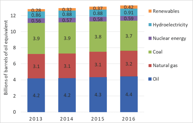
Primary energy consumption, by fuel or source, global, 2013-2016.

There are many kinds of climate change denial.  A minority of people deny that climate change is occurring or serious.  This is classic denial.  But a much more common and insidious form is all around us: accepting that the problem is real, but pretending that solutions are at hand, underway, or not very difficult.  By pretending that Elon Musk’s solar shingles or whiz-bang batteries can provide easy solutions, these people essentially deny the need for rapid, aggressive action.  They are wrong.  We are not solving the climate change problem.  At worst, record high rates of fossil fuel use are locking us into civilization-threatening levels of warming.  At best, we are proceeding toward solutions, but far too slowly.   What we must stop denying is the need for rapid, aggressive, transformative action.

Each year British Petroleum (BP) releases a report and dataset detailing global energy supply and demand.  The data includes each nation’s production and consumption of coal, oil, natural gas, hydroelectricity, and other energy sources.  Some data extends back to 1965.  BP provides one of the most important sources of energy information.  The company’s newest dataset—updated to include 2016—was released June 13th.  BP’s data shows that 2016 was another record-setting year for fossil fuel use: 11.4 billion tonnes of oil equivalent.  See graph above.  That same data shows that the rate of solar panel installation is slowing in nearly every nation.

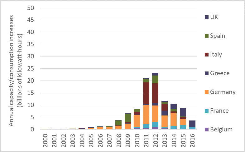
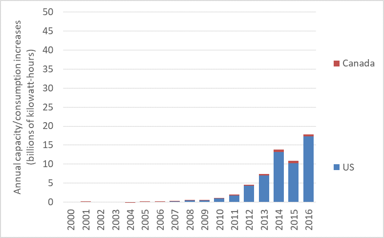
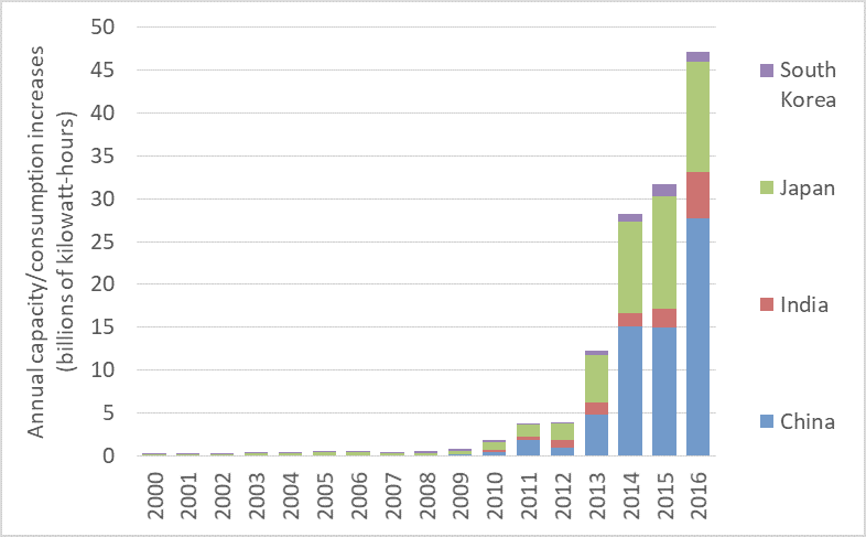
The three graphs below are also produced from recently-updated BP data.  They show the amount of annual increase in the production and use of solar PV electricity in various countries.  This is approximately equal to the annual amount of new capacity added, but it further takes into account how much of any new capacity is actually being utilized.  The North American, Asian, and European nations featured in the graphs together host 92 percent of the world’s installed solar generation capacity.

The first of the three graphs shows how much solar PV production/ consumption increased each year in selected EU countries over the past 17 years.  It’s bad news: the rate of additions to solar power consumption peaked in 2012 and has fallen dramatically since then.  The graph shows that the rate at which EU countries are installing solar panel arrays has collapsed since 2012.  Progress toward renewables is decelerating.

Annual PV production and consumption additions, 2000 to 2013, EU countries

Further, note how each individual country accelerated its installation then slowed.  Spain, represented by the green bars, ramped up installation of solar panel arrays in 2008 and ’09.  After that, solar PV additions to Spain’s grid fell sharply, and rallied in only one year: 2012.  Germany’s solar installations followed a similar trajectory.  In that country, annual increases in solar power production and consumption grew until 2011, then began falling.  Additions to solar power production and consumption in Italy peaked in 2011 and have been falling ever since.  Nearly every EU nation is slowing the rate at which they add solar power.

The next graph shows production/consumption additions in the US and Canada.  The rates of new additions in those countries also appears to be sputtering.

Annual-PV-production-and-consumption-additions-2000-to-2013-North-America

The final graph shows the rate of production/consumption increases in China, India, Japan, and South Korea.  Clearly, capacity and consumption are rising rapidly in Asia.  But note that rates of installation are increasing only in China and perhaps in India.  One EU-based analyst told me that in recent years China ramped up solar-panel production to serve markets in the EU and elsewhere.  But when demand in those markets contracted, faced with a glut of panels coming out of Chinese factories, the government there pushed to install those panels in China.  Perhaps that isn’t the entire story.  It may be that China’s world-leading solar install rates are partly caused by a visionary concern for the environment and the climate, and partly by the need to absorb the output of Chinese PV panel factories left with surpluses after other nations failed to maintain installation rates.

Annual-PV-production-and-consumption-additions-2000-to-2013-Asia

Together, these four graphs tell a disturbing story.  Instead of accelerating rates of solar panel installations, we see stagnation or decline in nearly every nation other than China.  This comes along-side record-high fossil fuel use and record-setting CO2 emissions.  We’re failing to act aggressively enough to decarbonize global electricity systems and we are largely ignoring the project of decarbonizing our overall energy systems.  Rather, we’re increasing carbon emissions.  And as we do so, we risk slamming shut any window we may have had to keep global temperature increases under 2 degrees C.

Graph sources: BP Statistical Review of World Energy.

Happy motoring: Global automobile production 1900 to 2016

Graph of global automobile production numbers, various nations, historic, 1900 to 2016
Global automobile production (cars, trucks, and buses), 1900-2016

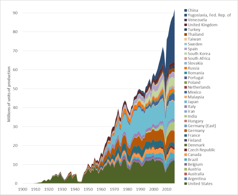
This week’s graph shows global automobile production over the past 116 years—since the industry’s inception.  The numbers include car, trucks, and buses.  The graph speaks for itself.  Nonetheless, a few observations may clarify our situation.

1.  Global automobile production is at a record high, increasing rapidly, and almost certain to rise far higher.

2. Annual production has nearly doubled since 1997—the year the world’s governments signed the Kyoto climate change agreement.

3. China is now the world’s largest automobile producer.  In terms of units made, Chinese production is double that of the United States.  This graph tells us something about the ascendancy of China.

4.  Most of the growth in the auto manufacturing sector is in Asia, especially Thailand, India, and China.  In 2000, those three nations together manufactured 3 million cars.  Last year their output totaled 34 million.  After 67 years of production, Australia is about to shut down its last automobile plant.  Most of its cars will be imported from Thailand, and perhaps a growing number  from China.

5. Auto production in “high-wage countries” is declining.  As noted, the Australian industry has been shuttered.  US production is down 5 percent since 2000, and Canadian production is down 20 percent.  Over that same period, production fell in France, Italy, and Japan, though not in Germany.  Since 2000, auto production increases in Mexico (+1.7 million) are roughly equal to decreases in Canada and the US (-1.2 million).

6. There are some surprises in the data:  Turkey, Slovakia, and Iran all make the  top-20 in terms of production numbers.

Graph sources: Motor Vehicle Manufacturers Association of the United States, World Motor Vehicle Data, 1981 Edition; Ward’s Communications, Ward’s World Motor Vehicle Data 2002; United States Department of Transportation, Bureau of Transportation Statistics, National Transportation Statistics, Table 1-23

Electric cars are coming…  Fast!

Graph of the number of electric vehicles worldwide and selected nations
Increase in the stock of electric vehicles: global and selected nations

When- and wherever it occurs, exponential growth is transformative.  After a long period of stagnation or slow increase, some important quantity begins doubling and redoubling.  The exponential growth in cloth, coal, and iron production transformed the world during the Industrial Revolution.  The exponential growth in the power and production volumes of transistors (see previous blog post)—a phenomenon codified as “Moore’s Law”—made possible the information revolution, the internet, and smartphones.  Electric cars and their battery systems have now entered a phase of exponential growth.

There are two categories of electric vehicles (EVs).  The first is plug-in hybrid electric vehicles (PHEVs).  These cars have batteries and can be driven a limited distance (usually tens of kilometres) using electrical power only, after which a conventional piston engine engages to charge the batteries or assist in propulsion.  Well-known PHEVs include the Chevrolet Volt and the Toyota Prius Plug-in.

The second category is the battery electric vehicle (BEV).  Compared to PHEVs, BEVs have larger batteries, longer all-electric range (150 to 400 kms), and no internal combustion engines.  Well-known BEVs include the Nissan Leaf, Chevrolet Bolt, and several models from Tesla.  The term electric vehicle (EV) encompasses both PHEVs and BEVs.

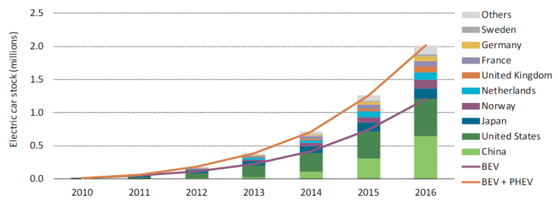
The graph above is reproduced from a very recent report from the International Energy Agency (IEA) entitled Global EV Outlook 2017.  It shows that the total number of electric vehicles in the world is increasing exponentially—doubling and redoubling every year or two.  In 2012, there we nearly a quarter-million EVs on streets and roads worldwide.  A year or two later, there were half-a-million.  By 2015 the number had surpassed one million.  And it is now well over two million.  Annual production of EVs is similarly increasing exponentially.  This kind of exponential growth promises to transform the global vehicle fleet.

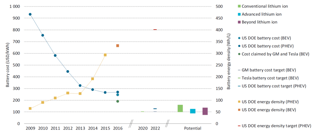
But if it was just vehicle numbers and production volumes that were increasing exponentially this trend would not be very interesting or, in the end, very powerful.  More important, quantitative measures of EV technology and capacity are doubling and redoubling.  This second graph, below, taken from the same IEA report, shows the dramatic decrease in the cost of a unit of battery storage (the downward trending line) and the dramatic increase in the energy storage density of EV batteries (upward trending line).  If we compare 2016 to 2009, we find that today an EV battery of a given capacity costs one-third as much and is potentially one-quarter the size.  Stated another way, for about the same money, and packaged into about the same space, a current battery can drive an electric car three or four times as far.

Graph of electric vehicle battery cost and power density 2009 to 2016

Looking to the future, GM, Tesla, and the US Department of Energy all project that battery costs will decrease by half in the coming five years.  Though these energy density increases and cost decreases will undoubtedly plateau in coming decades, improvements underway now are rapidly moving EVs from the periphery to the mainstream.  EVs may soon eclipse internal-combustion-engine cars in all measures: emissions, purchase affordability, operating costs, performance, comfort, and even sales.

Source for graphs: International Energy Agency, Global EV Outlook 2017: Two Million and Counting

Back on track: North America needs high-speed passenger rail

A graph of passenger rail utilization, selected nations, average kilometres per capita
Passenger train use, kilometers per person per year (average), selected countries, 2014 or 2015 data

Not every problem has a clear solution.  Here’s one that does.  The problem is the exponential growth in air travel and attendant greenhouse gas (GHG) emissions.  The solution is high-speed passenger rail.

Compared to airplanes, high-speed trains can move people faster, more comfortably and conveniently, more cheaply, and with a fraction of the GHG emissions.  And Canada is uniquely placed to benefit from a passenger-rail renaissance; one of the world’s largest passenger-rail manufacturers, Bombardier, is a Canadian company.

Air travel is increasing exponentially.  As I detailed in a previous blog post, air travelers now rack up about 7 trillion passenger-kilometres per year.  And that figure is projected to double by 2030.  If we are to retain a tolerable climate, most of the planes will soon need to be grounded, excepting perhaps those used for trans-oceanic flights.

While airplanes may remain our best option for crossing oceans, within continents higher-speed rail (130–200 km/h) and high-speed rail (200+ km/h) can move people faster and more comfortably.  Such trains can transport passengers from city-centre to city-centre, eliminating the long drive to the airport.  Trains do not require time-consuming, invasive airport security screenings.  These factors, combined with high speeds, mean that for many trips, the total travel time is lower for trains than for planes.  And because trains have much more leg-room and often include observation cars, restaurants, and lounges, they are much more comfortable and enjoyable.

Many people will know the Eurostar high-speed line that connects Paris and other European cities to London via the Channel Tunnel.  Top speed for that train is 320 km/h.  A trip from downtown London to Downtown Paris—nearly 500 kms—takes 2 hours and 20 minutes, about the time it takes the average North American to drive to the airport, check in, check baggage, clear security, and get to his or her airplane seat.

China recently inaugurated its Shanghai Maglev line, with a maximum speed of 430km/h and average speed of 250 km/h.  Japan’s famous “bullet trains” went into service more than 50 years ago.  They now travel on a network of 2,764 kms of track and reach speeds of 320 km/h.

North America has one high-speed line, the Acela Express that links Boston, New York, Philadelphia, Baltimore, and Washington. The maximum speed is 240 km/h, through average speeds are lower.  Travel time from New York to Washington is 2 hours and 45 minutes, including time spent at intermediate stops: an average speed of 132 km/h.  The Acela Express trains were built by a consortium 75 percent owned by Canada’s Bombardier.

This brings us to the truly good news: Canada is home to a world-leading passenger rail manufacturer, Bombardier.  You will find the company’s rolling stock in the subways of New York, London, and more than a dozen other cities.  Its intercity trains run throughout Europe, Asia, and North America.  And its high-speed trains are currently moving passengers in China, Europe, and the US.  Until a recent merger of two Chinese companies, Canada’s Bombardier was the largest passenger train manufacturer in the world.  Canada has a huge opportunity to create jobs and economic activity while leading the world in low-emission, cutting-edge rail technology.  As climate change forces Canada to scale back fossil-fuel production and maybe even auto manufacturing, Canada will need new economic engines.  Passenger-rail manufacturing can be an economic engine of the future.

Not all the news is good, however.  Many will have recent heard news reports about Bombardier.  Over the past few years, Federal and provincial governments have provided cash injections to the company totaling more than a billion dollars, largely to cover costs on its C-Series passenger-jet program.  Bombardier is in trouble.  Indeed, it may have made one of the biggest business blunders in recent decades: financially imperiling a world-leading train maker to make a huge gamble on planes just as climate change forces us to ground the planes and build a trillion-dollar passenger rail system.  Bombardier has recently announced that it may merge its train division with the German company Siemens.

Bombardier has been foolish.  Canadian citizens and their governments have been equally foolish: handing over billions of taxpayer dollars and not receiving a single passenger train in return.  But we can be smart.  That means building a North American network of fast trains.  Bombardier can prosper by being one of the main suppliers for that network.  High-speed passenger rail can be a win-win-win: jobs for Canadians and Americans; fast, comfortable travel; and a high-tech, low-emission transportation system on this continent like the ones being built in Europe and Asia.

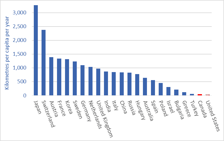
The graph at the top of this article shows average per-person passenger-train utilization.  The data is from the most recent year available: 2014 or ’15.  Passenger rail utilization rates in Canada and the US (an average of less than 40 kms per person per year) are among the lowest in the world.  In China, average use is more than 800 kms per person per year and rising very rapidly.  In many European nations, it is more than 1,000 kms per year per person—25 to 30 times the Canadian and US rates.  There is huge growth potential for the passenger rail sector in North America.

Graph sources: OECD.


China (re)rising: 1,000+ years of data on who dominates the global economy

Graph of China's share of the global economy, and selected other nations, 1000 AD to present
China’s share of the global economy, along with other nations, 1000AD to present

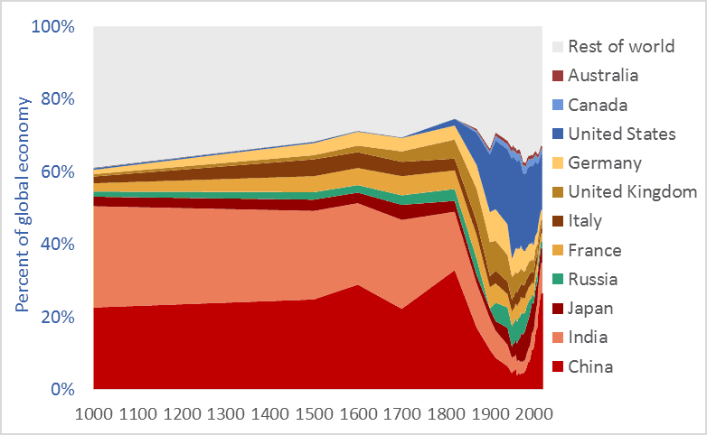
China’s share of the global economy has increased rapidly—from about 5 percent in the early 1980s to more than 26 percent today.  India’s economy has similarly expanded, from 3 percent of the global economy in the early ’80s to more than 8 percent today.  Meanwhile, the percentage shares of the US, UK, Germany, Japan, and other nations are falling fast.  The graph above shows the relative share of global GDP represented by selected nations.  The time-frame is 1000 AD to 2016.

Manufacturing data* similarly shows India and China’s long-term dominance. In 1800, fully half the manufacturing output of the world came from India and China.  In that year, the UK contributed 4.3 percent of manufacturing output and the US just 0.8 percent.  The UK and US came to dominate global manufacturing by the late-1800s, but their rise is recent and, as the graph above suggests, their dominance may be shortlived.

Many people have been surprised by the “rise of China” and that of India.  No one should be.  The global economy is merely returning to its long-term normal—resetting after an anomalous period when European and New World nations were economically ascendant.  Indeed, England and Europe have been economic backwaters for 97 percent of the time since civilizations first arose 5,000 years ago. Our educational system fails to teach us that China and India are the default global superpowers.

To give just two final examples of the long-term dominance of Asia, China  smelted hundreds of thousands of tons of iron in the 11th century using coal rather than wood, a feat not matched in Europe until 600 years later.** A list of the ten largest cities in the world in the year 1500 includes four in China (Beijing, Nanjing, Hangzhou, and Guangzhou) and two in India (Gaur and Vijayanagara), but just one in Europe, (Paris). The three cities rounding off the top-ten list were Tabriz, Cairo, and Istanbul.*** Clearly, the economic and civilizational centre of gravity was in the East. It appears to be shifting back there.

* Paul Bairoch, “International Industrial Levels from 1750 to 1980”
** Hartwell, various pubs
*** Hohenberg, Oxford Encyclopaedia of Economic History

Graph sources: 1000AD-2008, Angus Maddison, 2009-2016 Conference Board