Complexity, energy, and the fate of our civilization

Tainter Collapse of Complex Societies book cover

Some concepts stay with you your whole life and shape the way you see the world.  For me, one such concept is complexity.  Thinking about the increasing complexity of our human-made systems gives a window into future energy needs, the rise and fall of economies, the structures of cities, and possibly even the fate of our global mega-civilization.

In 1988, Joseph Tainter wrote a groundbreaking book on complexity and civilizations: The Collapse of Complex Societies.  The book is a detailed historical and anthropological examination of the Roman, Mayan, Chacoan, and other civilizations.  As a whole, the book can be challenging.  But most of the important big-picture concepts are contained in chapters 4 and 6.

Regarding complexity, energy, and collapse, Tainter argues that:

1.  Human societies are problem-solving entities;
2.  Problem solving creates complexity: new hierarchies and control structures; increased reporting and information processing; more managers, accountants, and consultants;
3.  All human systems require energy, and increased complexity must be supported by increased energy use;
4.  Investment in problem-solving complexity reaches a point of declining marginal returns: (energy) costs rise faster than (social or economic) benefits; and
5.  Complexity rises to a point where available energy supplies become inadequate to support it and, in that state, an otherwise withstandable shock can cause a society to collapse.  For example, the western Roman Empire, unable to access enough bullion, grain, and other resources to support the complexity of its cities, armies, and far-flung holdings, succumbed to a series of otherwise unremarkable attacks by barbarians.

Societies certainly are problem-solving entities.  Our communities and nations encounter problems: external enemies, environmental threats, resource availability, disease, crime.  For these problems we create solutions: standing armies and advanced weaponry, environmental protection agencies, transnational energy and mining corporations, healthcare companies, police forces.

Problem-solving, however, entails costs in the form of complexity.  To solve problems we create ever-larger bureaucracies, new financial products, larger data processing networks, and a vast range of regulations, institutions, interconnections, structures, programs, products, and technologies.  We often solve problems by creating new managerial or bureaucratic roles (e.g., ombudsmen, human resources managers, or cyber-security specialist); creating new institutions (the UN or EU); or developing new technologies (smartphones, smart bombs, geoengineering, in vitro fertilization).  We accept or even demand this added complexity because we believe that there are benefits to solving problems.  And there certainly are, at least if we evaluate benefits on a case-by-case basis.  Taken as whole, however, the unrelenting accretion of complexity weighs on the system, bogs it down, increases energy requirements, and, as Tainter argues, eventually outstrips available energy supplies and sets the stage for collapse.  We should keep this in mind as we push to further increase the complexity of our civilization even as energy availability may be contracting.  Tainter is telling us that complexity has costs—costs that civilizations sometimes cannot bear.  This warning should ring in our ears as we consider the internet of things, smart-grids, globe-circling production chains, and satellite-controlled autonomous cars.  The costs of complexity must be paid in the currency of energy.

Complexity remains a powerful concept for understanding our civilization and its future even if we don’t share Tainter’s conclusion that increasing complexity sets the stage for collapse.  Because embedded in Tainter’s theory is an indisputable idea: greater complexity must be supported by larger energy inflows.  Because of their complexity, there simply cannot be low-energy versions of London, Japan, the EU, or the global trading system.  As economies grow and consumer choices proliferate and as we increase the complexity of societies here and around the world we necessarily increase energy requirements.

It is no longer possible to understand the world by watching money flows.  There are simply too many trillions of notional dollars, euros, and yen flitting through the global economy.  These torrents of e-money obscure what is really happening.  If we want to understand our civilization and its future, we must think about energy and material flows—about the physical structure and organization of our societies.  Complexity is a powerful analytical concept that enables us to do this.
Our civilizational predicament: Doubling economic activity and energy use while cutting emissions by half

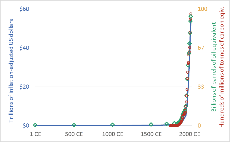
Graph of Global economic activity, energy use, and greenhouse gas emissions, 1CE to 2015CE.
Global economic activity, energy use, and carbon dioxide emissions, 1CE to 2015CE.

My friends sometimes suggest that I’m too pessimistic.  I’m not.  Rather, I’d suggest that everyone else is too optimistic.  Or, more precisely, I live in a society where people are discouraged from thinking rigorously about our predicament.  The graph above sets out our civilizational predicament, and it hints at the massive scale of the transformation that climate change requires us to accomplish in the coming decade or two.

The main point of the graph above is this: Long-term data shows that the size and speed of our global mega-civilization is precisely correlated with energy use, and energy use is precisely correlated with greenhouse gas emissions.  We have multiplied the size of our global economy and our living standards by using more energy, and this increased energy use has led us to emit more carbon dioxide and other greenhouse gases.

The graph plots three key civilizational metrics: economic activity, energy use, and carbon dioxide (CO2) emissions.  The graph covers the past 2015 years, the period from 1 CE (aka 1 AD) to 2015 CE.  The blue line depicts the size of the global economy.  The units are trillions of US dollars, adjusted for inflation.  The green diamond-shaped markers show global energy use, with all energy converted to a common measure: barrels of oil equivalent.  And the red circles show global CO2 emissions, in terms of tonnes of carbon.

Though it is seldom stated explicitly, most government and business leaders and most citizens are proceeding under the assumption that the economic growth line in the graph can continue to spike upward.  This will require the energy line to also climb skyward.  But our leaders are suggesting that the emissions line can be wrenched downward.  When people are “optimistic” about climate change, they are optimistic about doing something that has never been done before: maintaining the upward arc of the economic and energy trendlines, but somehow unhooking the emissions trendline and bending it downward, toward zero.  I worry that this will be very hard.  Most important, it will be impossibly hard unless we are realistic about what we are trying to do, and about the challenges and disruptions ahead.

We must not despair, but neither should we permit ourselves unfounded optimism.  There is a line from a great movie—the Cohen Brother’s “Miller’s Crossing”—in which the lead character, a gangster played by Gabriel Byrne, says “I’d worry a lot less if I thought you were worrying enough.”

Graph sources: GDP: Angus Maddison, The World Economy, Volume 1: A Millennial Perspective (Paris: Organization for Economic Co-operation and Development, 2001)

GHGs: Boden, T.A., Marland, G., and Andres R.J., “Global, Regional, and National Fossil-Fuel CO2 Emissions,” Carbon Dioxide Information Analysis Center (CDIAC), Oak Ridge National Laboratory, U.S. Department of Energy, Oak Ridge, Tenn., U.S.A.

Energy consumption: Vaclav Smil, Energy in Nature and Society: General Energetics of Complex Systems (Cambridge, MA: The MIT Press, 2008); British Petroleum, BP Statistical Review of World Energy: June 2016 (London: British Petroleum, 2016); pre-1500 energy levels estimated by the author based on data in Smil.

Fractal collapse: How the dominant societies and economies may fail.

Six images showing the stages of formation of a Sierpinski triangle
The stages of formation of a Sierpinski triangle illustrating fractal collapse

Fractal collapse is an important, useful idea.  It helps us understand that a society, economy, political system, or civilization may not “fall,” but rather become pock-marked and weakened—shot through with micro-collapses.

The United States may be in an advanced state of collapse.  There are many indicators that this is the case.  The national debt, nearly $20 trillion, about a quarter-million dollars per family of four (see my “US national debt per family”), seems unrepayable.  America’s former industrial heartland is now mostly rustbelt, and parts of Detroit look like sets for “Walking Dead” or “The Road.”  Climate change is bearing down from one side and resource depletion from another.  Its democratic system—rotted by dark money, voter suppression, gerrymandering, the distortions of the Electoral College, and messianic populist politics—has delivered gridlock, ideologues, cartoon-level analyses of complex issues, and, now, Trump.  Many of the manufacturing jobs that have not moved to Asia may soon be taken by robots.  Inequality and incarceration-rates are at record highs.  One could extend this list to fill pages.

Despite the preceding, I’m not predicting that America (or Greece or Australia or England) will “fall”—pitch into rapid and irreversible economic contraction and social disintegration.  Instead, fractal collapse is more likely.  In fractal collapse, parts of a system fail, at various scales, but the system, in diminished form, carries on.  We’re seeing this in America.  We see the collapse of a household here (perhaps a result of the opioid crisis), and a neighbourhood, there; a city declines rapidly (think Detroit or Scranton) and a county declares bankruptcy.  Collapse occurs in various places and at various scales but the aggregate entity moves forward.  And such collapses are not predictable—they do not just happen to poor people or in the “poor” places.  Suddenly and unexpectedly, the investment banks collapse, then General Motors becomes insolvent.  The Senate and House of Representatives cease to function properly.  Collapse is not a single event.  As we are seeing it play out now—amid the hyper-energized and dominant “industrial” economies—collapse is multiple, iterative, and repeated across scales: it is fractal.

And collapse is not monolithic or pervasive.  Indeed, some parts of the system expand and prosper.  The US is manufacturing billionaires at a record pace, the stock market continues to climb, output of everything from corn to natural gas is up, and Google and Apple are world-leading corporations.  A hallmark of collapse is that societies become dis-integrated, allowing some parts to fall as other parts rise.

The image above is a Sierpinski triangle or “gasket.”  It helps visualize this idea of fractal collapse.  Step by step, the original triangle shape develops more holes and loses area, but it does not disappear.  its outlines remain apparent.

To make a Sierpinski gasket, we start with an equilateral triangle.  Then we identify the mid-points of each side and use these as the vertices of a new triangle, which we remove from the original.  (See the top-middle triangle, above.)  This leaves us with three equilateral triangles.  We repeat this process over and over; we iterate.  From each remaining triangle we remove the middle, leaving three smaller triangles.  The Sierpinski gasket and its repeated holing can serve as a visual metaphor for the fractal collapse that may now be hollowing out many of the world’s nations.

The future is not binary, not rise or fall.  Increasingly, nations may become less homogeneous.  Some parts may expand and prosper while other parts may wither or fail.  The overall trendline may not be upward, however, but rather downward.  Our future may not be a train wreck, but rather a slow dilapidation.  Not with a bang but a wimper.  We can change this outcome.  But currently very few are trying.

The intellectual history of the idea of fractal collapse is not wholly clear.  The concept came out of the physical sciences and has been popularized as a description of social and economic collapse by author and analyst John Michael Greer.

Unimaginable output: Global production of transistors

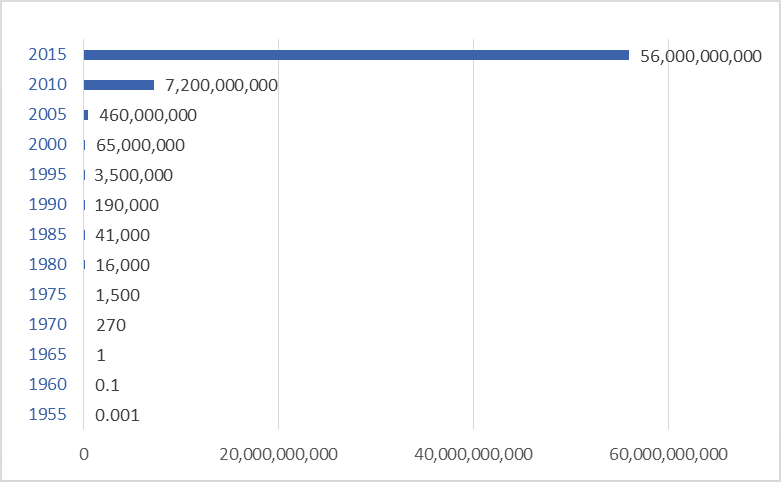
Approximate global production of transistors, per capita, selected years, 1955 to 2015

Global production of transistors has surpassed 20 trillion per second—hundreds of quintillions per year.  Transistors are the primary building blocks of modern electronic devices: computers, smartphones, TVs, radios, and other devices.  Transistors use semiconductor materials to amplify (think transistor radios) or switch (think digital computers) electronic signals and electrical power.  Transistors can be individual components, but are found in far greater numbers embedded in integrated circuits—in computer “chips.”

The graph above shows global production of transistors per year per person.  Per capita values are used here to make the size of the numbers more manageable.  In 1955, production was one transistor per 1,000 people—essentially zero.  Radios and TVs in the mid-’50s used vacuum tubes rather than transistors and integrated circuits.

Just ten years later, in 1965, production had increased 1,000-fold, to one transistor per person per year.  Transistor radios were gaining popularity in the 1960s.  Each radio contained several transistors—often 5 to 10.

While production in 1965 was one transistor per person per year, by 1975 it was nearly 1,500 per person.  Individual transistor components had been replaced by semiconductor computer chips, each containing thousands or millions of individual transistors.

The 1980s saw the proliferation of computers and home electronics.  By 1985 global production of transistors had surpassed 40 thousand per person per year.  By 2000 it was 65 million.  Today it is 56 billion per person.

The world now produces more transistors in one second that it did in one year in 1980.

The global population could not afford to purchase, on average, 56 billion transistors per person per year if prices had remained at 1965 or 1985 levels.  In the latter-1950s, a transistor radio with 5 transistors cost nearly $500 in today’s dollars.   Now, for not much more money, you can buy an iPhone that contains hundreds of billions of transistors.

A pound of rice sells for approximately one dollar and contains about 25,000 grains.  For that same dollar you can buy—as part of a memory stick or a phone—not 25,000 transistors, but billions.  A transistor today is thousands of times cheaper than a grain of rice.

Much of the news about the world is negative: famine, genocide, fisheries collapse, climate change, extinctions, resource depletion.  But we also need to acknowledge that our global hyper-civilization is truly wondrous.  We have built human systems of nearly incomprehensible power and productivity.  This is both their great strength and their great peril.  Nonetheless, if we are to safeguard some version of this civilization into the future we must appreciate and value it, despite its profound flaws.  We must take the time to understand it.  And we must work together to reform it.

Graph sources: VLSI Research.   Note that values are approximate and were derived, not directly from data, but from an existing graph.  Thus, while overall trends and conclusions are robust, individual values for specific years are approximate.

A doubling problem: 21st century exponential growth of the global economy

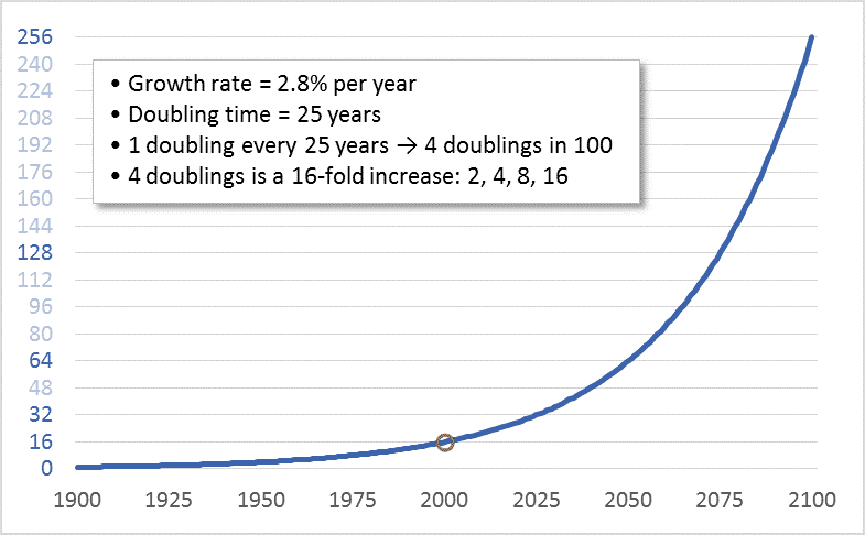
Graph of stylized exponential growth in the global economy
A notional graph modelling exponential growth in the global economy

When I was in grade-school, an uncle taught me something about limits, and about doubling.  He asked me: How many times can you fold a piece of paper in half?  Before I could reply, he told me that the answer was eight.  I thought this seemed too low.  So, as a child eager to demonstrate adults’ errors, I located a sheet of writing paper and began folding.  I managed seven folds—not even achieving the predicted eight.  I thought that the problem was the small size of the paper.  So, I located a newspaper, removed one sheet, and began folding.  I folded it eight times but could not make it to nine.

Why this limit?  Most people assume that the problem is the size of the sheet of paper: as we fold it, the paper gets smaller and, thus, the next fold becomes harder.  This is true, but the real problem is that the number of sheets to be folded increases exponentially.  Fold the paper once and it is two sheets thick.  A second fold brings the thickness to four sheets.  A third fold: eight.  A fourth, fifth, and sixth fold: sixteen sheets, thirty-two, then sixty-four.  The seventh fold doubles the thickness again to 128 sheets, and an eighth to 256.  When I was a child folding that sheet of newspaper, in attempting that ninth fold I was straining to bend 256 sheets.

Now, if I started with a very large piece  of paper perhaps I could prove my late uncle wrong and achieve that ninth fold.  It’s hard to predict precisely where limits lie.  Imagine a football-field-sized piece of paper and ten linebackers assigned the task of folding.  Those players could certainly make nine folds.  Perhaps they might even achieve ten, bending 512 sheets to increase the thickness to 1,024.  Maybe they could strain to make eleven folds, bending those 1,024 sheets to achieve a thickness of 2,048.  But eventually the doubling and redoubling would reach a point where it was impossible to double again.  Exponential growth creates a doubling problem.

Our petro-industrial-consumer mega-civilization has a doubling problem.  During the 20th century we doubled the size of the global economy four times.  Four doublings is a sixteenfold increase: 2, 4, 8, 16.  Despite this multiplication, today, every banker, CEO, investor, Minister of Finance, shareholder, bondholder, and would-be retiree (i.e., nearly all of us) wants to keep economic growth going.  And we want growth to continue at “normal” rates—rates that lead to a doubling in the size of the economy about every 25 years.  Thus, in effect, what we want in the 21st century is another four doublings—another sixteenfold increase.  The graph above shows the sixteenfold increase that occurred during the 20th century and shows what a sixteenfold increase during the 21st century would look like.

The first doubling of the 21st century is already underway.  We’re rapidly moving toward a global economy in 2025 that is twice the size of the one that existed in 2000.  But the economy in 2000 was already placing a heavy boot upon the biosphere.  By that year, North America’s East Coast cod fishery had already collapsed, greenhouse gas emissions were already driving up temperatures, and the Amazon was shrinking.  Despite this, we seem to believe that a 2025 economy twice as large as that year-2000 economy is “sustainable.”  Even worse, in 2025, we won’t be “sustaining” that two-times-2000 economy, we’ll be working to double it again.

Clearly, at some point, this has to stop.  Even those who think that the Earth can support and withstand a human economy twice the size that existed in 2000 must begin to have doubts about an economy four or eight times as large.  There can be no dispute that economic growth must end.  Though we may disagree as to when.

Perceptive readers will have noted a shortcoming in my paper-folding analogy: That system runs into hard limits; at some point, attempts to double the number of sheets simply fail, and that failure is immediately apparent.  Our civilizational-biospheric system is different.  Limits to Earth’s capacities to provision the human economy and absorb its wastes certainly exist, but they are not hard limits.  Given the immense power of our economy and technologies, we can breach Earth’s limits, at least for a time.  On many fronts we already have.  It will only be in hindsight—as ecosystems collapse and species disappear and the biosphere and climate become destabilized, damaged, and hostile—that we will know for sure that we’ve crossed a terrible line.  Only then will we know for sure that at some point in our past our doubling proceeded too far.  So, unlike paper folding, determining the limits of economic growth requires human wisdom and self-restraint.

China (re)rising: 1,000+ years of data on who dominates the global economy

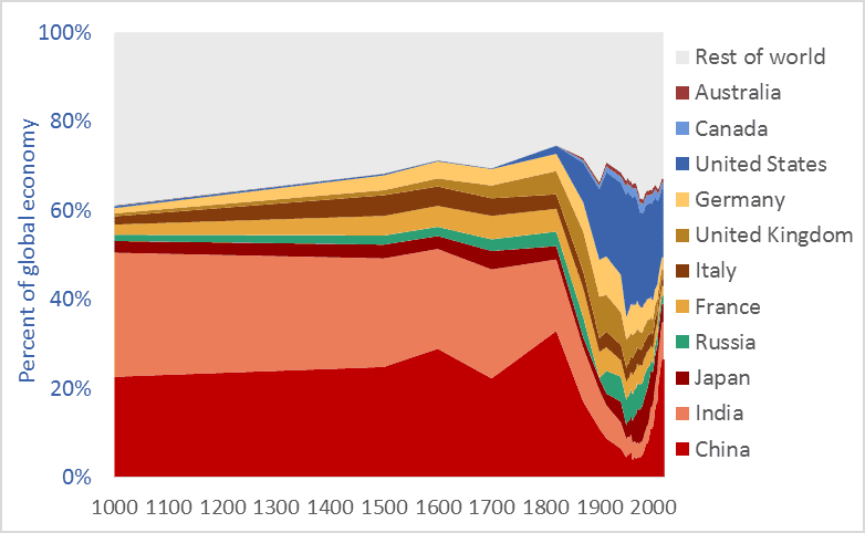
Graph of China's share of the global economy, and selected other nations, 1000 AD to present
China’s share of the global economy, along with other nations, 1000AD to present

China’s share of the global economy has increased rapidly—from about 5 percent in the early 1980s to more than 26 percent today.  India’s economy has similarly expanded, from 3 percent of the global economy in the early ’80s to more than 8 percent today.  Meanwhile, the percentage shares of the US, UK, Germany, Japan, and other nations are falling fast.  The graph above shows the relative share of global GDP represented by selected nations.  The time-frame is 1000 AD to 2016.

Manufacturing data* similarly shows India and China’s long-term dominance. In 1800, fully half the manufacturing output of the world came from India and China.  In that year, the UK contributed 4.3 percent of manufacturing output and the US just 0.8 percent.  The UK and US came to dominate global manufacturing by the late-1800s, but their rise is recent and, as the graph above suggests, their dominance may be shortlived.

Many people have been surprised by the “rise of China” and that of India.  No one should be.  The global economy is merely returning to its long-term normal—resetting after an anomalous period when European and New World nations were economically ascendant.  Indeed, England and Europe have been economic backwaters for 97 percent of the time since civilizations first arose 5,000 years ago. Our educational system fails to teach us that China and India are the default global superpowers.

To give just two final examples of the long-term dominance of Asia, China  smelted hundreds of thousands of tons of iron in the 11th century using coal rather than wood, a feat not matched in Europe until 600 years later.** A list of the ten largest cities in the world in the year 1500 includes four in China (Beijing, Nanjing, Hangzhou, and Guangzhou) and two in India (Gaur and Vijayanagara), but just one in Europe, (Paris). The three cities rounding off the top-ten list were Tabriz, Cairo, and Istanbul.*** Clearly, the economic and civilizational centre of gravity was in the East. It appears to be shifting back there.

* Paul Bairoch, “International Industrial Levels from 1750 to 1980”
** Hartwell, various pubs
*** Hohenberg, Oxford Encyclopaedia of Economic History

Graph sources: 1000AD-2008, Angus Maddison, 2009-2016 Conference Board

Cheap oil? Long-term US and Canadian crude oil prices

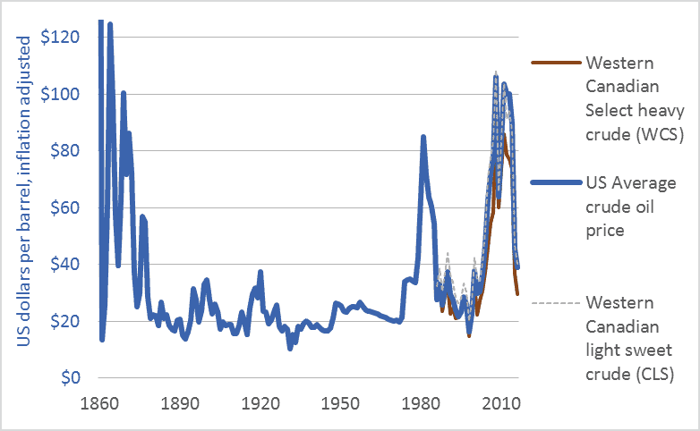
Graph of US and Canadian crude oil prices, historic, 1860 to 2016
US and Canadian crude oil prices, historical, 1860-2016

Many corporate spokespeople, government officials, economists, and journalists are repeating a very odd line: “oil prices are low.” Others talk of “cheap oil,” “plunging prices,” and a “crash.” Here’s one example, a 2016 headline from Maclean’s: “Life at $20 a barrel: What the oil crash means for Canada.”

I will argue that talk of “low oil prices” ignores history, misconstrues energy’s role in making civilizations, and confuses our efforts to build resilient, sustainable, climate-stabilizing economies. The graph above and the table below put recent oil prices into their long-term context. The graph covers the 156-year period from the first large-scale production of petroleum oil to the present: 1860 to 2016. It shows US average crude oil prices and Canadian prices for light sweet crude and heavy tarsands crude. For comparability, all figures are in US dollars and adjusted for inflation.

This table helps us interpret the data in the graph by showing average prices for each decade.

Canada and US crude oil prices, decade-averages, US dollars, adjusted for inflation
Canada and US crude oil prices, decade-averages, inflation-adjusted US dollars

Here’s what the graph and table can tell us about current “low oil prices.”

1. The graph shows that the very high 2003-2014 prices are an anomaly.

2. The $80 average price in the 2010s is the highest since the 1870s.

3. Even with recent declines, oil prices remain above the levels that held during the century from 1875 to 1975.

4. While prices have averaged $80 in the 2010s, the average price in the 1950s, ’60s, and ’70s was below $30. The greatest period of economic growth in global history, the postwar US boom, was accomplished with very cheap oil. As the cost of oil goes up, the cost of civilization goes up. If energy prices rise too high, we may no longer be able to afford to continue to build or even maintain our sprawling mega-civilization.

5. Many say that Canadian prices are particularly low relative to US or world prices. That isn’t the case. It’s not that Canadian oil is priced lower than US oil; rather, Canadian heavy (tar sands) oil is priced lower than US and Canadian light oil. The values in the table show this. The graph also shows this in the close correlation of US average oil prices with Canadian light oil prices. The right-wing think-tank The Fraser Institute explains that heavy oil from the tarsands and similar sources is priced lower because such oil “is more costly to transport by pipeline …. Further, the heavier the crude oil …, the lower its value to a refiner as it will either require more processing or yield a higher percentage of lower-valued by-products such as heavy fuel oil. Complex crudes containing more sulphur also generally cost more to refine than low-sulphur crudes. For these reasons, oil refiners are willing to pay more for light, low-sulphur crude oil.”

6. Western Canadians are particularly sensitive to “low oil prices” because our economy is dependent upon some of the highest-cost oil production systems in the world: the tar sands. We are the high-cost producers.

As the International Energy Agency (IEA) said recently, “Attempting to understand how the oil market will look during the next five years is today a task of enormous complexity.” I certainly cannot predict oil prices. And I’m not advocating lower prices. Just the opposite. As someone deeply concerned by climate change, I hope that oil prices rise and stay high, and that governments impose taxes on carbon emissions to push the cost of burning fossil fuels higher still. Nonetheless, we need to dispassionately interpret the data if we are to have any hope of directing our future and our economy. We need to be able to discern when energy prices are low and when they are not.

To leave a comment, click on the graph or the title and then scroll down.

Graph Sources: Canadian Association of Petroleum Producers (CAPP), Statistical Handbookfor Canada’s Upstream Petroleum Industry (October, 2016); and US Energy Information Administration (EIA), U.S. Crude Oil First Purchase Price


Hotter sooner faster: Global temperature changes over the past 136 years

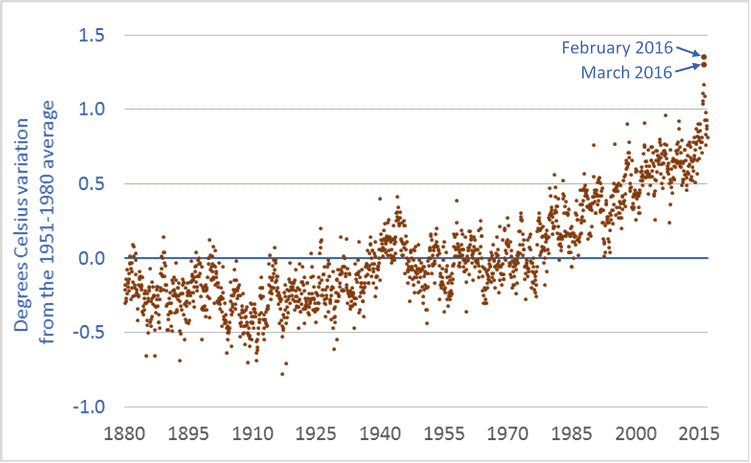
Graph of global temperature anomaly from 1880 to 2016
Global temperature anomaly, 1880 to present

This graph shows the global temperature anomaly: how current temperatures compare to latter-twentieth-century “normal” temperatures. Normal, here, is the 1951-1980 average.

in looking at the global temperature data, three things are apparent. First, the Earth is already warming. The graph has been trending strongly upward since at least the 1980s. Second, the increase in temperature from the 1951-1980 baseline period will soon reach one degree Celsius. Indeed, temperature outliers such as those in February and March 2016 are approaching 1.5 degrees. Temperatures are rising fast—charting significant increases in decades, not centuries. Third, there is in the data-points a suggestion that the curve may be getting steeper; temperature increases may be accelerating. It’s too early to tell, but given that global temperature increases are lagging well behind atmospheric greenhouse gas (GHG) increases, and given that global emission rates continue to increase, it is prudent to consider that temperature increases may accelerate beyond already-rapid rates.

How high might temperatures go? Here’s what we know. In the lead-up to the 2015 Paris climate talks, nearly every nation submitted to the United Nations a commitment to reduce GHG emissions. The United States committed to reduce its emissions by 26 to 28 percent (below 2005 levels) by 2025. Canada committed to reduce emissions by 30 percent by 2030. Other nations made comparable commitments. But the climate models show that even if every nation meets its emission-reduction commitments, our Earth will warm this century by 3.2 degrees Celsius—well beyond the so-called “dangerous” level of 2 degrees C, and more than double the 1.5 degree mark discussed in Paris. Indeed, the graph above makes it clear that 1.5 degrees was always pure fiction. In order to avoid a temperature increase of 3.2 degrees, we must set and meet more ambitious targets.

Climate science can be complicated. But at a public policy level—at the levels of citizens and legislators and democratic governance—climate change is simple and clear. It is happening. It is happening fast. And it will devastate our cities, economies, food systems, ecosystems, and perhaps even our civilization unless we act fast. Simple.

To leave a comment, click on the graph or the title and then scroll down.

Graph sources: Combined Land-Surface Air and Sea-Surface Water Temperature Anomalies from National Aeronautics and Space Administration (NASA) Goddard Institute for Space Studies (GISS): GISS Surface Temperature Analysis (GISTEMP).

It’s gonna get hot: Atmospheric carbon dioxide over the past 800,000 years

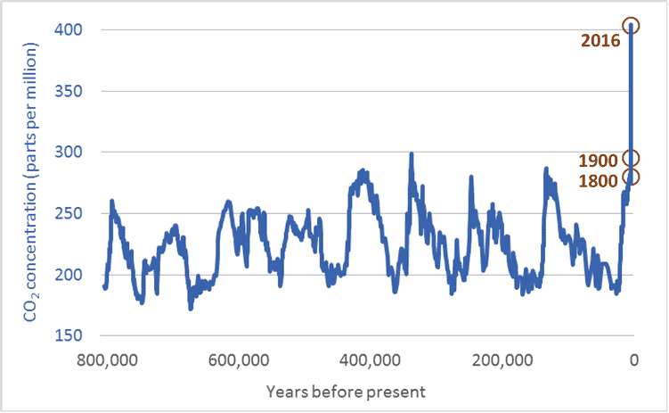
Graph of atmospheric carbon dioxide levels for the past 800,000 years
Atmospheric carbon dioxide concentrations, 800,000 years ago to present

There are lots of graphs related to climate change. Only a few, however, get to the core of the issue. This is one such graph. It shows atmospheric carbon dioxide (CO2) levels over the past 800,000 years—a period four times longer than our species, Homo sapiens, has walked the Earth. The units, parts per million (ppm), will not be familiar to everyone. But the units aren’t important. What is important is the shape of the graph, and the magnitude of current CO2 levels relative to those in the past.

As the graph shows, over the past 800,000 years, atmospheric carbon dioxide levels have risen and fallen. Low concentrations correspond to ice ages—eight such periods are visible in the graph. Higher CO2 levels correspond to largely ice-free “interglacial” periods. The critical point is this: in the 800,000 years before the modern era, CO2 levels never once rose above 300 ppm. Not once. Now, however, CO2 levels are 405 ppm. And because our emissions continue, it is likely that atmospheric concentrations will increase past 500 ppm, maybe past 600 ppm. Temperature increases are lagging behind CO2 increases. As Earth’s temperatures rise to “catch up” with the rapid increase in CO2, it’s going to get very hot. And it is going to stay hot for a long time.

There can be no doubt: humans are the cause of the rapid rise in CO2 levels. No one can look at the graph above and come to any other conclusion. The years 1800 and 1900 are highlighted. The fossil-fuelled industrial and transportation revolutions of the 19th, 20th, and 21st centuries are clearly visible in the graph’s vertical spike—an increase in atmospheric CO2 that has proceeded further and faster than at any other time in the past 800,000 years.

CO2 levels have increased by 100 ppm in a century. The data shows that such an increase usually takes 10,000 years. Humans are causing CO2 levels to rise 100 times faster than those levels rose at any time in the past 800 millennia. Even worse, the rate of increase is accelerating; at current and projected emission rates, the next increase of 100 ppm may take just 40 to 60 years.

It is impossible to overstate the danger of what we are doing. Words cannot convey how damaging continued CO2-level increases will be to the long-term prospects for human cities, societies, and economies, or to other species and the natural ecosystems we all rely upon. It is as if we have decided to set fire to our home, the Earth. Unless we extinguish that fire, all we hold dear will perish. Currently, we are pouring on gasoline.

Note: CO2 measurements for recent decades come directly from air samples. Measurements for past centuries come from analysis of air trapped in bubbles in Antarctic ice. Each ice core is analyzed at multiple research facilities using multiple techniques. Because of this duplicate testing and diversity of sampling methods, there is high confidence among scientists that ice-core data accurately reflects CO2 levels in previous centuries.

Graph sources:
– 800,000 years ago to 1913: Ice core samples, Dome C, Antarctica (Monnin et al. 2001; Siegenthaler et al. 2005; Luethi et al.) and Vostok, Antarctica (Petit et al. 1999; Pepin et al. 2001; Raynaud et al. 2005)
– 1832 – 1978: Ice core samples, Law Dome, Antarctica
– 1959 – 2013: Direct atmospheric measurements, Mauna Loa Observatory, National Oceanic and Atmospheric Administration (NOAA)

Too much tourism: Global air travel and climate change

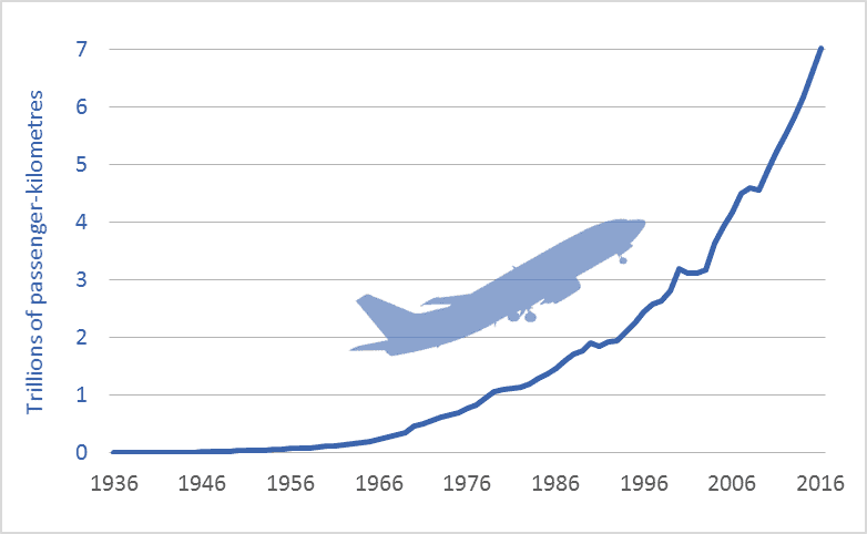
Graph of global air travel, in trillions of passenger-kilometres, historic, from 1936 to 2016
Global air travel, trillions of passenger-kilometres per year, 1936-2016

The graph above shows that global air travel is increasing exponentially. In 2016, business travelers, tourists, and others traveled more than 7 trillion passenger-kilometres by air.  As you might expect, a passenger-kilometre is equal to moving one person one kilometre. Therefore, if a plane carrying 100 people flies 1,000 kms that is equal to 100,000 passenger-kilometres (pkms).

The graph’s shape is significant; it reflects exponential growth: an ever-steeper upward curve. A system that grows exponentially doubles in a constant time-period. The amount of air travel we consume is doubling every 15 years. Thus, over the past 30 years, it has doubled twice, such that pkms were more than 4 times higher in 2016 than in 1986.

This exponential increase—this doubling and redoubling—is predicted to continue.  Aircraft manufacturer Airbus projects that pkms will double again by 2030 and continue upward (Global Market Forecast 2016). Forecasts by airline industry group International Air Transport Association and Boeing similarly project a doubling in coming years.

This projected doubling by 2030 is significant and troubling. In the lead-up to the 2015 Paris climate talks, nearly every nation pledged to reduce greenhouse gas (GHG) emissions. Canada committed to reducing its emissions by 30 percent by 2030. The United States made a similar commitment: a 26 to 28 percent reduction by 2025. One could sum up the world’s commitments, roughly, by saying we have a global goal of reducing emissions by 30 percent by 2030. Over that same period, however, Boeing, Airbus, and the world’s airlines will be working to increase global air travel by 100 percent. Something has to give. If the world’s airplane manufacturers, airlines, resort destinations, and tourist industry succeed in redoubling air travel, the resulting GHG emissions will contribute to massively destabilizing Earth’s climate.

To meet our targets to cut GHG emissions by 30 percent in just 13 years, and by perhaps 50 percent or more by mid-century, we must ground most of the airplanes and replace them with trains powered by electricity generated from renewable, low-emission sources. If a traveler must cross the ocean, then perhaps that person should travel in a plane. But within the North American continent, within Europe, within Asia, and wherever oceans do not present a barrier, travel will have to be transferred over to fast trains. And because these trains can go from city-centre to city-centre, because trains can travel at hundreds of kms per hour, and because train journeys do not require the lengthy security checks common at airports, door-to-door travel times in trains can be less than those in planes.

Citizens and travelers face a choice: keep the planes flying, continue to increase the amount we fly, increase road travel similarly, miss our emission targets by a mile, and destroy our chances of a stable, prosperous future; or invest in high-speed rail, create local jobs, and create a twenty-first century transportation system that aligns with our emission-reduction and sustainability goals.  We must ground most of the global airline fleet if we want to meet our emission-reduction goals.  And we must build a new system of fast trains if we want to meet our travel and quality-of-life goals.  Indeed, there is no reason that the factories and technologies currently in possession of aircraft makers Boeing, Airbus, Bombardier, Embraer, and other manufactures could not be repurposed to build those trains.

Graph sources: Airlines for America: Annual Results World Airlines