Turning fossil fuels into fertilizer into food into us: Historic nitrogen fertilizer consumption

Graph of historic global fertilizer use, including nitrogen fertilizer, 1850-2015
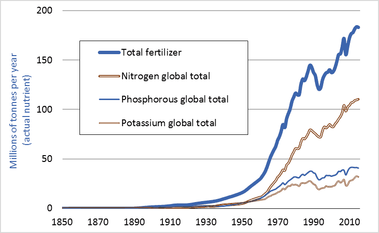
Global consumption of nitrogen fertilizer and other fertilizers, historic, 1850 to 2015

Last week’s blog post (Feeding the World) showed that farmers worldwide had, since 1950, quadrupled grain production. How is this possible? The answer is fertilizer; more specifically, nitrogen fertilizer. This graph shows global fertilizer use. In 1950, farmers applied less than 5 million tonnes of nitrogen (measured in terms of actual nutrient, not fertilizer product). In 2015, farmers applied more than 110 million tonnes. We managed to increase grain output fourfold largely by increasing nitrogen inputs 23-fold.

Nitrogen fertilizer is a fossil fuel product, made primarily from natural gas. One can think of a modern nitrogen fertilizer factory as having a large natural gas pipeline feeding into one end and a large pipe coming out the other carrying ammonia, a nitrogen-rich gas. To produce, transport, and apply one tonne of nitrogen fertilizer requires an amount of energy equal to almost two tonnes of gasoline. One reason we have been able to increase grain production fourfold since 1950, and human population threefold, is that we found a way to turn fossil fuels into plant nutrients into enlarged food supplies into us. With fertilizers, we can convert hydrocarbons into carbohydrates.

Dr. Vaclav Smil is an expert on the material flows, nutrient cycles, and energy transformations that underpin natural and human systems. He believes that without the capacity to turn fossil fuels into nitrogen fertilizers into enlarged harvests, nearly half the 7.4 billion people now on Earth could not be fed and could not exist. Smil calls factory-made nitrogen “the solution to one of the key limiting factors on the growth of modern civilization.” This blog highlights the many ways humans have managed to remove the limiting factors to the growth of modern civilization.

Finally, 1950 was long ago. Surely rapid increases in fertilizer consumption must have tapered off in recent years. That isn’t the case. Canadian consumption is rising especially rapidly. A look at Statistics Canada data (CANSIM 001-0069) reveals that Canadian nitrogen fertilizer consumption has increased 65 percent over the past decade (2006 to 2016). Like many countries, Canada is boosting food output by increasing the use of energy-intensive agricultural inputs.

Graph sources: Vaclav Smil, Enriching the Earth; UN FAO, FAOSTAT; International Fertilizer Industry Association, IFADATA; and Clark Gellings and Kelly Parmenter, “Energy Efficiency in Fertilizer Production and Use.”

Feeding the world: our struggle to multiply global grain production

Graph of global grain production historic 1950 to 2016
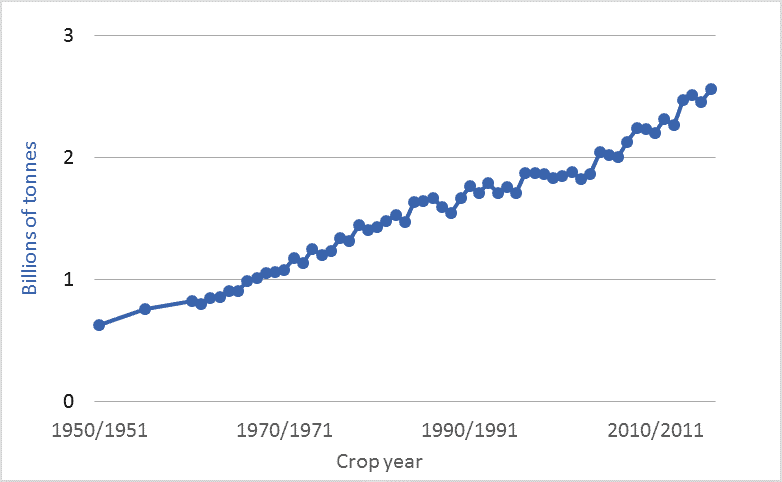
Global grain production, annual, 1950–2016

This blog post and the next (Turning fossil fuels into … food) look at the rapid expansion of our global food supply and how we’ve accomplished that feat. The graph above shows world grain production for the past 66 years: 1950 to 2016. The units are billions of tonnes of annual production of all grains: primarily wheat, corn, rice, barley, oats, and millet. The figures exclude oilseeds, tonnage of which is about one-fifth as large as that of grains.

By utilizing ever-increasing inputs of water, machinery, fuels, chemicals, technologically-enhanced seeds, and, especially, fertilizers, the world’s farmers have managed to quadruple global grain production since 1950, and to double production since 1975. This expansion has been accomplished on a largely unchanged land area. Farmers have doubled output since the mid-’70s on a cropland area that, according to the UN’s Food and Agriculture Organization (FAO), has increased by just 5 percent.

The UN projects that global human population will increase by 50 percent by the end of this century, to 11.2 billion. That enlarged population will likely be richer, on average, than today’s population. Thus, per-capita meat demand will probably rise. When we feed grains to livestock, we turn 5 to 10 grain Calories into 1 meat Calorie. Thus, diets rich in meat require higher levels of grain production. Coming on top of these drivers of increased grain consumption is the likely increase in demand for biofuels, biomass, and feedstocks for “the bioeconomy.” The Global Harvest Initiative is an industry group whose members include John Deere, Monsanto, Mosaic, and Dupont. The group asserts that there is a “Global Agricultural Imperative” to “nearly double global agricultural output by 2050 to respond to a rapidly growing population and to meet the consumer demands of an expanding middle class.” If this doubling is accomplished, it will mark an 8-fold increase over 1950 production levels. Few citizens or policymakers are aware that the bounty in our supermarkets and on our tables depends upon very rapid and difficult-to-sustain rates of growth in food production.

Graph sources: 1960-2016: United States Department of Agriculture (USDA) World Agricultural Supply and Demand Estimates (WASDE),  ; 1950 and 1955: Lester Brown and Worldwatch Institute, various publications. Brown and Worldwatch cite USDA, “World Grain Database,” unpublished printout, 1991.

This isn’t normal: 2,000 years of economic growth

Graph of gross world product (GWP) historic, for the past two thousand years
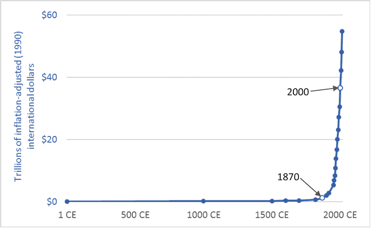
Gross World Product (GWP) over the long term, 1 CE – 2015 CE

The graph above places our 21st century global economy in its long-term context. It plots Gross World Product (GWP), the global aggregation of Gross Domestic Product (GDP). The time frame is the past 2,015 years: 1 CE (or AD) to 2015 CE. The units are trillions of US/international dollars adjusted for inflation (converted to 1990 dollars). The main source is Angus Maddison.  Pre-20th century values are, by necessity, informed estimates by Maddison.

The year 1870 is marked with a white circle. In the millennia before 1870, the size of the global economy barely grew at all. Then, not long before the eve of the 20th century, all Hell broke loose. The most recent ten or fifteen decades appear in our historical economic record like an explosion. For perhaps 98 percent of human history, the economic trendline has been almost flat—horizontal. Over the past century-and-a-half it has been almost vertical.

The late-19th, 20th, and early 21st centuries have not been “normal.” They have been extraordinary and wondrous. Equally extraordinary is how far we have gone to normalize what is clearly an abnormal situation. Though our lifestyles and expectations are now tightly bound to near-vertical trendlines we talk and act as if nothing out of the ordinary is happening, and that we can count on more of the same for the foreseeable future.

Moreover, the 20th and 21st century exceptionalism on display in this graph is not limited to economic growth. Graphs of energy use, population, cotton or iron production, water withdrawals, food production, automobile numbers, air-travel miles, and nearly any other economic metric will look nearly identical to the graph above: millennia of little or no growth, then a sudden spike. There is upon the Earth a wholly new kind of civilization.

Graph sources: Angus Maddison, The World Economy, vol. 2, Historical Statistics (Paris: OECD, 2006) Tables 7b and 8b; and World Bank, “World DataBank: World Development Indicators: GDP at market prices” 

Exponential growth: US and Canadian GDP in the 20th century

US and Canadian Gross Domestic Product (GDP) historic
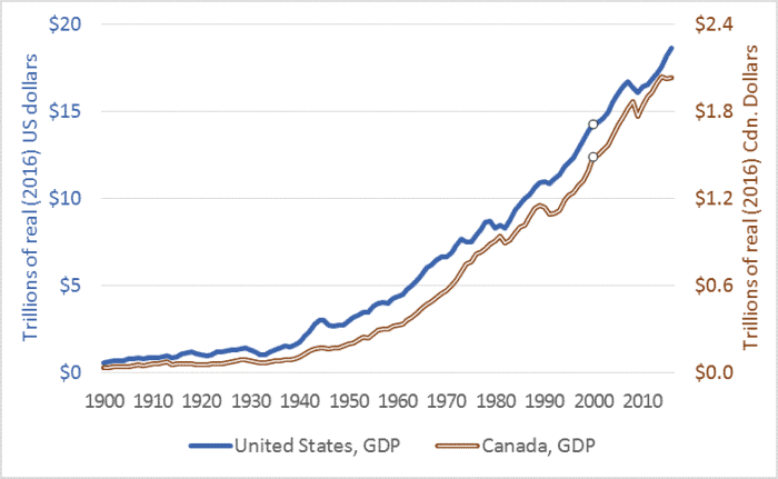
Canada and US Gross Domestic Product (GDP), 1900–2016

This graph shows the increasing sizes of the US and Canadian economies. The graph plots US Gross Domestic Product (GDP) on the left-hand axis, and Canadian GDP on the right. The time-frame is 1900 to 2016. The year 2000 is marked with an open circle, to highlight the 20th century. The units are trillions of US or Canadian dollars, and all figures are adjusted for inflation, that is, they are stated in 2016 dollars.

How much did these economies grow during the 20th century? US GDP in 1900 was $0.59 trillion dollars (in today’s US currency). In 2000, GDP was $14.3 trillion dollars—24 times larger. Canada’s economy in 2000 was 45 times larger than in 1900.

We can calculate the average annual growth rate. During the 20th century, the US economy grew at an average compound rate of 3.2 percent. We often hear growth rates of 2 to 3 percent described as normal. Indeed, if rates in the US or comparable nations fall below 2 percent, analysts warn of “slow growth.” Moreover, in recent years there has been consternation as Chinese economic growth rates have fallen from 9 or 10 percent per year to 7.

Can the US and comparable economies grow at rates in the 21st century that were “normal” in the 20th? Even if annual growth slows to an average of just 2 percent, the size of the US economy will increase 7-fold between 2000 and 2100. If the US economy grows at 2 percent per year throughout the 21st century, by 2100 the US economy alone will be more than twice as large as the global economy of 2000.

Growth rates of 2 or 3 percent per year, modest when considered over the short term, will, over several decades, cause an economy to double and redouble in size. Can we multiply the sizes of already-large national economies five- or ten-fold this century? Is it wise to try?

Graph sources: United States GDP: US Deptartment of Commerce, Bureau of Economic Analysis, NIPA Table 1.1.5; and Louis Johnston and Samuel Williamson, “What Was the U.S. GDP Then?” MeasuringWorth, https://www.measuringworth.com/usgdp/ . Canadian GDP: Statistics Canada CANSIM Tables 380-0566 and 384-0037; and M.C. Urquhart, “New Estimates of Gross National Product, Canada, 1870-1926…,” in Long-Term Factors in American Economic Growth, eds. Stanley Engerman and Robert Gallman (Chicago: University of Chicago Press, 1986)