Taking nearly the whole loaf: US and Canadian wheat and bread prices, 1975 to present

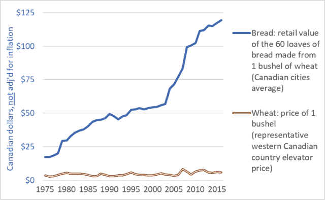
Graph of Canadian retail store bread price and country elevator wheat price, 1975-2016
Canadian retail store bread price and farm-gate wheat price, 1975-2016

Graph of United States retail store bread price and farm-gate wheat price, 1975-2016

United States retail store bread price and farm-gate wheat price, 1975-2016

It’s been said before but it bears repeating: farmers are making too little because others are taking too much.  For instance, food retailers, processors, grain companies, and railways are taking far too large a share of the retail price of bread.  And the share taken by these companies is increasing—choking off the flow of dollars to our family farms.  At the same time, these same corporations are profiteering by driving up the prices of the staple foods we all need to feed ourselves and our families.

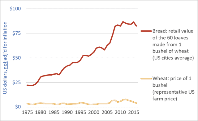
This week’s two graph show data for the US and Canada.  Both graphs show the price of a bushel of wheat (the relatively flat line across the bottom of each graph) and the retail value of the approximately 60 loaves of bread that can be produced from a bushel of wheat (the upward-trending line in each graph).  The wheat prices are farm-gate or country elevator values.  The units are Canadian or US dollars, as appropriate, not adjusted for inflation.

The units are not important, however.  What is important is the widening gap between what consumers pay for bread and the amount of money that makes it back to the farm.  This growing gap represents the ever-larger share taken by food retailers, flour millers and other processors, railways, and elevator companies and grain traders.

Very little of the money spent in grocery stores makes it back to American or Canadian farms.  Compounding this problem is the fact that most of the money that does make it back to these farms is quickly captured by powerful farm-input companies. (See details here.)  Corporations upstream and downstream from farmers use their market power to capture huge profits for themselves while reducing net farm income to zero in many years.  To keep farms solvent, governments and citizens must step in with taxpayer-funded farm support payments.  In Canada, these payments have totaled $100 billion dollars over the past three decades, and more than $400 billion in the US.  From some perspectives, the primary beneficiaries of these payments are the executives and shareholders of the dominant agribusiness/food corporations.

Finally, there is the issue of efficiency.  Farmers are relentlessly urged to become more efficient.  Indeed, they are forced to increase efficiency simply to remain solvent in the face of declining farm-gate prices and rising input costs.  Farmers are so efficient today that they can produce grains and other products for 1970s’ prices.  But what of efficiency elsewhere in the system?  What does it indicate about the efficiency of huge corporate flour millers and food retailers if they must constantly take more and more money for themselves?  Are they becoming less efficient as they get larger?  Or are they simply using their increasing size and power to capture more profit for themselves?  And if citizens are going to be made to pay more for food anyway, then why badger farmers to become ever more efficient?

Farmers are the primary victims of the abuses of power within the food system.  But everyone is hurt as we are made to pay increased taxes to fund farm-support programs and to pay increased retail prices to support the outsized profit needs of the dominant food-system transnationals and their shareholders.

Graph sources:
Canadian bread: Statistics Canada, Consumer Prices and Price Indexes (Catalog number 62-010); CANSIM Table 326-0012.
US bread: Bureau of Labour Statistics, “Bread prices 1980-2015“.
Canadian wheat: Government of Saskatchewan, Saskatchewan Agriculture and Agri-food, “StatFacts-Canadian Wheat Board Payments for No. 1 CWRS”; CANSIM Table  002-0043.
US Wheat: United States Department of Agriculture, “Wheat Yearbook”   

Happy motoring: Global automobile production 1900 to 2016

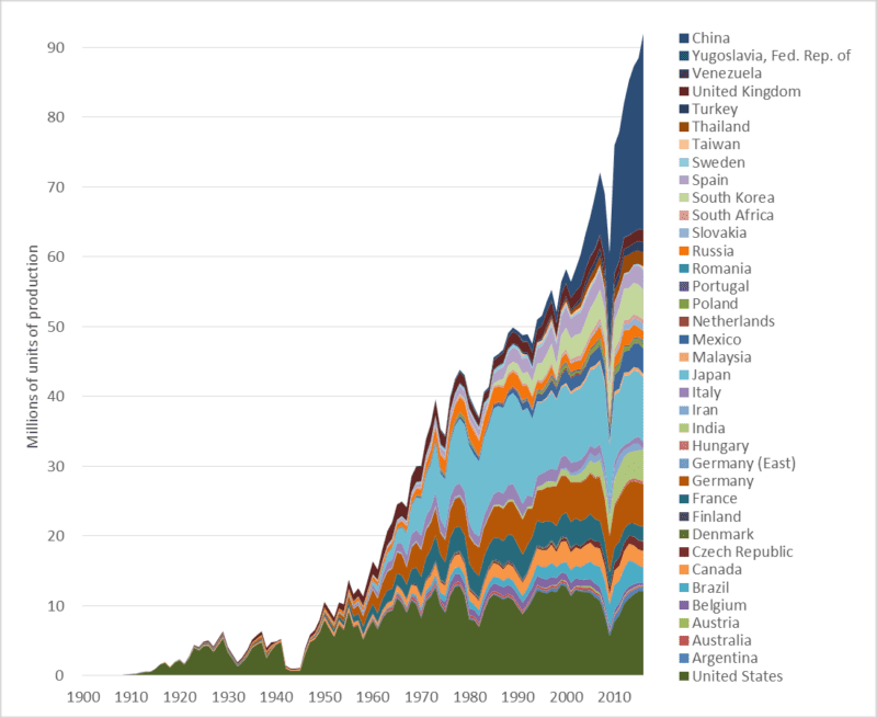
Graph of global automobile production numbers, various nations, historic, 1900 to 2016
Global automobile production (cars, trucks, and buses), 1900-2016

This week’s graph shows global automobile production over the past 116 years—since the industry’s inception.  The numbers include car, trucks, and buses.  The graph speaks for itself.  Nonetheless, a few observations may clarify our situation.

1.  Global automobile production is at a record high, increasing rapidly, and almost certain to rise far higher.

2. Annual production has nearly doubled since 1997—the year the world’s governments signed the Kyoto climate change agreement.

3. China is now the world’s largest automobile producer.  In terms of units made, Chinese production is double that of the United States.  This graph tells us something about the ascendancy of China.

4.  Most of the growth in the auto manufacturing sector is in Asia, especially Thailand, India, and China.  In 2000, those three nations together manufactured 3 million cars.  Last year their output totaled 34 million.  After 67 years of production, Australia is about to shut down its last automobile plant.  Most of its cars will be imported from Thailand, and perhaps a growing number  from China.

5. Auto production in “high-wage countries” is declining.  As noted, the Australian industry has been shuttered.  US production is down 5 percent since 2000, and Canadian production is down 20 percent.  Over that same period, production fell in France, Italy, and Japan, though not in Germany.  Since 2000, auto production increases in Mexico (+1.7 million) are roughly equal to decreases in Canada and the US (-1.2 million).

6. There are some surprises in the data:  Turkey, Slovakia, and Iran all make the  top-20 in terms of production numbers.

Graph sources: Motor Vehicle Manufacturers Association of the United States, World Motor Vehicle Data, 1981 Edition; Ward’s Communications, Ward’s World Motor Vehicle Data 2002; United States Department of Transportation, Bureau of Transportation Statistics, National Transportation Statistics, Table 1-23

Electric cars are coming…  Fast!

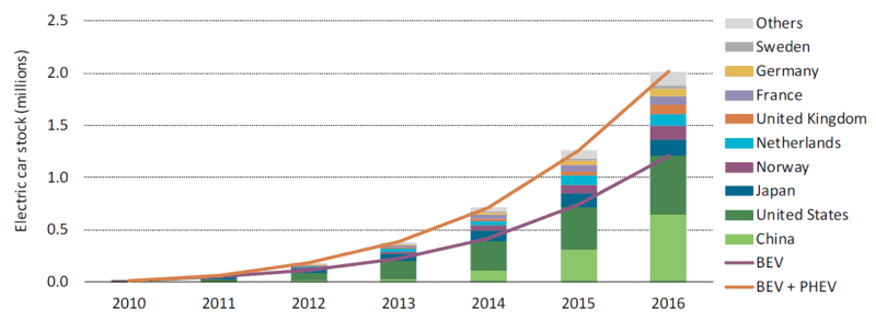
Graph of the number of electric vehicles worldwide and selected nations
Increase in the stock of electric vehicles: global and selected nations

When- and wherever it occurs, exponential growth is transformative.  After a long period of stagnation or slow increase, some important quantity begins doubling and redoubling.  The exponential growth in cloth, coal, and iron production transformed the world during the Industrial Revolution.  The exponential growth in the power and production volumes of transistors (see previous blog post)—a phenomenon codified as “Moore’s Law”—made possible the information revolution, the internet, and smartphones.  Electric cars and their battery systems have now entered a phase of exponential growth.

There are two categories of electric vehicles (EVs).  The first is plug-in hybrid electric vehicles (PHEVs).  These cars have batteries and can be driven a limited distance (usually tens of kilometres) using electrical power only, after which a conventional piston engine engages to charge the batteries or assist in propulsion.  Well-known PHEVs include the Chevrolet Volt and the Toyota Prius Plug-in.

The second category is the battery electric vehicle (BEV).  Compared to PHEVs, BEVs have larger batteries, longer all-electric range (150 to 400 kms), and no internal combustion engines.  Well-known BEVs include the Nissan Leaf, Chevrolet Bolt, and several models from Tesla.  The term electric vehicle (EV) encompasses both PHEVs and BEVs.

The graph above is reproduced from a very recent report from the International Energy Agency (IEA) entitled Global EV Outlook 2017.  It shows that the total number of electric vehicles in the world is increasing exponentially—doubling and redoubling every year or two.  In 2012, there we nearly a quarter-million EVs on streets and roads worldwide.  A year or two later, there were half-a-million.  By 2015 the number had surpassed one million.  And it is now well over two million.  Annual production of EVs is similarly increasing exponentially.  This kind of exponential growth promises to transform the global vehicle fleet.

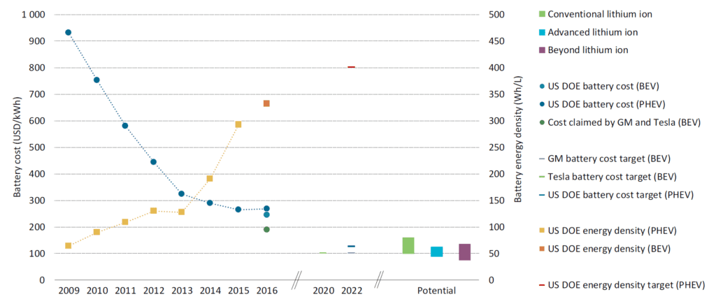
But if it was just vehicle numbers and production volumes that were increasing exponentially this trend would not be very interesting or, in the end, very powerful.  More important, quantitative measures of EV technology and capacity are doubling and redoubling.  This second graph, below, taken from the same IEA report, shows the dramatic decrease in the cost of a unit of battery storage (the downward trending line) and the dramatic increase in the energy storage density of EV batteries (upward trending line).  If we compare 2016 to 2009, we find that today an EV battery of a given capacity costs one-third as much and is potentially one-quarter the size.  Stated another way, for about the same money, and packaged into about the same space, a current battery can drive an electric car three or four times as far.

Graph of electric vehicle battery cost and power density 2009 to 2016

Looking to the future, GM, Tesla, and the US Department of Energy all project that battery costs will decrease by half in the coming five years.  Though these energy density increases and cost decreases will undoubtedly plateau in coming decades, improvements underway now are rapidly moving EVs from the periphery to the mainstream.  EVs may soon eclipse internal-combustion-engine cars in all measures: emissions, purchase affordability, operating costs, performance, comfort, and even sales.

Source for graphs: International Energy Agency, Global EV Outlook 2017: Two Million and Counting

Deindustrialization: Or, what are half-a-billion Canadians and Americans going to do for a living?

Graph of United States Gross Domestic Product, by sector, 1947 to 2016, highlighting deindustrialization
United States Gross Domestic Product, by sector, 1947 to 2016

Canada and the US continue to undergo rapid deindustrialization.  Our economies are increasingly service-based, and that should worry us.

The graph above looks complicated, but the key idea is contained in two trends.  And both are negative.  First, note the declining contribution manufacturing is making to United States (US) Gross Domestic Product (GDP).  The red, dotted line shows manufacturing’s percentage contribution.

Manufacturing now makes up just 12 percent of US GDP, and less than 10 percent in Canada.  The decline of manufacturing is even more evident when we look at employment rather than GDP.  According to the US Bureau of Labor Statistics, goods-producing industries (manufacturing, mining, construction, agriculture, etc.) now employ roughly 15 percent of America’s working population.  Nearly 85 percent are employed in the service sector.  The situation is similar in Canada.  According to Statistics Canada data , approximately 77 percent of Canadian workers are employed in the service sector, and this percentage continues to rise.  Both nations continue to deindustrialize.

Second, note the rise in the importance of three service sectors: 1. Finance, insurance, real estate, and rentals (the broad blue line); 2. Professional and business services (green line); and 3. Education and healthcare (red line). A US economy built upon General Motors, General Electric, and U.S. Steel has given way to one built upon JPMorgan Chase, Walmart, and UnitedHealth Group.

Note, especially, the blue line: finance and real estate.  With the 2008 financial crisis still fresh in our minds, and its effects still resonating through global economies, it should worry North Americans that banking and real estate have replaced manufacturing as the one of the largest economic sectors.

Manufacturing is declining, our energy sectors may have to contract as we deal with climate change, most North American fisheries have been depleted and agriculture seems to need fewer farmers and workers each year, low-wage nations continue to claim Canadian and American jobs, and we’re told that the robots are coming.  By mid-century there will be more than 450 million people living in Canada and the US.  Every politician in every party and every engaged citizen should be asking the same question: what are nearly half-a-billion North Americans going to do for a living?

We are not doomed to decline, but decline will be our lot unless we actively engage in a collective democratic effort to build a new, sustainable economy for North America.

Graph source: US Dept. of Commerce, Bureau of Economic Analysis


Back on track: North America needs high-speed passenger rail

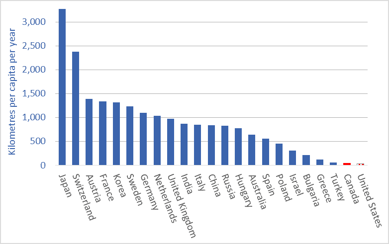
A graph of passenger rail utilization, selected nations, average kilometres per capita
Passenger train use, kilometers per person per year (average), selected countries, 2014 or 2015 data

Not every problem has a clear solution.  Here’s one that does.  The problem is the exponential growth in air travel and attendant greenhouse gas (GHG) emissions.  The solution is high-speed passenger rail.

Compared to airplanes, high-speed trains can move people faster, more comfortably and conveniently, more cheaply, and with a fraction of the GHG emissions.  And Canada is uniquely placed to benefit from a passenger-rail renaissance; one of the world’s largest passenger-rail manufacturers, Bombardier, is a Canadian company.

Air travel is increasing exponentially.  As I detailed in a previous blog post, air travelers now rack up about 7 trillion passenger-kilometres per year.  And that figure is projected to double by 2030.  If we are to retain a tolerable climate, most of the planes will soon need to be grounded, excepting perhaps those used for trans-oceanic flights.

While airplanes may remain our best option for crossing oceans, within continents higher-speed rail (130–200 km/h) and high-speed rail (200+ km/h) can move people faster and more comfortably.  Such trains can transport passengers from city-centre to city-centre, eliminating the long drive to the airport.  Trains do not require time-consuming, invasive airport security screenings.  These factors, combined with high speeds, mean that for many trips, the total travel time is lower for trains than for planes.  And because trains have much more leg-room and often include observation cars, restaurants, and lounges, they are much more comfortable and enjoyable.

Many people will know the Eurostar high-speed line that connects Paris and other European cities to London via the Channel Tunnel.  Top speed for that train is 320 km/h.  A trip from downtown London to Downtown Paris—nearly 500 kms—takes 2 hours and 20 minutes, about the time it takes the average North American to drive to the airport, check in, check baggage, clear security, and get to his or her airplane seat.

China recently inaugurated its Shanghai Maglev line, with a maximum speed of 430km/h and average speed of 250 km/h.  Japan’s famous “bullet trains” went into service more than 50 years ago.  They now travel on a network of 2,764 kms of track and reach speeds of 320 km/h.

North America has one high-speed line, the Acela Express that links Boston, New York, Philadelphia, Baltimore, and Washington. The maximum speed is 240 km/h, through average speeds are lower.  Travel time from New York to Washington is 2 hours and 45 minutes, including time spent at intermediate stops: an average speed of 132 km/h.  The Acela Express trains were built by a consortium 75 percent owned by Canada’s Bombardier.

This brings us to the truly good news: Canada is home to a world-leading passenger rail manufacturer, Bombardier.  You will find the company’s rolling stock in the subways of New York, London, and more than a dozen other cities.  Its intercity trains run throughout Europe, Asia, and North America.  And its high-speed trains are currently moving passengers in China, Europe, and the US.  Until a recent merger of two Chinese companies, Canada’s Bombardier was the largest passenger train manufacturer in the world.  Canada has a huge opportunity to create jobs and economic activity while leading the world in low-emission, cutting-edge rail technology.  As climate change forces Canada to scale back fossil-fuel production and maybe even auto manufacturing, Canada will need new economic engines.  Passenger-rail manufacturing can be an economic engine of the future.

Not all the news is good, however.  Many will have recent heard news reports about Bombardier.  Over the past few years, Federal and provincial governments have provided cash injections to the company totaling more than a billion dollars, largely to cover costs on its C-Series passenger-jet program.  Bombardier is in trouble.  Indeed, it may have made one of the biggest business blunders in recent decades: financially imperiling a world-leading train maker to make a huge gamble on planes just as climate change forces us to ground the planes and build a trillion-dollar passenger rail system.  Bombardier has recently announced that it may merge its train division with the German company Siemens.

Bombardier has been foolish.  Canadian citizens and their governments have been equally foolish: handing over billions of taxpayer dollars and not receiving a single passenger train in return.  But we can be smart.  That means building a North American network of fast trains.  Bombardier can prosper by being one of the main suppliers for that network.  High-speed passenger rail can be a win-win-win: jobs for Canadians and Americans; fast, comfortable travel; and a high-tech, low-emission transportation system on this continent like the ones being built in Europe and Asia.

The graph at the top of this article shows average per-person passenger-train utilization.  The data is from the most recent year available: 2014 or ’15.  Passenger rail utilization rates in Canada and the US (an average of less than 40 kms per person per year) are among the lowest in the world.  In China, average use is more than 800 kms per person per year and rising very rapidly.  In many European nations, it is more than 1,000 kms per year per person—25 to 30 times the Canadian and US rates.  There is huge growth potential for the passenger rail sector in North America.

Graph sources: OECD.


Fractal collapse: How the dominant societies and economies may fail.

Six images showing the stages of formation of a Sierpinski triangle
The stages of formation of a Sierpinski triangle illustrating fractal collapse

Fractal collapse is an important, useful idea.  It helps us understand that a society, economy, political system, or civilization may not “fall,” but rather become pock-marked and weakened—shot through with micro-collapses.

The United States may be in an advanced state of collapse.  There are many indicators that this is the case.  The national debt, nearly $20 trillion, about a quarter-million dollars per family of four (see my “US national debt per family”), seems unrepayable.  America’s former industrial heartland is now mostly rustbelt, and parts of Detroit look like sets for “Walking Dead” or “The Road.”  Climate change is bearing down from one side and resource depletion from another.  Its democratic system—rotted by dark money, voter suppression, gerrymandering, the distortions of the Electoral College, and messianic populist politics—has delivered gridlock, ideologues, cartoon-level analyses of complex issues, and, now, Trump.  Many of the manufacturing jobs that have not moved to Asia may soon be taken by robots.  Inequality and incarceration-rates are at record highs.  One could extend this list to fill pages.

Despite the preceding, I’m not predicting that America (or Greece or Australia or England) will “fall”—pitch into rapid and irreversible economic contraction and social disintegration.  Instead, fractal collapse is more likely.  In fractal collapse, parts of a system fail, at various scales, but the system, in diminished form, carries on.  We’re seeing this in America.  We see the collapse of a household here (perhaps a result of the opioid crisis), and a neighbourhood, there; a city declines rapidly (think Detroit or Scranton) and a county declares bankruptcy.  Collapse occurs in various places and at various scales but the aggregate entity moves forward.  And such collapses are not predictable—they do not just happen to poor people or in the “poor” places.  Suddenly and unexpectedly, the investment banks collapse, then General Motors becomes insolvent.  The Senate and House of Representatives cease to function properly.  Collapse is not a single event.  As we are seeing it play out now—amid the hyper-energized and dominant “industrial” economies—collapse is multiple, iterative, and repeated across scales: it is fractal.

And collapse is not monolithic or pervasive.  Indeed, some parts of the system expand and prosper.  The US is manufacturing billionaires at a record pace, the stock market continues to climb, output of everything from corn to natural gas is up, and Google and Apple are world-leading corporations.  A hallmark of collapse is that societies become dis-integrated, allowing some parts to fall as other parts rise.

The image above is a Sierpinski triangle or “gasket.”  It helps visualize this idea of fractal collapse.  Step by step, the original triangle shape develops more holes and loses area, but it does not disappear.  its outlines remain apparent.

To make a Sierpinski gasket, we start with an equilateral triangle.  Then we identify the mid-points of each side and use these as the vertices of a new triangle, which we remove from the original.  (See the top-middle triangle, above.)  This leaves us with three equilateral triangles.  We repeat this process over and over; we iterate.  From each remaining triangle we remove the middle, leaving three smaller triangles.  The Sierpinski gasket and its repeated holing can serve as a visual metaphor for the fractal collapse that may now be hollowing out many of the world’s nations.

The future is not binary, not rise or fall.  Increasingly, nations may become less homogeneous.  Some parts may expand and prosper while other parts may wither or fail.  The overall trendline may not be upward, however, but rather downward.  Our future may not be a train wreck, but rather a slow dilapidation.  Not with a bang but a wimper.  We can change this outcome.  But currently very few are trying.

The intellectual history of the idea of fractal collapse is not wholly clear.  The concept came out of the physical sciences and has been popularized as a description of social and economic collapse by author and analyst John Michael Greer.

China (re)rising: 1,000+ years of data on who dominates the global economy

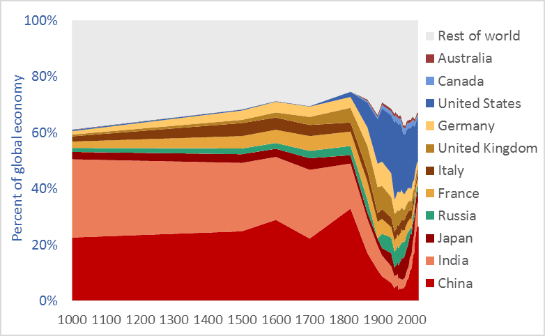
Graph of China's share of the global economy, and selected other nations, 1000 AD to present
China’s share of the global economy, along with other nations, 1000AD to present

China’s share of the global economy has increased rapidly—from about 5 percent in the early 1980s to more than 26 percent today.  India’s economy has similarly expanded, from 3 percent of the global economy in the early ’80s to more than 8 percent today.  Meanwhile, the percentage shares of the US, UK, Germany, Japan, and other nations are falling fast.  The graph above shows the relative share of global GDP represented by selected nations.  The time-frame is 1000 AD to 2016.

Manufacturing data* similarly shows India and China’s long-term dominance. In 1800, fully half the manufacturing output of the world came from India and China.  In that year, the UK contributed 4.3 percent of manufacturing output and the US just 0.8 percent.  The UK and US came to dominate global manufacturing by the late-1800s, but their rise is recent and, as the graph above suggests, their dominance may be shortlived.

Many people have been surprised by the “rise of China” and that of India.  No one should be.  The global economy is merely returning to its long-term normal—resetting after an anomalous period when European and New World nations were economically ascendant.  Indeed, England and Europe have been economic backwaters for 97 percent of the time since civilizations first arose 5,000 years ago. Our educational system fails to teach us that China and India are the default global superpowers.

To give just two final examples of the long-term dominance of Asia, China  smelted hundreds of thousands of tons of iron in the 11th century using coal rather than wood, a feat not matched in Europe until 600 years later.** A list of the ten largest cities in the world in the year 1500 includes four in China (Beijing, Nanjing, Hangzhou, and Guangzhou) and two in India (Gaur and Vijayanagara), but just one in Europe, (Paris). The three cities rounding off the top-ten list were Tabriz, Cairo, and Istanbul.*** Clearly, the economic and civilizational centre of gravity was in the East. It appears to be shifting back there.

* Paul Bairoch, “International Industrial Levels from 1750 to 1980”
** Hartwell, various pubs
*** Hohenberg, Oxford Encyclopaedia of Economic History

Graph sources: 1000AD-2008, Angus Maddison, 2009-2016 Conference Board

Fraught freight: trade agreements, globalization, and rising global freight transport

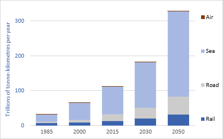
Graph of global freight transport, trillions of tonne-kilometres
Global freight transport, all modes, trillions of tonne-kilometres, selected years, 1985 to 2050

Global freight transport now exceeds 122 trillion tonne-kilometres* per year. That enormous tonnage/distance has more than tripled since the beginning of the “free trade” era, in the 1980s.  And the Organization for Economic Cooperation and Development (OECD) projects that global freight transport tonnage will triple again in the coming generation—rising to 330 trillion tonne-kilometres per year by 2050 (see OECD).  To put these trillions into perspective, freight movement will soon surpass 100,000 tonne-kilometres per capita per year for those of us living high-consumption lifestyles, here and around the world.

*Note: a tonne-kilometre is equivalent to moving one tonne one kilometre.  If you move 10 tonnes 10 kilometres, that is 100 tonne-kilometres.

A major part of this increase in transport tonnage is related to trade agreements and globalization.  As we’ve restructured the global economy we have off-shored our factories.  Our washing machines, toasters, rubber boots, TVs, and many of our cars now come from half-way around the world.  Our foods and fertilizers are increasingly shipped across continents or oceans.  And we ship food, resources, and other goods around the world.  Economic growth means we’re consuming more and more; globalization means we’re consuming resources and products from further away.  These two trends, together, help explain the tenfold increase in global freight transport depicted in the graph.

Moving this colossal tonnage requires ships, trains, trucks, and airplanes—all of which burn fossil fuels and emit greenhouse gas (GHG) emissions.  Emissions from the freight transport sector make up about 10 percent of all man-made CO2 emissions (see OECD). The OECD predicts that if current trends and policies hold, emissions will nearly double by 2050, to 5.7 billion tonnes of CO2 per year (see OECD).  This near-doubling of freight transport emissions between now and 2050 will occur at the same time that we are attempting to cut overall GHG emissions by half.  It is time to ask the obvious questions: Is our ongoing drive toward globalization (i.e., de-localization and transport maximization) compatible with our emission-reduction commitments and a livable climate?  Indeed, as our leaders aggressively sign and implement still more “free trade” agreements (TPP, CETA, etc.) we should consider that  perhaps doubling down on globalization vetoes emissions reduction, vetoes a stable climate, vetoes local food, and vetoes local jobs.

To leave a comment, click on the graph or this post’s title and then scroll down.

Graph sources: 2015, 2030, and 2050 data from the OECD/ITF page 56. Data for 2000 and 1985 are from various sources: air freight data is from the World Bank. Rail freight data is from the World Bank. Maritime freight data is from the United Nations, Review of Maritime Transport. Road freight data for 2000 is from the OECD. Road freight data for 1985 is an informed estimate.


Cheap oil? Long-term US and Canadian crude oil prices

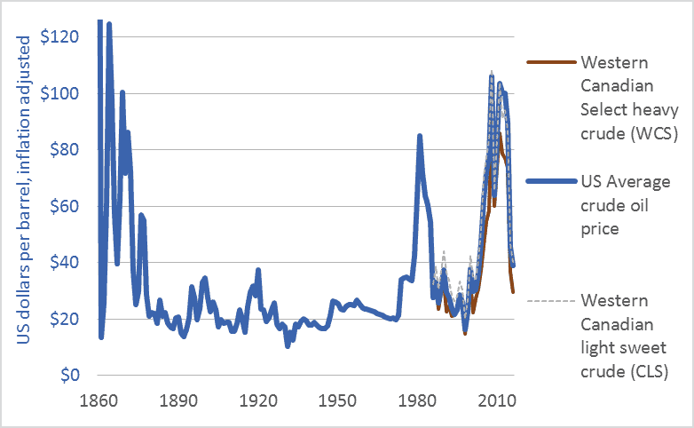
Graph of US and Canadian crude oil prices, historic, 1860 to 2016
US and Canadian crude oil prices, historical, 1860-2016

Many corporate spokespeople, government officials, economists, and journalists are repeating a very odd line: “oil prices are low.” Others talk of “cheap oil,” “plunging prices,” and a “crash.” Here’s one example, a 2016 headline from Maclean’s: “Life at $20 a barrel: What the oil crash means for Canada.”

I will argue that talk of “low oil prices” ignores history, misconstrues energy’s role in making civilizations, and confuses our efforts to build resilient, sustainable, climate-stabilizing economies. The graph above and the table below put recent oil prices into their long-term context. The graph covers the 156-year period from the first large-scale production of petroleum oil to the present: 1860 to 2016. It shows US average crude oil prices and Canadian prices for light sweet crude and heavy tarsands crude. For comparability, all figures are in US dollars and adjusted for inflation.

This table helps us interpret the data in the graph by showing average prices for each decade.

Canada and US crude oil prices, decade-averages, US dollars, adjusted for inflation
Canada and US crude oil prices, decade-averages, inflation-adjusted US dollars

Here’s what the graph and table can tell us about current “low oil prices.”

1. The graph shows that the very high 2003-2014 prices are an anomaly.

2. The $80 average price in the 2010s is the highest since the 1870s.

3. Even with recent declines, oil prices remain above the levels that held during the century from 1875 to 1975.

4. While prices have averaged $80 in the 2010s, the average price in the 1950s, ’60s, and ’70s was below $30. The greatest period of economic growth in global history, the postwar US boom, was accomplished with very cheap oil. As the cost of oil goes up, the cost of civilization goes up. If energy prices rise too high, we may no longer be able to afford to continue to build or even maintain our sprawling mega-civilization.

5. Many say that Canadian prices are particularly low relative to US or world prices. That isn’t the case. It’s not that Canadian oil is priced lower than US oil; rather, Canadian heavy (tar sands) oil is priced lower than US and Canadian light oil. The values in the table show this. The graph also shows this in the close correlation of US average oil prices with Canadian light oil prices. The right-wing think-tank The Fraser Institute explains that heavy oil from the tarsands and similar sources is priced lower because such oil “is more costly to transport by pipeline …. Further, the heavier the crude oil …, the lower its value to a refiner as it will either require more processing or yield a higher percentage of lower-valued by-products such as heavy fuel oil. Complex crudes containing more sulphur also generally cost more to refine than low-sulphur crudes. For these reasons, oil refiners are willing to pay more for light, low-sulphur crude oil.”

6. Western Canadians are particularly sensitive to “low oil prices” because our economy is dependent upon some of the highest-cost oil production systems in the world: the tar sands. We are the high-cost producers.

As the International Energy Agency (IEA) said recently, “Attempting to understand how the oil market will look during the next five years is today a task of enormous complexity.” I certainly cannot predict oil prices. And I’m not advocating lower prices. Just the opposite. As someone deeply concerned by climate change, I hope that oil prices rise and stay high, and that governments impose taxes on carbon emissions to push the cost of burning fossil fuels higher still. Nonetheless, we need to dispassionately interpret the data if we are to have any hope of directing our future and our economy. We need to be able to discern when energy prices are low and when they are not.

To leave a comment, click on the graph or the title and then scroll down.

Graph Sources: Canadian Association of Petroleum Producers (CAPP), Statistical Handbookfor Canada’s Upstream Petroleum Industry (October, 2016); and US Energy Information Administration (EIA), U.S. Crude Oil First Purchase Price


Deep into the red: US national debt per family, 1816 to 2016

US national debt graph 1816 to 2016, dollars per family
United States national debt, per family of four, 1816-2016

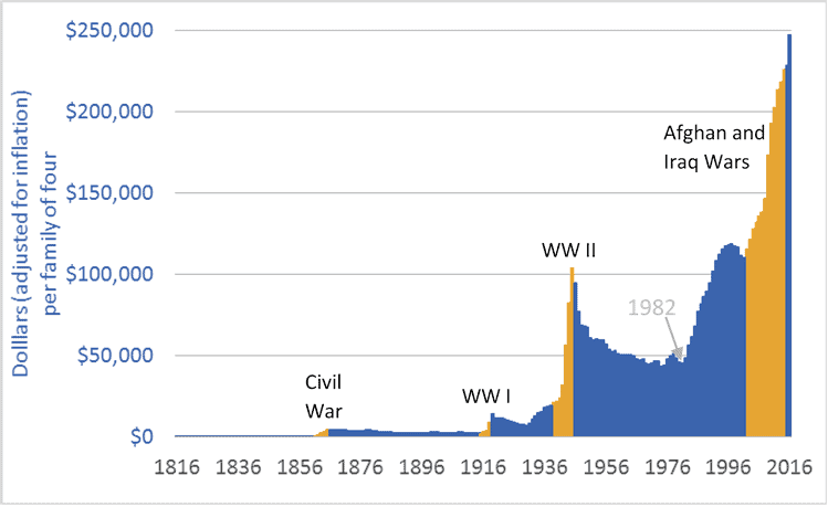
In the United States, federal government debt is nearly $20 trillion. That works out to about $62,000 per person, or just under $250,000 for a hypothetical family of four. Adjusted for inflation, debt has doubled since 2002, and is five times higher than in 1982.

The graph above shows the increasing size of the US national debt. The time-frame is 1816 to 2016. The units are US dollars, adjusted for inflation. In the graph, some conflict periods are highlighted in a contrasting colour. Wars have caused rapid increases in government debt. Indeed, the wars in Iraq and Afghanistan (2002-2014) played significant roles in creating the unprecedented level of debt US families now must carry. Other factors include a financial meltdown and bailout, and tax cuts that eroded revenues and forced governments to fund a greater portion of their services with borrowed money. As visible in the graph, 1982 marks the beginning of the recent phase of debt expansion. That is also the beginning of the modern era of tax cutting—the implementation of the Reagan tax cuts. US citizens have enjoyed tax cuts, but have yet to pay for them.

The graph shows that periods of increasing national debt (the Civil War, WW I, and WW II) were followed by periods of declining debt. The question now is this: Does the US economy retain enough vigour, and do US citizens and businesses retain enough good sense and discipline, to pay down $20 trillion in federal government debt, trillions more in personal debt, and trillions more in city, county, and state debts? It is never wise to bet against America. But de-industrialization, rising income inequality, world-leading incarceration rates, uncontrolled gun crime, Detroit and similar rustbelt cities, legislative gridlock, crumbling infrastructure, and a retreat into ideology all raise serious concerns.

For comparison, Canadian national debt works out to about $80,000 (Cdn.) per hypothetical family of four. Canadians, however, must not feel in any way superior or safe, because the Canadian and US economies are so tightly tied. Rising US debt is a concern for all the world’s citizens.

Graph sources: U.S. Department of the Treasury, “TreasuryDirect: Historical Debt Outstanding–Annual”