China will save us?  50+ years of data on Chinese energy consumption

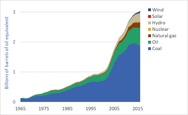
Graph of Chinese energy consumption by source or fuel, 1965 to 2016
Chinese energy consumption, by source or fuel, 1965 to 2016

There’s a lot being written about China’s rapid push to install solar panels and wind turbines (e.g., see here).  And as the US withdraws from the Paris Agreement, pundits have suggested that this opens the door for Chinese leadership on renewable energy and climate change mitigation (see here).  And China certainly has taken over global production of solar photovoltaic (PV) panels.  But is this talk of China’s low-carbon, renewable-energy future premature and overoptimistic?  Are we just pretending, because so little positive is happening where we live, that something good is happening somewhere?  Chinese energy consumption data provides a corrective to the flood of uncritical news stories that imply that China will save us.

This week’s graph shows how various energy sources are being combined to power China’s rapidly growing and industrializing economy.  The units are “billions of barrels of oil equivalent”: all energy sources have been recorded based on their energy content relative to the energy contained in a barrel of oil.  Similar data for Canada can be found here.  US data is coming soon.

Is the Chinese energy system being rapidly decarbonized?  Is China powered by wind turbines?  Or by coal?  The data can support some optimism for the future, but at present, most of the news is bad.  China remains the world’s largest consumer of fossil fuels and largest emitter of greenhouse gases (GHGs).  Let’s look at the good-news-bad-news story that is China’s energy system.

First, the good news: As is visible in the graph, China’s fossil fuel consumption has been flat-lined since 2013, and coal consumption is falling.  Further, CO2 emissions have been declining since 2014.  China has ceased, or at least paused, its rapid increase in its consumption of fossil fuels.

China is also leading the world in the installation of renewable energy systems, especially wind and solar generation systems (see here).  Chinese wind power production and consumption is growing exponentially—doubling approximately every two years.  Solar power production and consumption is growing even more rapidly and has increased 25-fold in just the past 5 years.  China has also invested massively in hydro dams, which can produce electricity with far fewer GHG emissions than coal-fired power plants.

But it would be naive or premature to simple project Chinese solar and wind power growth rates into the future and conclude that the nation will soon slash its emissions.  China’s coal-fired powerplants are relatively new and unlikely to be decommissioned prematurely.  No matter how cheap solar panels become, installing new solar arrays will never be cheaper than simply continuing to produce electricity with already-built coal plants.

Moreover, the graph makes clear that the current contribution of solar and wind to China’s energy system is small—about 2 percent of total consumption.  And while this portion will undoubtedly grow, there will be huge challenges for China as renewables make up a larger and larger percentage of its electricity generation capacity.  With a less-than-state-of-the-art power grid, China will face difficulties dealing with the fluctuations and uncertainty created by intermittent power sources such as wind and solar power.

Is China the leader we’re looking for?  If so, it is a very odd choice.  China has doubled its fossil fuel use and emissions since 2003.  It is the world’s largest fossil fuel consumer and GHG emitter, and these two facts will almost certainly remain true for decades to come.  The idea that China will pick up the slack as American and European commitments to decarbonization falter is dangerous wishful thinking.  Moreover, it should not be the case that we should expect China to lead.  It was us—the UK, US, EU, Canada and similar early-adopters of fossil fuels, cars, and consumerism—that overfilled the atmosphere with GHGs over the past century.  China has come late to the fossil fuel party.  Asking it to lead the way out the door—asking it to take the lead in decarbonization—is as inappropriate as it is naive.

Here’s one last reason why it’s wrong to look for China to lead the way to a zero-carbon future: Per person, China’s emissions are about half of those in Canada and the US (source here).  Is it right for those of us neck deep in high-emission consumerist car-culture to look to relatively poor people with relatively low emissions and urge them to “go first” down the road of carbon reduction?
 

Powering Canada: 51 years of Canadian energy use data

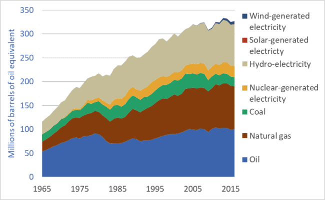
Graph of Canadian energy use, by fuel or energy source, 1965 to 2016.
Canadian energy use (primary energy consumption), by fuel or energy source, 1965 to 2016.

New reports in highly-respected journals Science and Nature (links here and here) tell us that the world’s economies and societies need to reduce carbon-dioxide emissions to zero before mid-century.  This has huge implications for the ways in which we power our cities, homes, food systems, transportation networks, and manufacturing plants.  Our civilization must undergo a rapid energy-system transformation, similar in magnitude and effects to previous energy transitions, such as the replacement of wood by fossil fuels in the 18th, 19th, and 20th centuries.  Enormous changes are on the way.

To understand our possible futures it is useful to know something of the past.  The graph above shows Canadian primary energy consumption from 1965 to 2016.  The units are “millions of barrels of oil equivalent”—that is, all energy sources have been quantified based on their energy content relative to the energy contained in a barrel of oil.  (“Primary energy” is energy in the form in which it is first produced: oil from a well, coal from a mine, hydroelectricity from a dam, or photovoltaic electricity from a solar panel.  Much of the coal and some of the natural gas listed in the graph above is turned into electricity in power generating stations.)

This multi-decade look at Canadian energy use reveals both good and bad news.  Most obvious, it shows that Canada has nearly tripled its overall energy consumption since 1965.  Today, on a per-capita basis, Canadians consume more energy than citizens of most other nations.  Our very high per-capita energy use will make our energy transition more difficult and costly.

On the positive side, our rate of increase in energy use is slowing—the top line of the graph is flattening out.  Partly, this indicates that Canadians are using energy more wisely and efficiently.  But another factor may be the transfer of heavy industry and manufacturing to other nations; Canadian energy use may be growing more slowly because more of our industrial and consumer goods are made overseas.  Also, the graph may not include the full extent of energy consumed in international shipping and aviation.  If Canada’s full share of global water and air transport were added, our energy use may appear higher still.

The graph has some good news in that fossil fuel use in Canada is declining.  Coal, oil, and natural gas provide less energy to our economy today than they did 20 years ago.  Coal use, especially, has been cut.  On the negative side, any downward trendline in fossil fuel use is not nearly steep enough to intersect zero by 2050.

Good news is that Canada already has a large number of low-emission energy sources in place.  We are the world’s third-largest producer of hydro-electricity.  We also produce significant amounts of electricity from nuclear powerplants.  Starting in the 1980s and continuing today, Canada has produced about a third of its primary energy from low-emission sources: including nuclear, hydro, wind, and solar electricity generation.

This brings us to perhaps the most important fact revealed by the graph: the very slow rate of installation of new low-emission energy sources—especially solar and wind.  Today, solar and wind provide just 2 percent of our primary energy.  Indeed, the contribution of solar power is barely visible in the graph.

An energy transformation is critical.  Global greenhouse gas emissions must peak before 2020 and ramp down sharply, reaching zero three decades later.  This will be, by far, the most rapid energy transition in human history.  Canadian action so far falls far short of the scale and rate required.

P.S. A new book on the history of Canadian energy systems has recently been published.  Powering up Canada: A History of Power, Fuel, and Energy from 1600 contains chapters on the energy sources for the fur trade, early horse-powered agriculture, the rise in the importance of coal in Canada, and chapter on the development of the oil and gas sectors.

Graph sources: BP Statistical Review of World Energy.


2016: record high fossil fuel use (!) and stagnating solar power installations (?)

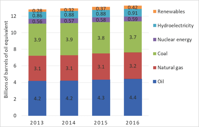
Graph of Primary energy consumption, by fuel or source, global, 2013-2016.
Primary energy consumption, by fuel or source, global, 2013-2016.

There are many kinds of climate change denial.  A minority of people deny that climate change is occurring or serious.  This is classic denial.  But a much more common and insidious form is all around us: accepting that the problem is real, but pretending that solutions are at hand, underway, or not very difficult.  By pretending that Elon Musk’s solar shingles or whiz-bang batteries can provide easy solutions, these people essentially deny the need for rapid, aggressive action.  They are wrong.  We are not solving the climate change problem.  At worst, record high rates of fossil fuel use are locking us into civilization-threatening levels of warming.  At best, we are proceeding toward solutions, but far too slowly.   What we must stop denying is the need for rapid, aggressive, transformative action.

Each year British Petroleum (BP) releases a report and dataset detailing global energy supply and demand.  The data includes each nation’s production and consumption of coal, oil, natural gas, hydroelectricity, and other energy sources.  Some data extends back to 1965.  BP provides one of the most important sources of energy information.  The company’s newest dataset—updated to include 2016—was released June 13th.  BP’s data shows that 2016 was another record-setting year for fossil fuel use: 11.4 billion tonnes of oil equivalent.  See graph above.  That same data shows that the rate of solar panel installation is slowing in nearly every nation.

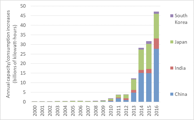
The three graphs below are also produced from recently-updated BP data.  They show the amount of annual increase in the production and use of solar PV electricity in various countries.  This is approximately equal to the annual amount of new capacity added, but it further takes into account how much of any new capacity is actually being utilized.  The North American, Asian, and European nations featured in the graphs together host 92 percent of the world’s installed solar generation capacity.

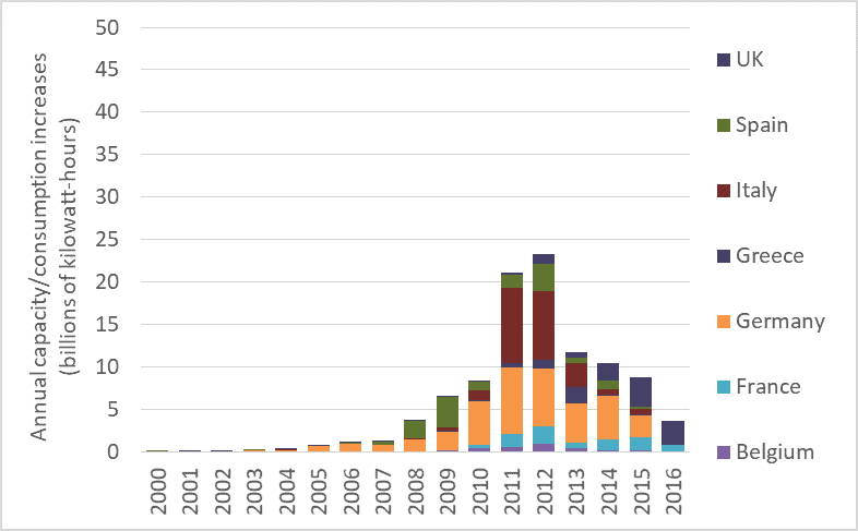
The first of the three graphs shows how much solar PV production/ consumption increased each year in selected EU countries over the past 17 years.  It’s bad news: the rate of additions to solar power consumption peaked in 2012 and has fallen dramatically since then.  The graph shows that the rate at which EU countries are installing solar panel arrays has collapsed since 2012.  Progress toward renewables is decelerating.

Annual PV production and consumption additions, 2000 to 2013, EU countries

Further, note how each individual country accelerated its installation then slowed.  Spain, represented by the green bars, ramped up installation of solar panel arrays in 2008 and ’09.  After that, solar PV additions to Spain’s grid fell sharply, and rallied in only one year: 2012.  Germany’s solar installations followed a similar trajectory.  In that country, annual increases in solar power production and consumption grew until 2011, then began falling.  Additions to solar power production and consumption in Italy peaked in 2011 and have been falling ever since.  Nearly every EU nation is slowing the rate at which they add solar power.

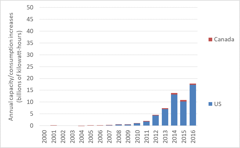
The next graph shows production/consumption additions in the US and Canada.  The rates of new additions in those countries also appears to be sputtering.

Annual-PV-production-and-consumption-additions-2000-to-2013-North-America

The final graph shows the rate of production/consumption increases in China, India, Japan, and South Korea.  Clearly, capacity and consumption are rising rapidly in Asia.  But note that rates of installation are increasing only in China and perhaps in India.  One EU-based analyst told me that in recent years China ramped up solar-panel production to serve markets in the EU and elsewhere.  But when demand in those markets contracted, faced with a glut of panels coming out of Chinese factories, the government there pushed to install those panels in China.  Perhaps that isn’t the entire story.  It may be that China’s world-leading solar install rates are partly caused by a visionary concern for the environment and the climate, and partly by the need to absorb the output of Chinese PV panel factories left with surpluses after other nations failed to maintain installation rates.

Annual-PV-production-and-consumption-additions-2000-to-2013-Asia

Together, these four graphs tell a disturbing story.  Instead of accelerating rates of solar panel installations, we see stagnation or decline in nearly every nation other than China.  This comes along-side record-high fossil fuel use and record-setting CO2 emissions.  We’re failing to act aggressively enough to decarbonize global electricity systems and we are largely ignoring the project of decarbonizing our overall energy systems.  Rather, we’re increasing carbon emissions.  And as we do so, we risk slamming shut any window we may have had to keep global temperature increases under 2 degrees C.

Graph sources: BP Statistical Review of World Energy.

Electric cars are coming…  Fast!

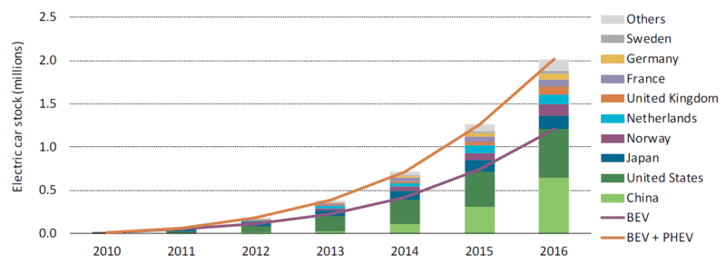
Graph of the number of electric vehicles worldwide and selected nations
Increase in the stock of electric vehicles: global and selected nations

When- and wherever it occurs, exponential growth is transformative.  After a long period of stagnation or slow increase, some important quantity begins doubling and redoubling.  The exponential growth in cloth, coal, and iron production transformed the world during the Industrial Revolution.  The exponential growth in the power and production volumes of transistors (see previous blog post)—a phenomenon codified as “Moore’s Law”—made possible the information revolution, the internet, and smartphones.  Electric cars and their battery systems have now entered a phase of exponential growth.

There are two categories of electric vehicles (EVs).  The first is plug-in hybrid electric vehicles (PHEVs).  These cars have batteries and can be driven a limited distance (usually tens of kilometres) using electrical power only, after which a conventional piston engine engages to charge the batteries or assist in propulsion.  Well-known PHEVs include the Chevrolet Volt and the Toyota Prius Plug-in.

The second category is the battery electric vehicle (BEV).  Compared to PHEVs, BEVs have larger batteries, longer all-electric range (150 to 400 kms), and no internal combustion engines.  Well-known BEVs include the Nissan Leaf, Chevrolet Bolt, and several models from Tesla.  The term electric vehicle (EV) encompasses both PHEVs and BEVs.

The graph above is reproduced from a very recent report from the International Energy Agency (IEA) entitled Global EV Outlook 2017.  It shows that the total number of electric vehicles in the world is increasing exponentially—doubling and redoubling every year or two.  In 2012, there we nearly a quarter-million EVs on streets and roads worldwide.  A year or two later, there were half-a-million.  By 2015 the number had surpassed one million.  And it is now well over two million.  Annual production of EVs is similarly increasing exponentially.  This kind of exponential growth promises to transform the global vehicle fleet.

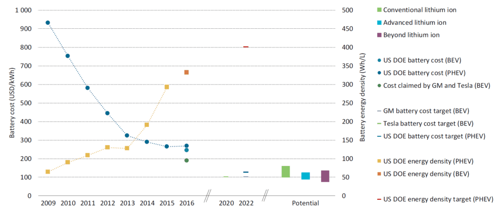
But if it was just vehicle numbers and production volumes that were increasing exponentially this trend would not be very interesting or, in the end, very powerful.  More important, quantitative measures of EV technology and capacity are doubling and redoubling.  This second graph, below, taken from the same IEA report, shows the dramatic decrease in the cost of a unit of battery storage (the downward trending line) and the dramatic increase in the energy storage density of EV batteries (upward trending line).  If we compare 2016 to 2009, we find that today an EV battery of a given capacity costs one-third as much and is potentially one-quarter the size.  Stated another way, for about the same money, and packaged into about the same space, a current battery can drive an electric car three or four times as far.

Graph of electric vehicle battery cost and power density 2009 to 2016

Looking to the future, GM, Tesla, and the US Department of Energy all project that battery costs will decrease by half in the coming five years.  Though these energy density increases and cost decreases will undoubtedly plateau in coming decades, improvements underway now are rapidly moving EVs from the periphery to the mainstream.  EVs may soon eclipse internal-combustion-engine cars in all measures: emissions, purchase affordability, operating costs, performance, comfort, and even sales.

Source for graphs: International Energy Agency, Global EV Outlook 2017: Two Million and Counting

Our civilizational predicament: Doubling economic activity and energy use while cutting emissions by half

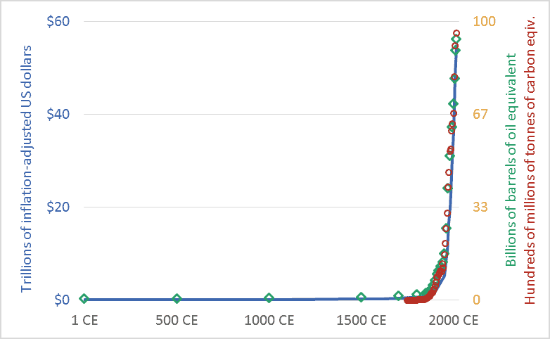
Graph of Global economic activity, energy use, and greenhouse gas emissions, 1CE to 2015CE.
Global economic activity, energy use, and carbon dioxide emissions, 1CE to 2015CE.

My friends sometimes suggest that I’m too pessimistic.  I’m not.  Rather, I’d suggest that everyone else is too optimistic.  Or, more precisely, I live in a society where people are discouraged from thinking rigorously about our predicament.  The graph above sets out our civilizational predicament, and it hints at the massive scale of the transformation that climate change requires us to accomplish in the coming decade or two.

The main point of the graph above is this: Long-term data shows that the size and speed of our global mega-civilization is precisely correlated with energy use, and energy use is precisely correlated with greenhouse gas emissions.  We have multiplied the size of our global economy and our living standards by using more energy, and this increased energy use has led us to emit more carbon dioxide and other greenhouse gases.

The graph plots three key civilizational metrics: economic activity, energy use, and carbon dioxide (CO2) emissions.  The graph covers the past 2015 years, the period from 1 CE (aka 1 AD) to 2015 CE.  The blue line depicts the size of the global economy.  The units are trillions of US dollars, adjusted for inflation.  The green diamond-shaped markers show global energy use, with all energy converted to a common measure: barrels of oil equivalent.  And the red circles show global CO2 emissions, in terms of tonnes of carbon.

Though it is seldom stated explicitly, most government and business leaders and most citizens are proceeding under the assumption that the economic growth line in the graph can continue to spike upward.  This will require the energy line to also climb skyward.  But our leaders are suggesting that the emissions line can be wrenched downward.  When people are “optimistic” about climate change, they are optimistic about doing something that has never been done before: maintaining the upward arc of the economic and energy trendlines, but somehow unhooking the emissions trendline and bending it downward, toward zero.  I worry that this will be very hard.  Most important, it will be impossibly hard unless we are realistic about what we are trying to do, and about the challenges and disruptions ahead.

We must not despair, but neither should we permit ourselves unfounded optimism.  There is a line from a great movie—the Cohen Brother’s “Miller’s Crossing”—in which the lead character, a gangster played by Gabriel Byrne, says “I’d worry a lot less if I thought you were worrying enough.”

Graph sources: GDP: Angus Maddison, The World Economy, Volume 1: A Millennial Perspective (Paris: Organization for Economic Co-operation and Development, 2001)

GHGs: Boden, T.A., Marland, G., and Andres R.J., “Global, Regional, and National Fossil-Fuel CO2 Emissions,” Carbon Dioxide Information Analysis Center (CDIAC), Oak Ridge National Laboratory, U.S. Department of Energy, Oak Ridge, Tenn., U.S.A.

Energy consumption: Vaclav Smil, Energy in Nature and Society: General Energetics of Complex Systems (Cambridge, MA: The MIT Press, 2008); British Petroleum, BP Statistical Review of World Energy: June 2016 (London: British Petroleum, 2016); pre-1500 energy levels estimated by the author based on data in Smil.

Cheap oil? Long-term US and Canadian crude oil prices

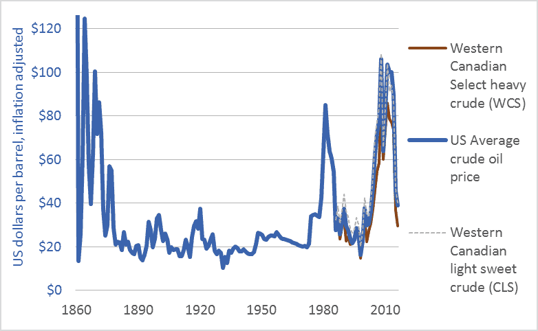
Graph of US and Canadian crude oil prices, historic, 1860 to 2016
US and Canadian crude oil prices, historical, 1860-2016

Many corporate spokespeople, government officials, economists, and journalists are repeating a very odd line: “oil prices are low.” Others talk of “cheap oil,” “plunging prices,” and a “crash.” Here’s one example, a 2016 headline from Maclean’s: “Life at $20 a barrel: What the oil crash means for Canada.”

I will argue that talk of “low oil prices” ignores history, misconstrues energy’s role in making civilizations, and confuses our efforts to build resilient, sustainable, climate-stabilizing economies. The graph above and the table below put recent oil prices into their long-term context. The graph covers the 156-year period from the first large-scale production of petroleum oil to the present: 1860 to 2016. It shows US average crude oil prices and Canadian prices for light sweet crude and heavy tarsands crude. For comparability, all figures are in US dollars and adjusted for inflation.

This table helps us interpret the data in the graph by showing average prices for each decade.

Canada and US crude oil prices, decade-averages, US dollars, adjusted for inflation
Canada and US crude oil prices, decade-averages, inflation-adjusted US dollars

Here’s what the graph and table can tell us about current “low oil prices.”

1. The graph shows that the very high 2003-2014 prices are an anomaly.

2. The $80 average price in the 2010s is the highest since the 1870s.

3. Even with recent declines, oil prices remain above the levels that held during the century from 1875 to 1975.

4. While prices have averaged $80 in the 2010s, the average price in the 1950s, ’60s, and ’70s was below $30. The greatest period of economic growth in global history, the postwar US boom, was accomplished with very cheap oil. As the cost of oil goes up, the cost of civilization goes up. If energy prices rise too high, we may no longer be able to afford to continue to build or even maintain our sprawling mega-civilization.

5. Many say that Canadian prices are particularly low relative to US or world prices. That isn’t the case. It’s not that Canadian oil is priced lower than US oil; rather, Canadian heavy (tar sands) oil is priced lower than US and Canadian light oil. The values in the table show this. The graph also shows this in the close correlation of US average oil prices with Canadian light oil prices. The right-wing think-tank The Fraser Institute explains that heavy oil from the tarsands and similar sources is priced lower because such oil “is more costly to transport by pipeline …. Further, the heavier the crude oil …, the lower its value to a refiner as it will either require more processing or yield a higher percentage of lower-valued by-products such as heavy fuel oil. Complex crudes containing more sulphur also generally cost more to refine than low-sulphur crudes. For these reasons, oil refiners are willing to pay more for light, low-sulphur crude oil.”

6. Western Canadians are particularly sensitive to “low oil prices” because our economy is dependent upon some of the highest-cost oil production systems in the world: the tar sands. We are the high-cost producers.

As the International Energy Agency (IEA) said recently, “Attempting to understand how the oil market will look during the next five years is today a task of enormous complexity.” I certainly cannot predict oil prices. And I’m not advocating lower prices. Just the opposite. As someone deeply concerned by climate change, I hope that oil prices rise and stay high, and that governments impose taxes on carbon emissions to push the cost of burning fossil fuels higher still. Nonetheless, we need to dispassionately interpret the data if we are to have any hope of directing our future and our economy. We need to be able to discern when energy prices are low and when they are not.

To leave a comment, click on the graph or the title and then scroll down.

Graph Sources: Canadian Association of Petroleum Producers (CAPP), Statistical Handbookfor Canada’s Upstream Petroleum Industry (October, 2016); and US Energy Information Administration (EIA), U.S. Crude Oil First Purchase Price


Turning fossil fuels into fertilizer into food into us: Historic nitrogen fertilizer consumption

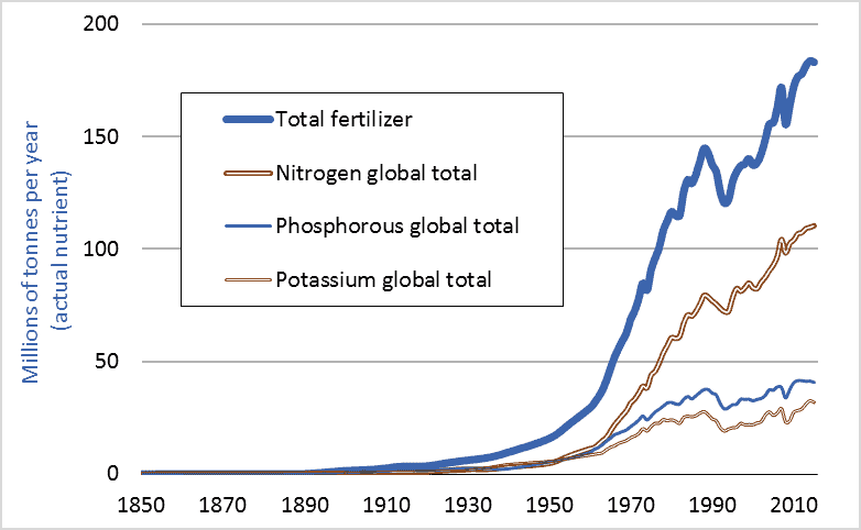
Graph of historic global fertilizer use, including nitrogen fertilizer, 1850-2015
Global consumption of nitrogen fertilizer and other fertilizers, historic, 1850 to 2015

Last week’s blog post (Feeding the World) showed that farmers worldwide had, since 1950, quadrupled grain production. How is this possible? The answer is fertilizer; more specifically, nitrogen fertilizer. This graph shows global fertilizer use. In 1950, farmers applied less than 5 million tonnes of nitrogen (measured in terms of actual nutrient, not fertilizer product). In 2015, farmers applied more than 110 million tonnes. We managed to increase grain output fourfold largely by increasing nitrogen inputs 23-fold.

Nitrogen fertilizer is a fossil fuel product, made primarily from natural gas. One can think of a modern nitrogen fertilizer factory as having a large natural gas pipeline feeding into one end and a large pipe coming out the other carrying ammonia, a nitrogen-rich gas. To produce, transport, and apply one tonne of nitrogen fertilizer requires an amount of energy equal to almost two tonnes of gasoline. One reason we have been able to increase grain production fourfold since 1950, and human population threefold, is that we found a way to turn fossil fuels into plant nutrients into enlarged food supplies into us. With fertilizers, we can convert hydrocarbons into carbohydrates.

Dr. Vaclav Smil is an expert on the material flows, nutrient cycles, and energy transformations that underpin natural and human systems. He believes that without the capacity to turn fossil fuels into nitrogen fertilizers into enlarged harvests, nearly half the 7.4 billion people now on Earth could not be fed and could not exist. Smil calls factory-made nitrogen “the solution to one of the key limiting factors on the growth of modern civilization.” This blog highlights the many ways humans have managed to remove the limiting factors to the growth of modern civilization.

Finally, 1950 was long ago. Surely rapid increases in fertilizer consumption must have tapered off in recent years. That isn’t the case. Canadian consumption is rising especially rapidly. A look at Statistics Canada data (CANSIM 001-0069) reveals that Canadian nitrogen fertilizer consumption has increased 65 percent over the past decade (2006 to 2016). Like many countries, Canada is boosting food output by increasing the use of energy-intensive agricultural inputs.

Graph sources: Vaclav Smil, Enriching the Earth; UN FAO, FAOSTAT; International Fertilizer Industry Association, IFADATA; and Clark Gellings and Kelly Parmenter, “Energy Efficiency in Fertilizer Production and Use.”