Electric cars are coming…  Fast!

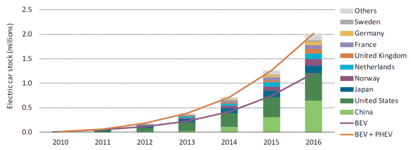
Graph of the number of electric vehicles worldwide and selected nations
Increase in the stock of electric vehicles: global and selected nations

When- and wherever it occurs, exponential growth is transformative.  After a long period of stagnation or slow increase, some important quantity begins doubling and redoubling.  The exponential growth in cloth, coal, and iron production transformed the world during the Industrial Revolution.  The exponential growth in the power and production volumes of transistors (see previous blog post)—a phenomenon codified as “Moore’s Law”—made possible the information revolution, the internet, and smartphones.  Electric cars and their battery systems have now entered a phase of exponential growth.

There are two categories of electric vehicles (EVs).  The first is plug-in hybrid electric vehicles (PHEVs).  These cars have batteries and can be driven a limited distance (usually tens of kilometres) using electrical power only, after which a conventional piston engine engages to charge the batteries or assist in propulsion.  Well-known PHEVs include the Chevrolet Volt and the Toyota Prius Plug-in.

The second category is the battery electric vehicle (BEV).  Compared to PHEVs, BEVs have larger batteries, longer all-electric range (150 to 400 kms), and no internal combustion engines.  Well-known BEVs include the Nissan Leaf, Chevrolet Bolt, and several models from Tesla.  The term electric vehicle (EV) encompasses both PHEVs and BEVs.

The graph above is reproduced from a very recent report from the International Energy Agency (IEA) entitled Global EV Outlook 2017.  It shows that the total number of electric vehicles in the world is increasing exponentially—doubling and redoubling every year or two.  In 2012, there we nearly a quarter-million EVs on streets and roads worldwide.  A year or two later, there were half-a-million.  By 2015 the number had surpassed one million.  And it is now well over two million.  Annual production of EVs is similarly increasing exponentially.  This kind of exponential growth promises to transform the global vehicle fleet.

But if it was just vehicle numbers and production volumes that were increasing exponentially this trend would not be very interesting or, in the end, very powerful.  More important, quantitative measures of EV technology and capacity are doubling and redoubling.  This second graph, below, taken from the same IEA report, shows the dramatic decrease in the cost of a unit of battery storage (the downward trending line) and the dramatic increase in the energy storage density of EV batteries (upward trending line).  If we compare 2016 to 2009, we find that today an EV battery of a given capacity costs one-third as much and is potentially one-quarter the size.  Stated another way, for about the same money, and packaged into about the same space, a current battery can drive an electric car three or four times as far.
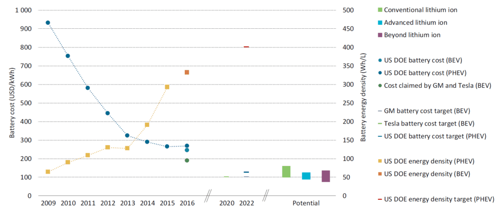
Graph of electric vehicle battery cost and power density 2009 to 2016

Looking to the future, GM, Tesla, and the US Department of Energy all project that battery costs will decrease by half in the coming five years.  Though these energy density increases and cost decreases will undoubtedly plateau in coming decades, improvements underway now are rapidly moving EVs from the periphery to the mainstream.  EVs may soon eclipse internal-combustion-engine cars in all measures: emissions, purchase affordability, operating costs, performance, comfort, and even sales.

Source for graphs: International Energy Agency, Global EV Outlook 2017: Two Million and Counting
Our civilizational predicament: Doubling economic activity and energy use while cutting emissions by half

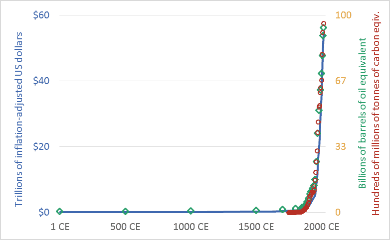
Graph of Global economic activity, energy use, and greenhouse gas emissions, 1CE to 2015CE.
Global economic activity, energy use, and carbon dioxide emissions, 1CE to 2015CE.

My friends sometimes suggest that I’m too pessimistic.  I’m not.  Rather, I’d suggest that everyone else is too optimistic.  Or, more precisely, I live in a society where people are discouraged from thinking rigorously about our predicament.  The graph above sets out our civilizational predicament, and it hints at the massive scale of the transformation that climate change requires us to accomplish in the coming decade or two.

The main point of the graph above is this: Long-term data shows that the size and speed of our global mega-civilization is precisely correlated with energy use, and energy use is precisely correlated with greenhouse gas emissions.  We have multiplied the size of our global economy and our living standards by using more energy, and this increased energy use has led us to emit more carbon dioxide and other greenhouse gases.

The graph plots three key civilizational metrics: economic activity, energy use, and carbon dioxide (CO2) emissions.  The graph covers the past 2015 years, the period from 1 CE (aka 1 AD) to 2015 CE.  The blue line depicts the size of the global economy.  The units are trillions of US dollars, adjusted for inflation.  The green diamond-shaped markers show global energy use, with all energy converted to a common measure: barrels of oil equivalent.  And the red circles show global CO2 emissions, in terms of tonnes of carbon.

Though it is seldom stated explicitly, most government and business leaders and most citizens are proceeding under the assumption that the economic growth line in the graph can continue to spike upward.  This will require the energy line to also climb skyward.  But our leaders are suggesting that the emissions line can be wrenched downward.  When people are “optimistic” about climate change, they are optimistic about doing something that has never been done before: maintaining the upward arc of the economic and energy trendlines, but somehow unhooking the emissions trendline and bending it downward, toward zero.  I worry that this will be very hard.  Most important, it will be impossibly hard unless we are realistic about what we are trying to do, and about the challenges and disruptions ahead.

We must not despair, but neither should we permit ourselves unfounded optimism.  There is a line from a great movie—the Cohen Brother’s “Miller’s Crossing”—in which the lead character, a gangster played by Gabriel Byrne, says “I’d worry a lot less if I thought you were worrying enough.”

Graph sources: GDP: Angus Maddison, The World Economy, Volume 1: A Millennial Perspective (Paris: Organization for Economic Co-operation and Development, 2001)

GHGs: Boden, T.A., Marland, G., and Andres R.J., “Global, Regional, and National Fossil-Fuel CO2 Emissions,” Carbon Dioxide Information Analysis Center (CDIAC), Oak Ridge National Laboratory, U.S. Department of Energy, Oak Ridge, Tenn., U.S.A.

Energy consumption: Vaclav Smil, Energy in Nature and Society: General Energetics of Complex Systems (Cambridge, MA: The MIT Press, 2008); British Petroleum, BP Statistical Review of World Energy: June 2016 (London: British Petroleum, 2016); pre-1500 energy levels estimated by the author based on data in Smil.

Back on track: North America needs high-speed passenger rail

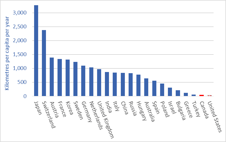
A graph of passenger rail utilization, selected nations, average kilometres per capita
Passenger train use, kilometers per person per year (average), selected countries, 2014 or 2015 data

Not every problem has a clear solution.  Here’s one that does.  The problem is the exponential growth in air travel and attendant greenhouse gas (GHG) emissions.  The solution is high-speed passenger rail.

Compared to airplanes, high-speed trains can move people faster, more comfortably and conveniently, more cheaply, and with a fraction of the GHG emissions.  And Canada is uniquely placed to benefit from a passenger-rail renaissance; one of the world’s largest passenger-rail manufacturers, Bombardier, is a Canadian company.

Air travel is increasing exponentially.  As I detailed in a previous blog post, air travelers now rack up about 7 trillion passenger-kilometres per year.  And that figure is projected to double by 2030.  If we are to retain a tolerable climate, most of the planes will soon need to be grounded, excepting perhaps those used for trans-oceanic flights.

While airplanes may remain our best option for crossing oceans, within continents higher-speed rail (130–200 km/h) and high-speed rail (200+ km/h) can move people faster and more comfortably.  Such trains can transport passengers from city-centre to city-centre, eliminating the long drive to the airport.  Trains do not require time-consuming, invasive airport security screenings.  These factors, combined with high speeds, mean that for many trips, the total travel time is lower for trains than for planes.  And because trains have much more leg-room and often include observation cars, restaurants, and lounges, they are much more comfortable and enjoyable.

Many people will know the Eurostar high-speed line that connects Paris and other European cities to London via the Channel Tunnel.  Top speed for that train is 320 km/h.  A trip from downtown London to Downtown Paris—nearly 500 kms—takes 2 hours and 20 minutes, about the time it takes the average North American to drive to the airport, check in, check baggage, clear security, and get to his or her airplane seat.

China recently inaugurated its Shanghai Maglev line, with a maximum speed of 430km/h and average speed of 250 km/h.  Japan’s famous “bullet trains” went into service more than 50 years ago.  They now travel on a network of 2,764 kms of track and reach speeds of 320 km/h.

North America has one high-speed line, the Acela Express that links Boston, New York, Philadelphia, Baltimore, and Washington. The maximum speed is 240 km/h, through average speeds are lower.  Travel time from New York to Washington is 2 hours and 45 minutes, including time spent at intermediate stops: an average speed of 132 km/h.  The Acela Express trains were built by a consortium 75 percent owned by Canada’s Bombardier.

This brings us to the truly good news: Canada is home to a world-leading passenger rail manufacturer, Bombardier.  You will find the company’s rolling stock in the subways of New York, London, and more than a dozen other cities.  Its intercity trains run throughout Europe, Asia, and North America.  And its high-speed trains are currently moving passengers in China, Europe, and the US.  Until a recent merger of two Chinese companies, Canada’s Bombardier was the largest passenger train manufacturer in the world.  Canada has a huge opportunity to create jobs and economic activity while leading the world in low-emission, cutting-edge rail technology.  As climate change forces Canada to scale back fossil-fuel production and maybe even auto manufacturing, Canada will need new economic engines.  Passenger-rail manufacturing can be an economic engine of the future.

Not all the news is good, however.  Many will have recent heard news reports about Bombardier.  Over the past few years, Federal and provincial governments have provided cash injections to the company totaling more than a billion dollars, largely to cover costs on its C-Series passenger-jet program.  Bombardier is in trouble.  Indeed, it may have made one of the biggest business blunders in recent decades: financially imperiling a world-leading train maker to make a huge gamble on planes just as climate change forces us to ground the planes and build a trillion-dollar passenger rail system.  Bombardier has recently announced that it may merge its train division with the German company Siemens.

Bombardier has been foolish.  Canadian citizens and their governments have been equally foolish: handing over billions of taxpayer dollars and not receiving a single passenger train in return.  But we can be smart.  That means building a North American network of fast trains.  Bombardier can prosper by being one of the main suppliers for that network.  High-speed passenger rail can be a win-win-win: jobs for Canadians and Americans; fast, comfortable travel; and a high-tech, low-emission transportation system on this continent like the ones being built in Europe and Asia.

The graph at the top of this article shows average per-person passenger-train utilization.  The data is from the most recent year available: 2014 or ’15.  Passenger rail utilization rates in Canada and the US (an average of less than 40 kms per person per year) are among the lowest in the world.  In China, average use is more than 800 kms per person per year and rising very rapidly.  In many European nations, it is more than 1,000 kms per year per person—25 to 30 times the Canadian and US rates.  There is huge growth potential for the passenger rail sector in North America.

Graph sources: OECD.


Fraught freight: trade agreements, globalization, and rising global freight transport

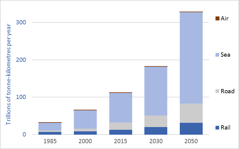
Graph of global freight transport, trillions of tonne-kilometres
Global freight transport, all modes, trillions of tonne-kilometres, selected years, 1985 to 2050

Global freight transport now exceeds 122 trillion tonne-kilometres* per year. That enormous tonnage/distance has more than tripled since the beginning of the “free trade” era, in the 1980s.  And the Organization for Economic Cooperation and Development (OECD) projects that global freight transport tonnage will triple again in the coming generation—rising to 330 trillion tonne-kilometres per year by 2050 (see OECD).  To put these trillions into perspective, freight movement will soon surpass 100,000 tonne-kilometres per capita per year for those of us living high-consumption lifestyles, here and around the world.

*Note: a tonne-kilometre is equivalent to moving one tonne one kilometre.  If you move 10 tonnes 10 kilometres, that is 100 tonne-kilometres.

A major part of this increase in transport tonnage is related to trade agreements and globalization.  As we’ve restructured the global economy we have off-shored our factories.  Our washing machines, toasters, rubber boots, TVs, and many of our cars now come from half-way around the world.  Our foods and fertilizers are increasingly shipped across continents or oceans.  And we ship food, resources, and other goods around the world.  Economic growth means we’re consuming more and more; globalization means we’re consuming resources and products from further away.  These two trends, together, help explain the tenfold increase in global freight transport depicted in the graph.

Moving this colossal tonnage requires ships, trains, trucks, and airplanes—all of which burn fossil fuels and emit greenhouse gas (GHG) emissions.  Emissions from the freight transport sector make up about 10 percent of all man-made CO2 emissions (see OECD). The OECD predicts that if current trends and policies hold, emissions will nearly double by 2050, to 5.7 billion tonnes of CO2 per year (see OECD).  This near-doubling of freight transport emissions between now and 2050 will occur at the same time that we are attempting to cut overall GHG emissions by half.  It is time to ask the obvious questions: Is our ongoing drive toward globalization (i.e., de-localization and transport maximization) compatible with our emission-reduction commitments and a livable climate?  Indeed, as our leaders aggressively sign and implement still more “free trade” agreements (TPP, CETA, etc.) we should consider that  perhaps doubling down on globalization vetoes emissions reduction, vetoes a stable climate, vetoes local food, and vetoes local jobs.

To leave a comment, click on the graph or this post’s title and then scroll down.

Graph sources: 2015, 2030, and 2050 data from the OECD/ITF page 56. Data for 2000 and 1985 are from various sources: air freight data is from the World Bank. Rail freight data is from the World Bank. Maritime freight data is from the United Nations, Review of Maritime Transport. Road freight data for 2000 is from the OECD. Road freight data for 1985 is an informed estimate.


Hotter sooner faster: Global temperature changes over the past 136 years

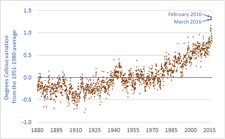
Graph of global temperature anomaly from 1880 to 2016
Global temperature anomaly, 1880 to present

This graph shows the global temperature anomaly: how current temperatures compare to latter-twentieth-century “normal” temperatures. Normal, here, is the 1951-1980 average.

in looking at the global temperature data, three things are apparent. First, the Earth is already warming. The graph has been trending strongly upward since at least the 1980s. Second, the increase in temperature from the 1951-1980 baseline period will soon reach one degree Celsius. Indeed, temperature outliers such as those in February and March 2016 are approaching 1.5 degrees. Temperatures are rising fast—charting significant increases in decades, not centuries. Third, there is in the data-points a suggestion that the curve may be getting steeper; temperature increases may be accelerating. It’s too early to tell, but given that global temperature increases are lagging well behind atmospheric greenhouse gas (GHG) increases, and given that global emission rates continue to increase, it is prudent to consider that temperature increases may accelerate beyond already-rapid rates.

How high might temperatures go? Here’s what we know. In the lead-up to the 2015 Paris climate talks, nearly every nation submitted to the United Nations a commitment to reduce GHG emissions. The United States committed to reduce its emissions by 26 to 28 percent (below 2005 levels) by 2025. Canada committed to reduce emissions by 30 percent by 2030. Other nations made comparable commitments. But the climate models show that even if every nation meets its emission-reduction commitments, our Earth will warm this century by 3.2 degrees Celsius—well beyond the so-called “dangerous” level of 2 degrees C, and more than double the 1.5 degree mark discussed in Paris. Indeed, the graph above makes it clear that 1.5 degrees was always pure fiction. In order to avoid a temperature increase of 3.2 degrees, we must set and meet more ambitious targets.

Climate science can be complicated. But at a public policy level—at the levels of citizens and legislators and democratic governance—climate change is simple and clear. It is happening. It is happening fast. And it will devastate our cities, economies, food systems, ecosystems, and perhaps even our civilization unless we act fast. Simple.

To leave a comment, click on the graph or the title and then scroll down.

Graph sources: Combined Land-Surface Air and Sea-Surface Water Temperature Anomalies from National Aeronautics and Space Administration (NASA) Goddard Institute for Space Studies (GISS): GISS Surface Temperature Analysis (GISTEMP).

It’s gonna get hot: Atmospheric carbon dioxide over the past 800,000 years

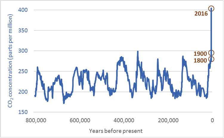
Graph of atmospheric carbon dioxide levels for the past 800,000 years
Atmospheric carbon dioxide concentrations, 800,000 years ago to present

There are lots of graphs related to climate change. Only a few, however, get to the core of the issue. This is one such graph. It shows atmospheric carbon dioxide (CO2) levels over the past 800,000 years—a period four times longer than our species, Homo sapiens, has walked the Earth. The units, parts per million (ppm), will not be familiar to everyone. But the units aren’t important. What is important is the shape of the graph, and the magnitude of current CO2 levels relative to those in the past.

As the graph shows, over the past 800,000 years, atmospheric carbon dioxide levels have risen and fallen. Low concentrations correspond to ice ages—eight such periods are visible in the graph. Higher CO2 levels correspond to largely ice-free “interglacial” periods. The critical point is this: in the 800,000 years before the modern era, CO2 levels never once rose above 300 ppm. Not once. Now, however, CO2 levels are 405 ppm. And because our emissions continue, it is likely that atmospheric concentrations will increase past 500 ppm, maybe past 600 ppm. Temperature increases are lagging behind CO2 increases. As Earth’s temperatures rise to “catch up” with the rapid increase in CO2, it’s going to get very hot. And it is going to stay hot for a long time.

There can be no doubt: humans are the cause of the rapid rise in CO2 levels. No one can look at the graph above and come to any other conclusion. The years 1800 and 1900 are highlighted. The fossil-fuelled industrial and transportation revolutions of the 19th, 20th, and 21st centuries are clearly visible in the graph’s vertical spike—an increase in atmospheric CO2 that has proceeded further and faster than at any other time in the past 800,000 years.

CO2 levels have increased by 100 ppm in a century. The data shows that such an increase usually takes 10,000 years. Humans are causing CO2 levels to rise 100 times faster than those levels rose at any time in the past 800 millennia. Even worse, the rate of increase is accelerating; at current and projected emission rates, the next increase of 100 ppm may take just 40 to 60 years.

It is impossible to overstate the danger of what we are doing. Words cannot convey how damaging continued CO2-level increases will be to the long-term prospects for human cities, societies, and economies, or to other species and the natural ecosystems we all rely upon. It is as if we have decided to set fire to our home, the Earth. Unless we extinguish that fire, all we hold dear will perish. Currently, we are pouring on gasoline.

Note: CO2 measurements for recent decades come directly from air samples. Measurements for past centuries come from analysis of air trapped in bubbles in Antarctic ice. Each ice core is analyzed at multiple research facilities using multiple techniques. Because of this duplicate testing and diversity of sampling methods, there is high confidence among scientists that ice-core data accurately reflects CO2 levels in previous centuries.

Graph sources:
– 800,000 years ago to 1913: Ice core samples, Dome C, Antarctica (Monnin et al. 2001; Siegenthaler et al. 2005; Luethi et al.) and Vostok, Antarctica (Petit et al. 1999; Pepin et al. 2001; Raynaud et al. 2005)
– 1832 – 1978: Ice core samples, Law Dome, Antarctica
– 1959 – 2013: Direct atmospheric measurements, Mauna Loa Observatory, National Oceanic and Atmospheric Administration (NOAA)