Methane and climate: 10 things you should know

Graph of global atmospheric methane concentrations
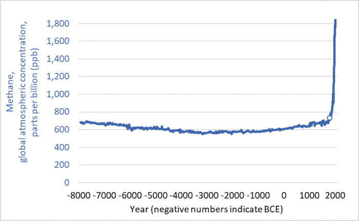
Global atmospheric methane concentrations, past 10,000+ years (8000 BCE to 2018 CE)

The graph above shows methane concentrations in Earth’s atmosphere over the past 10,000+ years: 8000 BCE to 2018 CE.  The units are parts per billion (ppb).  The year 1800 is marked with a circle.

Note the ominous spike.  As a result of increasing human-caused emissions, atmospheric methane levels today are two-and-a-half times higher than in 1800.  After thousands of years of relatively stable concentrations, we have driven the trendline to near-vertical.

Here are 10 things you should know about methane and the climate:

1. Methane (CH4) is one of the three main greenhouse gases, along with carbon dioxide (CO2) and nitrous oxide (N2O).

2. Methane is responsible for roughly 20% of warming, while carbon dioxide is responsible for roughly 70%, and nitrous oxide the remaining 10%.

3. Methane is a powerful greenhouse gas (GHG).  Pound for pound, it is 28 times more effective at trapping heat than is carbon dioxide (when compared over a 100-year time horizon, and 84 times as effective at trapping heat when compared over 20 years).  Though humans emit more carbon dioxide than methane, each tonne of the latter traps more heat.

4. Fossil-fuel production is the largest single source.  Natural gas is largely made up of methane (about 90%).  When energy companies drill wells, “frac” wells, and pump natural gas through vast distribution networks some of that methane escapes.  (In the US alone, there are 500,000 natural gas wells, more than 3 million kilometers of pipes, and millions of valves, fittings, and compressors; see reports here and here.)  Oil and coal production also release methane—often vented into the atmosphere from coal mines and oil wells.  Fossil-fuel production is responsible for about 19% of total (human-caused and natural) methane emissions.  (An excellent article by Saunois et al. is the source for this percentage and many other facts in this blog post.)  In Canada, policies to reduce energy-sector methane emissions by 40 percent will be phased in over the next seven years, but implementation of those policies has been repeatedly delayed.

5. Too much leakage makes electricity produced using natural gas as climate-damaging as electricity from coal.  One report found that for natural gas to have lower overall emissions than coal the leakage rate would have to be below 3.2%.  A recent study estimates leakage in the US at 2.3%.  Rates in Russia, which supplies much of the gas for the EU, are even higher.  Until we reduce leakage rates, the advantage of shutting down coal-fired power plants and replacing them with natural gas generation will remain much more modest than often claimed.

6. Domestic livestock are the next largest source of methane.  Cattle, sheep,  and other livestock that graze on grass emit methane from their stomachs through their mouths.  This methane is produced by the symbiotic bacteria that live in the guts of these “ruminants” and enable them to digest grass and hay.  In addition, manure stored in liquid form also emits methane.  Livestock and manure are responsible for roughly 18% of total methane emissions.

7. Rice paddy agriculture, decomposing organic matter in landfills, and biomass burning also contribute to methane emissions.  Overall, human-caused emissions make up about 60% of the total.  And natural sources (wetlands, swamps, wild ruminants, etc.) contribute the remaining 40%.

8. There is lots of uncertainty about emissions.  Fossil fuel production and livestock may be responsible for larger quantities than is generally acknowledged.  The rise in atmospheric concentrations is precisely documented, but the relative balance between sources and sinks and the relative contribution of each source is not precisely known.

9. There is a lot of potential methane out there, and we risk releasing it.  Most of the increase in emissions in recent centuries has come from human systems (fossil fuel, livestock, and rice production; and landfills).  Emissions from natural systems (swamps and wetlands, etc.) have not increased by nearly as much.  But that can change.  If human actions continue to cause the planet to warm, natural methane emissions will rise as permafrost thaws.  (Permafrost contains huge quantities of organic material, and when that material thaws and decomposes in wet conditions micro-organisms can turn it into methane.)  Any such release of methane will cause more warming which can thaw more permafrost and release more methane which will cause more warming—a positive feedback.

Moreover, oceans, or more specifically their continental shelves, contain vast quantities of methane in the form of “methane hydrates” or “clathrates”—ice structures that hold methane stable so long as the temperature remains cold enough.  But heat up the coastal oceans and some of that methane could begin to bubble up to the surface.  And there are huge amounts of methane contained in those hydrates—the equivalent of more than 1,000 years of human-caused emissions.  We risk setting off the “methane bomb“—a runaway warming scenario that could raise global temperatures many degrees and catastrophically damage the biosphere and human civilization.

Admittedly, the methane bomb scenario is unlikely to come to pass.  While some scientists are extremely concerned, a larger number downplay or dismiss it.  Nonetheless a runaway positive feedback involving methane represents a low-probability but massive-impact risk; our day-to-day actions are creating a small risk of destroying all of civilization and most life on Earth.

10. We can easily reduce atmospheric methane concentrations and  attendant warming; this is the good news.  Methane is not like CO2, which stays in the atmosphere for centuries.  No, methane is a “short-lived” gas.  On average, it stays in the atmosphere for less than ten years.  Many natural processes work to strip it out of the air.  Currently, human and natural sources emit about 558 million tonnes of methane per year, and natural processes in the atmosphere and soils remove all but 10 million tonnes.  (again, see Saunois et al.)  Despite our huge increase in methane production, sources and sinks are not that far out of balance.  Therefore, if we stop increasing our emissions then atmospheric concentrations could begin to fall.  We might see significant declines in just decades.  This isn’t the case for CO2, which will stay in the atmosphere for centuries.  But with methane, we have a real chance of reducing atmospheric levels and, as we do so, moderating warming and slowing climate change.

A series of policies focused on minimizing emissions from the fossil-fuel sector (banning venting and minimizing leaks from drilling and fracking and from pipes) could bring the rate of methane creation below the rate of removal and cause atmospheric levels to fall.  A more rational approach to meat production (including curbing over-consumption in North America and elsewhere) could further reduce emissions.  This is very promising news.  Methane reduction represents a “low-hanging fruit” when it comes to moderating climate change.

The methane problem is the climate problem in microcosm.  There are some relatively simple, affordable steps we can take now that will make a positive difference.  But, if we don’t act fast, aggressively, and effectively, we risk unleashing a whole range of effects that will swiftly move our climate into chaos and deprive humans of the possibility of limiting warming to manageable levels.  We can act to create some good news today, or we can suffer a world of bad news tomorrow.

Graph sources:
– United States Environmental Protection Agency (US EPA), “Climate Change Indicators: Atmospheric Concentrations of Greenhouse Gases.
– Commonwealth Scientific and Industrial Research Organisation (CSIRO), “Latest Cape Grim Greenhouse Gas Data.
– National Oceanic and Atmospheric Administration (NOAA), Earth System Research Laboratory, Global Monitoring Division, “Trends in Atmospheric Methane.

Energy slaves, “hard work,” and the real sources of wealth

Stuart McMillen graphic novel Energy Slaves
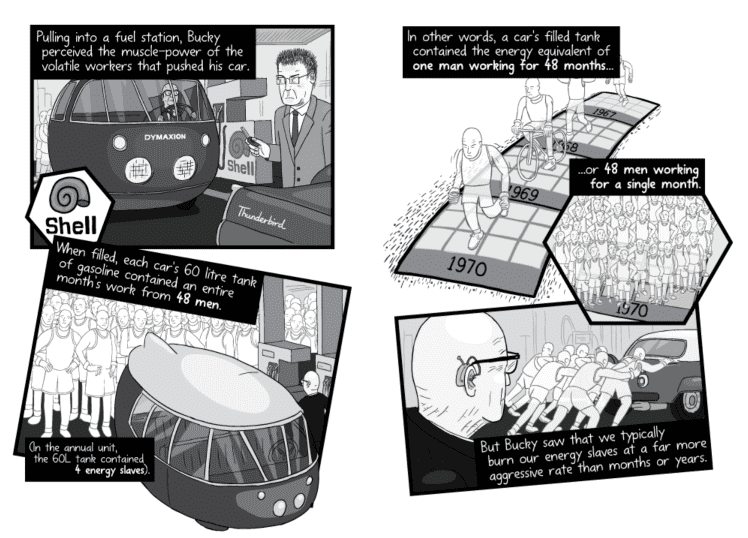
An excerpt from the online long-form comic "Energy Slaves" by Stuart McMillen

Check out this brilliant ‘long-form comic’ by Stuart McMillen: Energy Slaves.  Click here or on the URL above.

Many Canadians and Americans struggle financially.  Millions are unemployed.  Many others live paycheque-to-paycheque.  A 2017 report by the US Federal Reserve Board found that 40 percent of US citizens couldn’t cover an unexpected expense of $400 without selling something or borrowing money.  There’s a lot of denial and misunderstanding regarding the financial challenges faced by a large portion of our fellow citizens.

Equally, though, there is misunderstanding, denial, and myth-making regarding those among us who are more financially secure, those who are well off—“the rich.”  Most glaring is the way we mischaracterize the sources of our wealth, luxury, and ease.  We lie to ourselves and each other regarding why we have it so good.  The rich often claim that their wealth is a result of “hard work.”  We hear people objecting to even the smallest tax increase, saying: “I worked hard for my money and no one is going to take it from me.”

The reality, however, is quite the opposite.  The rich don’t work very hard.  Every poor women or girl in Asia or Africa who gets up at dawn to walk many kilometres to carry home water or firewood for her family works harder than the world’s multi-millionaires and billionaires.  Every farmer with a hoe or toiling behind an oxen works harder than any CEO.  My farmer grandparents worked far harder than I do, yet I live much better.  I would be self-delusional in the extreme to attribute my middle-class luxury to “hard work.”

No, those of us in North America, the European Union, and elsewhere in the world who enjoy privileged lives live well, not because we work hard, but because of the vast energy windfall of which we are the beneficiaries.  We live lives of comfort and ease because our work is done for us by “energy slaves.”

A human worker can toil at a constant rate of about one-tenth horsepower.  Working hard all year at that rate I can do about 200 horsepower-hours worth of work—hoeing or hauling or digging.  But if I add up the work accomplished by non-human energy—by fossil fuels and machines and by electricity from various sources and electric motors—I find that, on a per-capita average, that quantity is 100 times my annual work output.  For every unit of work I do, the motors and machines that surround me do 100 units.  Those of us who live comfortable, high-consumption lives are subsidized 100-to-1 by work we do not do.  And the richest among us enjoy the largest of those subsidies.

Let me state that another way: If I look around me, at the hurtling cars and trucks, the massive quantities of cloth and steel and concrete created each year, the rapidly expanding cities, the roads that get paved and the bridges built, I am seeing a quantity of building and digging and hauling and making that is 100 times greater than the humans around me could accomplish.  Human muscles and energies provide one percent of the work needed to create and maintain our towering, hyper-productive, petro-industrial civilization; but electricity, fossil fuels, other energy sources, engines, and machines provide the other 99 percent.  We and our human bodies put in 1 unit of work, but enjoy the benefits of 100.  That is the reason so many of us live better than the kings, sultans, and emperors of previous centuries.

As Stuart McMillen brilliantly illustrates in his long-form comic, Energy Slaves, it is as if each of us has a whole troupe of slaves toiling for our benefit.  It is the work of these virtual assistants that propel us along, create our homes and cities, raise our food, pump our water,  and make our goods.

We will face many hard questions as we progress through the twenty-first century: can we continue to consume energy at the rates we do now?  How can we generate that energy without fouling the atmosphere and destabilizing the climate?  How do we more equitably share access to energy among our soon-to-be 11-billion-person population?  How do we address energy poverty?  And all these questions and issues are tied to others, such as to issues of income inequality.  But a vital first step is to begin to talk honestly about the real sources of our wealth, to acknowledge that we enjoy undeserved subsidies, to admit that we are all (energy) lottery winners, and to approach the future with attitudes of humility and gratitude rather than entitlement.  We cannot navigate the future if we cling to the self-serving and self-aggrandizing myths of the past.

Electric car numbers, and projections to 2030

Graph of global electric vehicle numbers, 2013-17, and national data
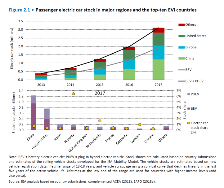
Number of electric cars on the road, 2013 to 2017, and national data

In just two years, 2013 to 2015, the number of electric cars worldwide more than doubled.  And in the following two years, 2015 to 2017, the number more than doubled again, to just over 3 million.  This exponential growth means that electric vehicles (EVs)* will soon make up a large portion of the global car fleet.

This week’s graph is reprinted from Global EV Outlook 2018, the latest in a series of annual reports compiled by the International Energy Agency (IEA).

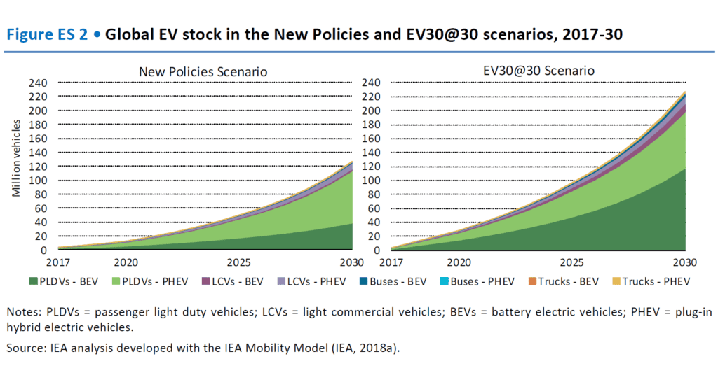
The graphs below show IEA projections of the number of EVs in the world by 2030 under two scenarios.  The first, the “New Policies Scenario,” takes into account existing and announced national policies.  Under this scenario, the number of EVs on the road is projected to reach 125 million by 2030.

The second scenario is called “EV30@30.”  This scenario is based on the assumption that governments will announce and implement new policies that will increase global EV penetration to 30 percent of new car sales by 2030—a 30 percent sales share.  This 30 percent share is roughly what is needed to begin to meet emission-reduction commitments made in the lead-up to the 2015 Paris climate talks.  Under this scenario, the number of EVs on the road could reach 228 million by 2030.

In either case, whether there are 125 million EV’s on the road in twelve years or 228 million, the result will be an impressive one, given that there were fewer than a million just four years ago.

Electric cars are not a panacea, but they do represent an important transition technology; electrifying much of the global car fleet can buy us the time we need to build zero-emission train and transit systems.  Thus, it is very important that we move very rapidly to maximize the number of EVs built and sold.  But the IEA is clear: EV adoption will depend on ambitious, effective government action.  The 228 million EVs projected under the EV30@30 Scenario will only exist if governments implement a suite of aggressive new policies.  The IEA states that:

“The uptake of electric vehicles is still largely driven by the policy environment.  The ten leading countries in electric vehicle adoption all have a range of policies in place to promote the uptake of electric cars.  Effective policy measures have proved instrumental in making electric vehicles more appealing to customers…, reducing risks for investors, and encouraging manufacturers to scale up production ….  Key examples of instruments employed by local and national governments to support EV deployment include public procurement programmes…, financial incentives to facilitate the acquisition of EVs and cut their usage cost (e.g. by offering free parking), and a variety of regulatory measures at different administrative levels, such as fuel-economy standards and restrictions on the circulation of vehicles based on tailpipe emissions performance.”

In 2018, about 95 million passenger cars and commercial vehicles were sold worldwide.  About 1 million were electric—about 1 percent.  The goal is to get to 30 percent in 12 years.  Attaining that goal, and thereby averting some of the worst effects of climate change, will require Herculean efforts by policymakers, regulators, international bodies, and automakers.

* There are two main types of EVs.  The first is plug-in hybrid electric vehicles (PHEVs).  These cars have batteries, can be plugged in, and can be driven a limited distance (usually tens of kilometres) using electrical power only, after which a conventional piston engine engages to charge the batteries or assist in propulsion.  Examples of PHEVs include the Chevrolet Volt and Toyota Prius Prime.  The second type is the battery electric vehicle (BEV).  BEVs have larger batteries, longer all-electric range (150 to 400 kms), and no internal combustion engines.  Examples of BEVs include the Chevrolet Bolt, Nissan Leaf, and several models from Tesla.  The term “electric vehicle” (EV) encompasses both PHEVs and BEVs.


$100 billion and rising: Canadian farm debt

Graph of Canadian farm debt, 1971-2017
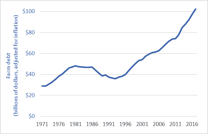
Canadian farm debt, 1971-2017

Canadian farm debt has risen past the $100 billion mark.  According to recently released Statistics Canada data, farm debt in 2017 was $102.3 billion—nearly double the level in 2000.  (All figures and comparisons adjusted for inflation.)

Some analysts and government officials characterize the period since 2007 as “better times” for farmers.  But during that period (2007-2017, inclusive) total farm debt increased by $37 billion—rising by more than $3 billion per year.

Here’s how Canadian agriculture has functioned during the first 18 years of the twenty-first century (2000 to 2017, inclusive):

1. Overall, farmers earned, on average, $47 billion per year in gross revenues from the markets (these are gross receipts from selling crops, livestock, vegetables, honey, maple syrup, and other products).

2. After paying expenses, on average, farmers were left with $1.6 billion per year in realized net farm income from the markets (excluding farm-support program payments).  If that amount was divided equally among Canada’s 193,492 farms, each would get about $8,300.

3. To help make ends meet, Canadian taxpayers transferred to farmers $3.1 billion per year via farm-support-program payments.

4. On top of this, farmers borrowed $2.7 billion per year in additional debt.

5. Farm family members worked at off-farm jobs to earn most of the household income needed to support their families (for data see here and here).

The numbers above give rise to several observations:

A. The amount of money that farmers pay each year in interest to banks and other lenders ($3 billion, on average) is approximately equal to the amount that Canadian citizens each year pay to farmers ($3.1 billion).  Thus, one could say that, in effect, taxpayers are paying farmers’ interest bills.  Governments are facilitating the transfer of tax dollars from Canadian families to farmers and on to banks and their shareholders.

B. Canadian farmers probably could not service their $100 billion dollar debt without government/taxpayer funding.

C. To take a different perspective: each year farmers take on additional debt ($2.7 billion, on average) approximately equal to the amount they are required to pay in interest to banks ($3 billion on average). One could say that for two decades banks have been loaning farmers the money needed to pay the interest on farmers’ tens-of-billions of dollars in farm debt.

Over and above the difficulty in paying the interest, is the difficulty in repaying the principle.  Farm debt now—$102 billion—is equal to approximately 64 years of farmers’ realized net farm income from the markets.  To repay the current debt, Canadian farm families would have to hand over to banks and other lenders every dime of net farm income from the markets from now until 2082.

The Canadian farm sector has many strengths.  By many measures, the sector is extremely successful and productive.  Over the past generation, farmers have managed to nearly double the value of their output and triple the value of agri-food exports.  Output per year, per farmer, and per acre are all up dramatically.  And Canadian farmers lead the world in adopting high-tech production systems.  The problem is not that our farms are backward, inefficient, or unproductive.  Rather, the problems detailed above are the result of voracious wealth extraction by the dominant agribusiness transnationals and banks. (To examine the extent of that wealth extraction, see my blog post here).

Although our farm sector has many strengths and is setting production records, the sector remains in a crisis that began in the mid-1980s.  And what began as a farm income crisis has metastasized into a farm debt crisis.  Further, the sector also faces a generational crisis (the number of farmers under the age of 35 has been cut by half since 2001) and a looming climate crisis.  Policy makers must work with farmers to rapidly restructure and transform Canadian agriculture.  A failure to do so will mean further costs to taxpayers, the destruction of the family farm, and irreparable damage to Canada’s food-production system.

We’re in year 30 of the current climate crisis

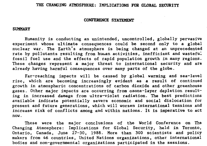
An excerpt from the Conference Statement of the 1988 World Conference on the Changing Atmosphere held in Toronto

In late-June, 1988, Canada hosted the world’s first large-scale climate conference that brought together scientists, experts, policymakers, elected officials, and the media.  The “World Conference on the Changing Atmosphere: Implications for Global Security” was held in Toronto, hosted by Canada’s Conservative government, and attended by hundreds of scientists and officials.

In their final conference statement, attendees wrote that “Humanity is conducting an unintended, uncontrolled, globally pervasive experiment whose ultimate consequences could be second only to a global nuclear war.”  (See excerpt pictured above.)  The 30-year-old conference statement contains a detailed catalogue of causes and effects of climate change.

Elizabeth May—who in 1988 was employed by Canada’s Department of Environment—attended the conference.   In a 2006 article she reflected on Canada’s leadership in the 1980s on climate and atmospheric issues:

“The conference … was a landmark event.  It was opened by Prime Minister Mulroney, who spoke then of the need for an international law of the atmosphere, citing our work on acid rain and ozone as the first planks in this growing area of international environmental governance…. 

Canada was acknowledged as the leader in hosting the first-ever international scientific conference on climate change, designed to give the issue a public face.  No nation would be surprised to see Canada in the lead.  After all, we had just successfully wrestled to the ground a huge regional problem, acid rain, and we had been champions of the Montreal Protocol to protect the ozone layer.”

The Toronto conference’s final statement also called on governments and industry to work together to “reduce CO2 emissions by approximately 20% … by the year 2005…. ”  This became known as the Toronto Target.  Ignoring that target and many others, Canada has increased its CO2 emissions by 29 percent since 1988.

Other events mark 1988 as the beginning of the modern climate-change era.  In 1988, governments and scientists came together to form the United Nations Intergovernmental Panel on Climate Change (IPCC). Since its formation, IPCC teams of thousands of scientists have worked to create five Assessment Reports which together total thousands of pages.

Also in 1988, NASA scientist Dr. James Hansen told a US congressional committee that climate change and global warming were already underway and that he was 99 percent certain that the cause was a buildup of carbon dioxide and other gases released by human activities.  Thirty years ago, Hansen told the committee that “It is time to stop waffling so much and say that the evidence is pretty strong that the greenhouse effect is here.” The New York Times and other papers gave prominent coverage to Hansen’s 1988 testimony.

Fast-forward to recent weeks.  Ironically, in Toronto, the site of the 1988 conference, and 30 years later, almost to the day, newly elected Ontario Premier Doug Ford announced he was scrapping Ontario’s carbon cap-and-trade emission-reduction plan, he vowed to push back against any federal-government moves to price or tax carbon, and he said he would join a legal challenge against the federal legislation.  In effect, Ford and premiers such as Saskatchewan’s Scott Moe have pledged to fight and stop Canada’s flagship climate change and emission-reduction initiative.  To do so, 30 years into the modern climate change era, is foolhardy, destructive, and unpardonable.

Citizens need to understand that when they vote for leaders such as Doug Ford (Ontario), Scott Moe (Saskatchewan), Jason Kenney (Alberta), or Andrew Scheer (federal Conservative leader) they are voting against climate action.  They are voting for higher emissions; runaway climate change; melting glaciers and permafrost; submerged seaports and cities worldwide; hundreds of millions of additional deaths from heat, floods, storms, and famines; and crop failures in this country and around the world.  A vote for a leader who promises inaction, slow action, or retrograde action is a vote to damage Canada and the Earth; it is a vote for economic devastation in the medium and long term, for dried-up rivers and scorched fields.  A vote for Moe, Ford, Kenney, Scheer, Trump, and a range of similar leaders is a vote to unleash biosphere-damaging and civilization-cracking forces upon our grandchildren, upon the natural environment, and upon the air, water, soil, and climate systems that support, provision, nourish, and enfold us.

In the 1990s, in decade one of the current climate crisis, inaction was excusable.  We didn’t know.  We weren’t sure.  We didn’t have the data.

As we enter decade four, inaction is tantamount to reckless endangerment—criminal negligence.  And retrograde action, such as that from Ford, Moe, Trump, and others, is tantamount to vandalism, arson, ecocide, and homicide.  How we vote and who we elect will affect how many forests burn, how many reefs disappear, and how many animals and people die.

In the aftermath of every crime against humanity (or against the planet or against the future) there are individuals who try to claim “I didn’t know.”  In year 30 of the current climate-change era, none can make that claim.  We’ve known for 30 years that the ultimate consequences of ongoing emissions and climate change “could be second only to a global nuclear war.”

Civilization as asteroid: humans, livestock, and extinctions

Graph of biomass of humans, livestock, and wild animals
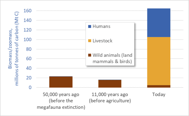
Mass of humans, livestock, and wild animals (terrestrial mammals and birds)

Humans and our livestock now make up 97 percent of all animals on land.  Wild animals (mammals and birds) have been reduced to a mere remnant: just 3 percent.  This is based on mass.  Humans and our domesticated animals outweigh all terrestrial wild mammals and birds 32-to-1.

To clarify, if we add up the weights of all the people, cows, sheep, pigs, horses, dogs, chickens, turkeys, etc., that total is 32 times greater than the weight of all the wild terrestrial mammals and birds: all the elephants, mice, kangaroos, lions, raccoons, bats, bears, deer, wolves, moose, chickadees, herons, eagles, etc.  A specific example is illuminating: the biomass of chickens is more than double the total mass of all other birds combined.

Before the advent of agriculture and human civilizations, however, the opposite was the case: wild animals and birds dominated, and their numbers and mass were several times greater than their numbers and mass today. Before the advent of agriculture, about 11,000 years ago, humans made up just a tiny fraction of animal biomass, and domesticated livestock did not exist.  The current situation—the domination of the Earth by humans and our food animals—is a relatively recent development.

The preceding observations are based on a May 2018 report by Yinon Bar-On, Rob Phillips, and Ron Milo published in the academic journal Proceedings of the National Academy of Sciences.  Bar-On and his coauthors use a variety of sources to construct a “census of the biomass of Earth”; they estimate the mass of all the plants, animals, insects, bacteria, and other living things on our planet.

The graph above is based on data from that report (supplemented with estimates based on work by Vaclav Smil).  The graph shows the mass of humans, our domesticated livestock, and “wild animals”: terrestrial mammals and birds.  The units are millions of tonnes of carbon.*  Three time periods are listed.  The first, 50,000 years ago, is the time before the Quaternary Megafauna Extinction.  The Megafauna Extinction was a period when Homo sapiens radiated outward into Eurasia, Australia, and the Americas and contributed to the extinction of about half the planet’s large animal species (>44 kgs).  (Climate change also played a role in that extinction.)  In the middle of the graph we see the period around 11,000 years ago—before humans began practicing agriculture.  At the right-hand side we see the situation today.  Note how the first two periods are dominated by wild animals.  The mass of humans in those periods is so small that the blue bar representing human biomass is not even visible in the graph.**

This graph highlights three points:
1. wild animal numbers and biomass have been catastrophically reduced, especially over the past 11,000 years;
2. human numbers and livestock numbers have skyrocketed, to unnatural, abnormal levels; and
3. The downward trendline for wild animals visible in this graph is gravely concerning; this graph suggests accelerating extinctions.

Indeed, we are today well into the fastest extinction event in the past 65 million years.  According to the 2005 Millennium Ecosystem Assessment “the rate of known extinctions of species in the past century is roughly 50–500 times greater than the extinction rate calculated from the fossil record….”

The extinction rate that humans are now causing has not been seen since the Cretaceous–Paleogene extinction event 65 million years ago—the asteroid-impact-triggered extinction that wiped out the dinosaurs.  Unless we reduce the scale and impacts of human societies and economies, and unless we more equitably share the Earth with wild species, we will enter fully a major global extinction event—only the sixth in 500 million years.  To the other species of the Earth, and to the fossil record, human impacts increasingly resemble an asteroid impact.

In addition to the rapid decline in the mass and number of wild animals it is also worth contemplating the converse: the huge increase in human and livestock biomass.  Above, I called this increase “unnatural,” and I did so advisedly.  The mass of humans and our food animals is now 7 times larger than the mass of animals on Earth 11,000 or 50,000 years ago—7 times larger than what is normal or natural.  For millions of years the Earth sustained a certain range of animal biomass; in recent millennia humans have multiplied that mass roughly sevenfold.

How?  Fossil fuels.  Via fertilizers, petro-chemical pesticides, and other inputs we are pushing hundreds of millions of tonnes of fossil fuels into our food system, and thereby pushing out billions of tonnes of additional food and livestock feed.  We are turning fossil fuel Calories from the ground into food Calories on our plates and in livestock feed-troughs.   For example, huge amounts of fossil-fuel energy go into growing the corn and soybeans that are the feedstocks for the tens-of-billions of livestock animals that populate the planet.

Dr. Anthony Barnosky has studied human-induced extinctions and the growing dominance of humans and their livestock.  In a 2008 journal article he writes that “as soon as we began to augment the global energy budget, megafauna biomass skyrocketed, such that we are orders of magnitude above the normal baseline today.”  According to Barnosky “the normal biomass baseline was exceeded only after the Industrial Revolution” and this indicates that “the current abnormally high level of megafauna biomass is sustained solely by fossil fuels.”

Only a limited number of animals can be fed from leaves and grass energized by current sunshine.  But by tapping a vast reservoir of fossil sunshine we’ve multiplied the number of animals that can be fed.  We and our livestock are petroleum products.

There is no simple list of solutions to mega-problems like accelerating extinctions, fossil-fuel over-dependence, and human and livestock overpopulation.  But certain common sense solutions seem to present themselves.  I’ll suggest just one: we need to eat less meat and fewer dairy products and we need to reduce the mass and number of livestock on Earth.  Who can look at the graph above and come to any other conclusion?  We need not eliminate meat or dairy products (grazing animals are integral parts of many ecosystems) but we certainly need to cut the number of livestock animals by half or more.  Most importantly, we must not try to proliferate the Big Mac model of meat consumption to 8 or 9 or 10 billion people.  The graph above suggests a stark choice: cut the number of livestock animals, or preside over the demise of most of the Earth’s wild species.


* Using carbon content allows us to compare the mass of plants, animals, bacteria, viruses, etc.  Very roughly, humans and other animals are about half to two-thirds water.  The remaining “dry mass” is about 50 percent carbon.  Thus, to convert from tonnes of carbon to dry mass, a good approximation is to multiply by 2.

** There is significant uncertainty regarding animal biomass in the present, and much more so in the past.  Thus, the biomass values for wild animals in the graph must be considered as representing a range of possible values.  That said, the overall picture revealed in the graph is not subject to any uncertainty.  The overall conclusions are robust: the mass of humans and our livestock today is several times larger than wild animal biomass today or in the past; and wild animal biomass today is a fraction of its pre-agricultural value.

Graph sources:
– Yinon M. Bar-On, Rob Phillips, and Ron Milo, “The Biomass Distribution on Earth,” Proceedings of the National Academy of Sciences, May 17, 2018.
– Anthony Barnosky, “Megafauna Biomass Tradeoff as a Driver of Quaternary and Future Extinctions,” Proceedings of the National Academy of Sciences 105 (August 2008).
– Vaclav Smil, Harvesting the Biosphere: What We Have Taken from Nature (Cambridge, MA: MIT Press, 2013).

Home grown: 67 years of US and Canadian house size data

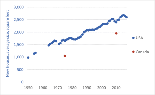
Graph of the average size of new single-family homes, Canada and the US, 1950-2017
Average size of new single-family homes, Canada and the US, 1950-2017

I was an impressionable young boy back in 1971 when my parents were considering building a new home.  I remember discussions about house size.  1,200 square feet was normal back then.  1,600 square feet, the size of the house they eventually built, was considered extravagant—especially in rural Saskatchewan.  And only doctors and lawyers built houses as large as 2,000 square feet.

So much has changed.

New homes in Canada and the US are big and getting bigger.  The average size of a newly constructed single-family detached home is now 2,600 square feet in the US and probably 2,200 in Canada.  The average size of a new house in the US has doubled since 1960.  Though data is sparse for Canada, it appears that the average size of a new house has doubled since the 1970s.

We like our personal space.  A lot.  Indeed, space per person has been growing even faster than house size.  Because as our houses have been growing, our families have been shrinking, and this means that per-capita space has increased dramatically.  The graph below, from shrinkthatfootprint.com, shows that, along with Australia, Canadians and Americans enjoy the greatest per-capita floorspace in the world.  The average Canadian or American each has double the residential space of the average UK, Spanish, or Italian resident.

Those of us fortunate enough to have houses are living in the biggest houses in the world and the biggest in history.  And our houses continue to get bigger.  This is bad for the environment, and our finances.

Big houses require more energy and materials to construct.  Big houses hold more furniture and stuff—they are integral parts of high-consumption lifestyles.  Big houses contribute to lower population densities and, thus, more sprawl and driving.  And, all things being equal, big houses require more energy to heat and cool.  In Canada and the US we are compounding our errors: making our houses bigger, and making them energy-inefficient.  A 2,600 square foot home with leading edge ‘passiv haus’ construction and net-zero energy requirements is one thing, but a house that size that runs its furnace half the year and its air conditioner the other half is something else.  And multiply that kind of house times millions and we create a ‘built in’ greenhouse gas emissions problem.

Then there are the issues of cost and debt.  We continually hear that houses are unaffordable.  Not surprising if we’re making them twice as large.  What if, over the past decade, we would have made our new houses half as big, but made twice as many?  Might that have reduced prices?

And how are large houses connected to large debt-loads?  Canadian debt now stands at a record $1.8 trillion.  Much of that is mortgage debt.  Even at low interest rates of 3.5 percent, the interest on that debt is $7,000 per year for a hypothetical family of four.  And that’s just the average.  Many families are paying a multiple of that amount, just in interest.  Then on top of that there are principle payments.  It’s not hard to see why so many families struggle to save for retirement or pay off debt.

Our ever-larger houses are filling the air with emissions; emptying our pockets of saving; filling up with consumer-economy clutter; and creating car-mandatory unwalkable, unbikable, unlovely neighborhoods.

The solutions are several fold.  First, new houses must stop getting bigger.  And they must start getting smaller.  There is no reason that Canadian and US residential spaces must be twice as large, per person, as European homes.  Second, building standards must get a lot better, fast.  Greenhouse gas emissions must fall by 50 to 80 percent by mid-century.  It is critical that the houses we build in 2020 are designed with energy efficient walls, solar-heat harvesting glass, and engineered summer shading such that they require 50 to 80 percent less energy to heat and cool.  Third, we need to take advantage of smaller, more rational houses to build more compact, walkable, bikable, enjoyable neighborhoods.  Preventing sprawl starts at home.

Finally, we need to consider questions of equity, justice, and compassion.  What is our ethical position if we are, on the one hand, doubling the size of our houses and tripling our per-capita living space and, on the other hand, claiming that we “can’t afford” housing for the homeless.  Income inequality is not just a matter of abstract dollars.  This inequality is manifest when some of us have rooms in our homes we seldom visit while others sleep outside in the cold.

We often hear about the “triple bottom line”: making our societies ecologically, economically, and socially sustainable.  Building oversized homes moves us away from sustainability, on all three fronts.

Graph sources:
US Department of Commerce/US Census Bureau, “2016 Characteristics of New Housing”
US Department of Commerce/US Census Bureau, “Characteristics of New Housing: Construction Reports”
US Department of Commerce/US Census Bureau, “Construction Reports: Characteristics of New One-Family Homes: 1969”
US Department of Labour, Bureau of Labour Statistics, “New Housing and its Materials:1940-56”
Preet Bannerjee, “Our Love Affair with Home Ownership Might Be Doomed,” Globe and Mail, January 18, 2012 (updated February 20, 2018) 

The cattle crisis: 100 years of Canadian cattle prices

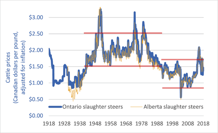
Graph of Canadian cattle prices, historic, 1918-2018
Canadian cattle prices at slaughter, Alberta and Ontario, 1918-2018

Earlier this month, Brazilian beef packer Marfrig Global Foods announced it is acquiring 51 percent ownership of US-based National Beef Packing for just under $1 billion (USD).  The merged entity will slaughter about 5.5 million cattle per year, making Marfrig/National the world’s fourth-largest beef packer.  (The top-three are JBS, 17.4 million per year; Tyson, 7.7 million; and Cargill, 7.6.)  To put these numbers into perspective, with the Marfrig/National merger, the largest four packing companies will together slaughter about 15 times more cattle worldwide than Canada produces in a given year.  In light of continuing consolidation in the beef sector it is worth taking a look at how cattle farmers and ranchers are fairing.

This week’s graph shows Canadian cattle prices from 1918 to 2018.  The heavy blue line shows Ontario slaughter steer prices, and is representative of Eastern Canadian cattle prices.  The narrower tan-coloured line shows Alberta slaughter steer prices, and is representative for Western Canada.  The prices are in dollars per pound and they are adjusted for inflation.

The two red lines at the centre of the graph delineate the price range from 1942 to 1989.  The red lines on the right-hand side of the graph delineate prices since 1989.  The difference between the two periods is stark.  In the 47 years before 1989, Canadian slaughter steer prices never fell below $1.50 per pound (adjusted for inflation).  In the 28 years since 1989, prices have rarely risen that high.  Price levels that used to mark the bottom of the market now mark the top.

What changed in 1989?  Several things:

1.       The arrival of US-based Cargill in Canada in that year marked the beginning of integration and consolidation of the North American continental market.  This was later followed by global integration as packers such as Brazil-based JBS set up plants in Canada and elsewhere.

2.       Packing companies became much larger but packing plants became much less numerous.  Gone were the days when two or three packing plants in a given city would compete to purchase cattle.

3.       Packer consolidation and giantism was faciliated by trade agreements and global economic integration.  It was in 1989 that Canada signed the Canada-US Free Trade Agreement (CUSTA).  A few years later Canada would sign the NAFTA, the World Trade Organization (WTO) Agreement on Agriculture, and other bilateral and multilateral “free trade” deals.

4.       Packing companies created captive supplies—feedlots full of packer-owned cattle that the company could draw from if open-market prices rose, curtailing demand for farmers’ cattle and disciplining prices.

Prices and profits are only partly determined by supply and demand.  A larger factor is market power.  It is this power that determines the allocation of profits within a supply chain.  In the late ’80s and continuing today, the power balance between packers and farmers shifted as packers merged to become giant, global corporations.  The balance shifted as packing plants became less numerous, reducing competition for farmers’ cattle.  The balance shifted still further as packers began to utilize captive supplies.  And it shifted further still as trade agreements thrust farmers in every nation into a single, hyper-competitive global market.  Because market power determines profit allocation, these shifts increased the profit share for packers and decreased the share for farmers.   The effects on cattle farmers have been devastating.  Since the latter-1980s, Canada has lost half of its cattle farmers and ranchers.

For more background and analysis, please see the 2008 report by the National Farmers Union: The Farm Crisis and the Cattle Sector: Toward a New Analysis and New Solutions.

Graph sources: numerous, including Statistics Canada CANSIM Tables 002-0043, 003-0068, 003-0084; and  Statistics Canada “Livestock and Animal Products”, Cat. No. 23-203


There are just two sources of energy

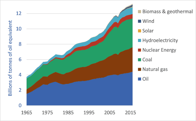
Graph of global primary energy supply by fuel or energy source, 1965-2016
Global primary energy consumption by fuel or energy source, 1965-2016

Our petro-industrial civilization produces and consumes a seemingly diverse suite of energies: oil, coal, ethanol, hydroelectricity, gasoline, geothermal heat, hydrogen, solar power, propane, uranium, wind, wood, dung.  At the most foundational level, however, there are just two sources of energy.  Two sources provide more than 99 percent of the power for our civilization: solar and nuclear.  Every other significant energy source is a form of one of these two.  Most are forms of solar.

When we burn wood we release previously captured solar energy.  The firelight we see and the heat we feel are energies from sunlight that arrived decades ago.  That sunlight was transformed into chemical energy in the leaves of trees and used to form wood.  And when we burn that wood, we turn that chemical-bond energy back into light and heat.  Energy from wood is a form of contemporary solar energy because it embodies solar energy mostly captured years or decades ago, as distinct from fossil energy sources such as coal and oil that embody solar energy captured many millions of years ago.

Straw and other biomass are a similar story: contemporary solar energy stored as chemical-bond energy then released through oxidation in fire.  Ethanol, biodiesel, and other biofuels are also forms of contemporary solar energy (though subsidized by the fossil fuels used to create fertilizers, fuels, etc.).

Coal, natural gas, and oil products such as gasoline and diesel fuel are also, fundamentally, forms of solar energy, but not contemporary solar energy: fossil.  The energy in fossil fuels is the sun’s energy that fell on leaves and algae in ancient forests and seas.  When we burn gasoline in our cars, we are propelled to the corner store by ancient sunlight.

Wind power is solar energy.  Heat from the sun creates air-temperature differences that drive air movements that can be turned into electrical energy by wind turbines, mechanical work by windmills, or geographic motion by sailing ships.

Hydroelectric power is solar energy.  The sun evaporates and lifts water from oceans, lakes, and other water bodies, and that water falls on mountains and highlands where it is aggregated by terrain and gravity to form the rivers that humans dam to create hydro-power.

Of course, solar energy (both photovoltaic electricity and solar-thermal heat) is solar energy.

Approximately 86 percent of our non-food energy comes from fossil-solar sources such as oil, natural gas, and coal.  Another 9 percent comes from contemporary solar sources, mostly hydro-electric, with a small but rapidly growing contribution from wind turbines and solar photovoltaic panels.  In total, then, 95 percent of the energy we use comes from solar sources—contemporary or fossil.  As is obvious upon reflection, the Sun powers the Earth.

The only major energy source that is not solar-based is nuclear power: energy from the atomic decay of unstable, heavy elements buried in the ground billions of years ago when our planet was formed.  We utilize nuclear energy directly, in reactors, and also indirectly, when we tap geothermal energies (atomic decay provides 60-80 percent of the heat from within the Earth).  Uranium and other radioactive elements were forged in the cores of stars that exploded before our Earth and Sun were created billions of years ago.  The source for nuclear energy is therefore not solar, but nonetheless stellar; energized not by our sun, but by another.  Our universe is energized by its stars.

There are two minor exceptions to the rule that our energy comes from nuclear and solar sources: Tidal power results from the interaction of the moon’s gravitational field and the initial rotational motion imparted to the Earth; and geothermal energy is, in its minor fraction, a product of residual heat within the Earth, and of gravity.  Tidal and geothermal sources provide just a small fraction of one percent of our energy supply.

Some oft-touted energy sources are not mentioned above.  Because some are not energy sources at all.  Rather, they are energy-storage media.  Hydrogen is one example.  We can create purified hydrogen by, for instance, using electricity to split water into its oxygen and hydrogen atoms.  But this requires energy inputs, and the energy we get out when we burn hydrogen or react it in a fuel cell is less than the energy we put in to purify it.  Hydrogen, therefore, functions like a gaseous battery: energy carrier, not energy source.

Understanding that virtually all energy sources are solar or nuclear in origin reduces the intellectual clutter and clarifies our options.  We are left with three energy supply categories when making choices about our future:
– Fossil solar: oil, natural gas, and coal;
– Contemporary solar: hydroelectricity, wood, biomass, wind, photovoltaic electricity, ethanol and biodiesel (again, often energy-subsidized from fossil-solar sources); and
– Nuclear.

Knowing that virtually all energy flows have their origins in our sun or other stars helps us critically evaluate oft-heard ideas that there may exist undiscovered energy sources.  To the contrary, it is extremely unlikely that there are energy sources we’ve overlooked.  The solution to energy supply constraints and climate change is not likely to be “innovation” or “technology.” Though some people hold out hope for nuclear fusion (creating a small sun on Earth rather than utilizing the conveniently-placed large sun in the sky) it is unlikely that fusion will be developed and deployed this century.  Thus, the suite of energy sources we now employ is probably the suite that will power our civilization for generations to come.  And since fossil solar sources are both limited and climate-disrupting, an easy prediction is that contemporary solar sources such as wind turbines and solar photovoltaic panels will play a dominant role in the future.


Graph sources: BP Statistical Review of World Energy 2017


Rail lines, not pipelines: the past, present, and future of Canadian passenger rail

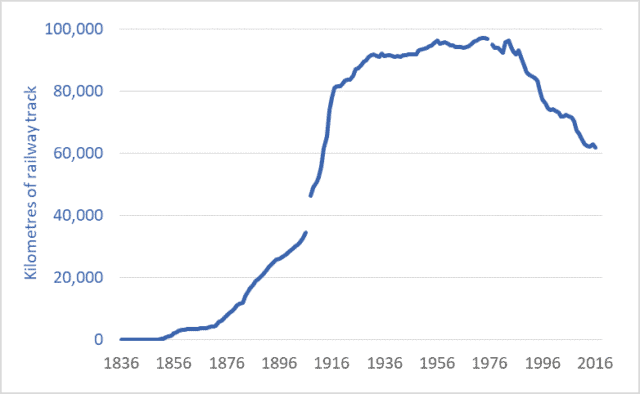
Graph of Canadian railway network, kilometres, historic, 1836 to 2016
Canadian railway network, kilometres of track, 1836 to 2016

One kilometre of oil pipeline contains the same amount of steel as two kilometres of railway track.*  The proposed Trans Mountain pipeline expansion will, if it goes ahead, consume enough steel to build nearly 2,000 kms of new passenger rail track.  The Keystone XL project would consume enough steel to build nearly 4,000 kms of track.  And the now-cancelled Energy East pipeline would have required as much steel as 10,000 kms of track.  (For an overview of proposed pipelines, see this CAPP publication.)

With these facts in mind, Canadians (and Americans) should consider our options and priorities.  There’s tremendous pressure to build new pipelines.  Building them, proponents claim, will result in jobs and economic development.  But if we’re going to spend billions of dollars, lay down millions of tonnes of steel, and consume millions of person-hours of labour, should we be building soon-to-be-obsolete infrastructure to transport climate-destabilizing fossil fuels?  Or should we take the opportunity to create even more jobs building a zero-emission twenty-first century transportation network for Canada and North America?  Admittedly, the economics of passenger rail are different than those of pipelines; building a passenger rail system is not simply a matter of laying down steel rails.  But for reasons detailed below, limiting global warming probably makes significant investments in passenger rail inevitable.

The graph above shows the total length of the Canadian railway network.  The time-frame is the past 180 years: 1836 to 2016.  Between 1880 and 1918, Canada built nearly 70,000 kms of railway track—nearly 2,000 kms per year, using tools and machinery that were crude by modern standards, and at a time when the nation and its citizens were poor, compared to today.  In the middle and latter decades of the twentieth century, tens of thousands of kms of track were upgraded to accommodate heavier loads.

The length of track in the Canadian railway system peaked in the 1980s.  Recent decades have seen the network contract.  About a third of Canadian rail lines have been torn up and melted down over the past three-and-a-half decades.  Passenger rail utilization in recent years has fallen to levels not seen since the 1800s—down almost 90 percent from its 1940s peak, despite a doubling of the Canadian population.  Indeed, ridership on Via Rail is half of what it was as recently as 1989.

Contrast China.  In just one decade, that nation has built 25,000 miles of high-speed passenger rail lines.  Trains routinely operate at speeds in excess of 300 km/h.  Many of those trains were designed and built by Canada’s Bombardier.  China plans to build an additional 13,000 kms of high-speed passenger lines in the next seven years.

Japan’s “bullet trains” began running more than 50 years ago.  The Japanese high-speed rail network now exceeds 2,700 kms, with trains reaching speeds of 320 km/h.

Saudi Arabia, Poland, Turkey, and Morocco all have high-speed lines, as do more than a dozen nations in Europe.  Uzbekistan—with a GDP one-twentieth that of Canada’s—has built 600 kms of high-speed rail line and has trains operating at 250 km/h.

The construction of Canadian and North American passenger rail networks is probably inevitable.  As part of an international effort to hold global temperature increases below 2 degrees C, Canada has committed to reduce greenhouse gas (GHG) emissions emission by 30 percent by 2030—now less than 12 years away.  Emissions reductions must continue after 2030, reaching 50 to 60 percent in little more than a generation.  Emission reductions of this magnitude require an end to routine air travel.  Aircraft may still be needed for trans-oceanic travel, but within continents long-distance travel will have to take place using zero-emission vehicles: electric cars or buses for shorter journeys, and electrified passenger trains for longer ones.

This isn’t bad news.  Trains can transport passengers from city-centre to city-centre, eliminating long drives to and from airports.  Trains do not require time-consuming airport security screenings.  These factors, combined with high speeds, mean that for many trips, the total travel time is less for trains than for planes.  And because trains have more leg-room and often include observation cars, restaurants, and lounges, they are much more comfortable, enjoyable, and social.  For some long journeys where it is not cost-effective to build high-speed rail lines, European-style sleeper trains can provide comfortable, convenient overnight transport.  In other cases, medium-speed trains (traveling 150 to 200 km/h) may be the most cost-effective option.

Canada must embrace the inevitable: air travel must be cut by 90 percent; and fast, comfortable, zero-emission trains must take the place of the planes.  Maybe we can build thousands of kms of passenger rail lines and thousands of kms of pipelines.  But given the gravity and menace of the climate crisis and given the rapidly approaching deadlines to meet our emission-reduction commitments, it isn’t hard to see which should be our priority.


*For example, Kinder Morgan’s Trans Mountain pipeline would be made up primarily of 36” pipe (914mm) with a 0.465 wall thickness (11.8 mm).  This pipe weighs 262 kgs/m.  Rails for high-speed trains and other demanding applications often weigh 60 kgs/m.  As two rails are needed, this means 120 kgs/m—half the weight of a comparable length of pipeline.

Graph sources:
Urquhart and Buckley, 1965, Historical Statistics of Canada.
Leacy, Urquhart, and Buckley, 1983, Historical Statistics of Canada, 2nd Ed.
Stats. Can., Various years, Railway Transport in Canada: General Statistics.
Stats. Can., CANSIM Table 404-0010