Carbon tax will not cause fossil fuel use to fall: Canada’s NEB

Graph of Canadian fossil fuel use and NEB projections to 2040
Canadian fossil fuel use, historic and projections to 2040

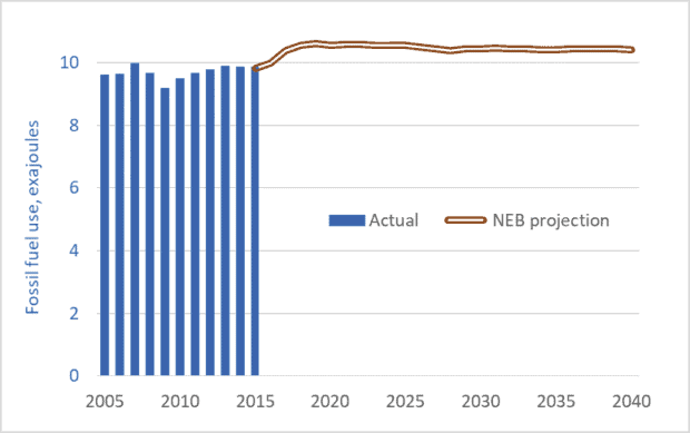
The graph above is based on data from a recent report by Canada’s National Energy Board (NEB)—a federal government agency.  The October 26 report, Canada’s Energy Future 2017, predicts that Canadians will be consuming fossil fuels at the same rate in 2040 as we are today.  The NEB is projecting that fossil fuel use will not fall, nor will attendant greenhouse gas (GHG) emissions.

The graph’s blue bars show Canadian fossil fuel use over the past 11 years.  The brown line shows the NEB’s projections for the future.  The units, exajoules, are not important.  What is important is that the NEB predicts no drop in fuel consumption.

Most important, is that the NEB’s projections take into account the federal government’s carbon tax.  Ottawa has announced that the provinces must impose a carbon tax of $10 per tonne in 2018, escalating to $50 per tonne by 2022.  All provinces must impose a tax, or some equivalent carbon-pricing scheme.

At the Paris climate talks in 2015, Canada joined other nations in committing to limit the global average temperature increase to 2.0 degrees C (relative to pre-industrial levels).  To help achieve that goal, Canada has made an international commitment to reduce its GHG emissions by 30 percent (relative to 2005 levels) by 2030.  The NEB is, in effect, saying that Canada will fail to meet its commitment of a 30 percent reduction; the carbon tax, along with all other measures announced so far, will not cause a decline in fossil fuel use or emissions.

The preceding should surprise no one.  The federal government’s carbon tax starts out at $10 per tonne of carbon—equivalent to about 2¢ per litre of gasoline.  Over the next half-decade, it rises to $50 per tonne—about 11¢ per litre.  Many Canadians do not know the price of gasoline to the nearest dime.  And gasoline prices over the past year were down as much as 40¢ compared to three years ago.  An 11¢ per litre carbon tax is not going to cause gasoline consumption to fall.  Similarly modest taxes on other fuels will likewise prove ineffective.

Canadians need to understand that they are being deceived.  Politicians—eager for re-election and afraid of hard conversations with voters—are understating the magnitude of the climate crisis and overestimating the effectiveness of our actions to counter the threat.

How do we actually reduce fossil fuel use, cut emissions, and stabilize the climate?  A carbon tax is needed, but it must be much higher: $200 to $300 per tonne—equivalent to 50¢ to 75¢ per litre of gasoline.  But such a tax is unbearable for citizens (and politicians) unless 100 percent of the total tax collected is rebated back to citizens on a per-capita basis.  We need a carbon-tax-and-refund system.  Under such a system, we would all pay taxes on gasoline, home heating fuel, etc. and pay indirectly on the energy embedded in our products.  Goods that required a lot of energy to produce or transport would cost more.  But offsetting these new costs, we would receive back all the carbon tax money collected, on a per-capita basis.  Thus, if a person’s energy consumption is below average, he or she would finish the year money ahead—his or her per-capita refund would exceed the carbon taxes paid.  On the other hand, someone who wants to drive a Hummer and heat and cool a huge home will come out money behind.  Another way of thinking about this tax-and-refund system is that it transfers money to those doing the right things from those doing the wrong things.  And the former group can take their carbon tax refunds and invest them in home energy retrofits, solar panels, and other emission-reduction measures, setting the stage for even larger carbon tax savings next year.

The NEB is telling us we’re not on track.  But we can change course.  Bold and rapid policy action now can reduce emissions by 30 percent and help limit temperature increases to 2 degrees.  But we must act.

Graph source: National Energy Board
Setting our future aflame: Projected energy use to 2035

Graph of primary energy consumption by source or fuel, 1965 to 2015, with projections to 2035
Global primary energy use, by source or fuel, 1965 to 2015, with projections to 2035 (billions of tonnes of oil equivalent)

In a recent post (link here) I said that holding global temperature increases below dangerous levels would require “a mobilization of near-wartime scale and speed to transform the global economy and its energy and transportation systems.”  Most climate scientists looking at carbon budgets agree that global greenhouse gas emissions need to fall to near zero in the 2040s (to hold temperature increases below 1.5 degrees Celsius) or 2050s (to hold increases to 2 degrees).

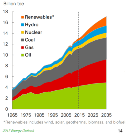
So, how are we doing?  BP (formerly British Petroleum) is one of the world’s leading sources for energy statistics and projections.  This week’s graph is taken from the 2017 edition of its Energy Outlook.  The graph shows BP’s projections of energy use to 2035, based on current trends.  The picture is bleak.

BP’s projections show oil use/combustion rising over the next 18 years.  Natural gas combustion rises even faster.  Even coal combustion increases.  Not surprising, BP projects rising GHG emissions for the period from 2017 to 2035.  But this is exactly the time frame in which we are supposed to be rapidly reducing emissions.

If BP is correct, if we act in the ways they are predicting, there is zero chance of meeting the Paris commitments of reducing GHG emissions by 30 percent by 2030.  And there is zero chance of holding temperature increases below 2 degrees.  The picture BP paints, if we allow it to come to pass, would push global temperature increases past 3 degrees, or even higher.  That would be a cataclysmic amount of warming.

I’m told that fear and bad news are not good motivators.  But neither are delusion or denial.  We must stop telling ourselves fanciful stories about salvation by solar shingles.  The citizens of the world need to know the facts about our situation and our trajectory.  There is a vague feeling that we’re doing the right thing, that solar and wind power are growing so fast that we can meet our targets, that a modest carbon tax levied sometime in the future will be enough to put us onto the right track.  No.  Projections by BP and others tell a wholly different story.  The facts indicate that we are on track to climate calamity.  That may not be welcome news, but it is the truth.  Whether it motivates people remains to be seen.

Graph source: BP, Energy Outlook: 2017 edition

Cattle Rustling? The growing gap between cattle and beef prices

Graph of Canadian cattle prices and retail beef prices, 1995 to 2017
Retail prices of ground beef and steak compared to farmers’ prices for cattle, 1995–2017

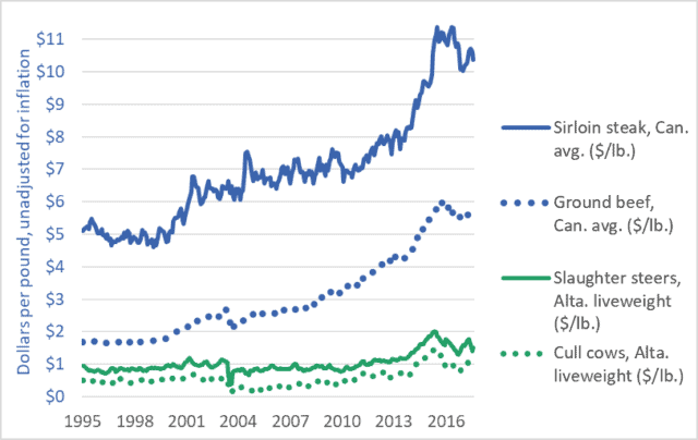
This week’s graph highlights the growing gap between what Canadians pay for beef and what farmers receive for their cattle.  The rising blue lines show grocery-store prices for steak and ground beef.  The comparatively flat green lines represent the prices farmers and feedlot operators receive for the cattle they sell to beef packers.  Steers (castrated male cattle) are more likely to be the source of steaks, while cows are primarily turned into ground beef.

The blue lines show what consumers pay; the green lines show what farmers get.  The widening gap between the blue lines and the green lines reveals the amount that packers and retailers take for themselves.

Let’s look first at the dotted lines.  The green dotted line shows the per-pound price farmers in Alberta receive for their cows.  (prices across Canada are similar.)  In the decade-and-a-half before 2010, that price averaged about 50¢.  In recent years it has averaged about $1.00.  One could say that farmers are receiving an extra 50¢ per pound for their cows.  These figures do not take into account rising costs (they are not adjusted for inflation) but we’ll leave that issue aside for now.  Note what happens to the blue dotted line: the grocery-store price of ground beef.  It more than triples, from about $1.70 per pound to about $5.50.  Farmers’ prices increased by 100%, but packers and retailers increased their take by 320%.  Farmers’ prices increased by 50¢, but packers and retailers increased their prices by nearly $4.00.

The solid green line shows the price that farmers (or feedlot operators) receive for slaughter-ready steers.  The solid blue line is a representative price for grocery-store steaks.  If we compare recent years to those before 2013, we see that steer prices have risen by perhaps 50¢ or 60¢ per pound.  Over the same period, steak prices have risen by $5.00 or $6.00.

There is little discernible connection between the prices consumers pay and the prices farmers receive.  This is true of cattle and beef, but also true of nearly every other farm-retail product pair.  For a graph comparing the prices of wheat and bread, click here.  Similar “wedge” graphs can be created for corn and cornflakes, hogs and pork chops, and many other farm-retail product pairs.

Food processors, packers, and retailers are choking off the flow of dollars to Canadian farms, with devastating effects.  The number of Canadian farms raising cattle has been cut nearly in half in a generation—from 142,000 in 1995 to less than 75,000 today.  Moreover, many of these farms reporting cattle are dairy farms (which do sell cattle for slaughter, but support themselves primarily from milk sales).  The number of farms classified as “beef cattle ranching and farming, including feedlots” stood at just 36,000 in 2016.  Farm debt is a record $100 billion.  And the number of young farmers (<35 years of age) today is just one-third the number a generation ago.

Canadians are paying many times over.  We’re paying a high price at the store.  We’re paying again through our taxes to fund farm support programs—money paid to farmers to backfill for the dollars extracted by powerful transnational packers, processors, and retailers.  And we’re paying yet again as our rural economies are hollowed out, our communities decimated, our family farms destroyed, and our nation’s capacity to sustainably produce food is eroded.

Graph sources: Statistics Canada CANSIM Tables 326-0012 and 002-0043.  

Everything must double: Economic growth to mid-century

Graph of GDP of the world's largest economies, 2016 vs 2050
Size of the world’s 17 largest economies, 2016, and projections for 2050

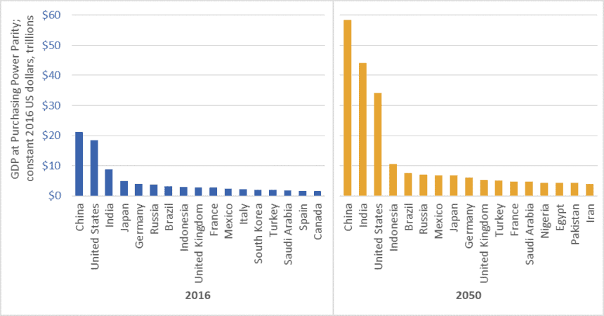
In February 2017, global accounting firm PricewaterhouseCoopers (PwC) released a report on economic growth entitled The Long View: How will the Global Economic Order Change by 2050?  The graph above is based on data from that report.  (link here)  It shows the gross domestic product (GDP) of the largest economies in the world in 2016, and projections for 2050.  The values in the graph are stated in constant (i.e., inflation adjusted) 2016 dollars.

PwC projects that China’s economy in 2050 will be larger than the combined size of the five largest economies today—a list that includes China itself, but also the US, India, Japan, and Germany.

Moreover, the expanded 2050 economies of China and India together ($102.5 trillion in GDP) will be almost as large as today’s global economy ($107 trillion).

We must not, however, simply focus on economic growth “over there.”  The US economy will nearly double in size by 2050, and Americans will continue to enjoy per-capita GDP and consumption levels that are among the highest in the world.  The size of the Canadian economy is similarly projected to nearly double.   The same is true for several EU countries, Australia, and many other “rich” nations.

Everything must double

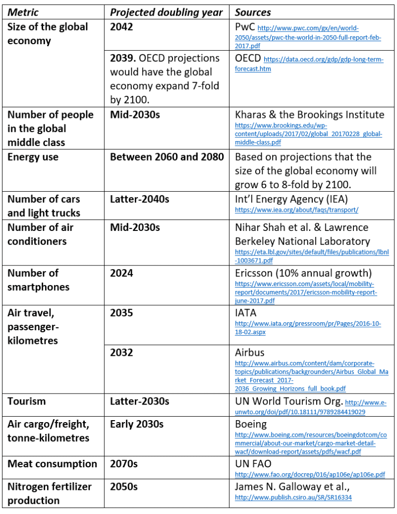
PwC’s report tells us that between now and 2050, the size of the global economy will more than double.  Other reports concur (See the OECD data here).  And this doubling of the size of the global economy is just one metric—just one aspect of the exponential growth around us.  Indeed, between now and the middle decades of this century, nearly everything is projected to double.  This table lists just a few examples.

Table of projected year of doubling for various energy, consumption, transport, and other metrics
Projected year of doubling for selected energy, consumption, and transport metrics

At least one thing, however, is supposed to fall to half

While we seem committed to doubling everything, the nations of the world have also made a commitment to cut greenhouse gas (GHG) emissions by half by the middle decades of this century.  In the lead-up to the 2015 Paris climate talks, Canada, the US, and many other nations committed to cut GHG emissions by 30 percent by 2030.  Nearly every climate scientist who has looked at carbon budgets agrees that we must cut emissions even faster.  To hold temperature increases below 2 degrees Celsius relative to pre-industrial levels, emissions must fall by half by about the 2040s, and to near-zero shortly after.

Is it rational to believe that we can double the number of cars, airline flights, air conditioners, and steak dinners and cut global GHG emissions by half?

To save the planet from climate chaos and to spare our civilization from ruin, we must—at least in the already-rich neighborhoods—end the doubling and redoubling of economic activity and consumption.  Economic growth of the magnitude projected by PwC, the OECD, and nearly every national government will make it impossible to cut emissions, curb temperature increases, and preserve advanced economies and stable societies.  As citizens of democracies, it is our responsibility to make informed, responsible choices.  We must choose policies that curb growth.

Graph source: PriceWaterhouseCoopers

Falling per-capita farmland raises critical questions

Graph of per capita farmland arable land, global, 1950 to 2050
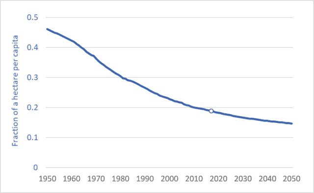
Per-capita arable land (cropland), world average, 1950 to 2050.

As populations continue rising, per-capita farmland area is falling.  In 1950, for each person in the world (about 2.5 billion back then) there was, on average, 0.46 hectares of cropland (“arable” land).  That is an area roughly equal to the in-bounds playing area of a US football field.  Today, per-capita cropland area is just 0.19 hectares.  By 2050, it will be lower still: 0.15 hectares—one-third the area in 1950.  We’ll soon be down to just a third of a football field each.

The graph above shows the average per-capita cropland area from 1950 to 2050.  The units are fractions of a hectare.

Humanity’s in a bind.  We’re becoming more numerous.  The UN predicts a global population of 9.8 billion by mid-century.  Moreover, we’re becoming richer.  Projected rates of economic growth—3 percent compounded annually, according to the World Bank—will cause the size of the global economy to nearly triple by 2050.  That enlarged, enriched population will want to consume more food.  It will want to consume more of its food in the form of meat rather than vegetables or grains.  It will be more prone to overeating and more demanding of processed foods and junk food.  And it will waste more of its food, because comfortable, well-fed people do that.  In addition, more food will be diverted to energy and fuel uses, including biofuels for air travel and ocean shipping.  Based on these factors, the UN projects that food production in 2050 will have to be 70 percent higher than in 2005 (see here or here).

Here’s the bind.  In order to deal with climate change, the world’s governments have committed to reducing GHG emissions by 30 percent by 2030—just over 12 years from now.  And reductions of 50 to 80 percent are needed by 2050.  How do we expand food supplies and reduce emissions?  Bringing new land into production (Amazon rainforest, for example) emits huge plumes of GHGs as soil carbon is released by tillage.  If we want to reduce emissions we cannot afford to continue releasing carbon stored in forests or grasslands.  So the alternative is to intensify production—produce more on the land we already have.  This usually requires more fertilizer.  But the most used and most critical fertilizer, nitrogen, is made from natural gas and is a major source of GHG emissions.  Globally, nitrogen (N) fertilizer use has doubled since the 1970s (see blog post here); Canadian farmers have doubled their N use since the 1990s.  Our commitments to downward-trending GHG emissions is already in conflict with upward trending nitrogen fertilizer usage.

In the face of monumental problems such as these it is best to just spend some time mulling our predicament.  We must resist the “rush to solutions.”  For now, let’s just consider some questions:
– Can we continue to waste 20 to 40 percent of our food?
– Can we burn food in cars and airliners and cruise ships?
– Should we increase livestock production by two-thirds in the next three decades (as the UN predicts), knowing that many livestock production systems inefficiently turn 5 to 10 Calories worth of grain into one Calorie of meat?
– Should we continue to make bad food out of good—producing millions of tonnes of nutritionally disfigured foods such as soft drinks, cocoa puffs, and potato chips?  (One quarter of US Calories now come from junk food.  See here.)
– Should we continue to foster a food industry that promotes over-eating and resulting health problems?

As our per-capita land base contracts, and as our atmospheric emission-space fills, can we afford these extravagances?  …these follies?  An adequate response to these problem will require re-imagining and restructuring of our food system–fundamental changes to food production and consumption.

Graph sources: FAOSTAT and the UN Population Division 


Efficiency, the Jevons Paradox, and the limits to economic growth

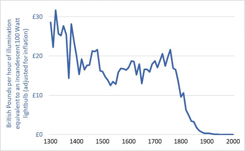
Graph of the cost of lighting in the UK, 1300-2000

I’ve been thinking about efficiency.  Efficiency talk is everywhere.  Car buyers can purchase ever more fuel-efficient cars.  LED lightbulbs achieve unprecedented efficiencies in turning electricity into visible light.  Solar panels are more efficient each year.  Farmers are urged toward fertilizer-use efficiency.  And our Energy Star appliances are the most efficient ever, as are the furnaces and air conditioners in many homes.

The implication of all this talk and technology is that efficiency can play a large role in solving our environmental problems.  Citizens are encouraged to adopt a positive, uncritical, and unsophisticated view of efficiency: we’ll just make things more efficient and that will enable us to reduce resource use, waste, and emissions, to solve our problems, and to pave the way for “green growth” and “sustainable development.”

But there’s something wrong with this efficiency solution: it’s not working.  The current environmental multi-crisis (depletion, extinction, climate destabilization, ocean acidification, plastics pollution, etc.) is not occurring as a result of some failure to achieve large efficiency gains.  The opposite.  It is occurring after a century of stupendous and transformative gains.  Indeed, the efficiencies of most civilizational processes (e.g., hydroelectric power generation, electrical heating and lighting, nitrogen fertilizer synthesis, etc.) have increased by so much that they are now nearing their absolute limits—their thermodynamic maxima.  For example, engineers have made the large electric motors that power factories and mines exquisitely efficient; those motors turn 90 to 97 percent of the energy in electricity into usable shaft power.  We have maximized efficiencies in many areas, and yet our environmental problems are also at a maximum.  What gives?

There are many reasons why efficiency is not delivering the benefits and solutions we’ve been led to expect.  One is the “Jevons Paradox.”  That Paradox predicts that, as the efficiencies of energy converters increase—as cars, planes, or lightbulbs become more efficient—the cost of using these vehicles, products, and technologies falls, and those falling costs spur increases in use that often overwhelm any resource-conservation gains we might reap from increasing efficiencies.  Jevons tells us that energy efficiency often leads to more energy use, not less.  If our cars are very fuel efficient and our operating costs therefore low, we may drive more, more people may drive, and our cities may sprawl outward so that we must drive further to work and shop.  We get more miles per gallon, or per dollar, so we drive more miles and use more gallons.  The Jevons Paradox is a very important concept to know if you’re trying to understand our world and analyze our situation.

The graph above helps illustrate the Jevons Paradox.  It shows the cost of a unit of artificial light (one hour of illumination equivalent to a modern 100 Watt incandescent lightbulb) in England over the past 700 years.  The currency units are British Pounds, adjusted for inflation.  The dramatic decline in costs reflects equally dramatic increases in efficiency.

Adjusted for inflation, lighting in the UK was more than 100 times more affordable in 2000 than in 1900 and 3,000 time more affordable than in 1800.  Stated another way, because electrical power plants have become more efficient (and thus electricity has become cheaper), and because new lighting technologies have become more efficient and produce more usable light per unit of energy, an hour’s pay for the average worker today buys about 100 times more artificial light than it did a century ago and 3,000 time more than two centuries ago.

But does all this efficiency mean that we’re using less energy for lighting?  No.  Falling costs have spurred huge increases in demand and use.  For example, the average UK resident in the year 2000 consumed 75 times more artificial light than did his or her ancestor in 1900 and more than 6,000 times more than in 1800 (Fouquet and Pearson).  Much of this increase was in the form of outdoor lighting of streets and buildings.  Jevons was right: large increases in efficiency have meant large decreases in costs and large increases in lighting demand and energy consumption.

Another example of the Jevons Paradox is provided by passenger planes.  Between 1960 and 2016, the per-seat fuel efficiency of jet airliners tripled or quadrupled (IPCC).  This, in turn, helped lower the cost of flying by more than 60%.  A combination of lower airfares, increasing incomes, and a growing population has driven a 50-fold increase in global annual air travel since 1960—from 0.14 trillion passenger-kilometres per year to nearly 7 trillion (see here for more on the exponential growth in air travel).  Airliners have become three or four times more fuel efficient, yet we’re now burning seventeen times more fuel.  William Stanley Jevons was right.

One final point about efficiency.  “Efficiency” talk serves an important role in our society and economy: it licenses growth.  The idea of efficiency allows most people to believe that we can double and quadruple the size of the global economy and still reduce energy use and waste production and resource depletion.  Efficiency is one of our civilization’s most important licensing myths.  The concept of efficiency-without-limit has been deployed to green-light the project of growth-without-end.

Graph sources: Roger Fouquet, Heat Power and Light: Revolutions in Energy Services

Earning negative returns: Energy use in modern food systems

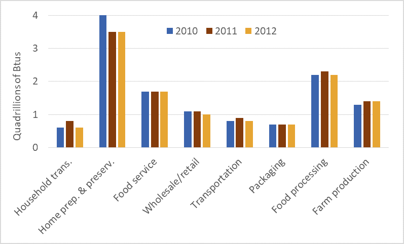
Graph of energy use in the U.S. food system
Energy use in the U.S. food system, 2010, 2011, and 2012

Humans eat food and food gives us energy.  Some humans use some of that energy to move their bodies and limbs to produce more food.  Our great-grandparents ate hearty breakfasts and used some of that food energy to power their work in fields or gardens.  Here’s the important part: until the fossil fuel age, our food production work had to produce more energy than it required.  We had to achieve positive returns on our energy investments.  If we expended 1 Calorie of energy working in the field, the resulting food had to yield 3, 4, 5, or more Calories, or else we and those who depended upon us would starve.

Pioneering research by David and Marcia Pimentel and others show that traditional food systems yielded positive returns.  The Pimentels’ book, Food, Energy, and Society, documents that for every unit of energy that a traditional farmer (i.e., no fossil fuels) put into cultivating and harvesting corn or other crops, that farmer received back 5 to 10 units.  For almost the entire 10,000-year history of agriculture, food systems were net energy producers.  Food powered  societies and civilizations.

In the 20th century we did something unprecedented: we turned human food systems from energy sources into energy sinks.  Today, for every Calorie consumed in North America, 13.3 Calories (mostly in the form of fossil fuels) have been expended.  This calculation includes all energy use in the food system: farm production, transport, processing, packaging, retailing, in-home food preservation and cooking, energy use in restaurants, etc.  It also takes into account the fact that 30 to 40 percent of all food produced is thrown away.

Traditional food systems generated an energy return on investment (EROI) of between 5:1 and 10:1.  Because our modern food system returns one unit of energy for every 13.3 invested, the EROI works out to just 0.08:1.*

The graph above shows energy use in the US food system in the years 2010, 2011, and 2012.  The data is from a recent report published by the USDA.  It shows very high levels of energy use throughout the entire food system.  Perhaps surprising, aggregate food-related energy use in US homes—running refrigerators, powering ovens, washing dishes—far exceeds aggregate energy use on US farms.  Similarly, energy use in food services (food served in restaurants, hospitals, prisons, care homes, etc.) also exceeds energy use on farms.  This data shows that the entire food system is very energy costly.  As we’re forced to curtail fossil fuel use we will be forced to dramatically transform all parts of our food systems.

* This comparison does not take into account the firewood used to cook meals in traditional systems.  But even taking that into account we still find that traditional systems have EROI values that were (and are) large multiples of the EROI values for fossil-fueled systems.

Graph source: Canning, Rehkamp, Waters, and Etemadnia, The Role of Fossil Fuels in the U.S. Food System and the American Diet (USDA, 2017)

Taking nearly the whole loaf: US and Canadian wheat and bread prices, 1975 to present

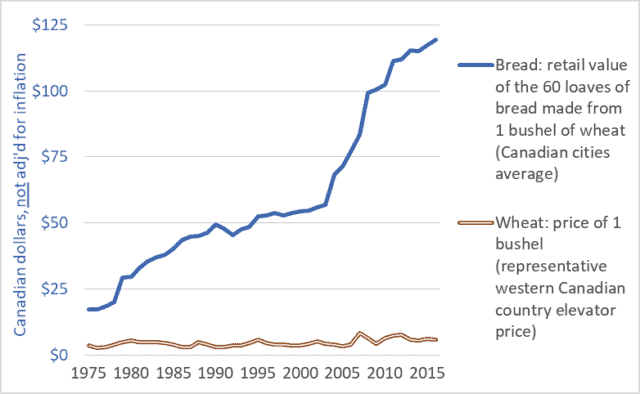
Graph of Canadian retail store bread price and country elevator wheat price, 1975-2016
Canadian retail store bread price and farm-gate wheat price, 1975-2016

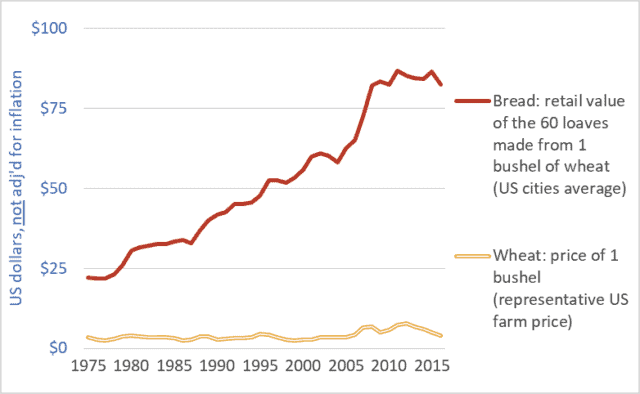
Graph of United States retail store bread price and farm-gate wheat price, 1975-2016

United States retail store bread price and farm-gate wheat price, 1975-2016

It’s been said before but it bears repeating: farmers are making too little because others are taking too much.  For instance, food retailers, processors, grain companies, and railways are taking far too large a share of the retail price of bread.  And the share taken by these companies is increasing—choking off the flow of dollars to our family farms.  At the same time, these same corporations are profiteering by driving up the prices of the staple foods we all need to feed ourselves and our families.

This week’s two graph show data for the US and Canada.  Both graphs show the price of a bushel of wheat (the relatively flat line across the bottom of each graph) and the retail value of the approximately 60 loaves of bread that can be produced from a bushel of wheat (the upward-trending line in each graph).  The wheat prices are farm-gate or country elevator values.  The units are Canadian or US dollars, as appropriate, not adjusted for inflation.

The units are not important, however.  What is important is the widening gap between what consumers pay for bread and the amount of money that makes it back to the farm.  This growing gap represents the ever-larger share taken by food retailers, flour millers and other processors, railways, and elevator companies and grain traders.

Very little of the money spent in grocery stores makes it back to American or Canadian farms.  Compounding this problem is the fact that most of the money that does make it back to these farms is quickly captured by powerful farm-input companies. (See details here.)  Corporations upstream and downstream from farmers use their market power to capture huge profits for themselves while reducing net farm income to zero in many years.  To keep farms solvent, governments and citizens must step in with taxpayer-funded farm support payments.  In Canada, these payments have totaled $100 billion dollars over the past three decades, and more than $400 billion in the US.  From some perspectives, the primary beneficiaries of these payments are the executives and shareholders of the dominant agribusiness/food corporations.

Finally, there is the issue of efficiency.  Farmers are relentlessly urged to become more efficient.  Indeed, they are forced to increase efficiency simply to remain solvent in the face of declining farm-gate prices and rising input costs.  Farmers are so efficient today that they can produce grains and other products for 1970s’ prices.  But what of efficiency elsewhere in the system?  What does it indicate about the efficiency of huge corporate flour millers and food retailers if they must constantly take more and more money for themselves?  Are they becoming less efficient as they get larger?  Or are they simply using their increasing size and power to capture more profit for themselves?  And if citizens are going to be made to pay more for food anyway, then why badger farmers to become ever more efficient?

Farmers are the primary victims of the abuses of power within the food system.  But everyone is hurt as we are made to pay increased taxes to fund farm-support programs and to pay increased retail prices to support the outsized profit needs of the dominant food-system transnationals and their shareholders.

Graph sources:
Canadian bread: Statistics Canada, Consumer Prices and Price Indexes (Catalog number 62-010); CANSIM Table 326-0012.
US bread: Bureau of Labour Statistics, “Bread prices 1980-2015“.
Canadian wheat: Government of Saskatchewan, Saskatchewan Agriculture and Agri-food, “StatFacts-Canadian Wheat Board Payments for No. 1 CWRS”; CANSIM Table  002-0043.
US Wheat: United States Department of Agriculture, “Wheat Yearbook”   

China will save us?  50+ years of data on Chinese energy consumption

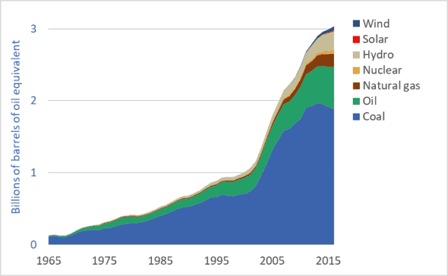
Graph of Chinese energy consumption by source or fuel, 1965 to 2016
Chinese energy consumption, by source or fuel, 1965 to 2016

There’s a lot being written about China’s rapid push to install solar panels and wind turbines (e.g., see here).  And as the US withdraws from the Paris Agreement, pundits have suggested that this opens the door for Chinese leadership on renewable energy and climate change mitigation (see here).  And China certainly has taken over global production of solar photovoltaic (PV) panels.  But is this talk of China’s low-carbon, renewable-energy future premature and overoptimistic?  Are we just pretending, because so little positive is happening where we live, that something good is happening somewhere?  Chinese energy consumption data provides a corrective to the flood of uncritical news stories that imply that China will save us.

This week’s graph shows how various energy sources are being combined to power China’s rapidly growing and industrializing economy.  The units are “billions of barrels of oil equivalent”: all energy sources have been recorded based on their energy content relative to the energy contained in a barrel of oil.  Similar data for Canada can be found here.  US data is coming soon.

Is the Chinese energy system being rapidly decarbonized?  Is China powered by wind turbines?  Or by coal?  The data can support some optimism for the future, but at present, most of the news is bad.  China remains the world’s largest consumer of fossil fuels and largest emitter of greenhouse gases (GHGs).  Let’s look at the good-news-bad-news story that is China’s energy system.

First, the good news: As is visible in the graph, China’s fossil fuel consumption has been flat-lined since 2013, and coal consumption is falling.  Further, CO2 emissions have been declining since 2014.  China has ceased, or at least paused, its rapid increase in its consumption of fossil fuels.

China is also leading the world in the installation of renewable energy systems, especially wind and solar generation systems (see here).  Chinese wind power production and consumption is growing exponentially—doubling approximately every two years.  Solar power production and consumption is growing even more rapidly and has increased 25-fold in just the past 5 years.  China has also invested massively in hydro dams, which can produce electricity with far fewer GHG emissions than coal-fired power plants.

But it would be naive or premature to simple project Chinese solar and wind power growth rates into the future and conclude that the nation will soon slash its emissions.  China’s coal-fired powerplants are relatively new and unlikely to be decommissioned prematurely.  No matter how cheap solar panels become, installing new solar arrays will never be cheaper than simply continuing to produce electricity with already-built coal plants.

Moreover, the graph makes clear that the current contribution of solar and wind to China’s energy system is small—about 2 percent of total consumption.  And while this portion will undoubtedly grow, there will be huge challenges for China as renewables make up a larger and larger percentage of its electricity generation capacity.  With a less-than-state-of-the-art power grid, China will face difficulties dealing with the fluctuations and uncertainty created by intermittent power sources such as wind and solar power.

Is China the leader we’re looking for?  If so, it is a very odd choice.  China has doubled its fossil fuel use and emissions since 2003.  It is the world’s largest fossil fuel consumer and GHG emitter, and these two facts will almost certainly remain true for decades to come.  The idea that China will pick up the slack as American and European commitments to decarbonization falter is dangerous wishful thinking.  Moreover, it should not be the case that we should expect China to lead.  It was us—the UK, US, EU, Canada and similar early-adopters of fossil fuels, cars, and consumerism—that overfilled the atmosphere with GHGs over the past century.  China has come late to the fossil fuel party.  Asking it to lead the way out the door—asking it to take the lead in decarbonization—is as inappropriate as it is naive.

Here’s one last reason why it’s wrong to look for China to lead the way to a zero-carbon future: Per person, China’s emissions are about half of those in Canada and the US (source here).  Is it right for those of us neck deep in high-emission consumerist car-culture to look to relatively poor people with relatively low emissions and urge them to “go first” down the road of carbon reduction?


Powering Canada: 51 years of Canadian energy use data

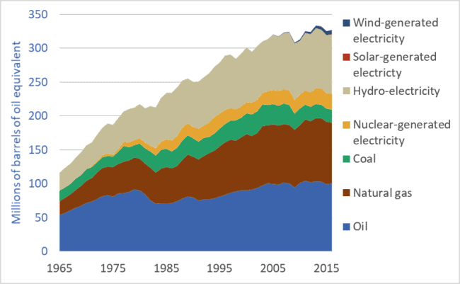
Graph of Canadian energy use, by fuel or energy source, 1965 to 2016.
Canadian energy use (primary energy consumption), by fuel or energy source, 1965 to 2016.

New reports in highly-respected journals Science and Nature (links here and here) tell us that the world’s economies and societies need to reduce carbon-dioxide emissions to zero before mid-century.  This has huge implications for the ways in which we power our cities, homes, food systems, transportation networks, and manufacturing plants.  Our civilization must undergo a rapid energy-system transformation, similar in magnitude and effects to previous energy transitions, such as the replacement of wood by fossil fuels in the 18th, 19th, and 20th centuries.  Enormous changes are on the way.

To understand our possible futures it is useful to know something of the past.  The graph above shows Canadian primary energy consumption from 1965 to 2016.  The units are “millions of barrels of oil equivalent”—that is, all energy sources have been quantified based on their energy content relative to the energy contained in a barrel of oil.  (“Primary energy” is energy in the form in which it is first produced: oil from a well, coal from a mine, hydroelectricity from a dam, or photovoltaic electricity from a solar panel.  Much of the coal and some of the natural gas listed in the graph above is turned into electricity in power generating stations.)

This multi-decade look at Canadian energy use reveals both good and bad news.  Most obvious, it shows that Canada has nearly tripled its overall energy consumption since 1965.  Today, on a per-capita basis, Canadians consume more energy than citizens of most other nations.  Our very high per-capita energy use will make our energy transition more difficult and costly.

On the positive side, our rate of increase in energy use is slowing—the top line of the graph is flattening out.  Partly, this indicates that Canadians are using energy more wisely and efficiently.  But another factor may be the transfer of heavy industry and manufacturing to other nations; Canadian energy use may be growing more slowly because more of our industrial and consumer goods are made overseas.  Also, the graph may not include the full extent of energy consumed in international shipping and aviation.  If Canada’s full share of global water and air transport were added, our energy use may appear higher still.

The graph has some good news in that fossil fuel use in Canada is declining.  Coal, oil, and natural gas provide less energy to our economy today than they did 20 years ago.  Coal use, especially, has been cut.  On the negative side, any downward trendline in fossil fuel use is not nearly steep enough to intersect zero by 2050.

Good news is that Canada already has a large number of low-emission energy sources in place.  We are the world’s third-largest producer of hydro-electricity.  We also produce significant amounts of electricity from nuclear powerplants.  Starting in the 1980s and continuing today, Canada has produced about a third of its primary energy from low-emission sources: including nuclear, hydro, wind, and solar electricity generation.

This brings us to perhaps the most important fact revealed by the graph: the very slow rate of installation of new low-emission energy sources—especially solar and wind.  Today, solar and wind provide just 2 percent of our primary energy.  Indeed, the contribution of solar power is barely visible in the graph.

An energy transformation is critical.  Global greenhouse gas emissions must peak before 2020 and ramp down sharply, reaching zero three decades later.  This will be, by far, the most rapid energy transition in human history.  Canadian action so far falls far short of the scale and rate required.

P.S. A new book on the history of Canadian energy systems has recently been published.  Powering up Canada: A History of Power, Fuel, and Energy from 1600 contains chapters on the energy sources for the fur trade, early horse-powered agriculture, the rise in the importance of coal in Canada, and chapter on the development of the oil and gas sectors.

Graph sources: BP Statistical Review of World Energy.